Do you remember that comic preview I put up a while ago? No? That’s fine.
I decided to rewrite the whole thing, pared it down a lot, changed the art style, and decided to do it all digitally now.
Although I’m not completely satisfied with what I’ve got lined up (let’s be honest, no one is ever completely satisfied with their own work), I’m a lot happier with where it’s going now than where it was before.
That being said, I’m not fully confident nor ready to begin actual production of the real deal, but I’ve decided to go ahead and jump in with a “Test Comic” if you will. A really short, 10 page prologue really, to test the waters and figure out the process.
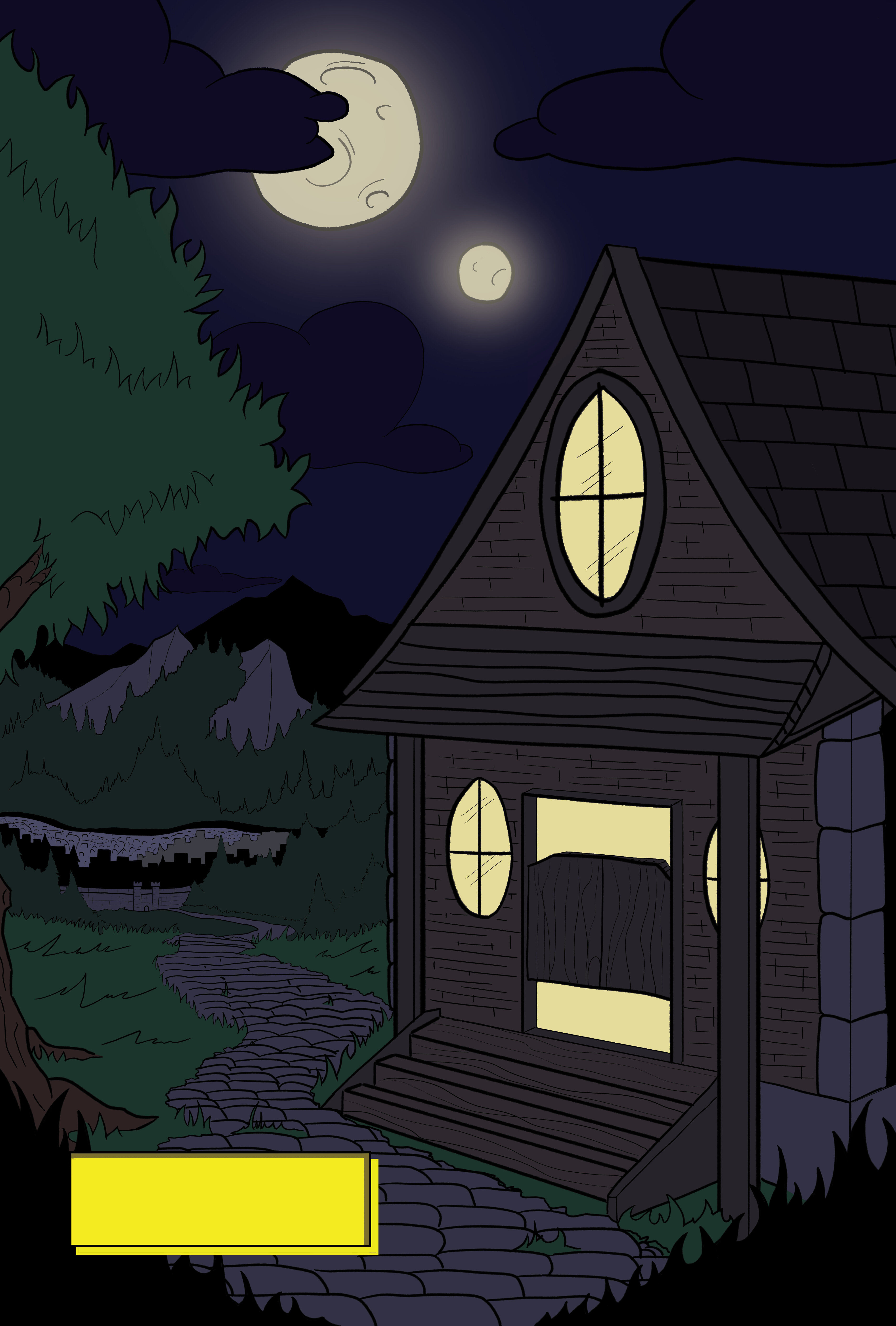
This is the work in progress of the very first page of that comic:
I get what your tryna achieve here with the ominous(this is what i feel) tone, but please for the love of your detailing in the sketches up the brightness a tad
I like where this is starting, but there are some things I would recommend fixing. Nitpicky ramble incoming.
The most important thing to fix is definitely the perspective on objects in the foreground. The background objects are well positioned and have appropriate depth to them, however the house seems off. This should be due to the placement of the entryway roof supports and stairwell. The support on the left is positioned so that it looks closer to the house than the other. I could understand if this is a deliberate choice, but given the symmetricality of the rest of the house, I think it would be best to fix that. Similarly, the staircase is a tad bit off and does not really align with the perspective of the house wall.
Secondly (and this is INCREDIBLY nitpicky, but I guess I’m just like that), I think that if you make the lines a little less pronounced, the art in general would look a bit more professional. The reason why I say this is that constant use of thick lines without accentuating the thinner lines and details make the work look flat, and doesn’t benefit the illusion of depth. However, if you do decide to stick with this, then I think that running all the way with the decision and good use of color can easily remedy this.
Oh, and on a side note I think you may want to make the light in the house a tad bit warmer, maybe alter the hue to be a bit more orange-y. Helps with the narrative the picture establishes.
Anyways, I’m glad to see you return with more cool stuff. Rewriting a story takes work and I’m curious to see where this can go.