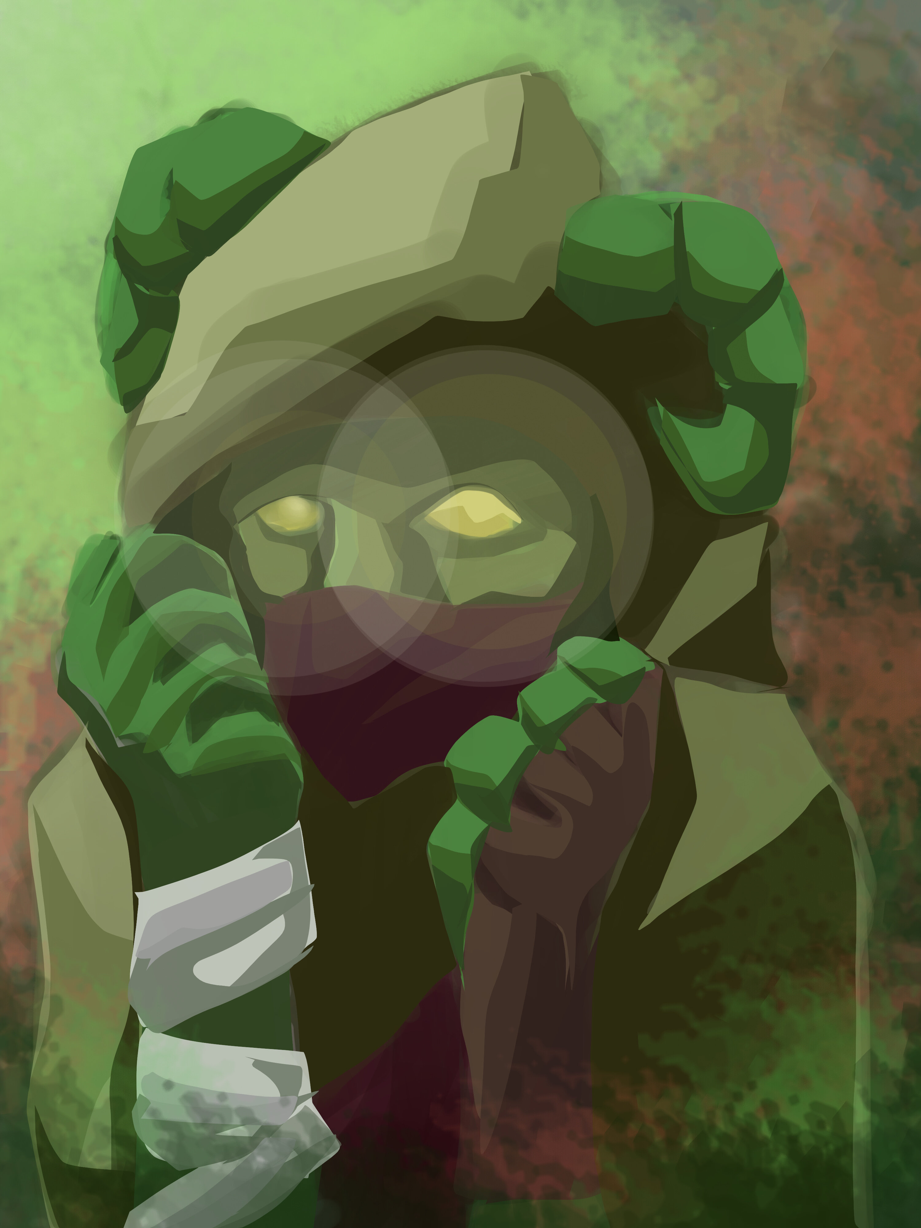
This is my new D&D character for the Fools of Misfortune campaign. A lot has happened since I last posted something related to it, and needless to say a lot of characters have since been…lost.
If you’re curious, his name is Connie, and he’s a dryad-tiefling Glamour bard. He’s 4’6", has an Irish accent, stutters, and is a massive coward, and he’s my new special boy.
Don’t beat yourself up, art is hard, especially mediums you don’t have much experience with. If you decide that you suck at painting you’re never going to actually explore the things it can offer.
As for the actual piece, it looks far from pitiful. You have a solid foundation given previous art experience, now I would recommend learning how to blend colors and use different brush styles (dry, soft, hard, opacity, etc).
Honestly it’s not that bad for a start. Definitely a much better start than a lot of professionals had.
There’s not much I can critique this on since I don’t really know what I’m looking at. The position of the horns don’t like up with the formation of the skull based on the eye placement, the left hand tapers to nothing but bone even before it reaches the wrist, and the right thumb doesn’t have well enough of a defined separation from the forefinger.
Overall, it’s a start, and if you keep working on stuff like this you’ll get really good at it before long.