Deepsea Warlords: Carapar, Takadox and Pridak revamps

Hi! Today I’d like to show you some of my most recent set revamps.

Barraki have always been some of my favourite Bionicle canister sets ever released: they weren’t the clones we had been constantly getting until 2007, they all had unique appearances, builds and parts.
But ,unfortunately, they weren’t perfect: their builds, while being creative and unique, were too skeletal and thin; the fact that most Of them didn’t rely on any big Inikabuild parts made them incredibly small compared to your normal inikabuild Toa sets.

So, I decided to fix that.

This whole project started when I was looking through my boxes of Bionicle parts and realised that I had gained a lot of extra specialised Barraki pieces over the years. I couldn’t really find use for them in my MOCs, since most of those pieces have exclusive colour mixes that never appeared in any other Lego sets, so I decided to update my Barraki sets with them.

And these are the results:

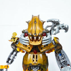
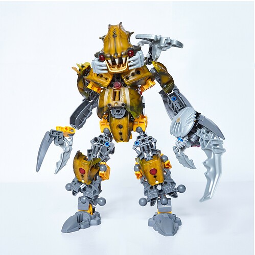
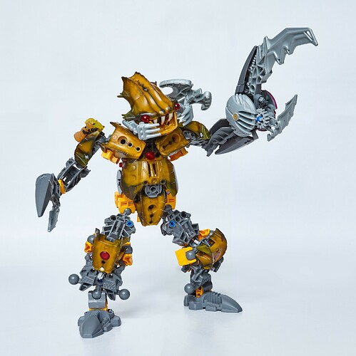
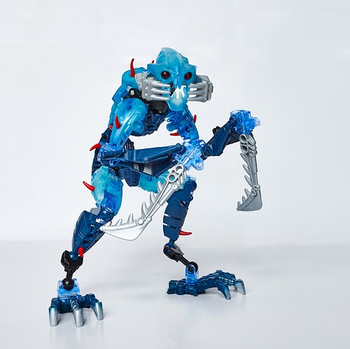
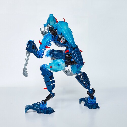
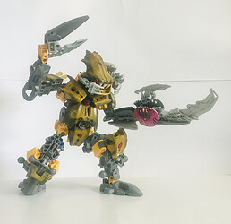
My main goal with this one was to make him as chunky and big as I could.

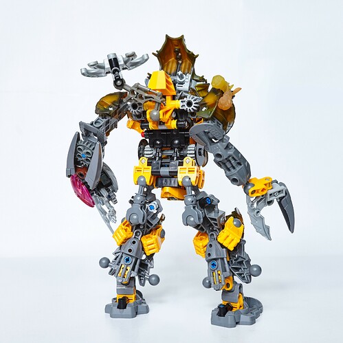
I think that I succeeded, since now Carapar is a little taller then a standard Inikabuild and much, much beefier. I think that makes him a proper Titan, since the piece count is probably three or four times higher than the original set’s

I gave Carapar a bit of a belly, because that big armour piece seemed to fit that use perfectly and I think that such trait perfectly fits Carapar’s character and crab theme.

His squid launcher is now shoulder-mounted, it is possible to put it in his smaller claw, but the connection’s too loose and it blends in too much.

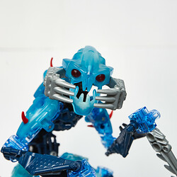
Honestly, there’s not much to say about this one, since that’s just the Takadox set with a bunch of extra pieces added, so it’s more of an update rather than a revamp.

Takadox has alway been my favourite Barraki set wise, so I didn’t feel the need to change much, I just added more armour to everything to hide the fact that he’s basically just a technic beam with some limbs.

And yeah, I got rid of the squid launcher because the thing ruined his silhouette no matter where I put it… and it’s useless anyways

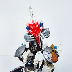
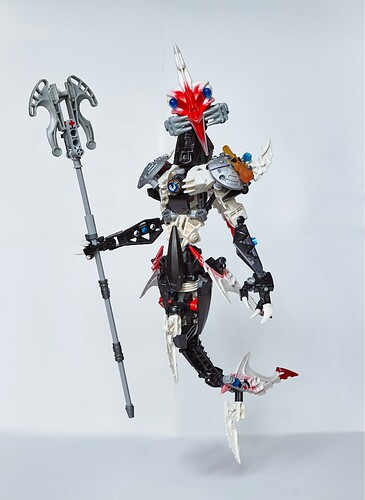
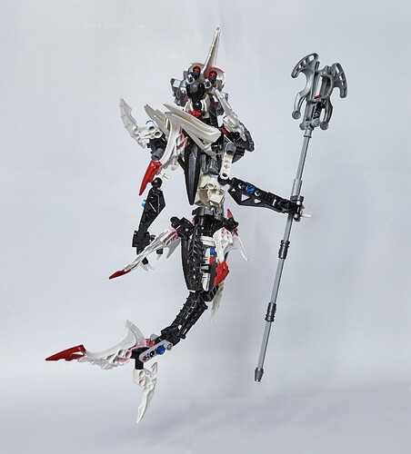
this one, I saved for the last, because I’m especially happy with how it turned out.

I never liked the original set with its weird… everything, I felt like I needed to do the leader of the Barraki justice.

I tried to make him elegant in appearance, the reasoning for it is that Pridak must have been quite beautiful in his unmutated form, considering how passionate he was about his appearance and, although distorted, some of that beauty was carried over to his pit form.
It also works because he has to resemble a shark and those things are quite elegant.

At this point, you must have noticed that I gave him a fish tail instead of a pair of normal legs. This might have been a bold move, but I think that if fits the theme of mutant sea creatures so much better.
Unfortunately, it creates a bit of a problem: he can’t stand properly without any magical trickery involved (in case you’re wondering how I made him “float” in the pictures: I used my stand to hold Pridak up in the air while I was taking the pictures, you just can’t see it)

Another bold move that I did was attaching the squid launcher to a stick. I don’t have any canon explanation for that (although I wish I had), I just thought that a staff weapon would fit the character. Also, repeatedly hitting an enemy with a squid launcher would do a lot more damage and be more efficient than trying to shoot from it

Unfortunately, part two with the other three Barraki revamps won’t come any time soon, since I don’t have the pieces to finish Ehlek, don’t have any ideas how to revamp Mantax and simply don’t have Kalmah… oh well.

Alright, that’s it for now. Which one of the revamps is your favourite? Tell me what you think!
54 Likes

this is accurate

also nice mocs

5 Likes

I think that giving him a tail works a lot better than having legs I never understood how he was supposed to be a shark . Like you said takadox is the best one and I think what you have added to him definitely puts him in 1st place for best boi, the skull spider usage works so well, does he still have the same frame underneath? Definitely making carapar more beefy was a good decision, although I’m not a fan of the av matoran body’s in his legs but apart from that he looks really crab like so 10/10 overall so sad we won’t get to see the other barraki :frowning:

4 Likes

Channelling inner @Hawkflight in 3… 2…

Carapar:

Let’s start off with the positives. The big claw looks good, even if I’d prefer to see more yellow. The head looks kinda derpy but it works. The Torso is decent, some questionable shaping with the shoulders but it doesn’t look two bad.

Now, some nitpicks: the gold chin sticks out a little bit, being the only gold (and it’s only really visible from certain angles). The grey system plate on his belly sticks out and messes with the flow of the torso. The big claw looks too technic-y, like it looks more like a robotic claw than a crab claw. And the little claw doesn’t look great, with the exposed system butt and the fragile connection. And the hips look like they’d hinder poseability by a fair bit. Also, those blue pins in the legs bug me more than they should, especially when they’re not attached to anything

And now, for the big problems: the legs. The legs are a mess, with the kneepads sticking out, hands on the sides of the knees, and the balljoints sticking out at the ankles before suddenly turning into regular sized ankles. The legs are a nightmare of pieces that look thrown together into a vaguely leg-shaped leg.

Takadox

This one is the most solid, probably because Takadox just already works and this just improves it. I love the removal of the squid launcher, the added red spikes, the torso. If I were to nitpick one thing, it would be those black ankles, that ruin the flow of color – I’d either remove them or replace them with trans-light blue, IMO.

Pridak

First off, credit where it’s due: the OG Pridak was a mess. This is leagues better no matter what flaws it might have.

Concept-wise, I feel like making Pridak elegant in appearance goes against his character in 2007, that he hated his mutation. That’s just my opinion, though.

Moc-wise… well, it has a lot of color. And I think that’s where most of the issues lie. You’ve got the red, white, and black of the original, but now with blue accents, and silver shoulder pads. The shoulder pads really stick out IMO. Since you’ve made him so much bigger while retaining the same amount of red (only adding in some technic in the tail), the red face sticks out a bit. So, too, does the orange squid – since he isn’t using the actual squid launcher other than being a bludgeon, why give him a squid at all?

So, to recap:
Carapar: decent, except for the legs and some minor issues.
Takadox: solid, only issue is the ankles
Pridak: good shaping, messy colors.

Also,

4 Likes

Takadox’s chest armor works so well! And Pridak looks awesome too!

1 Like

Thank you, @Eilrach!

Yeah, that’s basically the Takadox set with some extra stuff added.

I can definitely understand this, since that might have been a strange choice. I did this mainly because I wanted to use a piece that strongly resembles an Inika limb, while being much bigger and chunkier (just like the rest of Carapar) and I think that an av-matoran body fits this use best. I feel like if I designed a fully custom limb out of technic, it would clash with the G1-y aesthetic of the rest of the MOC.
Additionally, I wanted to find a use for the av-matoran torsos that I have tons of lying around.

Don’t worry, I think I’m going to post the second part here sooner or later, that really depends on how fast I’ll be able to get my hands on the parts I need.

@Willess12, Thank you so much for your criticism, I really appreciate that!

I agree with that. Although, I think that if you don’t look too closely, it doesn’t look too off, since gold is kind of close to Carapar’s unique armour colour. The colour choice is still far from ideal, but it’s the most fitting out of all the colours the piece comes in.
I might try silver out because there’s some silver on Carapar’s face already, but I don’t think that it will be less distracting.

I think that I could easily fix that by taking that one gear off, but do I need to? The crab claws weren’t supposed to be a part of his body anyways, since he could literally take them off whenever he wanted in the story.

Yes, they do hinder the sideways articulation, but other than that,


It works just fine.
(Sorry for the bad picture quality, I was too lazy to get my good camera and editing out for this one photo)

They have a use nonetheless: they keep the Hordika necks in the stability address from sliding out when I try to pose the figure.

Well, the knee pads kinda stick out, but I think that they are not far away enough to be a problem. The hands fill in the gaps incredibly neatly, almost like they were designed for that specific use, and I think that thay are just abstract enough to not look like fists in this case.

I like to think of those as “creative part usages”, but that might be just me and they are actually pretty dumb and nonsensical.

Ironically, I think that I spent more time designing the legs than the rest of Carapar’s body… whoops

I’m glad that you like Takadox though, I’m quite happy with how he turned out.

I knew that someone was going to point this out and I partially agree with that, it does break the colour scheme a bit, but I think that I chose the least bad variant, since trans light blue would have been worse, as there are no other parts in this colour on Takadox. Black, on the other hand, is already present in his colour scheme.

I’m glad that you like it, since making Pridak somewhat make sense was my main intention.

Well, I can still see him being disturbed by this appearance because of all those claws, spikes, fins and a rather scary face. Heck, any unwanted change in appearance would be a tragedy for such a self-loving being that Pridak is, and that’s not even talking about his entire look getting changed.

Well, yes, That’s true, but none of those colours is new: in the OG set the pincers on the face and the launcher were silver and the eyes were blue. I actually tried to organise those messy colours as much as I could: all the fins and spikes are either white or red and white; the tail, the lower arms and the neck are black and connected to a mostly white upper torso; all the “lights” including the eyes and the heartlight are blue; all the artificial parts that don’t belong to Pridak’s body (shoulder pads, face pincers and the staff) are silver. But I’ll try swapping the silver shoulder pads for the white ones, since I kind of dislike them anyways.

This though, I consider a big problem that I don’t know how to fix. I want red to be exclusive to the marbled red/white pieces, but Lego don’t make any other pieces with that colour mix, so that’s all I have to work with.

I imagine that this is a shooting staff in-story, but in reality squid launchers don’t work no matter what you do with them.

Also, this

gives me anxiety.

I want to know what you wanted to say here so badly :rofl:

4 Likes

Really NICE Revamps!! :blush: :blush: :blush: :revolving_hearts: :revolving_hearts: :revolving_hearts: :revolving_hearts:

I especially LOVE Carapar, you made him looks so Crab-likely!
( I love his Pincers’ size are defferent each, like a Fiddler crab)

2 Likes

I was always under the impression that he had it removed more surgically, and it wasn’t like he could just take it off and put it back on as he wished.

Couldn’t the same goal be achieved with black pins? Not the old black pin-axles that are stupidly rare, just a regular 2L black pin. It would allow the Hordika neck to slide a few millimeters, but it wouldn’t slide off.

And if you have one, you could use a round bushing to keep it from sliding even that much.

I would argue that it’s similar enough to the Glow-in-the-dark armor that you could get away with it.

That was a bit of an inside joke. I said I was channeling my inner Hawkflight, and I remembered a very old post that Hawk made ending in “Also”. For some reason this post and Slime’s response still make me laugh to this day.

This pun was entirely unintentional and I don’t know how I missed it until just now. :laughing:

3 Likes

God I love Carapar’s smile, he’s too pure for this world.

4 Likes

Takadox is my favorite overall - a great layer of polish on an already great set :+1:

Carapar’s goofy grin is perfect though :grin: he looks so happy!

3 Likes

a joke so niche not even I remember it

That is the kind of joke I like.

Also,

take away some of the small armor shells off Carapar’s torso and put them on the limbs. The heavy crab styling of the torso conflicts with the traditional BIONICLE styling of the legs.

4 Likes