So I’ve been DM’ing at my school and drew some stuff for my campaign. Here’s some stuff:
Veilheim
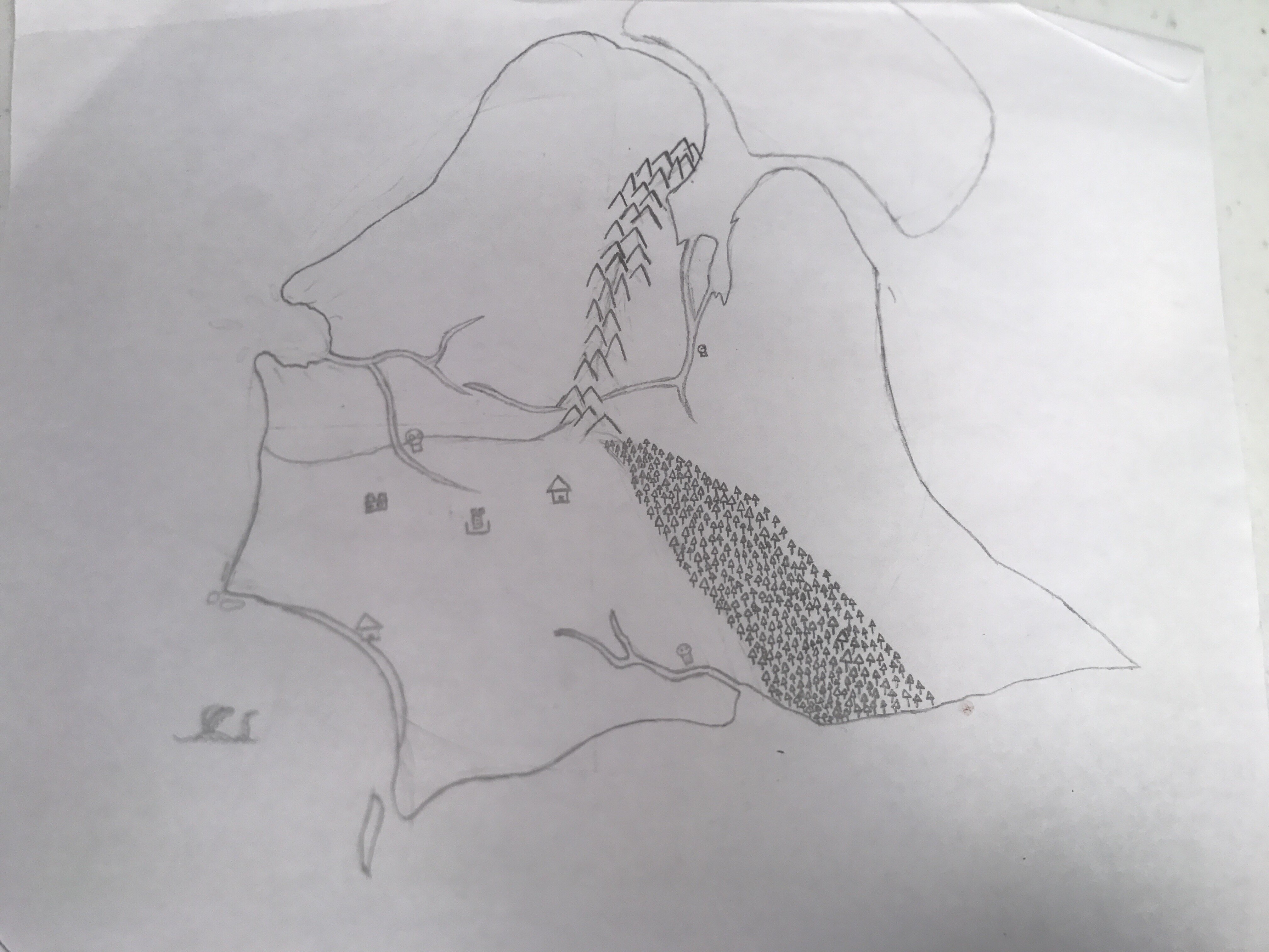
The small newly discovered continent that the campaign takes place on. It’s a land full of new discoveries and possibilities that hold a dark secret locked beneath its ancient shores.
The drawing itself isn’t actual supposed to be used a a man. Instead it’s more for deciding what goes we’re and where the players are and will go with important locations drawn in. The big empty space on the top right will eventually become a glacier, I just couldn’t find any good references for what I wanted. In fact, I’ve never actually drawn land masses before.
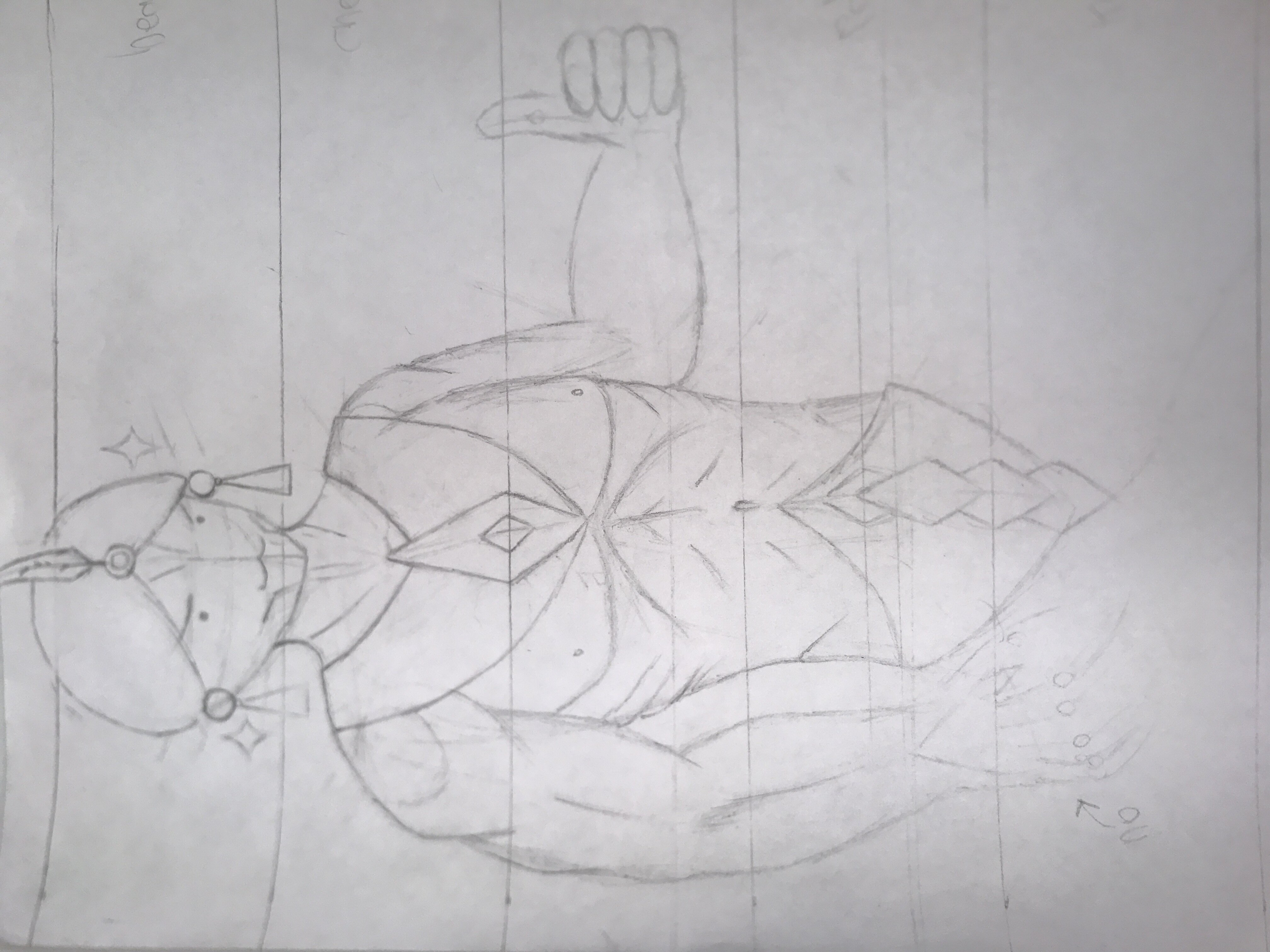
Solarian
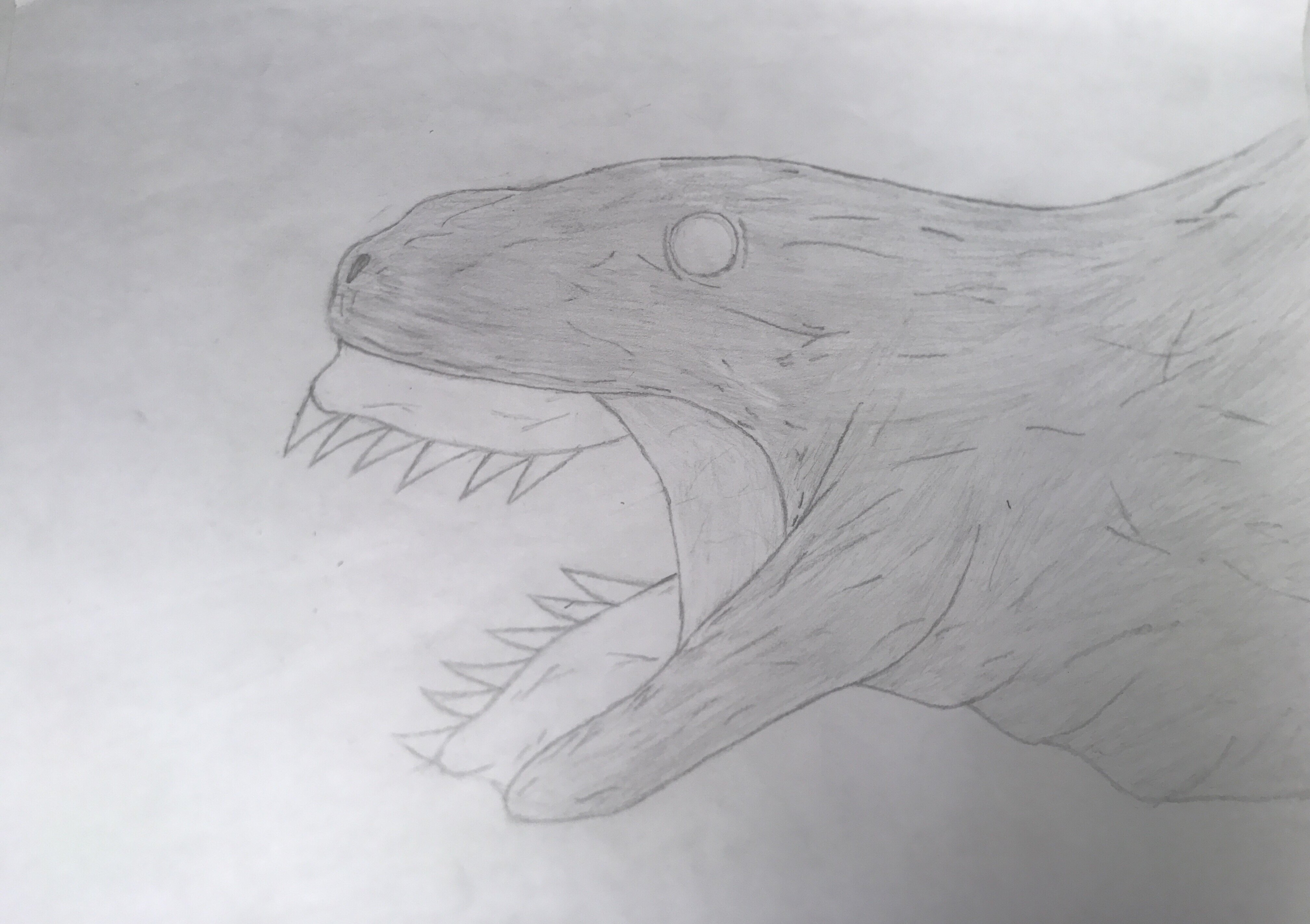
The fallen star that devours ancient worlds. A mindless horror whoa unsociable hunger and ferocity threatens to raise Veilheim to swalowed ashes.
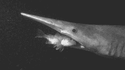
I really enjoyed this one, although getting the shaping right was a challenge. I took inspiration mainly from snakes and goblin sharks as one idea I was was for the jaws to extend from the head. Gif for reference:
Another inspiration for the design was 2016’s Godzilla, specifically the 2’nd form.
Solarian P:2
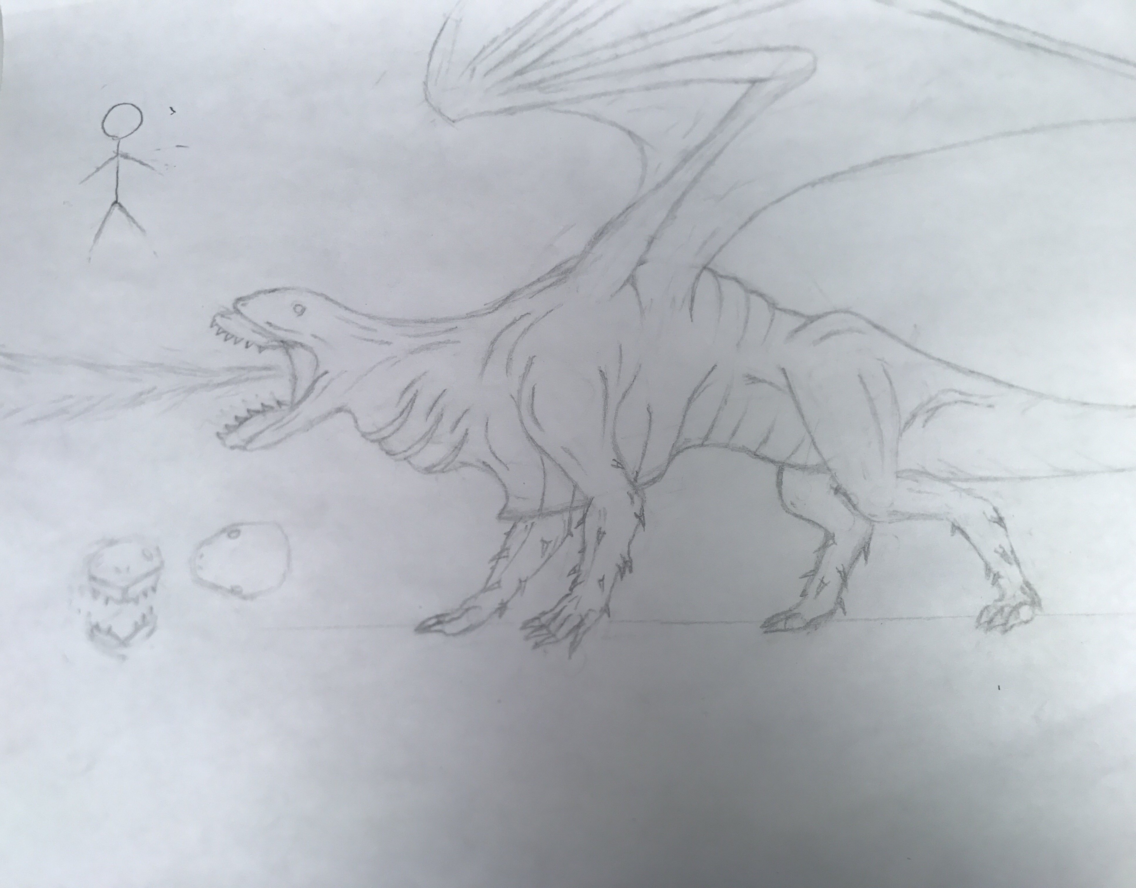
Its blood is strange. Instead of a simple liquid, it is a corse white powder that explodes in a violent flash of heat and light after a few seconds when in contact with anything except the Solarian itself. Anything caught in the blast is completely anialated. It can use the gill-like structures an it’s neck to detonate blood in its mouth and use its jaws to concentrate the blast into a single precise laser.
The point of drawing this one was to give my players a visual representation of this enemy. There are a few things that I don’t like about the drawing though. The right hind leg I don’t think looks too good and wing didgets look to Steiger for me. I was trying to do something were the wing was bent over itself sorta like the illustration for the ancient white dragon in the D&D 5e monster manual but I failed in doing that and decided to do it differently. The result I relay don’t like. I also really don’t like the two smaller heads I drew in the corner there. I just can’t get the look I want from a head-on perscpective. Finally I think head has too many wrinkles. I fixed that though.
Epitaph
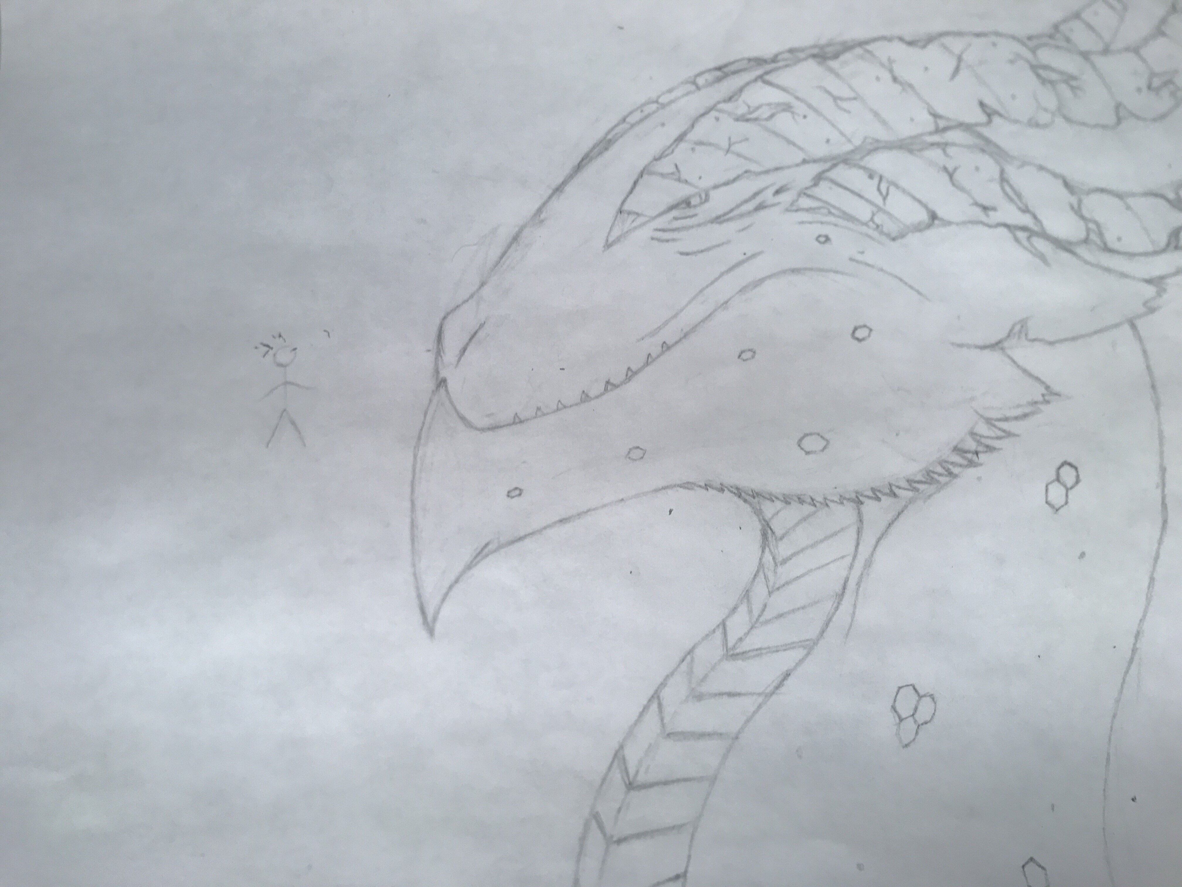
An ancient beast that dwells beneath a long forgotten well. He is exceptionally wise having lived for many millennia and has spend his most recent years raising and training the young sorcerer Walice. As a dragon he possesses a hoard, his of silver coins which in his own words embodies the deepest wishes of mortals, and that the idea that mortals would be willing to arbitrarily sacrifice precious recourses like wealth to “make a wish” is a fascinating concept to him and thus cherishes them. He hopes that one day he will be able to make each one of those wishes come true even if he can never for fill his own wish.
A last-minute sketch of an important character for the campaign. I wanted to make the character look old but still strong and robust with things like the cracked horns and strong jaw. I’m a bit iffy on the horns because I may have overdesigned them and most of the cracks and chips don’t look natural. The front of the face also needs more detail and the hexagons that dot the neck and jaw also look it of place.
So what do you think? which one was your favorite? Tell me what you think! 
Update on commissions
Commission are coming along very poorly. I can say that the topic was a complete failure for me. Nearly all of my time drawing has been devoted to my campaign which leaves little time or drive to work on anything else. I want to finish it and eventually I will force myself too finish it all but I just wanted to apologize for not keeping my promise to the boards.