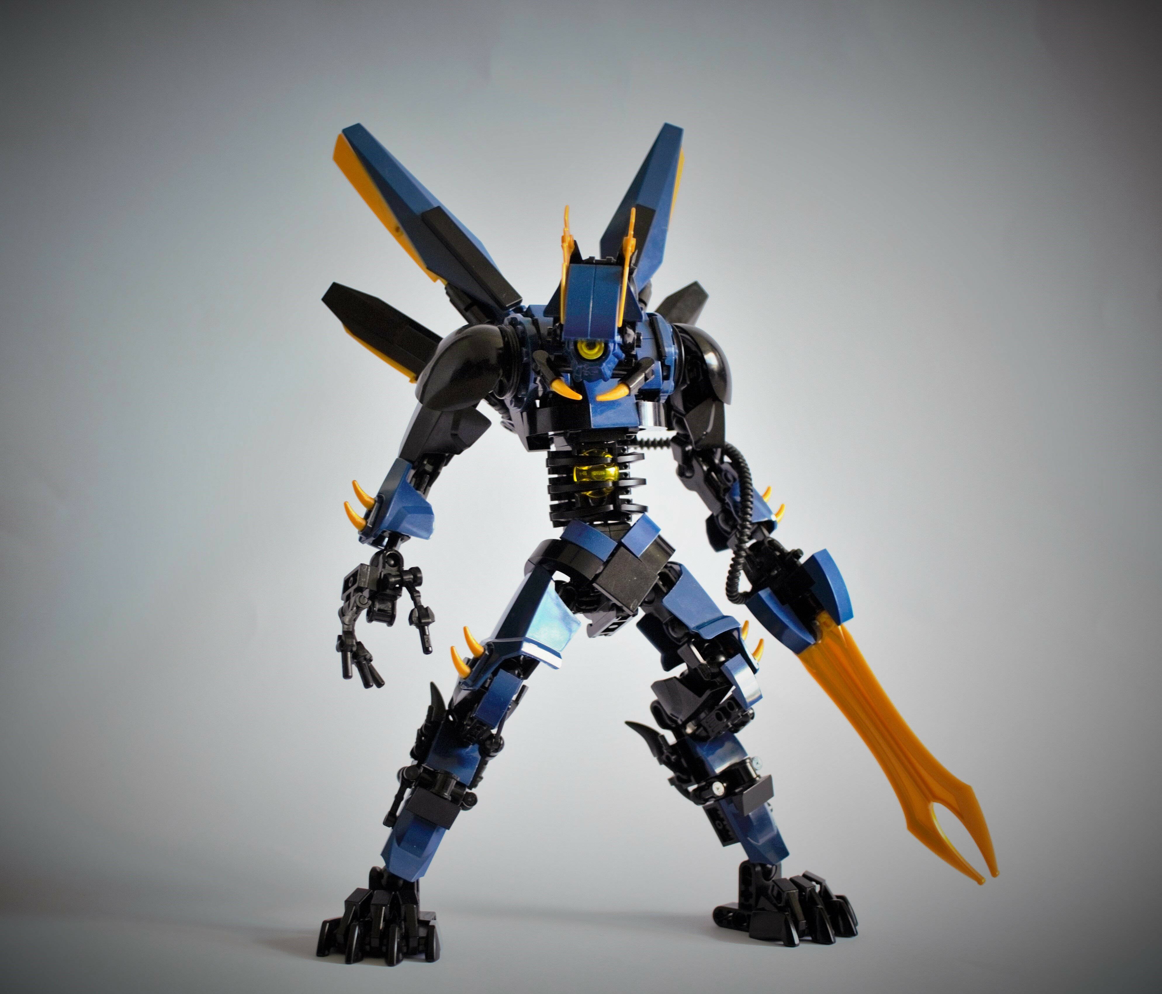
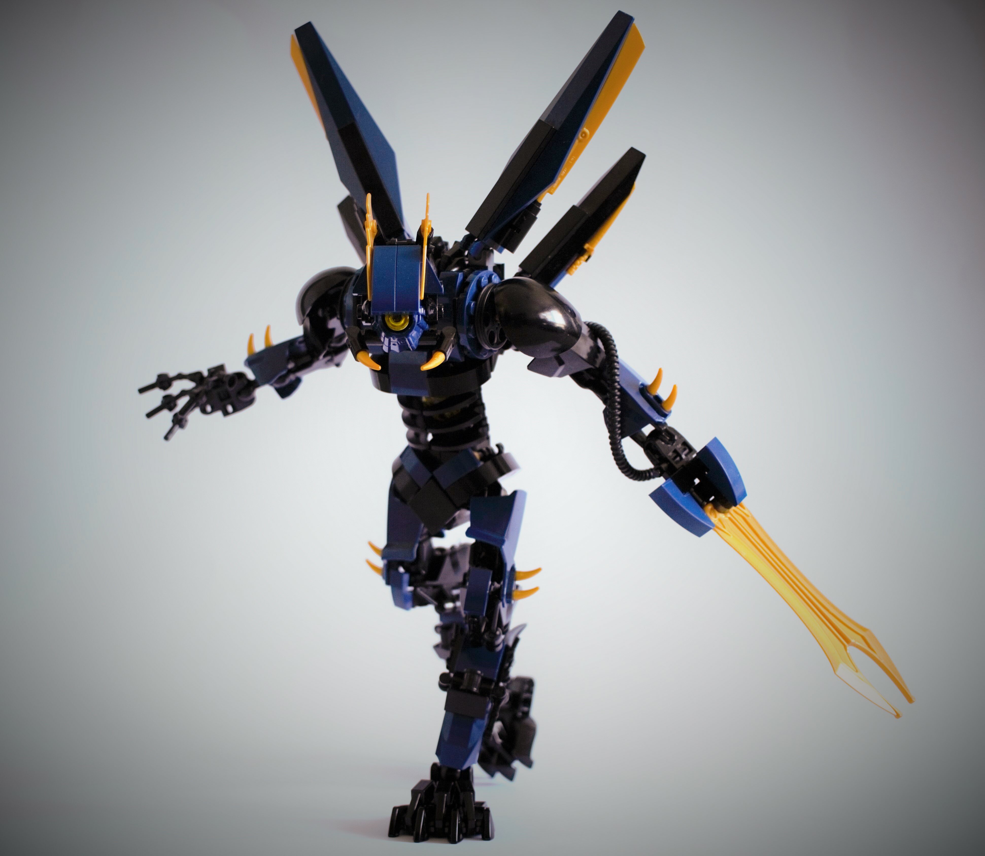
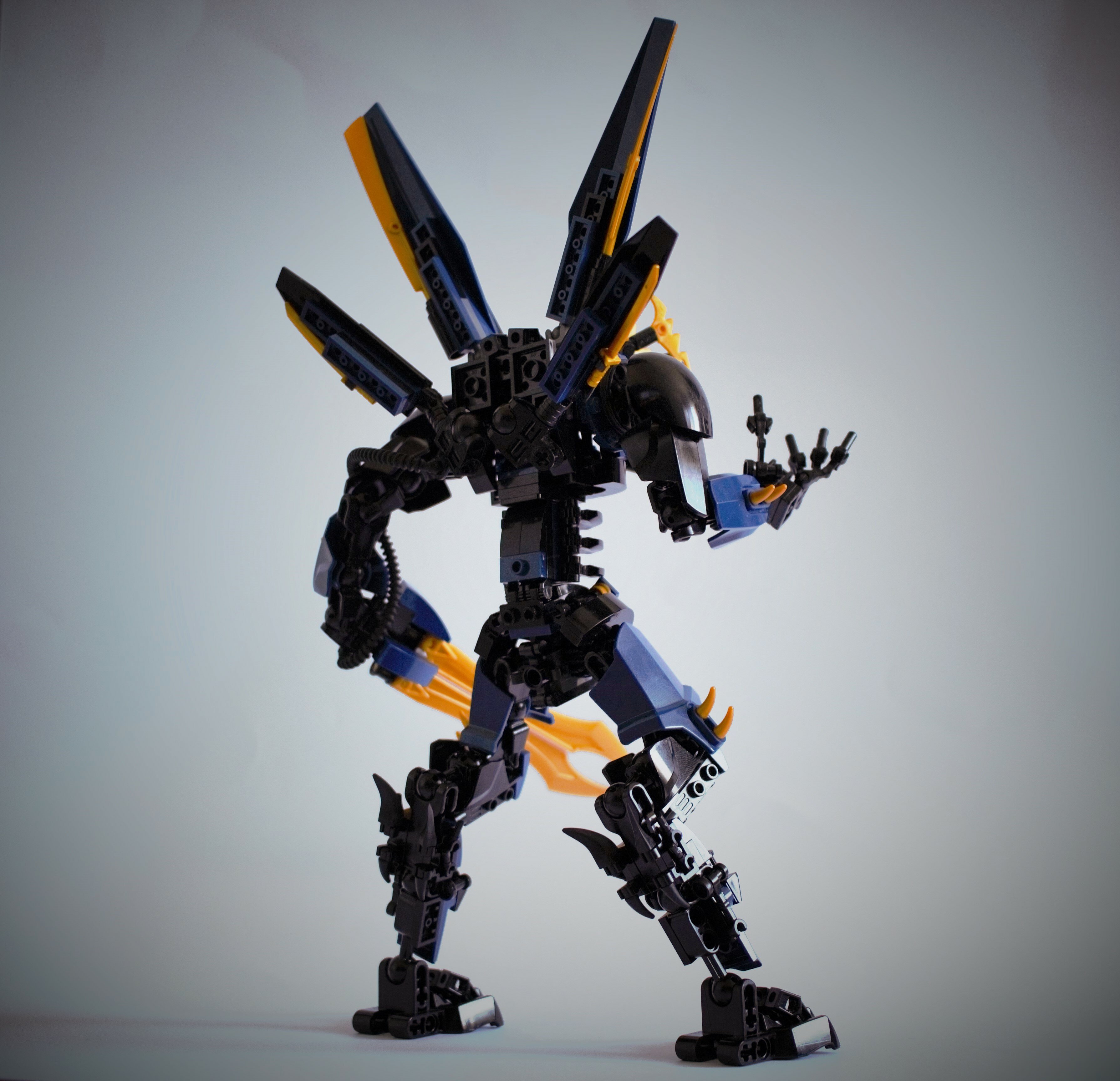
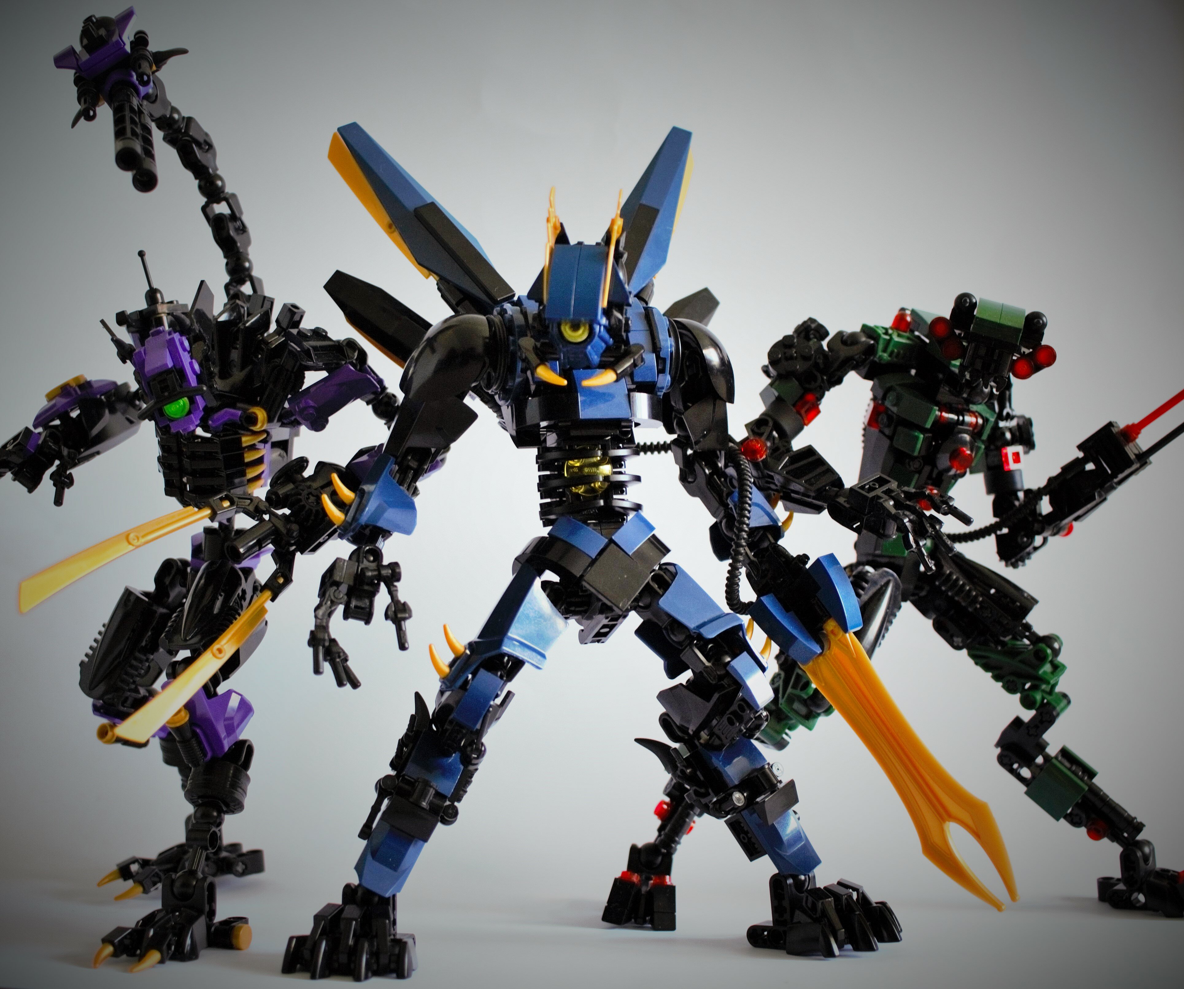
Essentially i figured out what colour blocking was and ever since, staring at old dragonfly hurt my soul. So enjoy the new revamped dragonfly as well as a few tasty shots of him and the other mechs. Also idk if you guys enjoy seeing stuff updated from time to time, so lemme know if you do
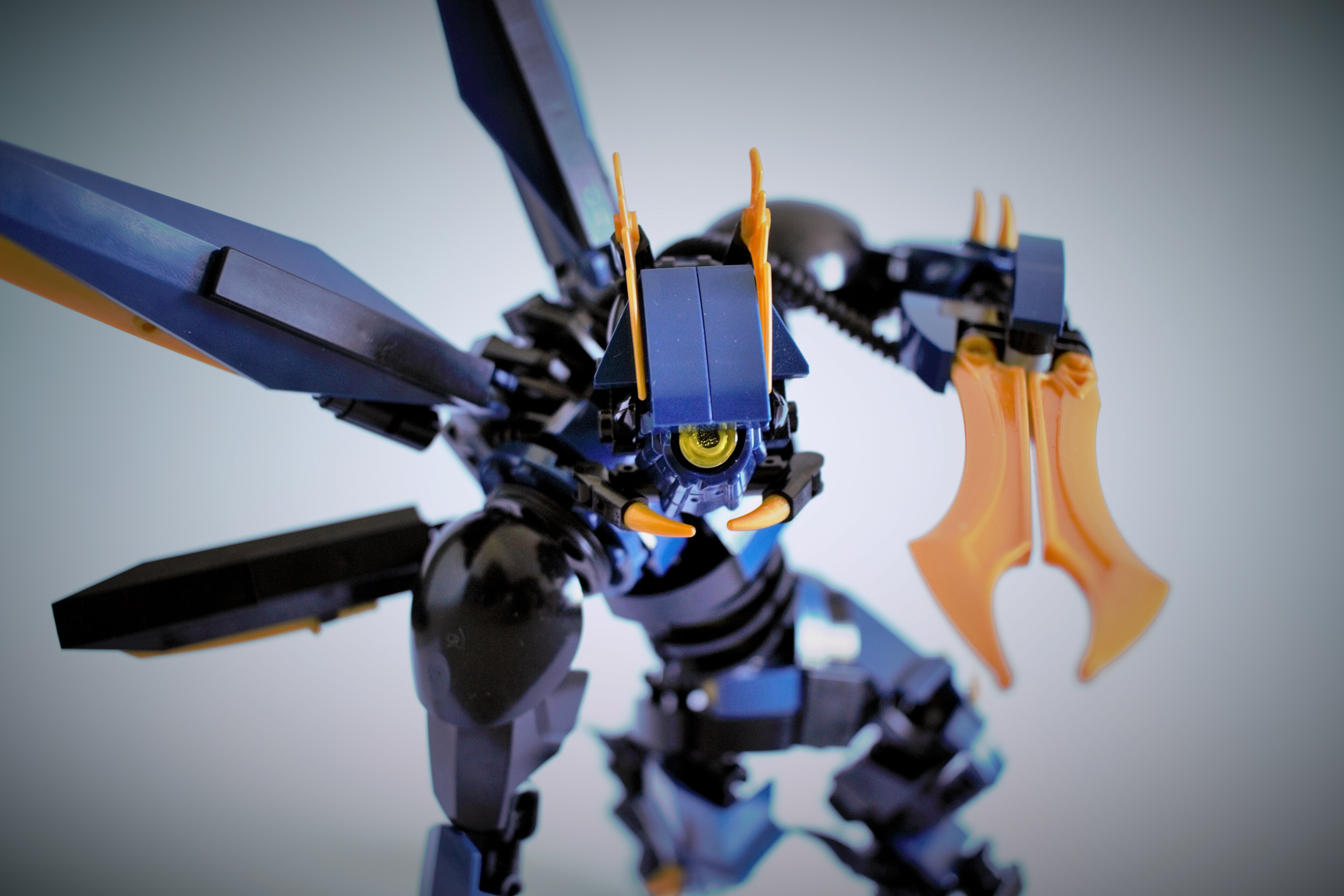
Having an order or purpose as to how and where you place colours. In this guy’s case, removing a lot of gold and making the uses of it consistent and strategic. Makes a big difference in the overall aesthetic regardless if you notice it or not at first.
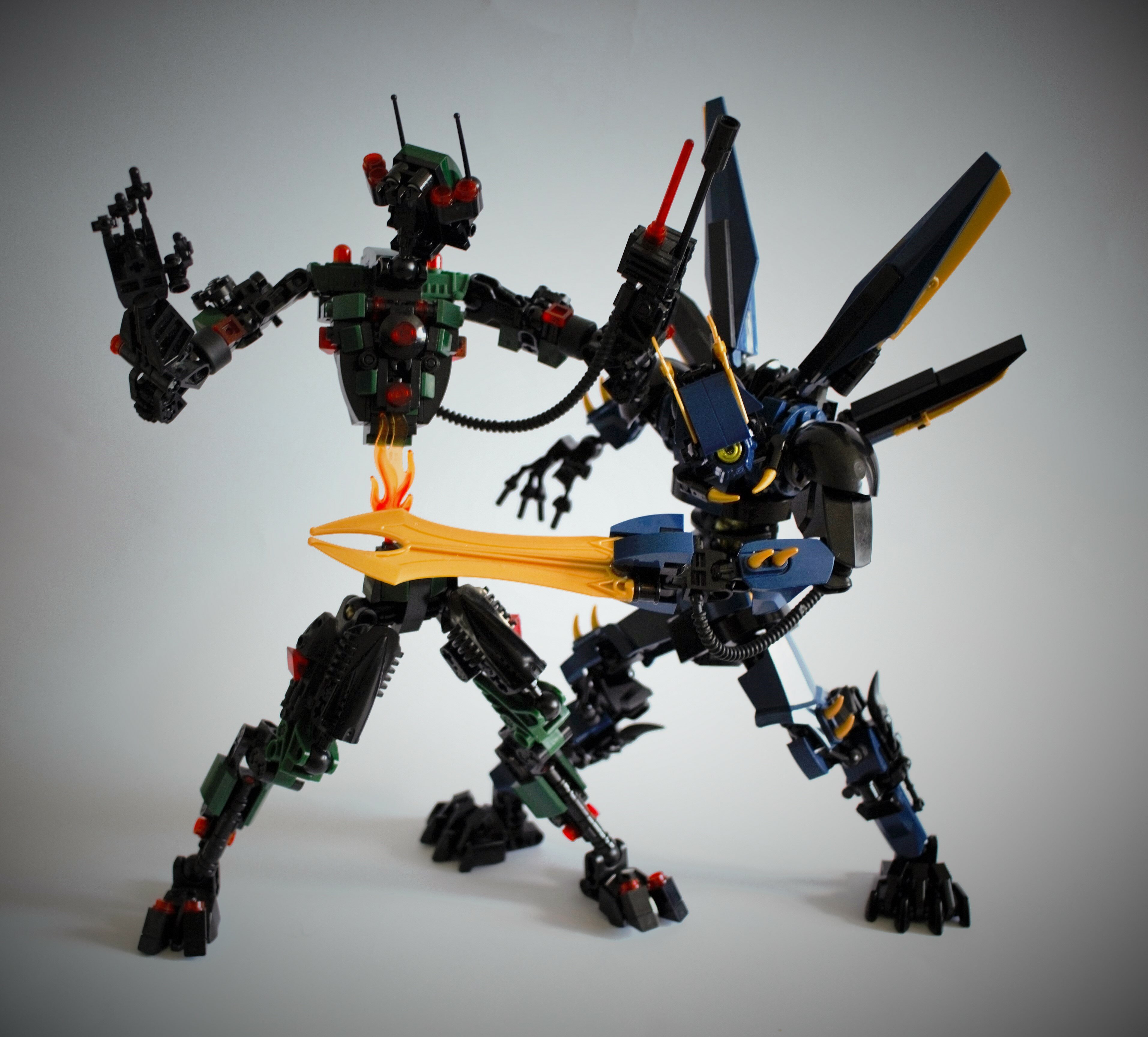
Uh references to translations of the theme song aside, this is a really good moc. Shaping is on point. System and small details are crisp and clean not distracting on the ccbs or the rest of the moc in general flowing well together.
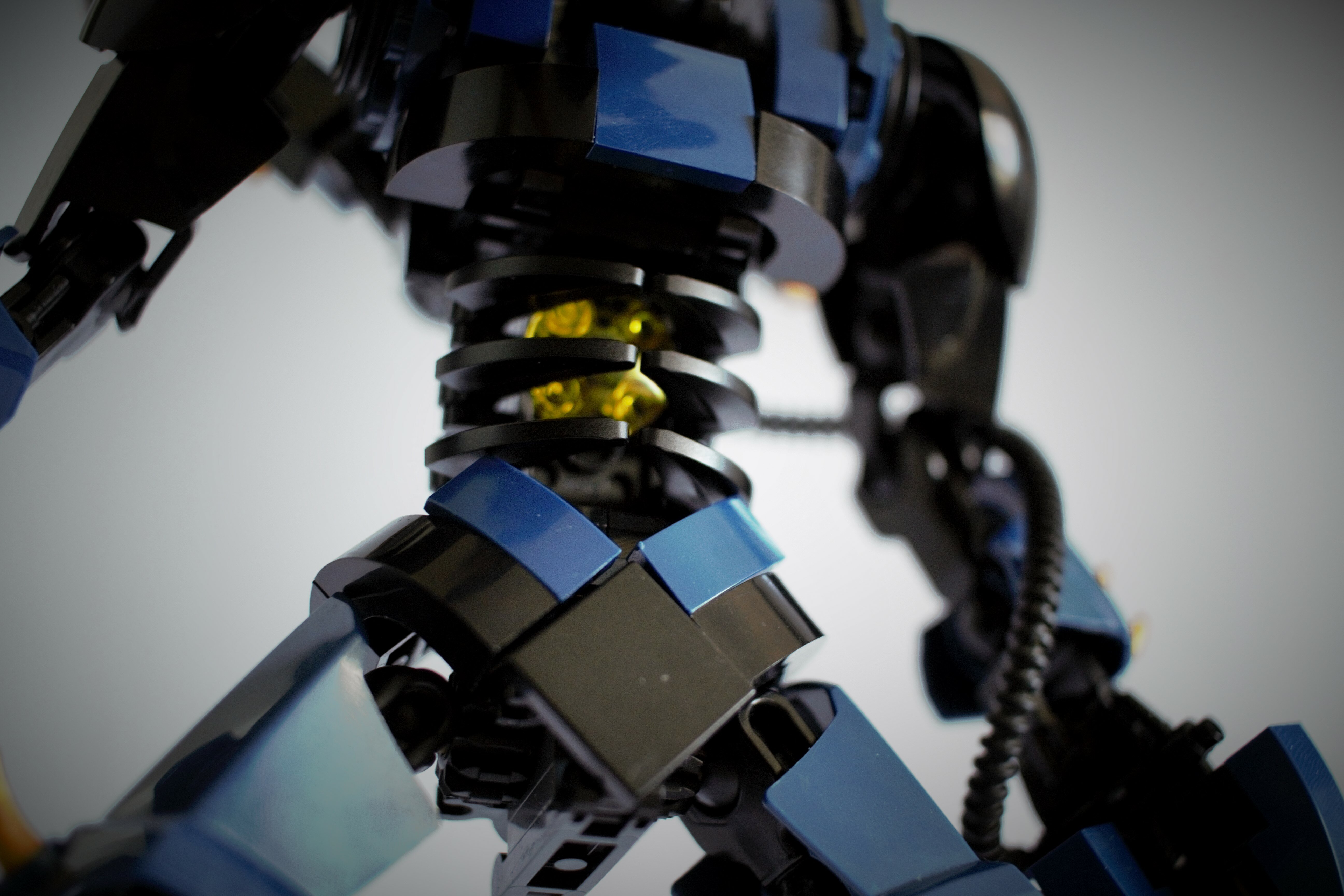
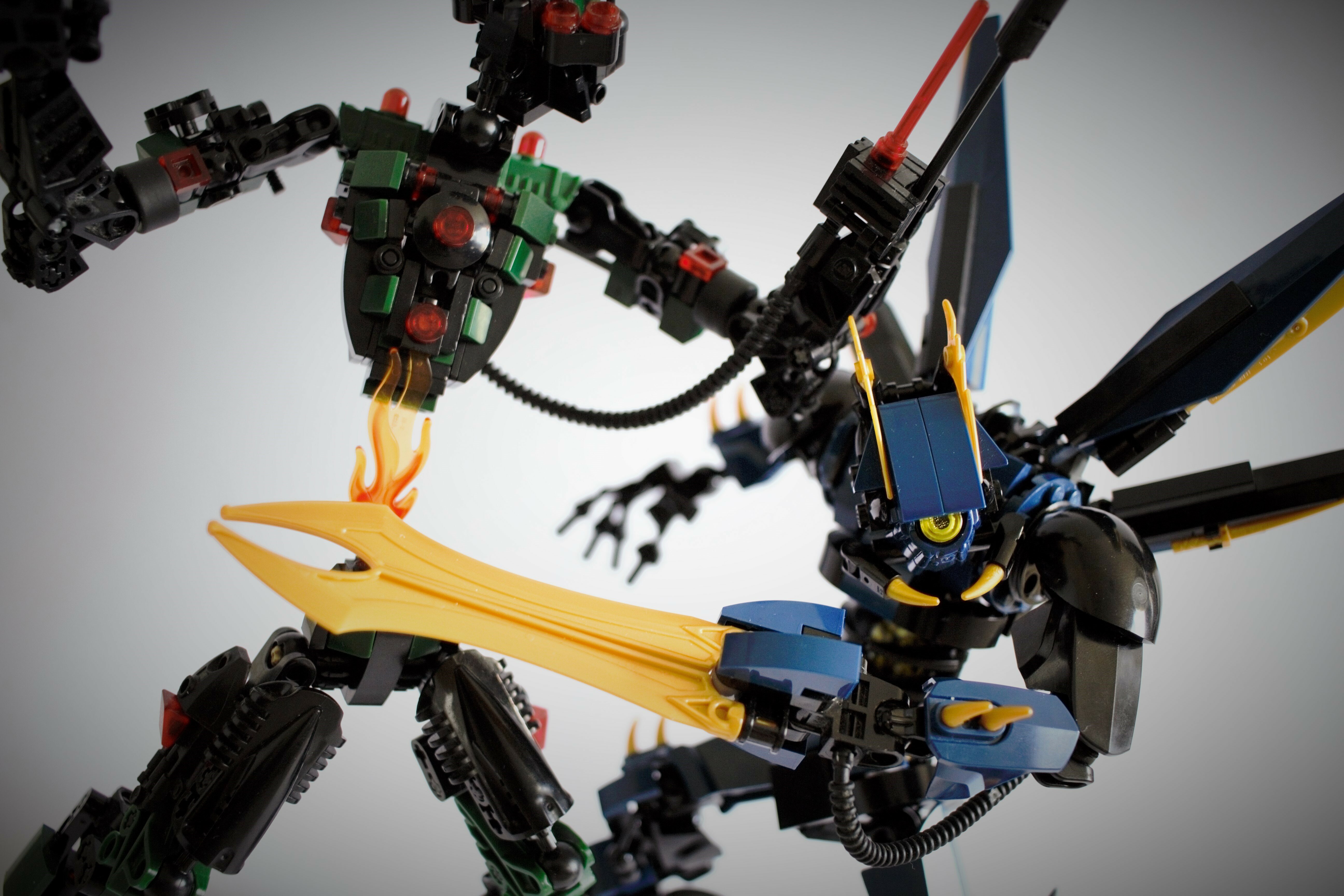
Yeah man, it’s so well done. And I can tell you’re proud of it (as you should be) because you have a pic focused in on it. In addition to it looking so good, it doesn’t appear to limit the range of motion at all. That’s pretty hard to do. Well for me it is, at least.
This is the best thing I’ve seen today. I really wish this were an actual set, in fact, I wish LEGO would outright make a Japanese Mecha theme that either created designs very similar to this, or outright got the licenses to create some of the most popular mechs from various anime in LEGO.