Hey Ved here again, I’m here to pitch you guy some color schemes. I hope you like them and agree. Warning, I know these aren’t the best drawings, but they should be good enough for all of you to get the big idea.
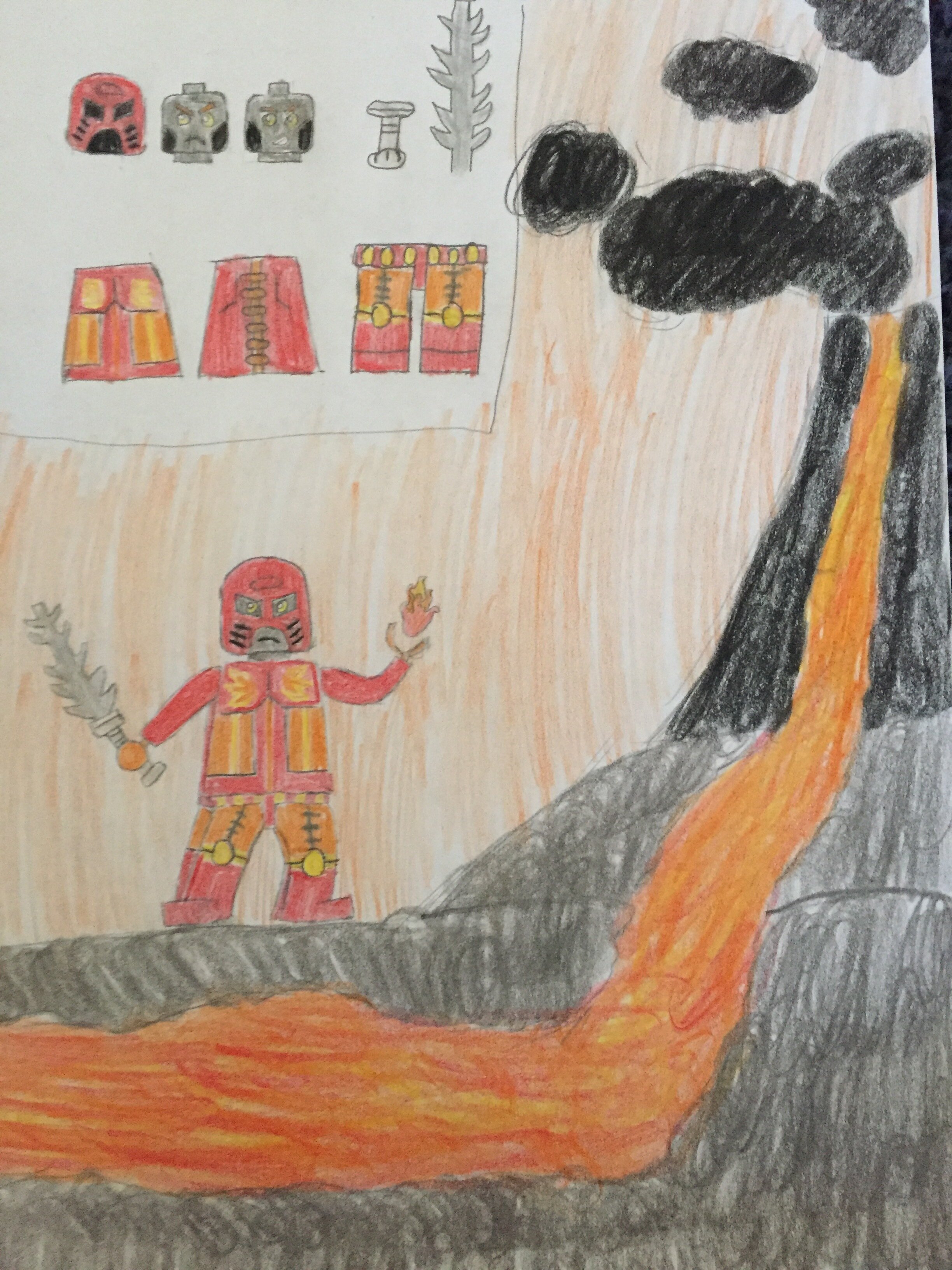
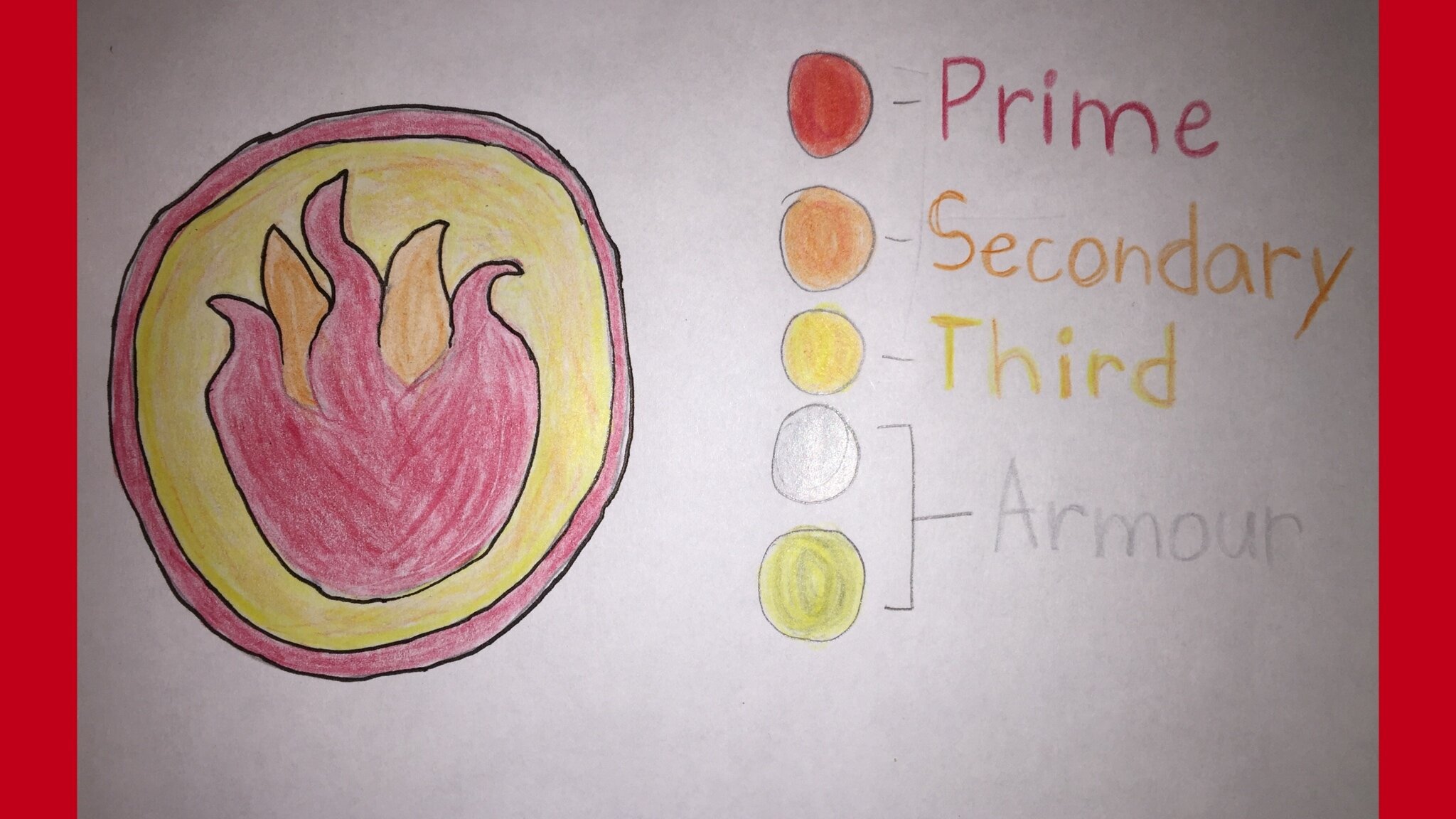
Element: Fire
Prime: Red
Secondary: Orange
Highlights: Keet Orange
Reasoning: Let’s see well red was an obvious choice being it’s represented fire for along time. As for the other colors you find in a flame.
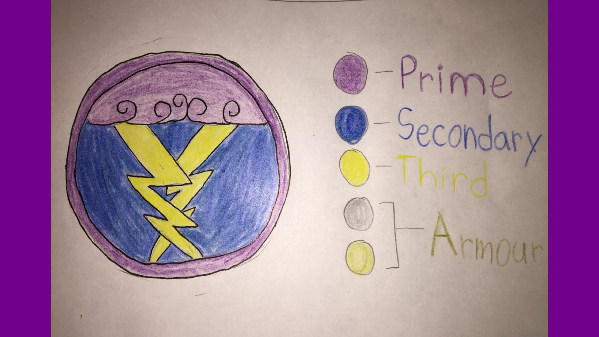
Element: Lightning
Prime: Purple
Secondary: Dark Blue
Highlights: Yellow
Reasoning: I’m going to the simpler one here first. The reason I picked yellow is that it was originally the standard color for lighting befor blue. As for dark blue is the idea of a dark sky when a storm rolls in. Lastly, I chose purple because it was talked about on the Podcast which I agree.
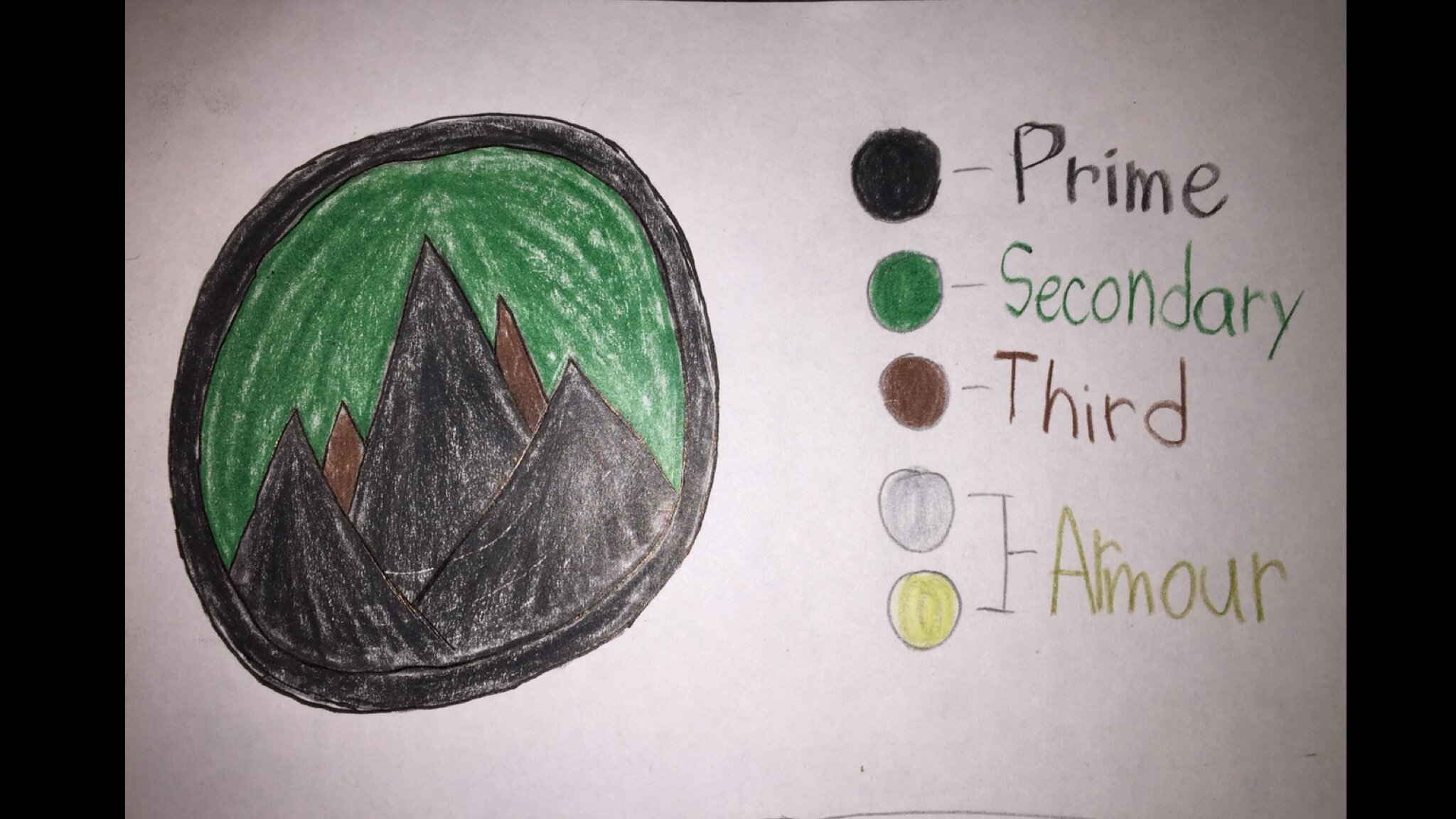
Element: Earth
Prime: Black
Secondary: Dark Green(Metru Green)
Highlights: Brown
Reasoning: I picked these colors because I feel each one pretty much represents earth and nature.
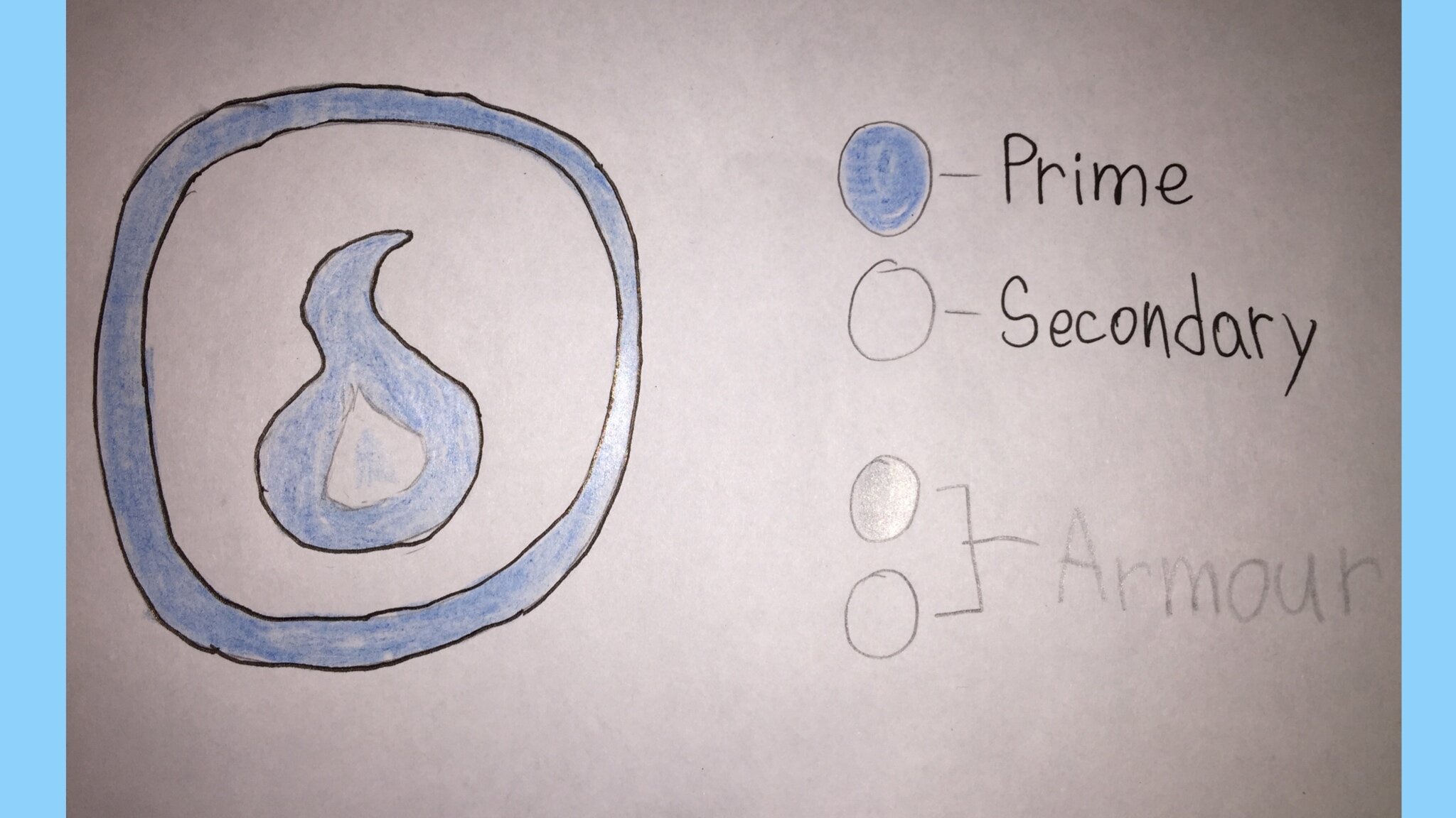
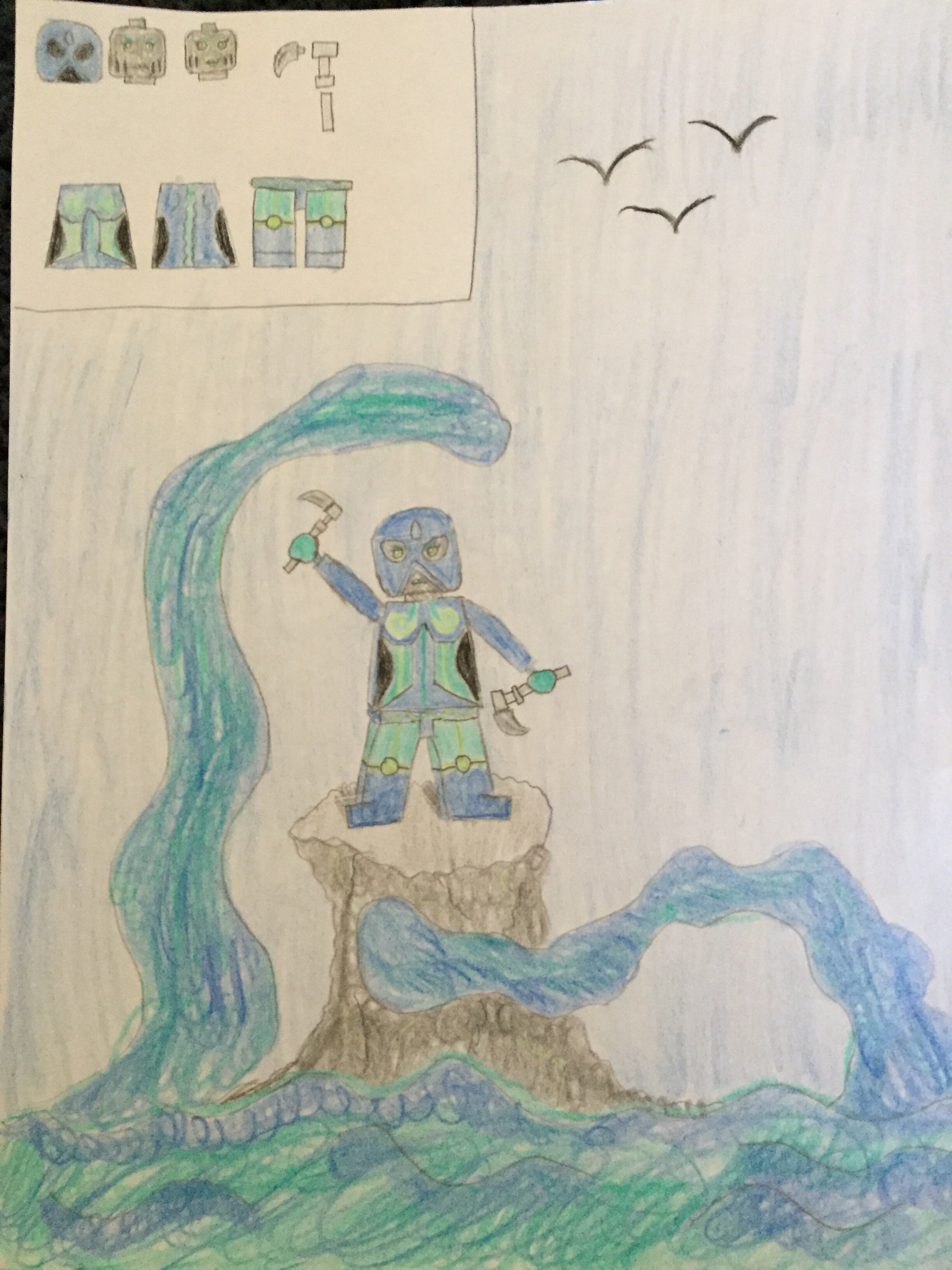
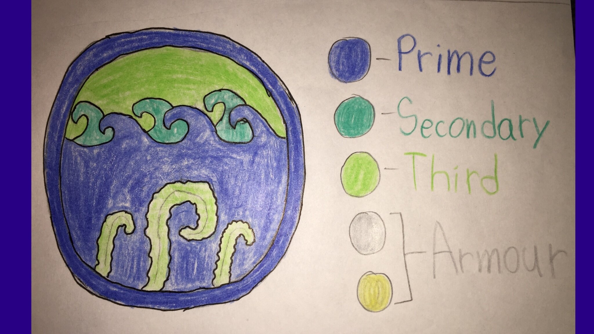
Element: Water
Prime: Blue
Secondary: Turquoise
Highlights: Green
Reasoning: I feel that the picture pretty much sums it up.
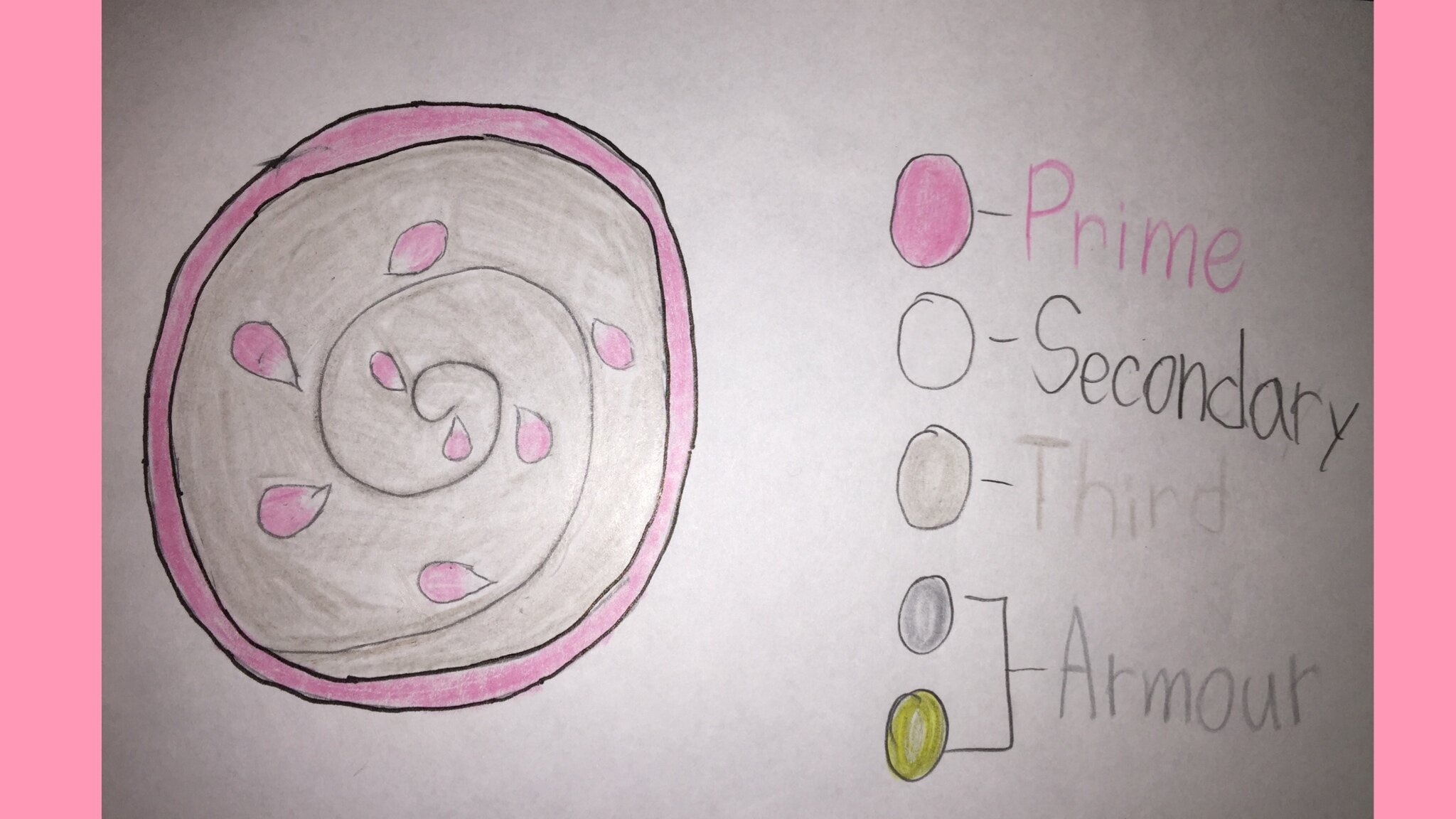
Element: Air
Prime: Pink
Secondary: White
Highlights: Light Gray
Reasoning: Well white and light gray sort of explain themselves. “But why pink?!” I here you say at me very angrily. I can ask the same about green. Sadly I have only one reason why, but that is one more reason than green. And it the sky, to be more specific the sunset which the reaches a pink color.
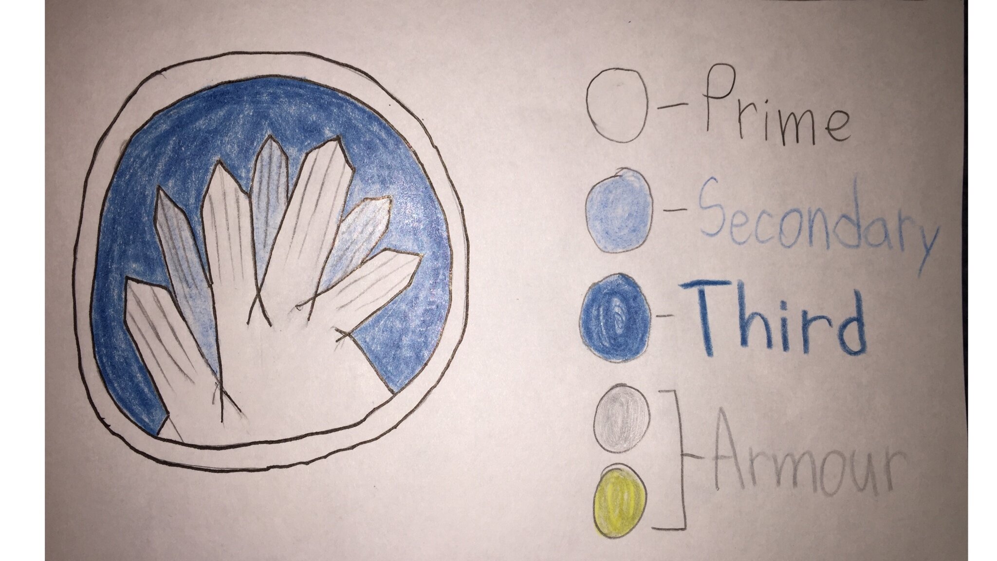
Element: Ice
Prime: White
Secondary: Light Blue
Highlights: Dark Blue
Reasoning: Sadly this has been done already in 2016.
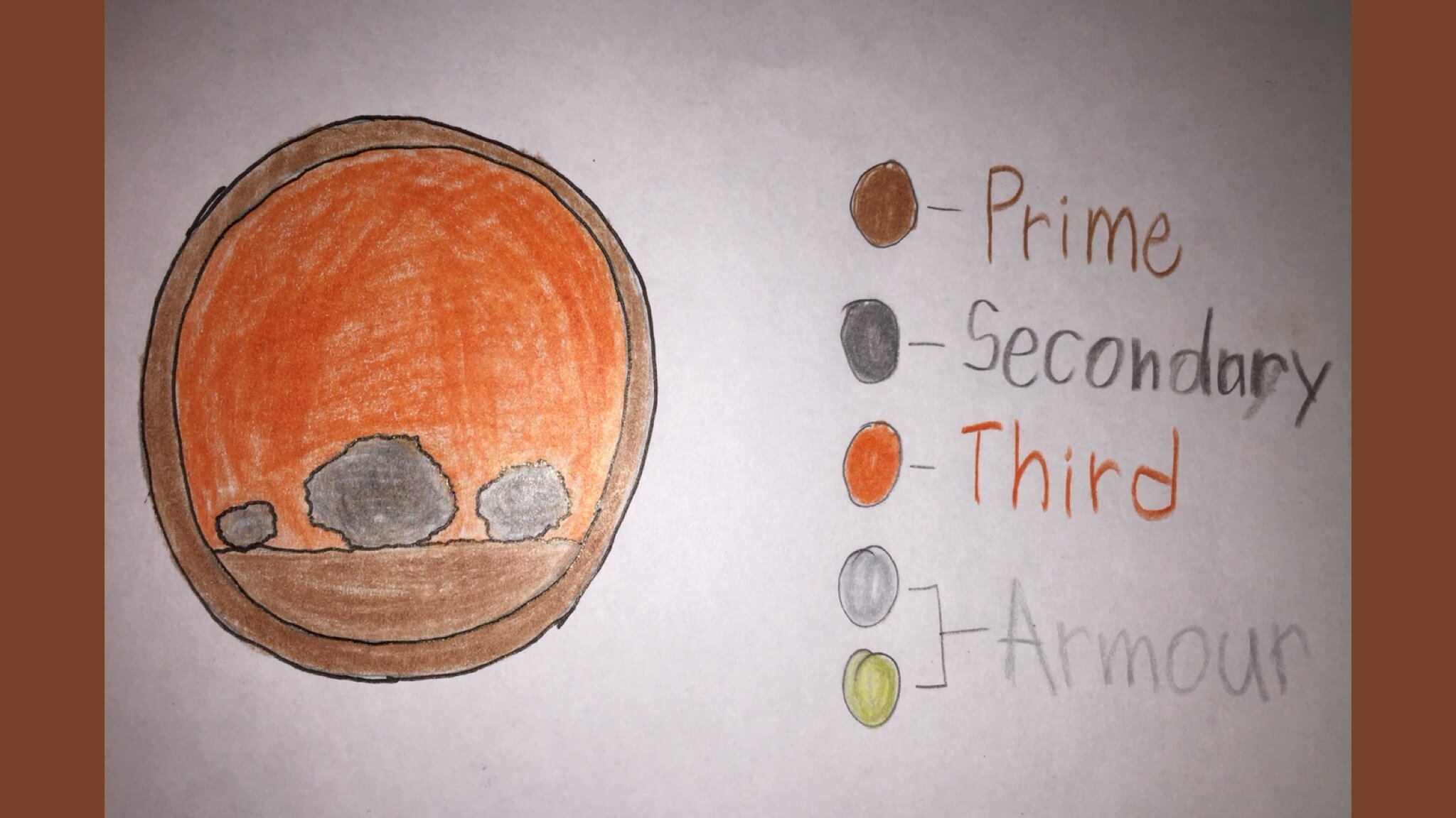
Element: Stone
Prime: Brown
Secondary: Gray
Highlights: Orange
Reasoning: I took away tan from the stone mixture because it would look like it should be sand, and so why gray. While a lot of stones can be found in gray or brown. As for my explanation for orange, is that I was inspired by some concept art which the orange looked really good.
Element: Super Fire (or Light?)
Prime: Light Blue
Highlights: White
Reasoning: I remember on one of the Podcasts about giving Tahu a super heated mode or something of those lines. So I what ahead and made this color scheme for super Tahu (yes I know these are stupid name but can you blame me). Anyways I picked light blue because it is the hottest and brightest fire color as for white you can sometime see in a hot flame or star. Also last but not least, why don’t we have Tahu become the Toa of Light in this form, fire was an original source of light.