I use Gisha. Novecento is cool as well, and there’s this one font which’s name I don’t recall.
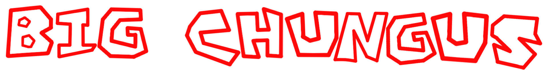
http://puu.sh/ncDh8/23a55d7fe7.png
1 Like
I have a Matoran font. You are all beneath me.
1 Like
I think we all downloaded that font.
well my favorite font is raleway
4 Likes
Who are you ? Brick Heck? /s 
I can’t decide to be honest. Shadows into Light is one of the fonts I prefer to use on Google Docs, though.
1 Like
Trajan and Times New Roman.
Looks nice.
https://upload.wikimedia.org/wikipedia/commons/thumb/7/7f/TrajanSpec3a.svg/2000px-TrajanSpec3a.svg.png
And this one cause I like standard and easy to read.
3 Likes
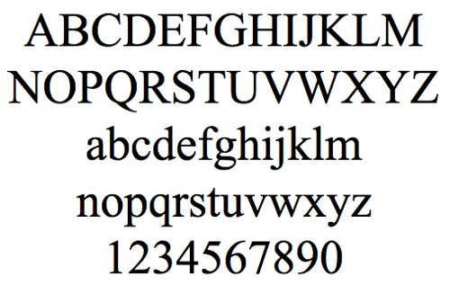
Century School Book. Hands down.
1 Like
I am a fan of Times New Roman and Telex
1 Like
Nowadays, I still use Calibri as the default, but use Times New Roman or similar old-world fonts for band stuff. I’ve also been getting some usage out of Book Antiqua (AKA the font used in early episodes of VeggieTales - yes, that’s the main reason I use it).
1 Like
Good a reason as any.
1 Like
Personally, I like the fancy look of Pacifico.
1 Like
I love Goudy Trajan font. Especially when textured like metal.
1 Like
Update: I have recently taken to using Tahoma, it’s my new favorite font.
1 Like
it’s not very useful, but I prefer the look of biysk
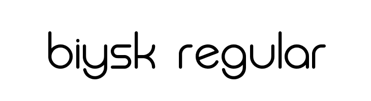
I’ve never used it in a design, but it’s so clean
1 Like
huh, so this was the topic to be badabing-badaboomed.
I’ve mentioned my usage of Book Antiqua/Palatino before, however, in the four years since that post, I have noticed it a lot more. Including at my workplace, where it isn’t the UX-approved font (that would be Segoe.) Still use Times New Roman for my music stuff, but I might end up changing that in future (I’d like to find a monospaced variant of that style of font so I can better use it in other art.)
2 Likes