Gresh Revamp

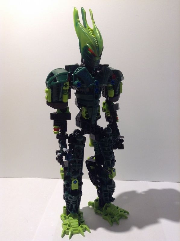
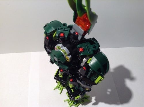
OK, Before you h@te it, let’s talk about why I did some of the stuff here.

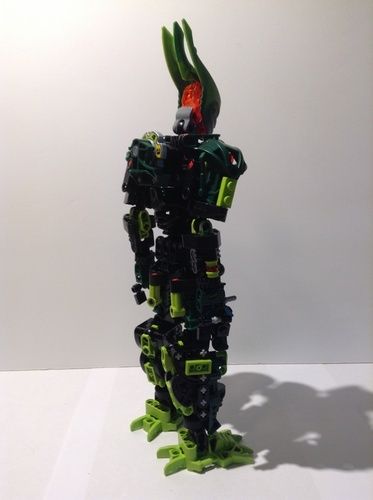
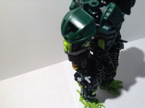
First off, this is an old MOC, so some off the stuff I did I can’t change anymore.

Sorry, I already demolished it and I forgot how I built it.

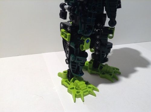
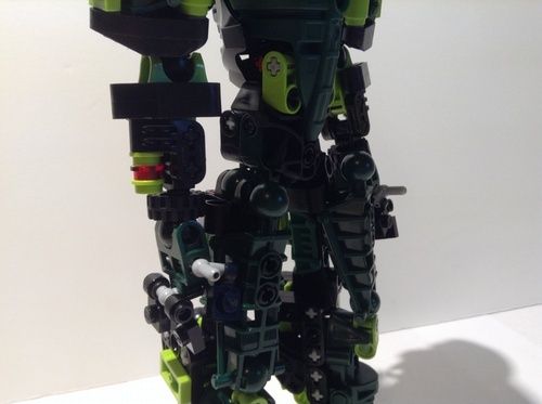
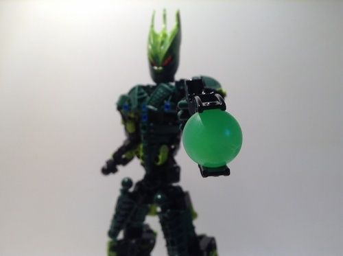
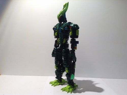
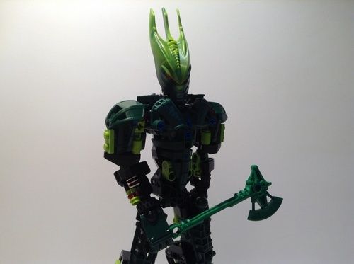
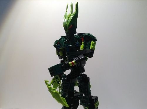
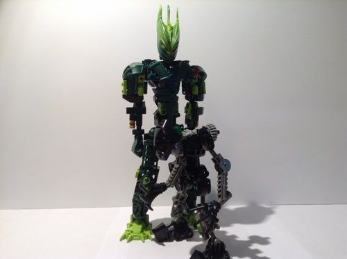
Now, I apologize for the red axles everywhere. I ran out of black ones. :stuck_out_tongue:

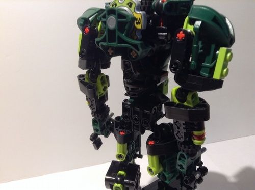
Also, I got rid of his spikes because, well, I forgot about them honestly.

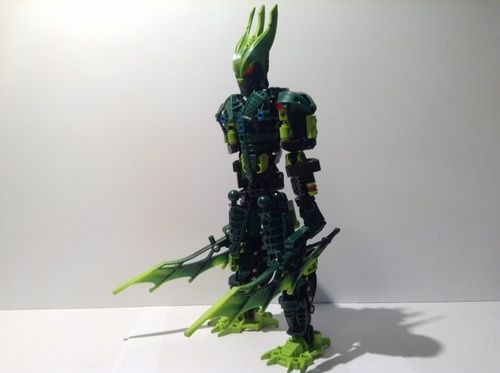
And, I realize he is supposed to be quite a lanky character, but I wanted to beef him up somewhat to make him appear as if he were a more menacing Glatorian.

Anyway, here he is!

The one!

The only!

GRESH!

Bye Guys!

~Saxton

17 Likes

0/10 not spikey enough. s\

But in all honesty, this looks really cool! :smiley:

Really cool, but blue pins on chest really break it up and the lower legs should be more slim and proportional.

@Gresh113

2 Likes

It’s a good start but I dislike the lack of spiky armor that gave Gresh a sort of jungle vibe IMO.

1 Like

Thanks, @Booster_Gold

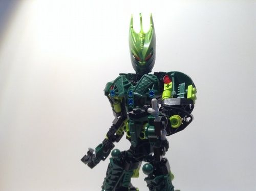
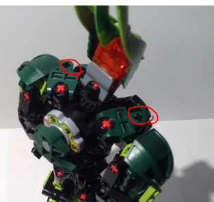
I think I’ve seen this before… Anyway, I don’t really like how the blue and red pieces, and I agree with what @Stoax said adopt the spikes. Other than that, it’s really awesome! It looks very much like Gresh should, minus the spikes.

You could add some spikes here.

4 Likes

Definitely, it would make it look much Greshier.

1 Like

way too greebled for me.

Looking good, but (as stated by many others) is missing spikes. The shoulders specifically look pretty bare.

Pretty darn awesome! Could use some shoulder spikes, though.

I really like the build of this moc but it is just a bit cluttered

If only this was how Gresh and the rest of the Bionicle Stars were built like this.

Gresh’s mask is awfully ugly but aside from that the MOC looks great.

The MOC itself is pretty cool. But I’m not really getting a Gresh feel from it myself. I feel it could use a bit more lime to make that work.

1 Like

The forearms seem to thin, but good none the less.