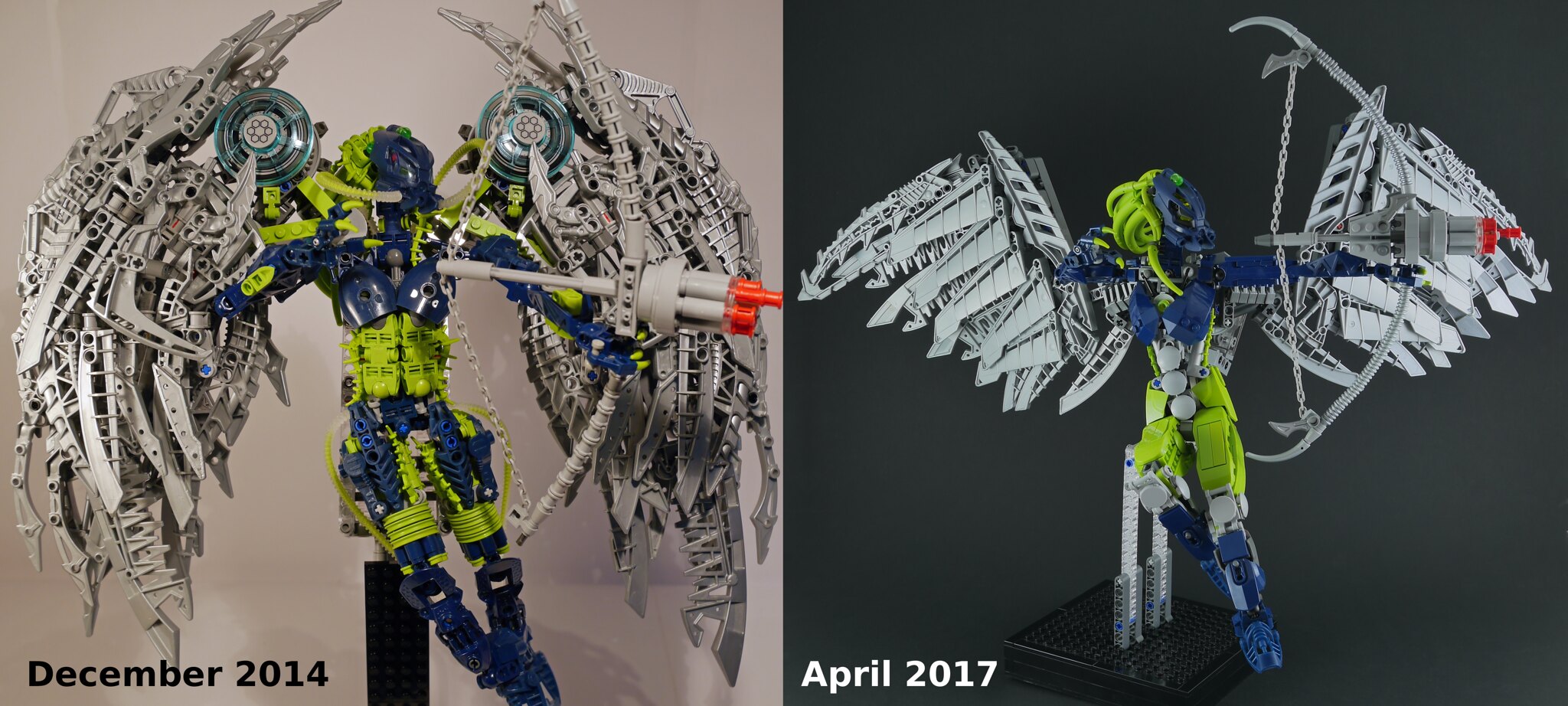
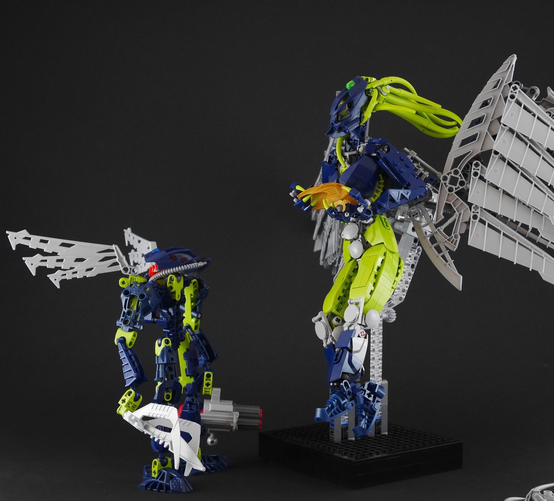
So about two and half years ago I made a pretty infamous Toa Mahri Hahli revamp that got a decent amount of attention (and my first MOC spotlight). I’ve been wanting to do an overhaul of this MOC for about a year now and I finally got round to doing it.
I should be bringing this to Brickfair virginia so if anyone wants to see it irl it’ll be there.
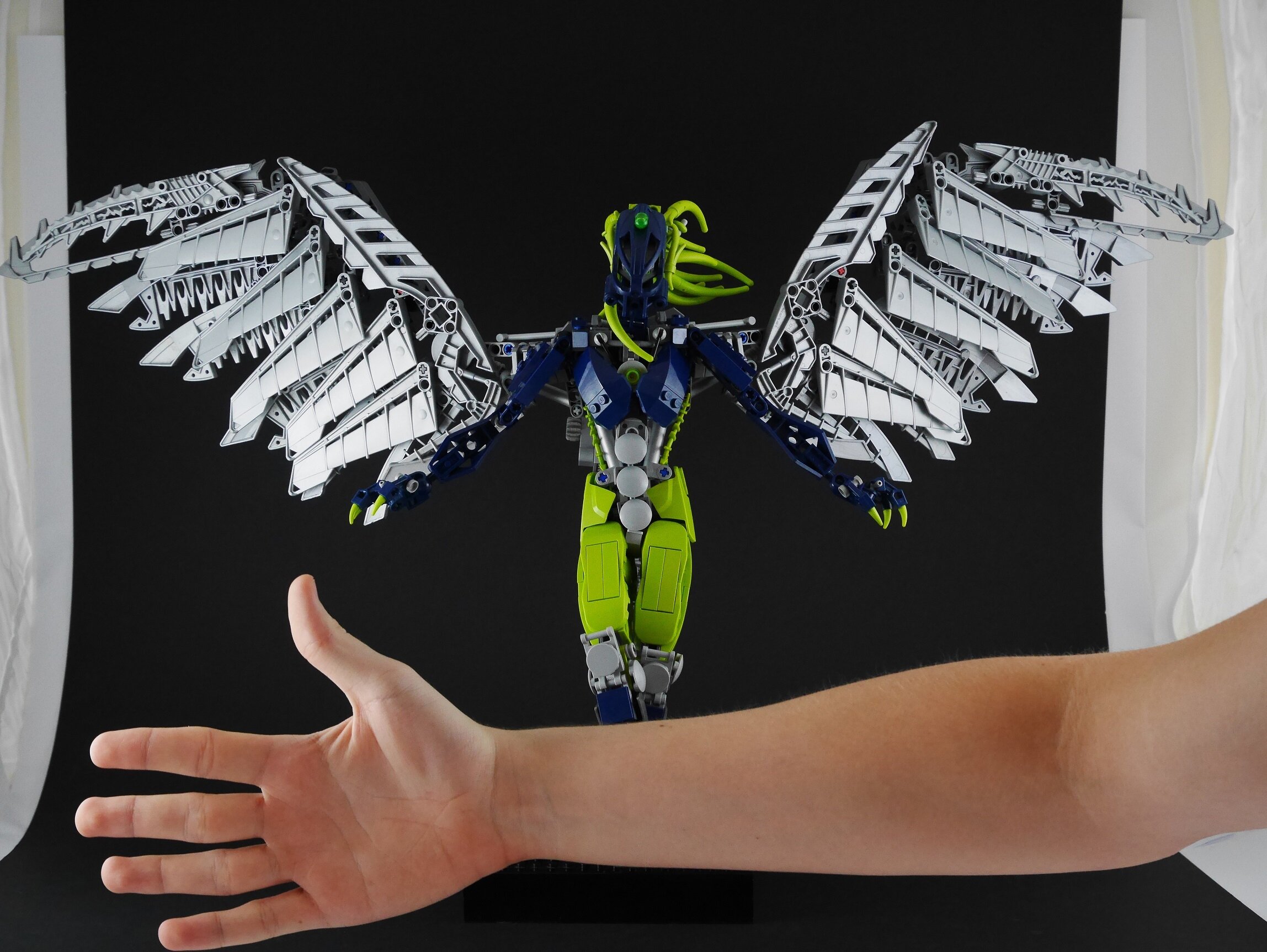
Forgive me if some of the shots here a little poorly shot on my part. New lighting setup, messing around w. the camera, you know how it is.
My arm in comparison to her full wingspan. IIRC it spans about 70cm or about 30" when fully extended.
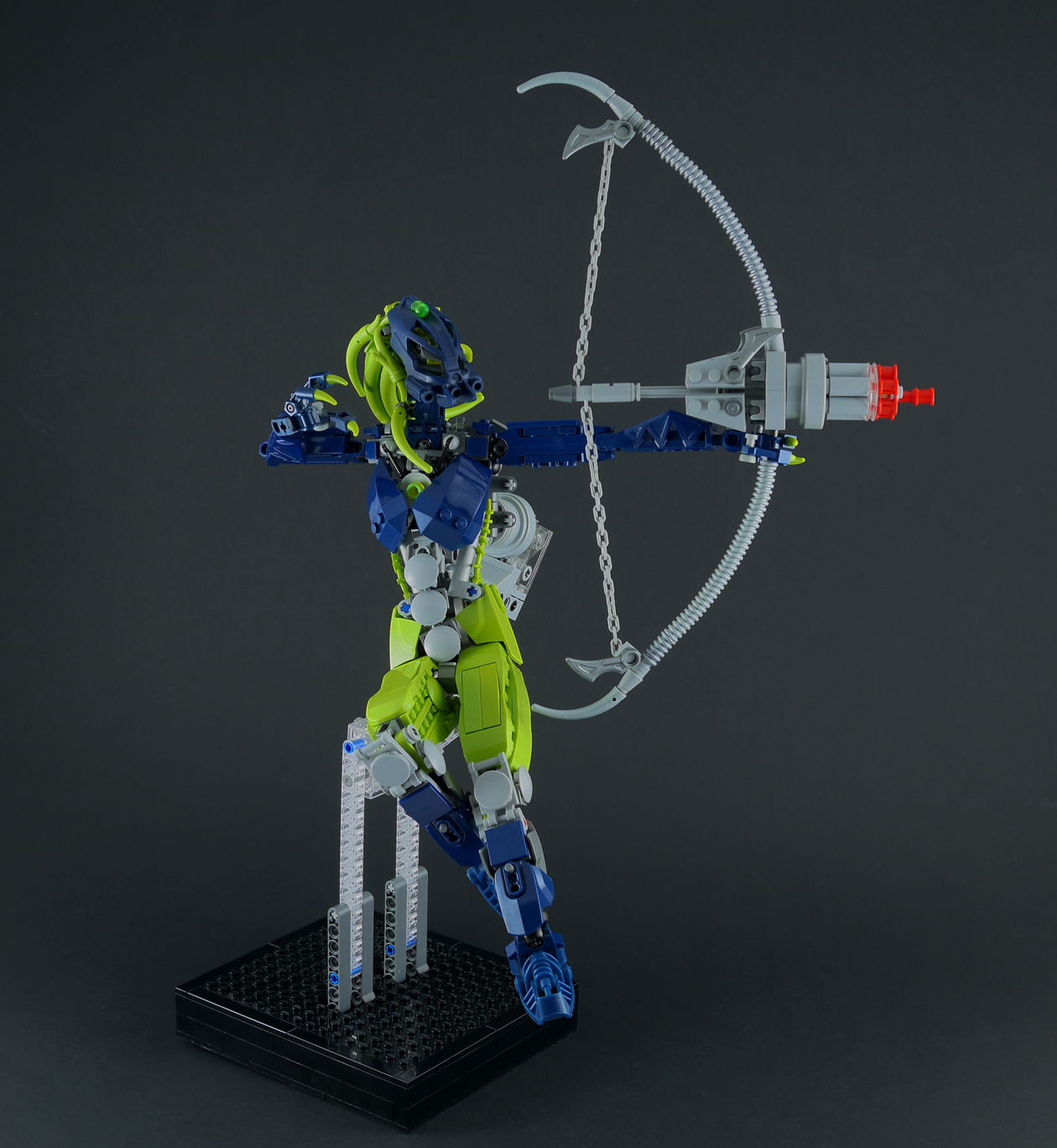
I actually really like the pose/shot with this one. When I get the chance I’ll try and redo the shot at some point with a wider backdrop and better camera presets.
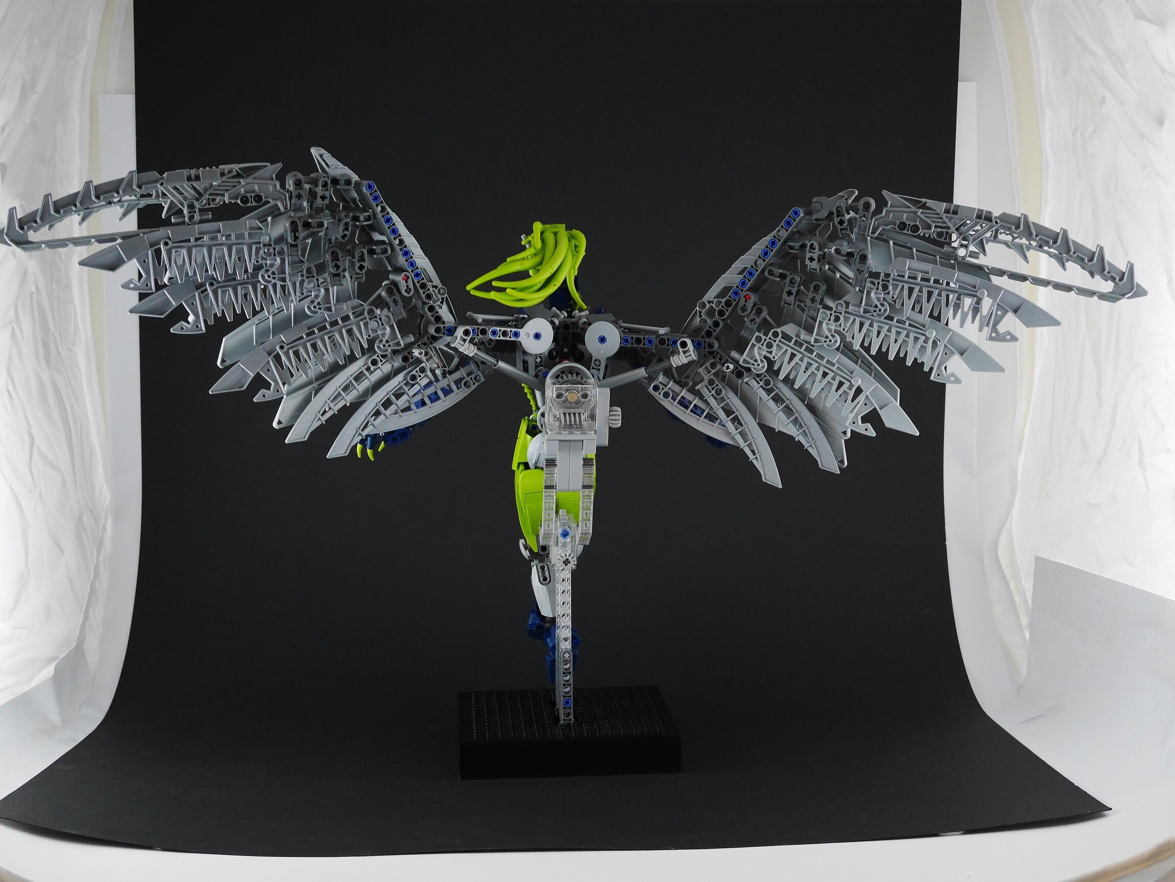
Admittedly I’m not too focused on the back of this MOC. This is intended to be a display piece first and foremost so bulking up the back of the wings just to make it look a little nicer from this angle wasn’t worth it. I did try and make it look presentable though, you’re eyes won’t hurt if you look directly at the back.
Firstly, Ven, your standards (atleast back then) were extremely low.
Honestly looking back on this thing it IMO it deserves about 5/10 or something similar. Might be me being extremely self critical but there’s a ton wrong with the first one, including but not limited to:
Poor colour distribution
Messy texturing
Some awkward proportions
The wings can’t angle in any way except for up and down
The wings are too thick
EDIT: Also, anecdote time.
So I’ve exhibited both of these mocs at lego shows before, and I kid you not most people referred to both of them as ‘he’. The irony there is so strong it may spontaneously form a black hole at any moment. To be fair the original didn’t have too great proportions but still it’s pretty funny. Hahli just can’t catch a break.
Dang, waaaaaaay better than the old one. The use of system really helps round things out. Also the wings are quite a bit more streamlined than the jumbled ones from the previous version.
Oh wow, this reminded me that I saw this MOC before I knew you were on these boards. I love the improvements here, the original was good but had some unnecessary armor and was generally too big imo, this works a lot better.
Something about the old models’ wings made them look much more wing-like than the flat-fronted ones you have here. Other than that, everything is a vast improvement.
A long time ago I ran across your MOC and was awed by it, but this beats it out ten to one. Keep up the good work!
Much, much better. The textures flow more naturally and the body proportions feel a lot less clunky, specifically the chest; now less barrel like. The more streamlined appearance looks a lot more appropriate for the underwater environment of Mahri Nui, and the wings definitely compliment this. While prior they looked bulky and cumbersome with the abundance of blades, here they look more elegant and light- on par with the actual sets wings. Overall I can’t find anything too glaring here or problematic. Nice job!
I’d say this is an excellent improvement! The shaping has been perfected, and I think the wings look better with their new, smaller size. The hair is particularly clever in design.
(rehash comment)
Here to show that less complexity can look better. (well the limbs does consist with more pieces, but you get the idea)
While the wings look better, she seems unable to wield it without her stand despite your mention of not caring the back design.