Helryx, The Eldest Sister (BIONICLE Canon Contest #1: The First)

Here’s my entry for the Helryx canon contest, I’m really excited to be a part of this! Helryx, perhaps more so than any other character in these contests offers so many opportunities for visual storytelling with her build. As such I tried to make each piece usage as meaningful as possible.

tumblr_15d6c71555393883964dbb6cb662a93d_0c1937e7_250

tumblr_51bae464f0c2c6c27dc3e759c6b7a8c7_5bb1c95d_250

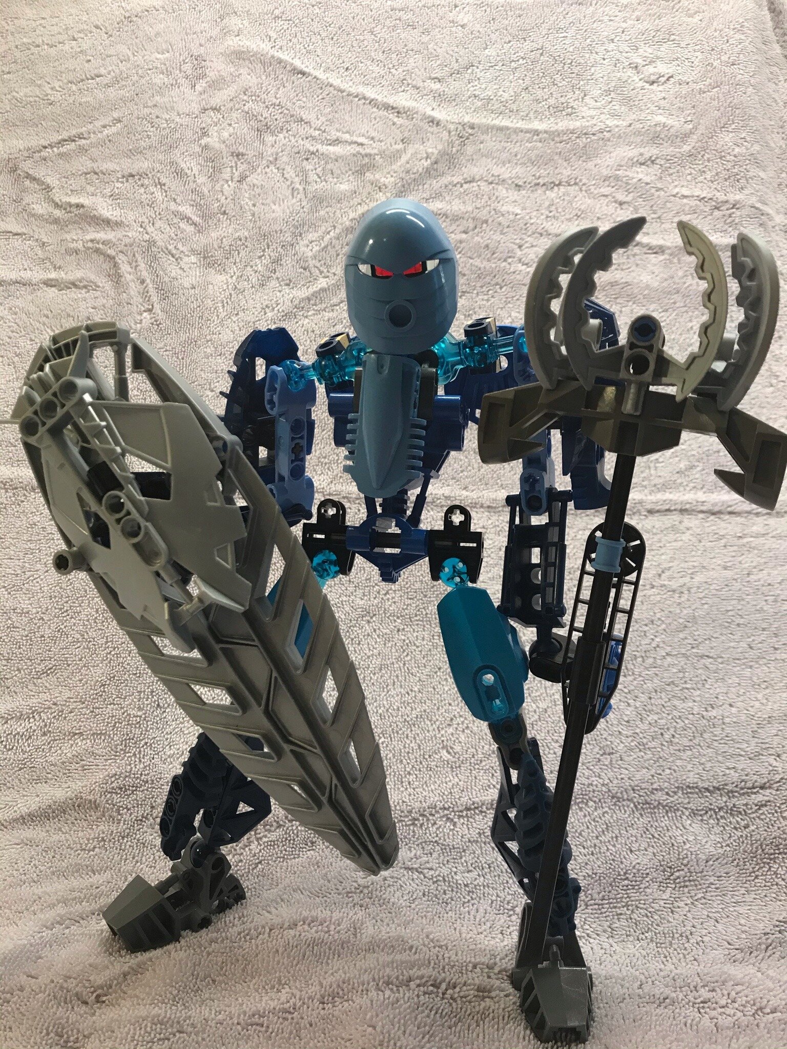
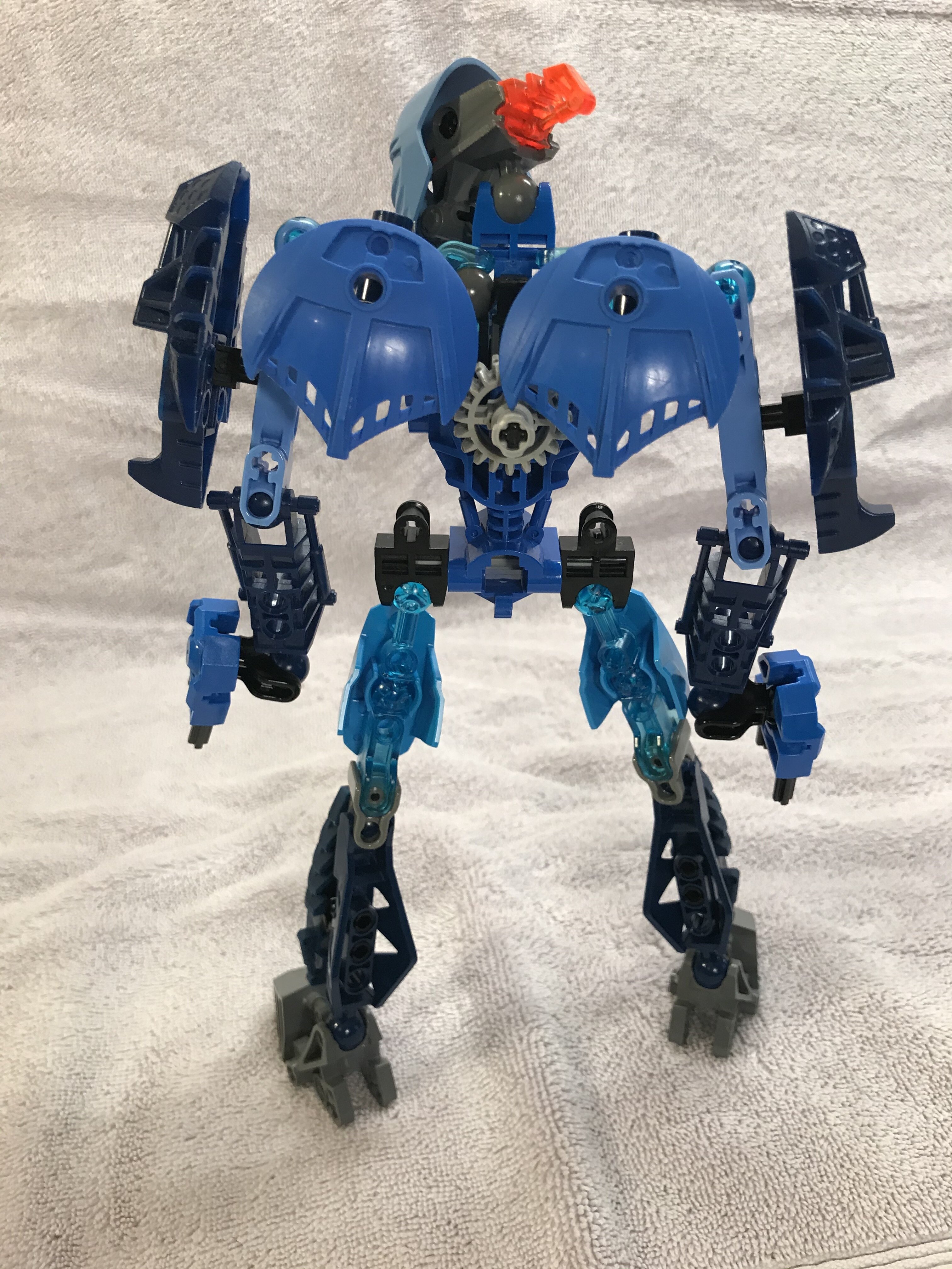
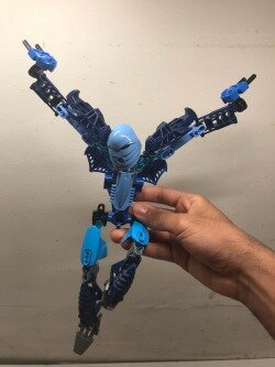
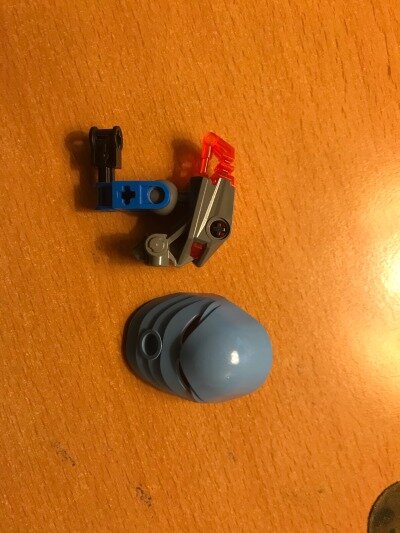
We know the Toa were based off the Glatorian species and that the Toa Mata were also a relatively early build of Toa. With that in mind I tried to make her a “missing link” between the Glatorian, who were Inika builds, and the Toa Mata. I made heavy usage of parts from Kiina and Terix in her limbs, and a Toa Mata torso, hands, and feet. There’s also some translucent blue CCBS in her limbs that I used mainly because they were the best way to make the connections I needed, but they also look amazing and very water-elemental with a back light.

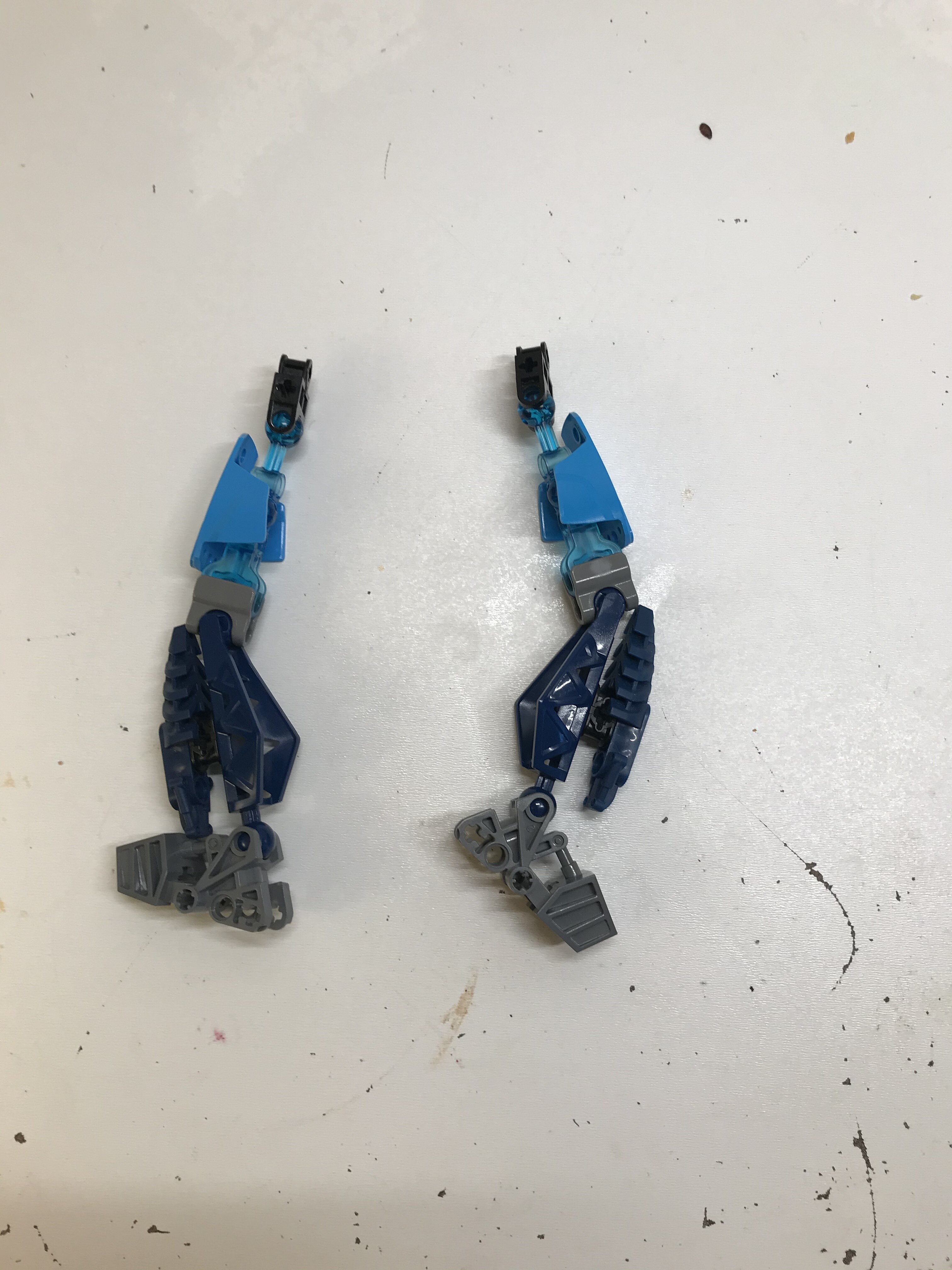
One of the parts of the design I’m most proud of is her shoulders and the way they attach. It was difficult finding a natural looking way to add Inika style limbs to a Mata torso, given the different connections and proportions. By going up and around the way I did with the connections, the attachment maintains the arm’s articulation and even makes the torso look a little longer and more proportional. As an added bonus, the extra CCBS limb piece makes her shoulders more anatomically correct and even allow her to shrug!

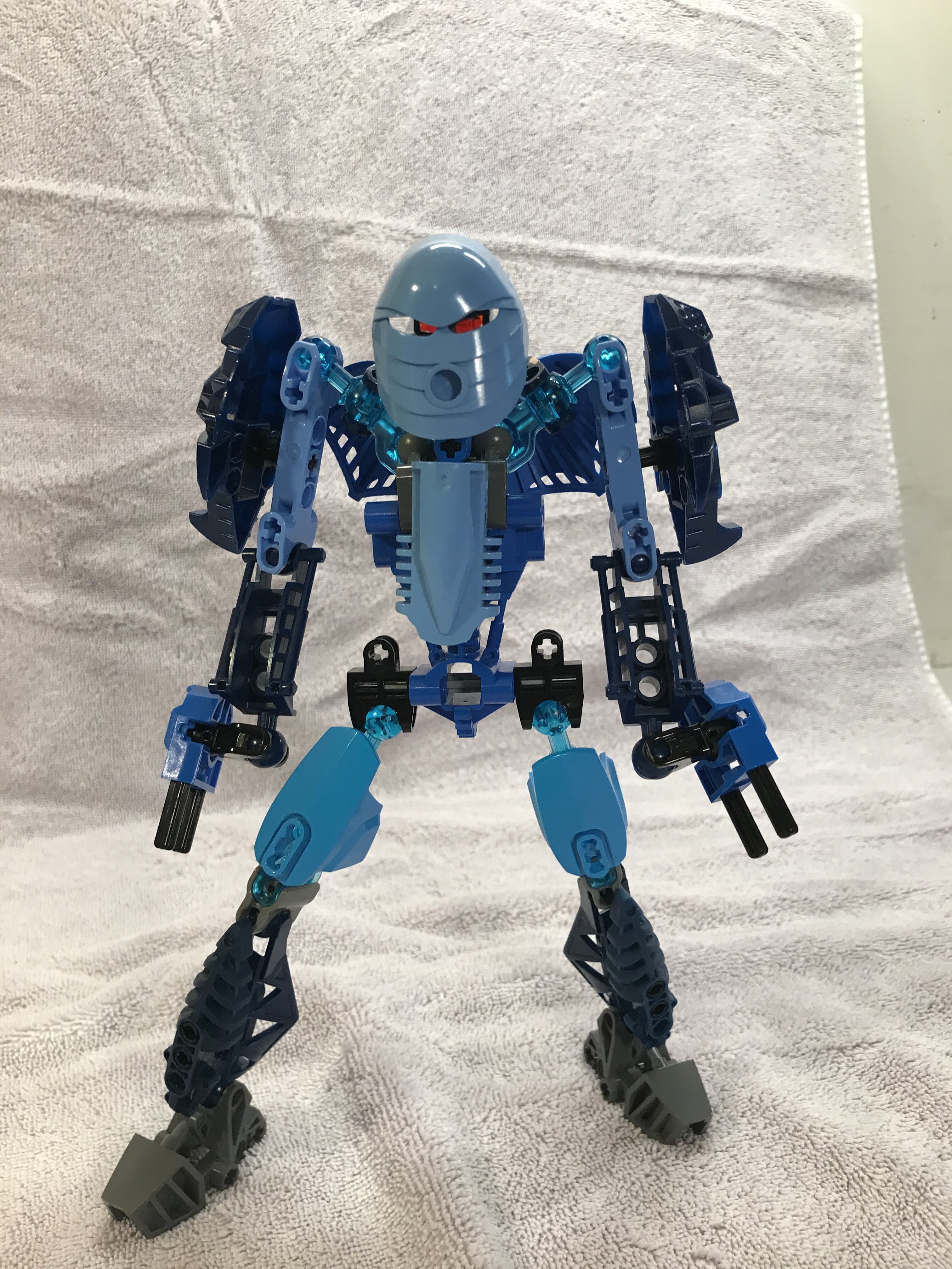
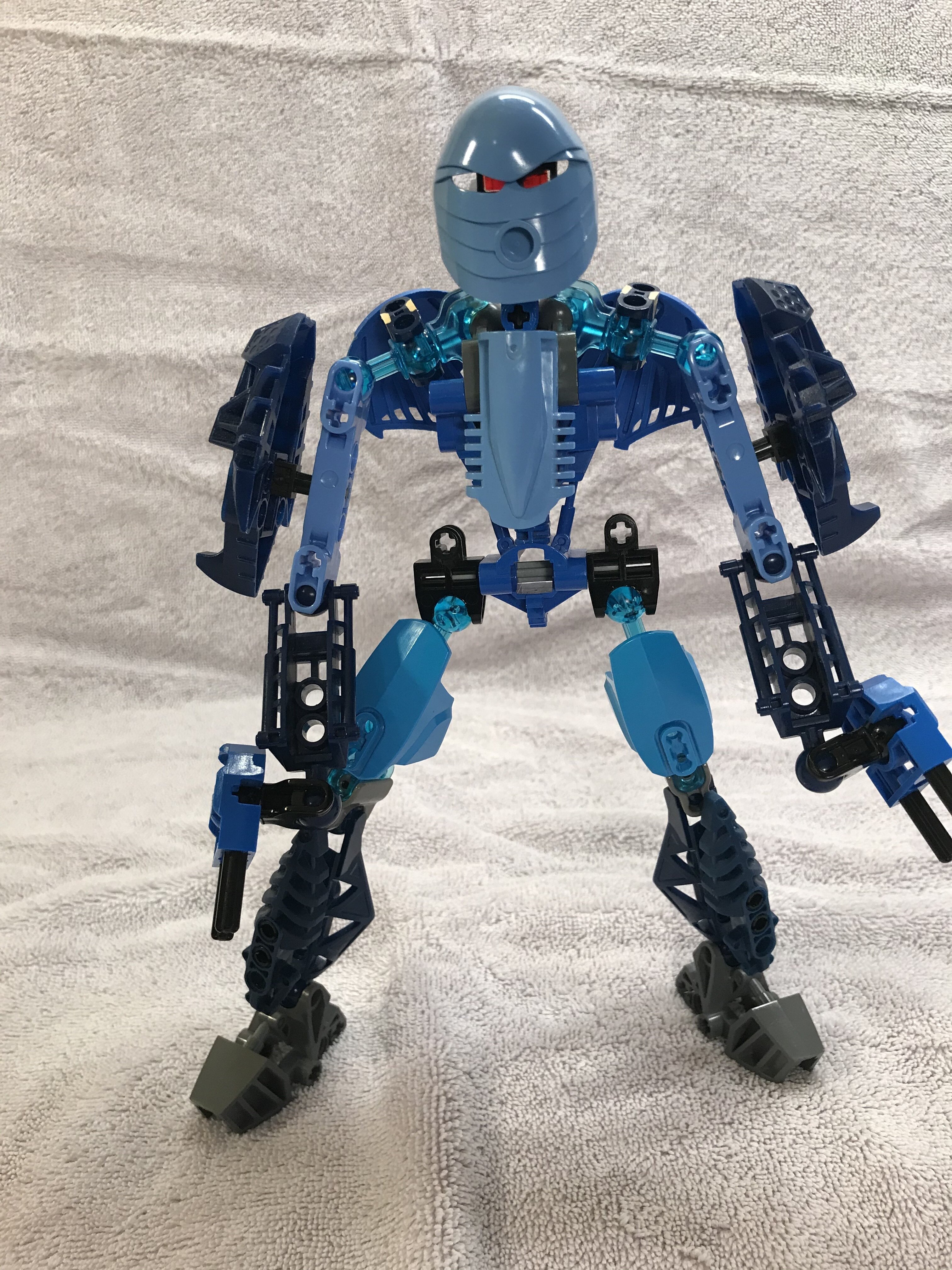
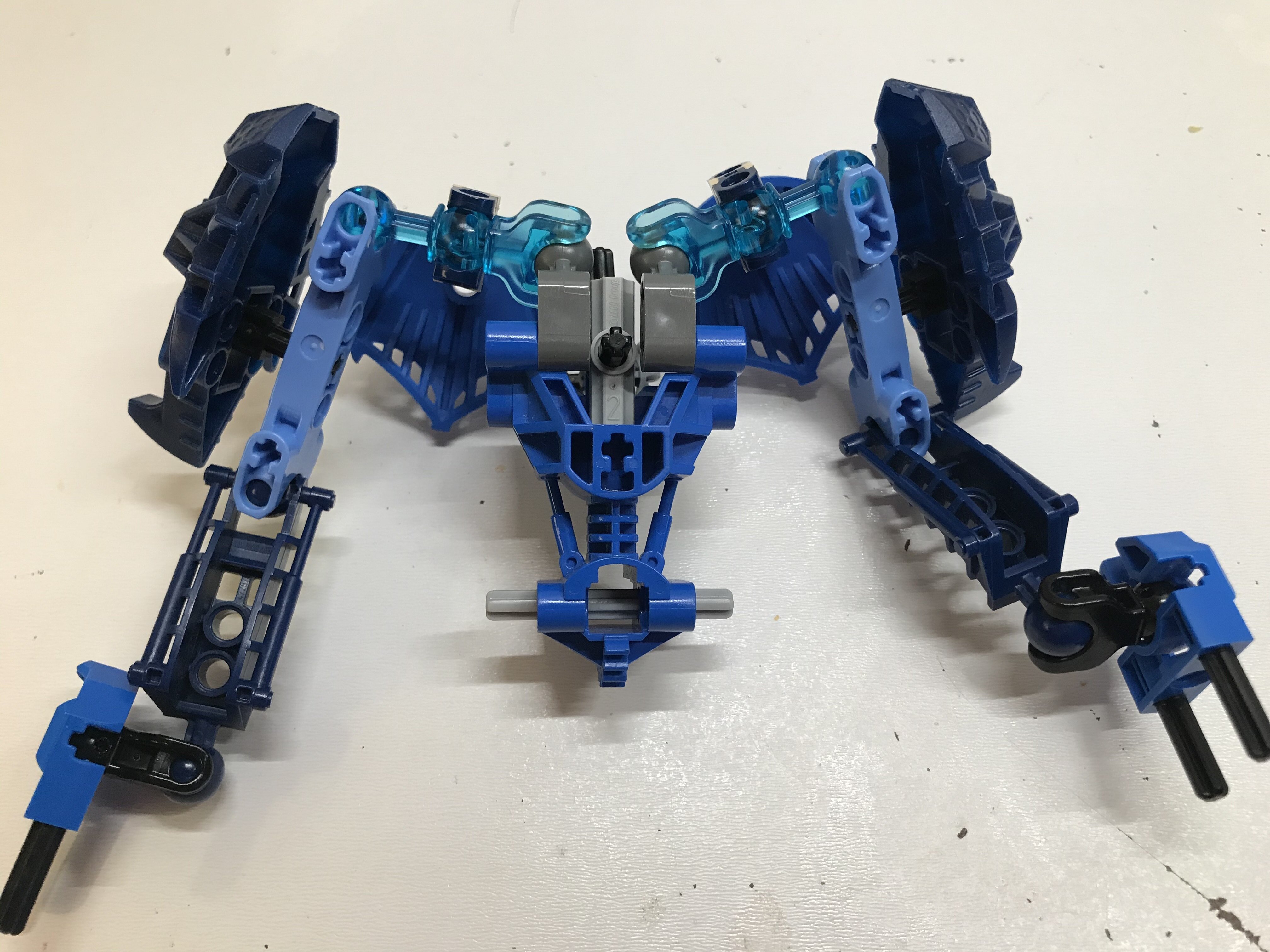
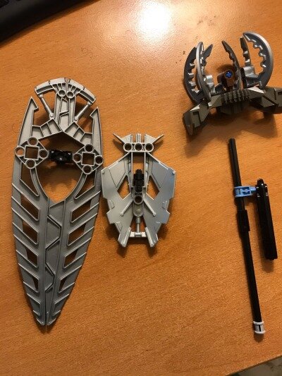
The Gahlok shields on her back made great shoulder blades and really highlight the shrugging. The way the Inika feet were attached to her shoulders were meant to make her armored while still making her arms look thin to give something to the “frail” description.

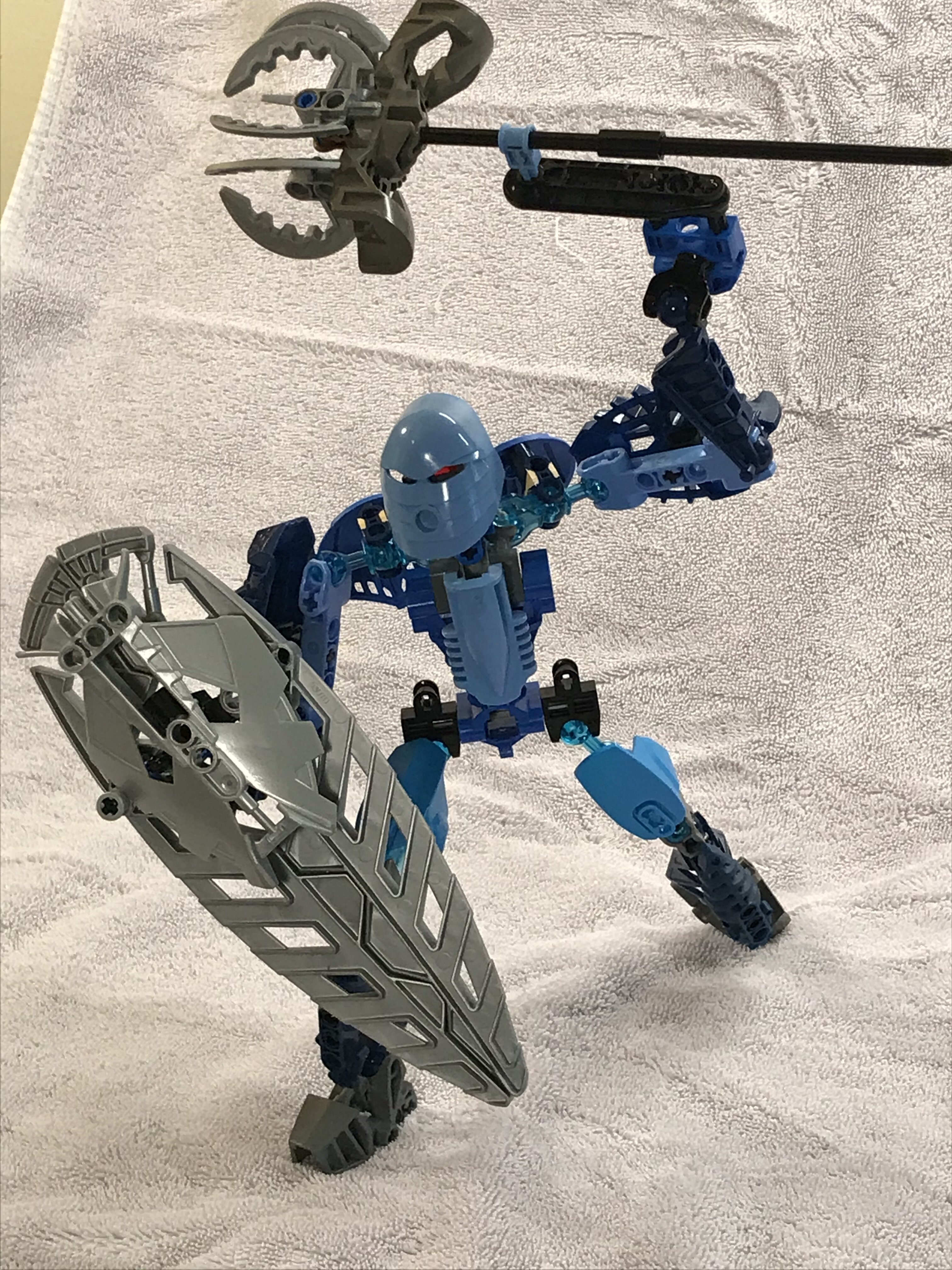
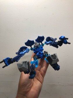
Her mace and shield attach via the axles on her Mata hands.

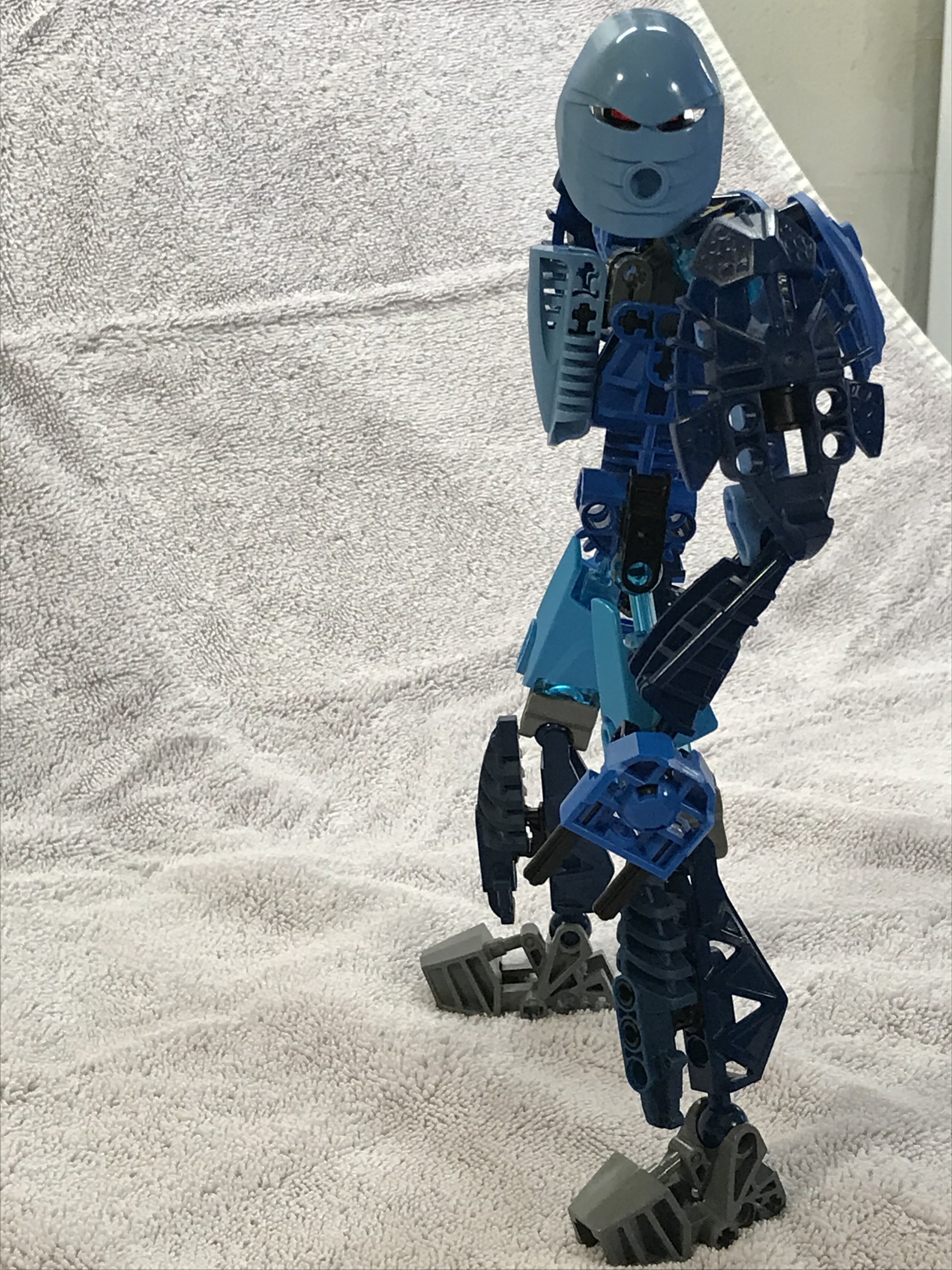
A headcanon that I’ve had about her design for a long time was that she would resemble Krakua. We know Krakua only became a Toa after he was brought to the Order and the only other Toa in the order was Helryx, so it stands to reason that her appearance would influence what he think a Toa looks like. That’s why I made sure to add some of Krakua’s armor details onto her, such as the Nui-Jaga stinger on the chestplate and the Visorak feet on her shins. Krakua also had Mata hands and feet, which is pretty cool for continuity.

Overall, this was a fantastic building experience for me, and my first big attempt at MOCing in a while. However this goes I’ll be really glad I did this.

12 Likes

Thank you for entering!

Unfortunately, we can’t accept this entry yet. Two of the breakdown images are the same step at different angles. If we could get one more (possibly of the weapons), then that would be excellent.

Thank you!

Oh sure, of course

I like the idea of making her look like something between the Mata and the Glatorian. I think you pulled that off fairly well.

The torso is my favorite part. The shaping feels good, and the way the arms are attached is quite clever. The shrug articulation is cool. I kinda wish more MOCs had something like that.

I understand what you were going for with the upper arms, but the armor feels a bit tacked on. The gap between the armor and the arm looks really awkward to me. I think reducing that gap somehow whould improve the look a lot.

I like the idea of using dark azure in Helryx’s color scheme, but it feels a bit isolated in this build. It’s concentrated in the thighs, but it’s absent from the rest of the build, unless you count the little bit of transparent light blue in the shoulders. I think in general the MOC has one too many shades of blue. A more focused color scheme would help a lot.

The thighs also feel a bit blank compared to the rest of the build. I think replacing the generic armor shell with one of the 2016 unity armor parts (in titanium metallic) would work better for both a classic G1 look, as well as the “frail” description. It would also get rid of the isolated dark azure and simplify the color scheme.

The way the armor is attached to the lower legs feels a little gappy, but it doesn’t bother me as much as the upper arms.

I’m not certain, but in addition to the 2016 armor suggestion (and to avoid an overuse of dark gray in the legs), I think maybe the feet should be Mata blue, to match the look of the hands. It would also add a splash of that color to the lower half of the build, where it is currently absent.

I wonder what it would look like if all the sand blue pieces were dark azure instead. I know the pieces don’t exist in that color (unless you want to use paint or 3D printing), but I think that could help make the color scheme both more cohesive as well as more unique. The Metru blue to dark azure transition feels a bit random as-is, but I think if it was used throughout the MOC it would work a lot better.

As for the accessories, I like the shield. It’s simple, but the shaping feels cohesive and it looks effective. The mace on the other hand suffers from the same problem as a lot of other maces in this competition: it doesn’t really look like a mace. It looks like a staff - a cool staff, but a staff nonetheless.

Overall, I think there’s room for improvement, but I see a lot of potential in this build. Some further polish here and there would help greatly. And again, that torso design is clever.