Here’s the whole design process I went through, and the end result as some mocked-up business cards.
The logo is for my other online platforms focused on art that aren’t named after masks.
######Yes, I have a life outside of you, Karen.
Anyways, just wanted to share these. Let me know if you think this design is successful if you want. Or don’t. I only spent a few hours in a dark, wet hole for this. For you.
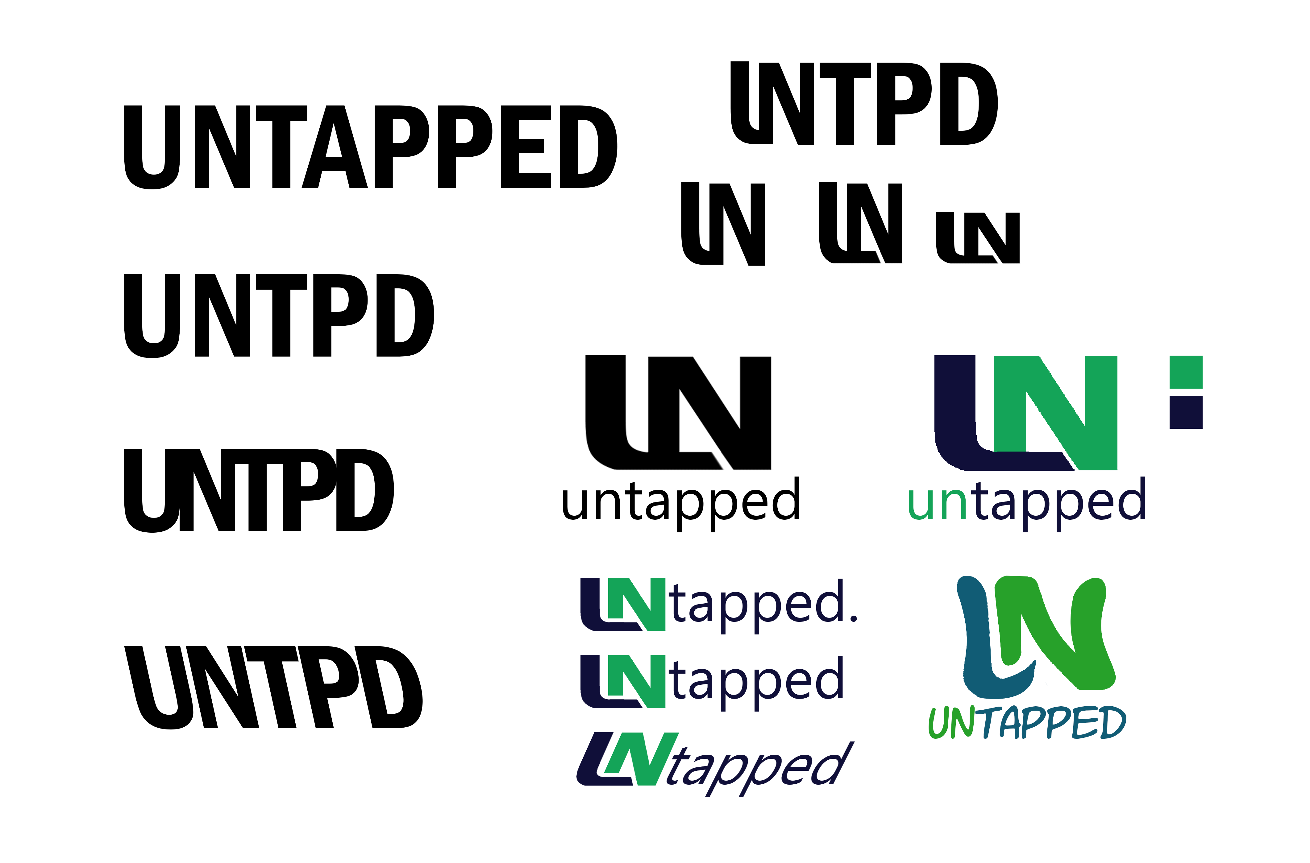
Interesting logo, nice job! I would get rid of the outlines, and make only “U” and “n” in colors (because I immediately assume that the “N” is for “tapped”).
I like it! The more formal ones look better in my opinion, probably the ones where you can easily trace the “U” and the “N”.[quote=“PakariNation99, post:1, topic:47395”]
######Yes, I have a life outside of you, Karen.
[/quote]
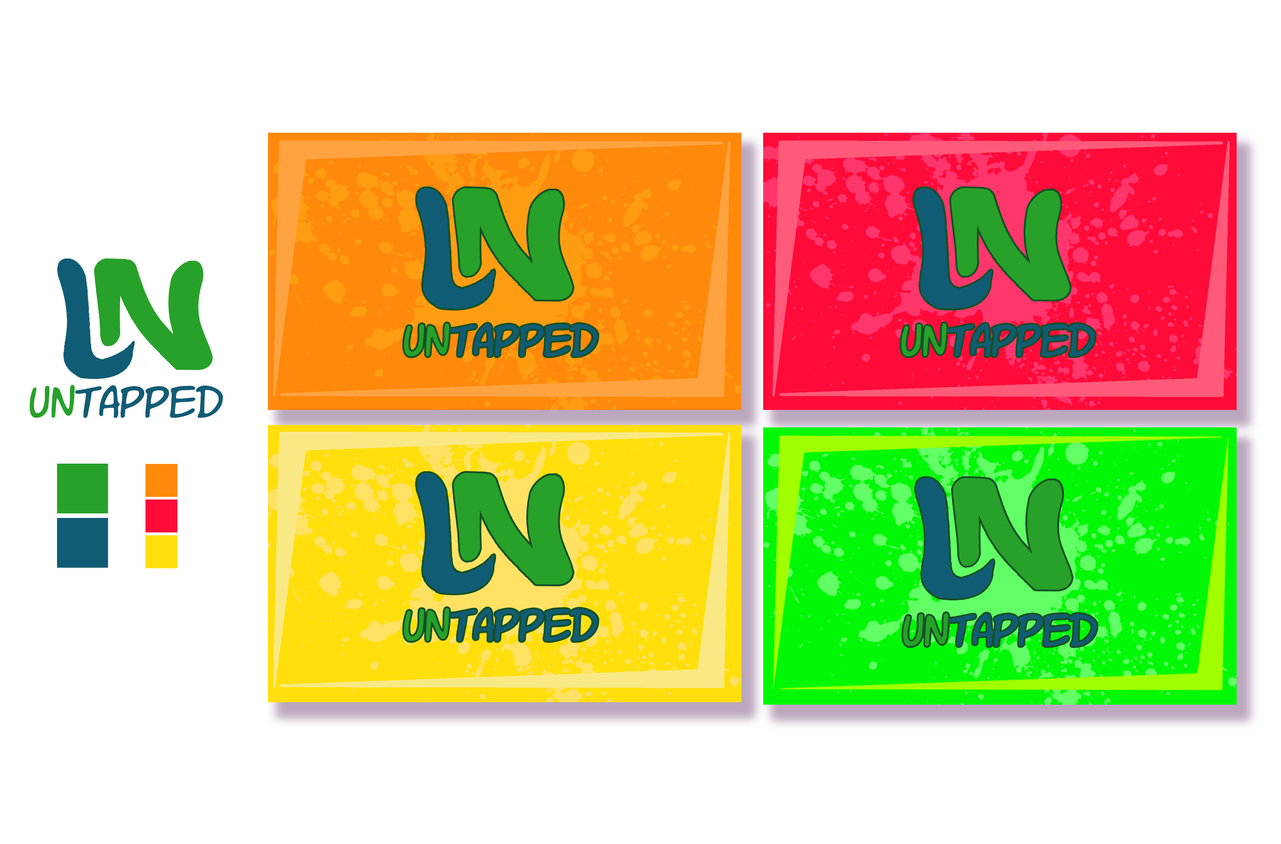
It looks like a solid logo to me! Although, I’d like to recommend two things: first, making the UN part of the logo flow more seamlessly - right now, at least to me, it looks more like an LN. I think the best way to do that would be having the second vertical line in the N be partly the same color as the U. Secondly, I’d highly recommend changing the color choices for the bottom set. As it stands right now, the background colors are more vibrant than the logo and distract from it.
The “U” in the logo does look a lot like an “L”. Perhaps you could fix that by including just a little bit of the second “prong” of the U.
Not too much of a fan of the “business cards”, unless you’re trying to sell a fruity carbonated drink. I think the green and blue against the white background is solid though. Could give you more critique but first I’d want to know what kind of “product” you’re selling.
That’s how it normally is, I used the outlines on the cards to help it stand out from the background, but I’ll give it a shot without them too! Thanks!
Yea, I do think they’re easier to read in the formal ones, but after I did some iterating on that one I didn’t think they quite fit with the idea of art. The logo is meant for my art “identity” for lack of a better word, and the more straight, blocky logo looked more like a company. Too manufactured and clean to be associated with art.
I do still like it as a design, it just didn’t fit with what I wanted out of the logo.
Thank you! Yea, for the same reason as I said before, I think the squiggly lines hearken more to art than the straight ones, but “fun” is exactly what I was going for!
Thanks! That’s a critique of the logo I actually have myself, and the next pass is definitely going to address that.
That’s a great point, thanks for bringing that up! I don’t want to lose the vibrancy completely, but I can try desaturating them a little or maybe finding some other way to make the logo pop more!
I think so as well, but I think it’s, again, too plain and manufactured-looking to fit with the idea of art.
A service, really. I do art commissions online and I’ve exhibited my material at some local events, so the cards really just serve as contact info to plug my Instagram and email.
Thank you all so much for the comments and critiques! It really does mean a lot! A new version will be uploaded soon!
There’s a difference between something made for the sake of art and something intended for graphic design. I’d try doing stuff with light grey or light, not-completely-saturated blue that won’t conflict with the less saturated colors of the logo.
As someone who actually went to school for graphic design, this is actually really cool to see on here! I actually really dig this design, and like a few other people have said, it does look very professional. A few critiques:
Like many others have said, it’s hard to not see LN. This sort of thing has happened to me many many times, so I totally get it. Easiest solution would be raising the bottom part of the right side up more, but another solution could be recoloring the left side of the N so it creates a U shape.
Remove the outlines on the business cards. I get that they’re there to help contrast against the background colors, but it doesn’t work. The rest of the background design is so flat, I’d love to see how it looks with the logo matching.
Don’t listen to Hawk about colors. It does look nice on white, but graphic design can be just as vibrant and colorful as anything else. However, there is an issue with your business cards, and that’s that the background colors contrast too heavily with your logo. Have you considered changing the color of the N to match the color of the background? It would make it a little easier to look at.
Small nitpick, but the green business card. The green lines on the outside need to be less lime and more light green to match the other four. It’s driving me a bit nuts.
As a side note, did you use Illustrator for this? Just curious.
Trust me, I get that. I didn’t understand Illustrator for a solid year after I started using it, and it took several more before I really started to become proficient. This is amazingly clean for just Photoshop! I’m honestly impressed.
The key to figuring out AI is the pen tool. Don’t treat it like a pencil (like I did when I first used AI), treat it like a connect the dots type of thing. The handles change the angle and curve of that line, but you can always add them later if you don’t want to immediately deal with that. Just focus on getting the rough shape that you want, then clean it up later. If you use selection tool to correct your mistakes, you’ll be rockin’ and rollin’ in no time!