Ay, I’ve been doing this stuff for eight years (just typing this makes me feel old )
With enough practice you’ll be able to reach that level and beyond
They put the Ghid branding onto anything that has gnarly teeth and multiple eyes nowadays
Back in my day they used to have higher standards than that smh smh
My inktober drawings so far will be posted soon, from now on I wanna upload them in batches of three because I don’t think mine are interesting enough individually
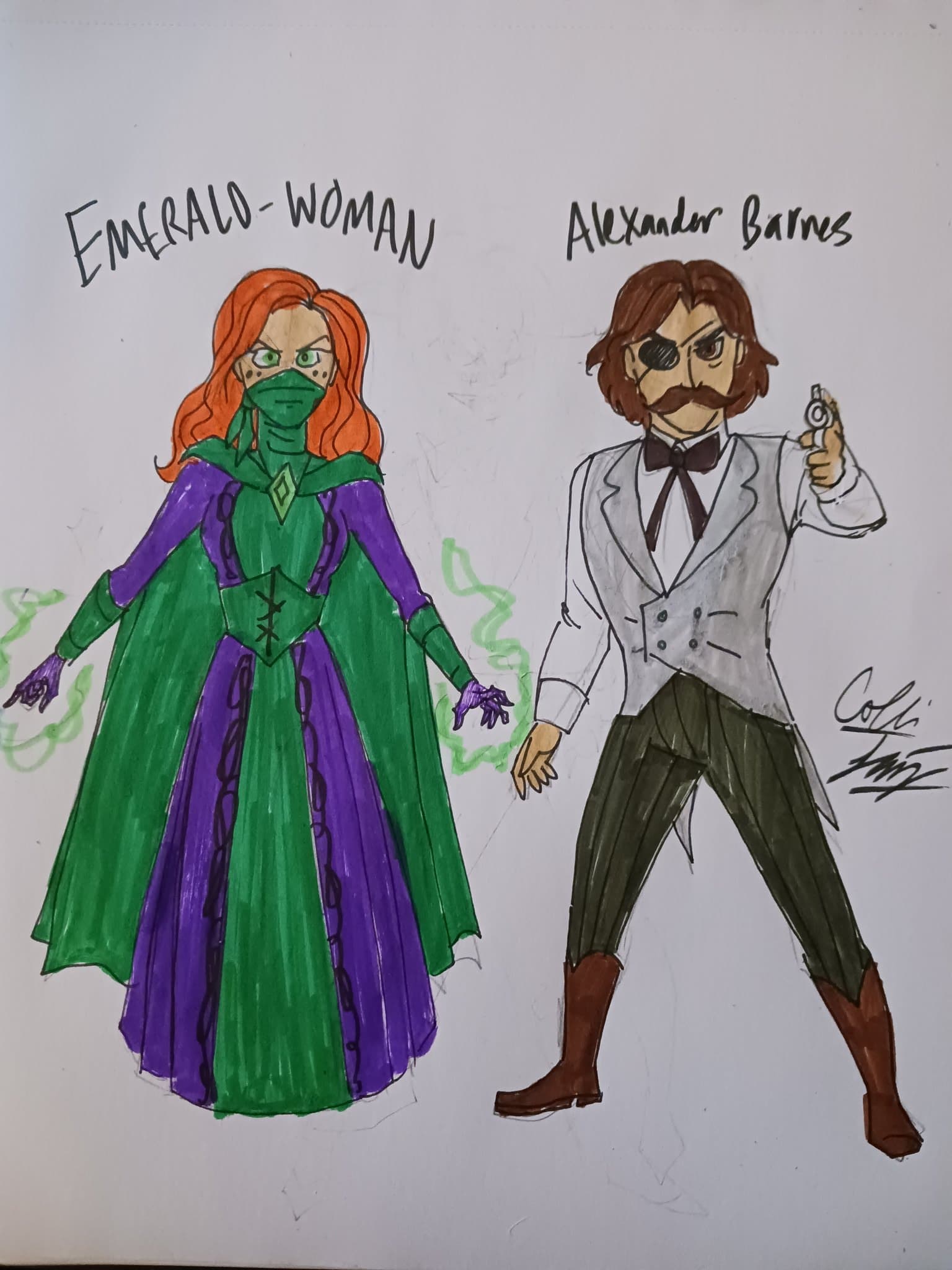
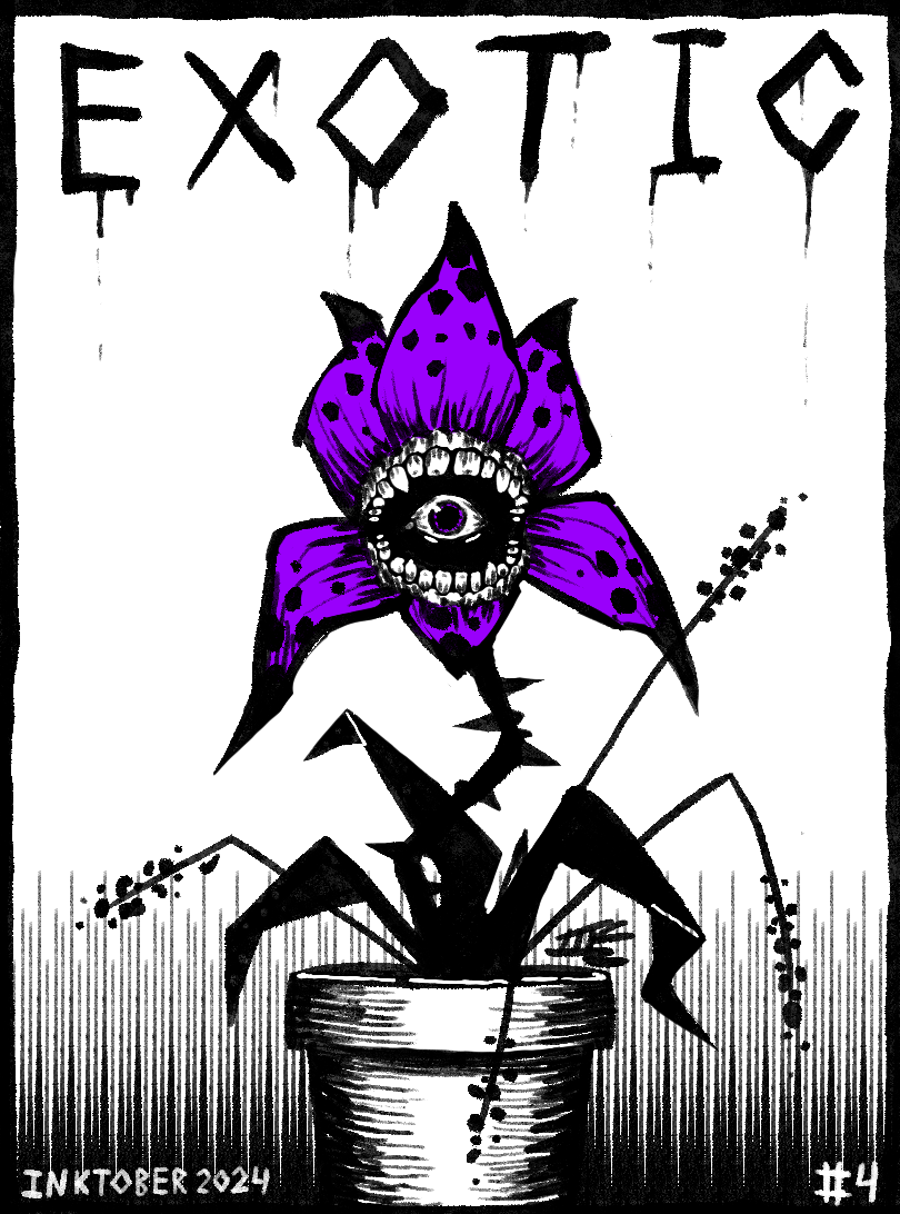
What I came up for with “exotic” (barely following the prompt), had this idea hovering around for a long time. One quandary I came across with the current concept of the character is that I kept his old name, “Barnes” when he should have been a “McCandall” due to his lineage. I decided somewhere along the line one of the Emerald-Men in the lineage was a woman so she could take her husband’s surname.
And then obviously she was an Irish immigrant and so it got me thinking of the late 19th century when a lot of Irish came over to America. Pieces fell together. One day I’ll write a proper comic about this.
As you’ll probably see with most if not all of my inktober drawings this year, I’m very much going for a horror-ish aesthetic because I want to improve at drawing horror stuff, which I’ve been wanting to do for a while. And hey, it just so happens to be October, the Spooky Month right now, so it all works kinda perfectly
Also, as for me doing all of my pieces digitally, it’s just my preferred method of drawing and I don’t own any traditional art supplies anymore. To make this as authentic as possible, I’m limiting myself to using only my favorite ink brush and nothing more and limiting my color palette to black, white and one highlight color of my choice per drawing
No, i didn’t forget what day it was. Uh… Hand Unit was glitching again, i accidentally hit the 3 key instead of the 4 key.
Sure, this is my simplest one yet, but i actually really like how the basket of butters turned out, i think it’s my favourite one so far. Hand unit is missing a few letters, but that’s accurate to the game.
in order to sway these hitmen into not bloeing me to smithereens, I shall give glowing critique of the copyright infringement and say how good it is
The angle on this one is good. I’m sorry this poor boy has such an awful case of anime nose, I hope he gets better soon. This graphical style is pretty much exactly what I picture a Wild Masks comic looking like, although I would probably forego the crosshatching since it clashes a little.
Okay so now Marvel Comics is also suing
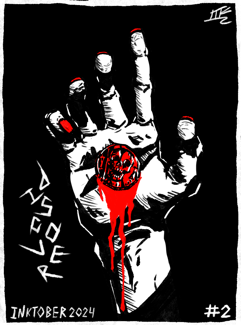
The bulky masculine hand would be much easier to look at if the slim painted nails didn’t keep pulling my attention away. Good wrinking at the base of the wrist, most people don’t think about that. It’s hard to tell if this is some kind of mark in the palm (if it is, it doesn’t match the changing shape of the hand) or a coin (if it is, the depth is kind of smothered by the excessive amount of goopy goopy red sauce).
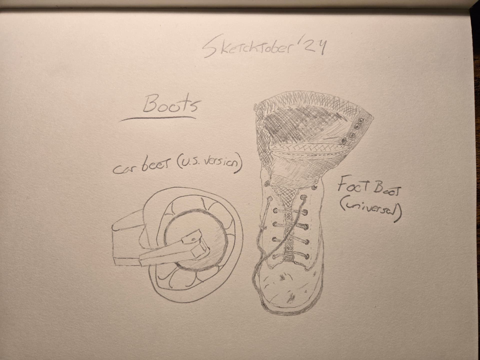
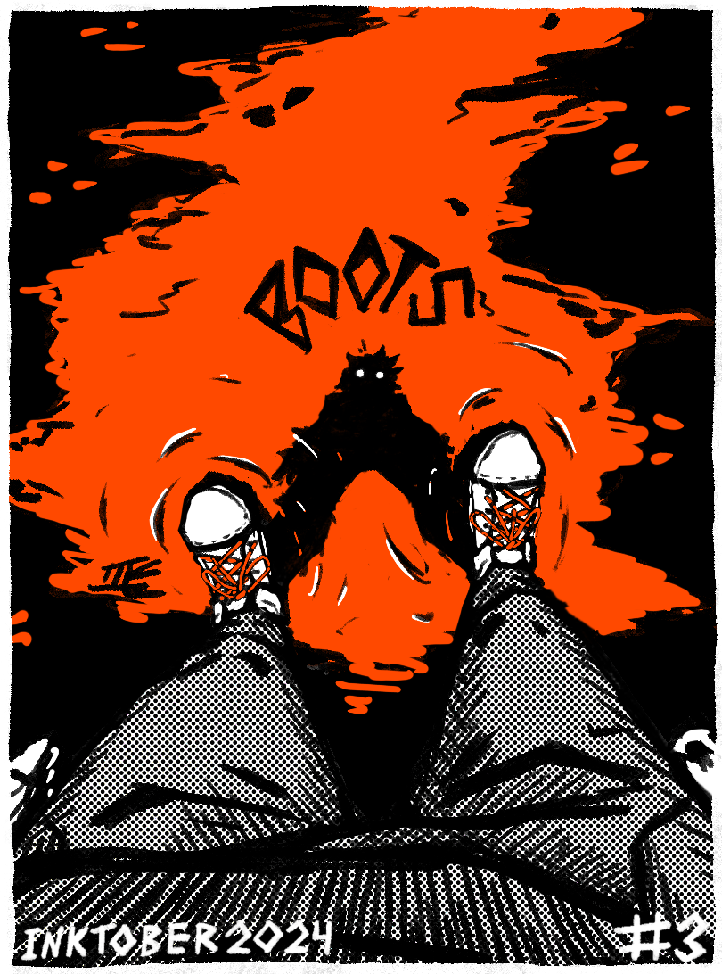
Unfortunately the halftones are hurting my eyes please stop it I can’t see shoes in this one appear to be tipping up ever so slightly at the heel - that might be a result of the way the reflected figure is matching them, I’m not sure. The reflection is really good, disturbed more at the feet than anywhere else, but this one does not feature any boots and is therefore fake news
And here is the most impressive and also most confusing piece. There’s too many conflicting elements here, with a very simple pot and leaf design, and a mouth and eye with a significant level of detail. I like both approaches, but they’re fighting each other here, and I don’t know how to feel about it, however the piece still shows off a good amount of technical prowess in spite of it, so good work with this one.
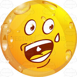
I know destiny has been kinda dead for years, but my brother used to play it all the time, so the word exotic still has some association with that game and the color yellow for me. The logo was suprisingly hard to get right, but the traveler was pretty straightforward
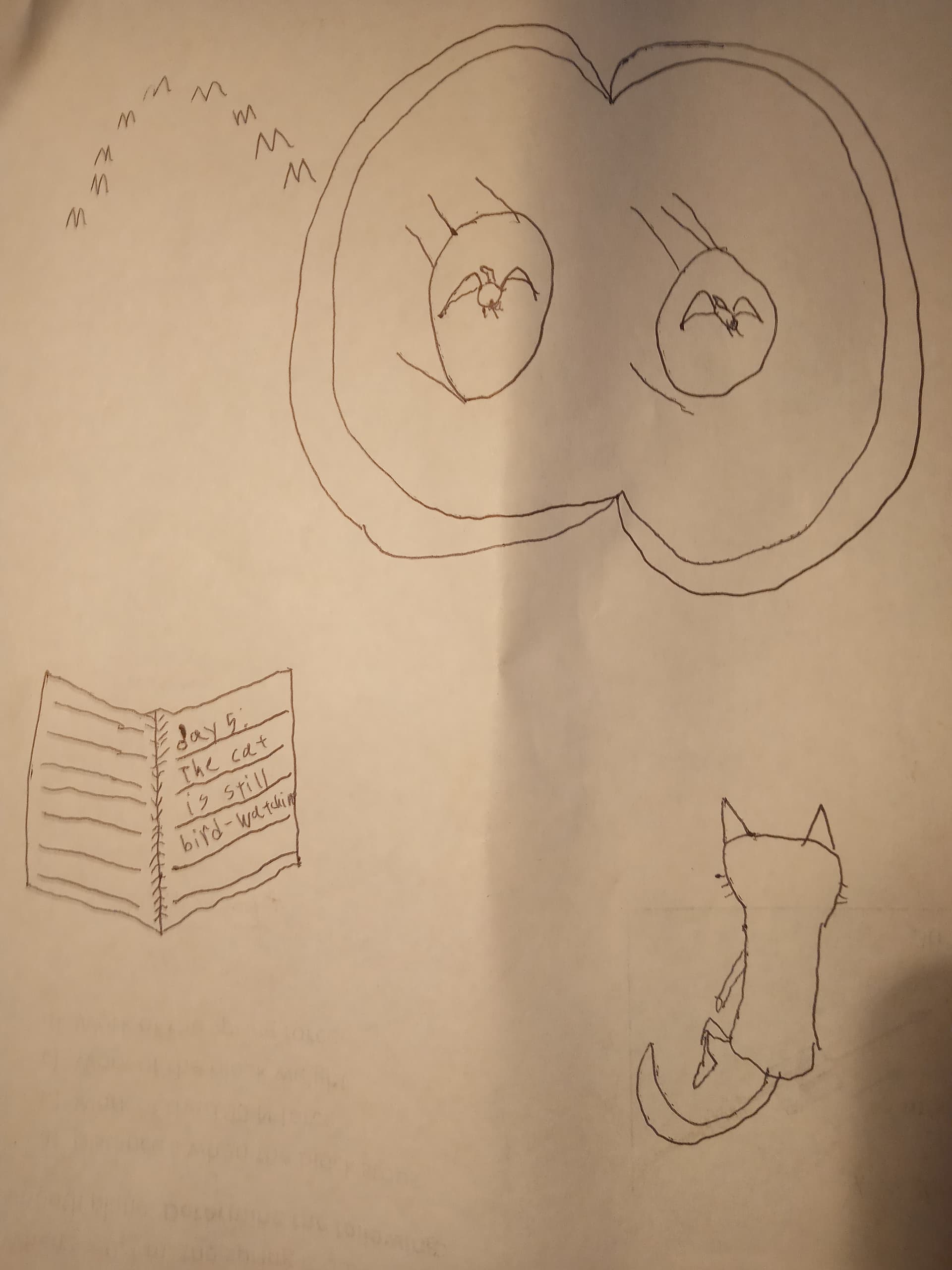
In contrast to yesterday’s this is my least favourite one yet. No part of it turned out how I’d hoped. I don’t know how to draw binoculars, or birds, or cats, or… well, the book turned out okay, i guess. The cat was almost okay, but i made the mistake of giving him legs. And while yesterday’s was a single main piece with some extra stuff, this is just a whole bunch of stuff. Not my best work.