Willing to rip your own MOC?
I like this guy.
K, so I am gonna rip this, and not feel bad. K? cool.
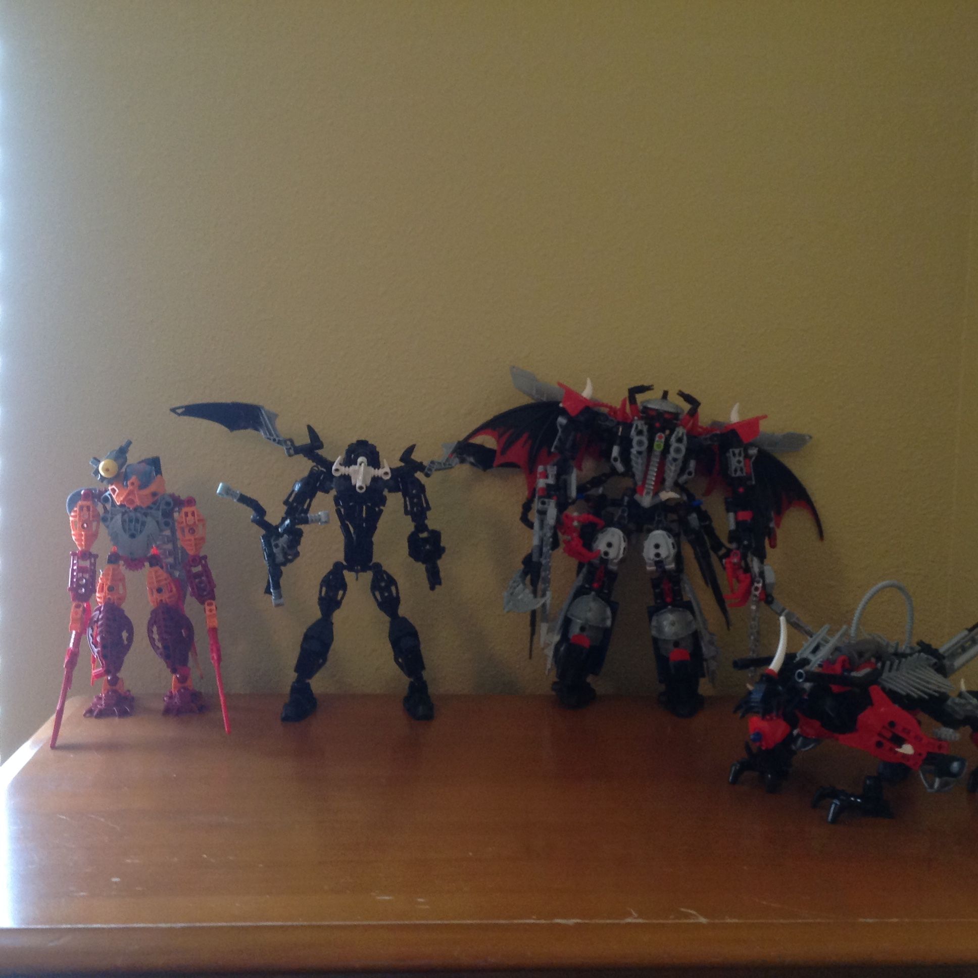
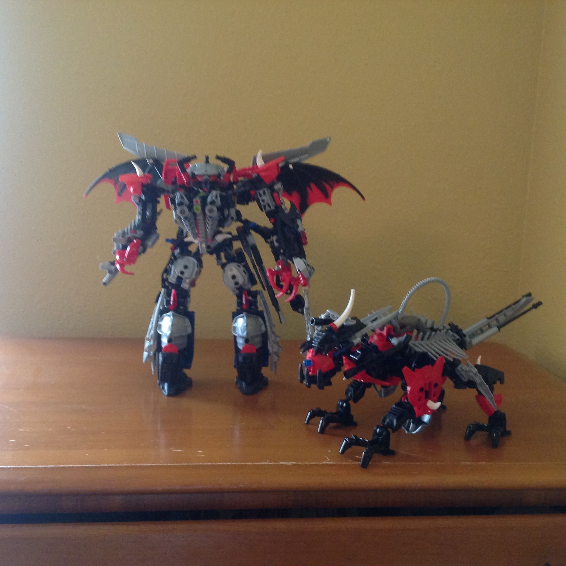
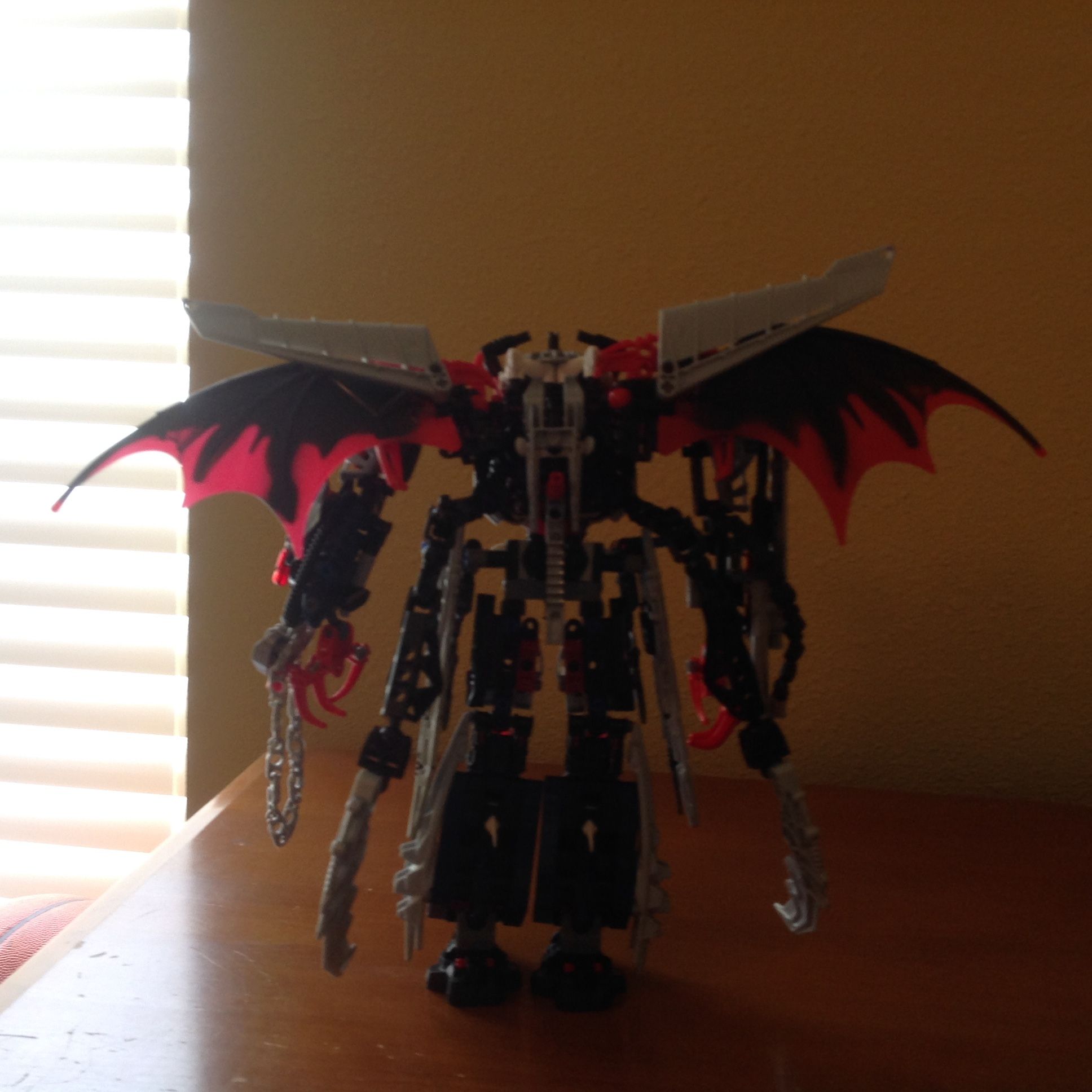
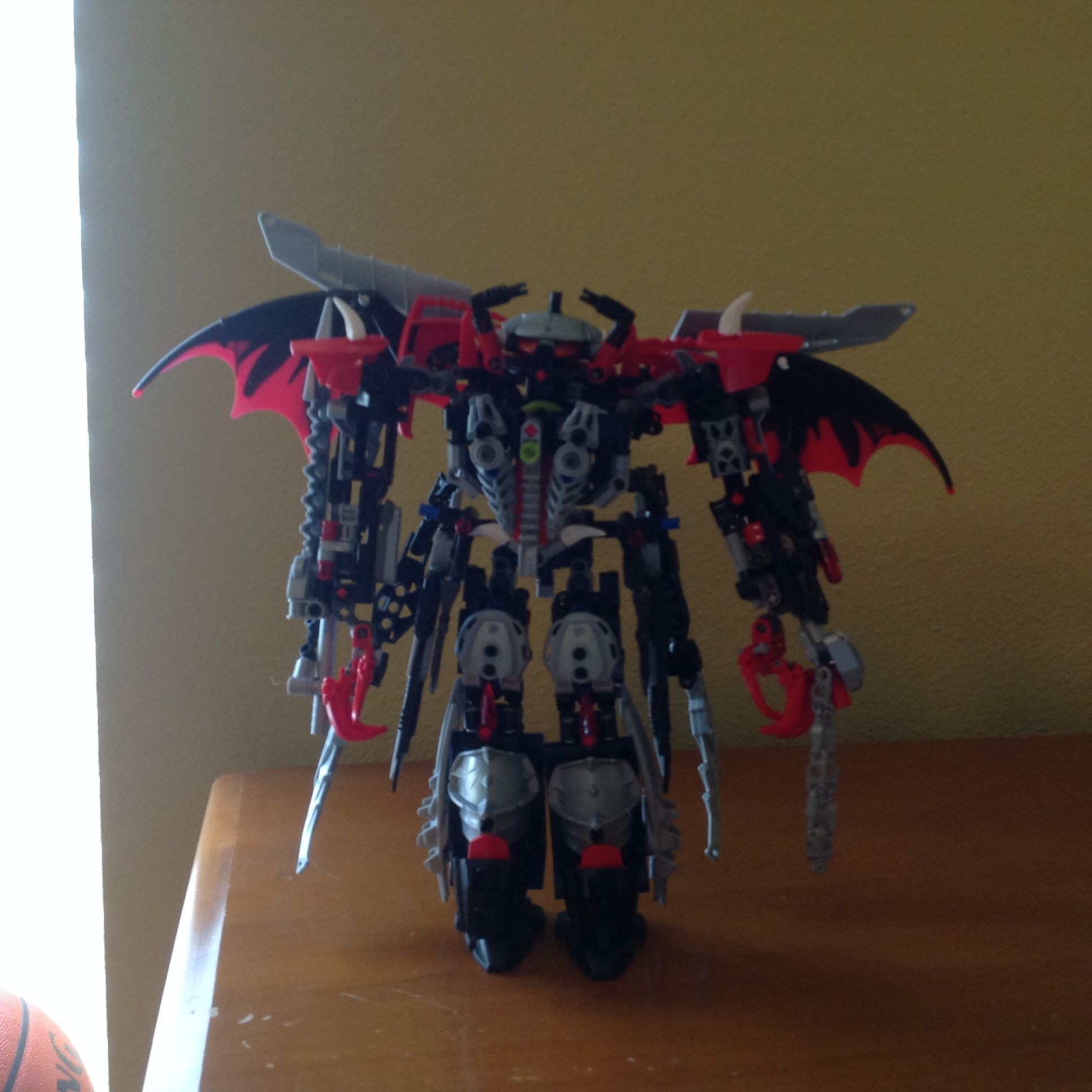
So, starting from the ground up. the lower legs lack flow and overall shape, I am a fan of the overall look, with the larger lower leg and the smaller upper leg. but when you get to the details it looks…off. it seems like his leg is thin, then it gets more bulky at the knee, then it gets skinny again. I like that you tried some knee pads or whatever, and I like how you used that piece, but it does not look right with the CCBS pieces under it. it does not have flow. and flow is something I find this whole MOC lacks. The technic heavy skeleton of the lower leg also gives it a off blocky look that I am not entirely fond of. I find that it is found all over this MOC, you seem to make a bulky skeleton and try to put textured, shaped, armor over it. thus exposing the the skeleton and ruining the MOC’s silhouette. the feet kinda seem a bit small as well, but eh, forgivable. Moving on up! the Torso. Not a fan of it,I would rather you just try something else, looks cluttered, too many colors. the shoulders are too wide. I also am not a fan of his second pair of arms they just clutter up a cluttered MOC, the skirt things are also kinda unnecessary and add even more clutter. I think you need to redo the torso, make it taller as well. Moving on to the arms, I see that you tried to make them kinda work with the legs, but I am sorry, they do not work, they look cluttered, and awkward. And last, the head. it works, needs a neck though. the wings…not feeling it, he has organic looking dragon wings, and then airplane wings…
Colors, they are generic, Black, red, and silver. they are really overdone and then you throw in some white and lime, then trans green, trans red, and trans orange. he has too many colors, pick three colors, and stick with those. Also try to make the eyes and heartlight the same color, and make it stand out. also it helps if they are the same color as the rest of the trans accents.
Final thoughts. The whole thing is a decent MOC, and I like that you are willing to improve. That is good, seeing as this MOC needs improvements, it seems like you have a ton of great ideas, but you are dumping them all into each other and it lacks cohesion. If all of the ideas overpower each other, none of them do. You are left with a jumble of great ideas with no clear motive. I hope you take my advice and work on this, I am looking forward to more from you.