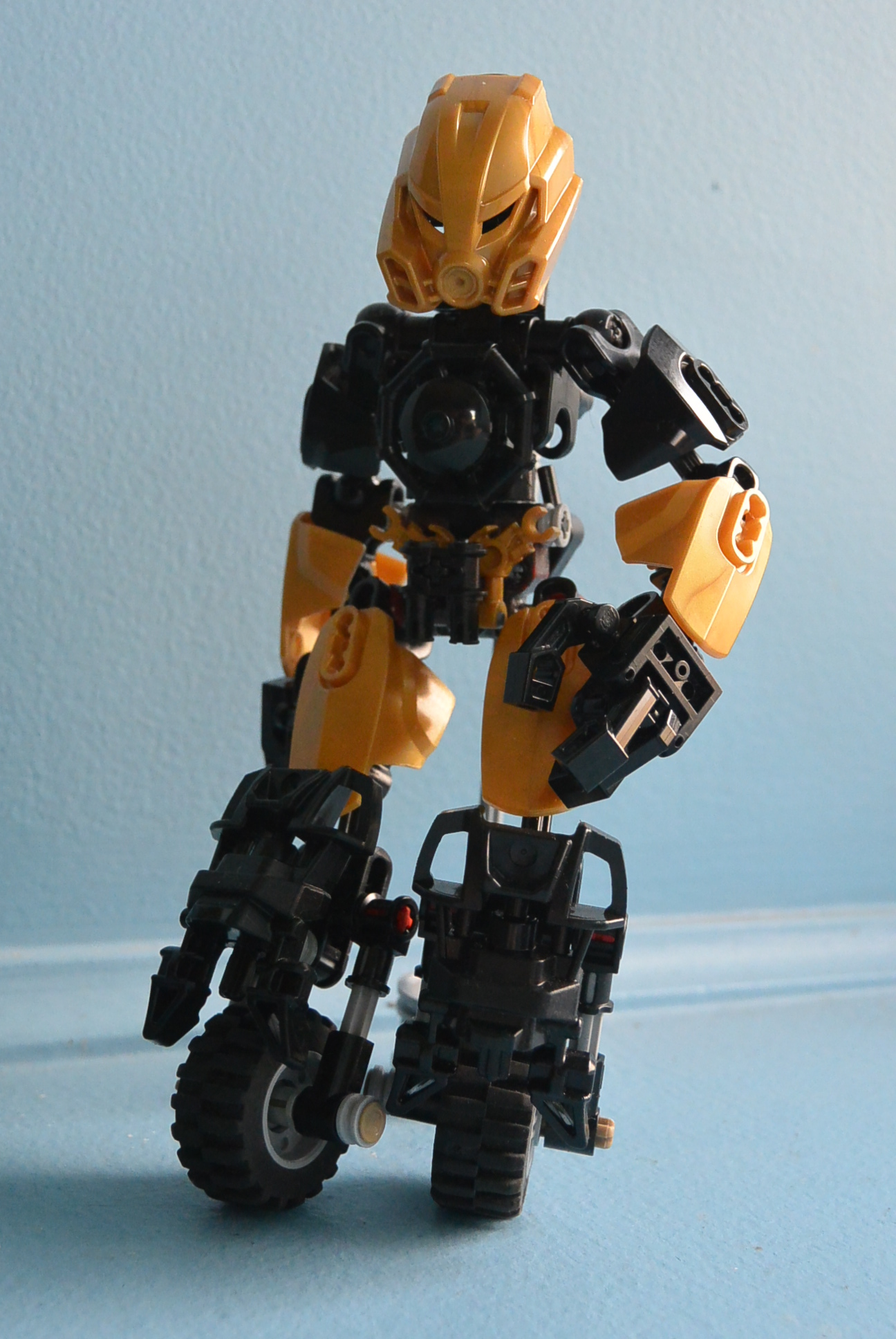
KAyfer’s not too bad, I just have a few things that make me not like it.
Toa of Speed. There is no such thing. It doesn’t even make sense to add speed as an element in a fan story.
Please give him an actual element. Also might be a good idea to explain how he lost his legs
He looks very awkward, but that may just be the way you’ve posed him. Either way, the head’s too big for his slim figure, and the wheels just look weird. I also can’t imagine he’s easy to stand up.
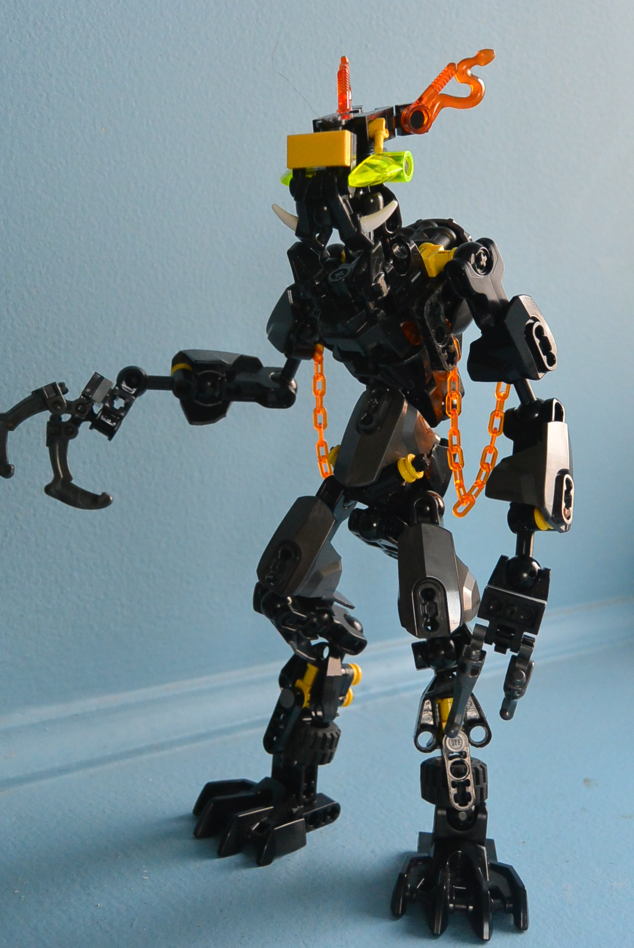
As for the second one, I really don’t like it at all. The whole thing looks very quickly assembled, especially the legs and arms. The trans-orange doesn’t really work, as there seem to only be 4 piecies of it in the entire MOC. Also, with those claws and horns, he doesn’t really look like a “friendly creature.” In fact, he looks a bit like a Makuta…
Sorry if I was a little harsh. I actually really like the concept of the first one, and the color scheme’s not bad. just a few things throw it off for me.
Well, You could make him an elementless Toa with a mask of Speed or something, that could work out. Cool design on Kayfer (even though Bio-Racers isn’t new). Gradius looks okay but not as interesting to me.
i like Gradius, but i have a problem with Kayfer. i have no idea why you cut that technic piece, but it seems unnecessary. i think you could have found a better piece to cover it anyway. in addition, i would put something on that gray axel on his lower leg, because that seems like a great opportunity for more coverage. overall its good tho
I like the whole Toa of speed concept. It’s quite unique… Besides that, the torso’s pretty good and the legs are an interesting design choice. He should probably have some kickstands on them too so that he can walk/stand as well.
Gradius is interesting, to say the least. He looks rather well built and such, but I really can’t make heads or tails of the face. It has an odd look to it, although I suppose it’s what makes him stand out given his relatively generic body.
Kayfer:
It’s ok, but the lower legs could use a little work. I do quite like it though.
Gradius:
The head needs a lot of work, but other than that, I actually love him. I personally wouldn’t change anything other than the head, and have to disagree with other complaints that people have had. I don’t think the trans-orange stands out too much, and I think it makes a nice accenting color, alongside the yellow. I think the number of fingers works, /startrant BECAUSE IT’S AN ANIMAL. ANIMALS SOMETIMES HAVE WEIRD THINGS LIKE THIS. NOT EVERY MOC IS A HUMANOID, WITH HUMANOID PROPORTIONS. ANIMALS ARE NOT PEOPLE. DON’T EXPECT THEM TO LOOK LIKE SUCH.
/endrant
Overall, I think they both work. Kayfer is an character, who I think has an interesting design, and Gradius pulls of the intelligent animal look quite well.
Kayfer:
Preety boring guy, tho ideas are interesting.
Gold is preety meh and having Mask of speed while having wheels instead of legs is preety much useless.
Gradius:
Fluffy? Yes
Evil? No
I would understend that having not an evil character in black would couse alot of confusion, but realy… his head preety much shows that he is peaceful.
Also change in post to "…helping villagersWithfood." since that would make more sense.
Overall one thing bugging me on him is wierd lower leg design