When pictures of the 2016 sets first surfaced, I had a number of concerns, primarily concerning the Uniters. I’ll go into more detail about them later, but they were significant enough to keep me from just buying every set I could get my hands on the first day they came out; I simply didn’t feel all that excited about the wave as a whole. Only now that reviews have begun to trickle in have I actually purchased a few of them. I started with two Ketars, mainly because that was the set that is almost universally judged to be the worst of the new wave and therefore presented an excellent opportunity for a revamp. The first sets I actually bought for their merits in their official form were Uxar and Umarak, who I’d intended to follow up this week with Ikir and Terak. Unfortunately, the former has already sold out at my local store (surprise surprise) and therefore I ended up walking home with the Unity set, Kopaka and Melum, instead.
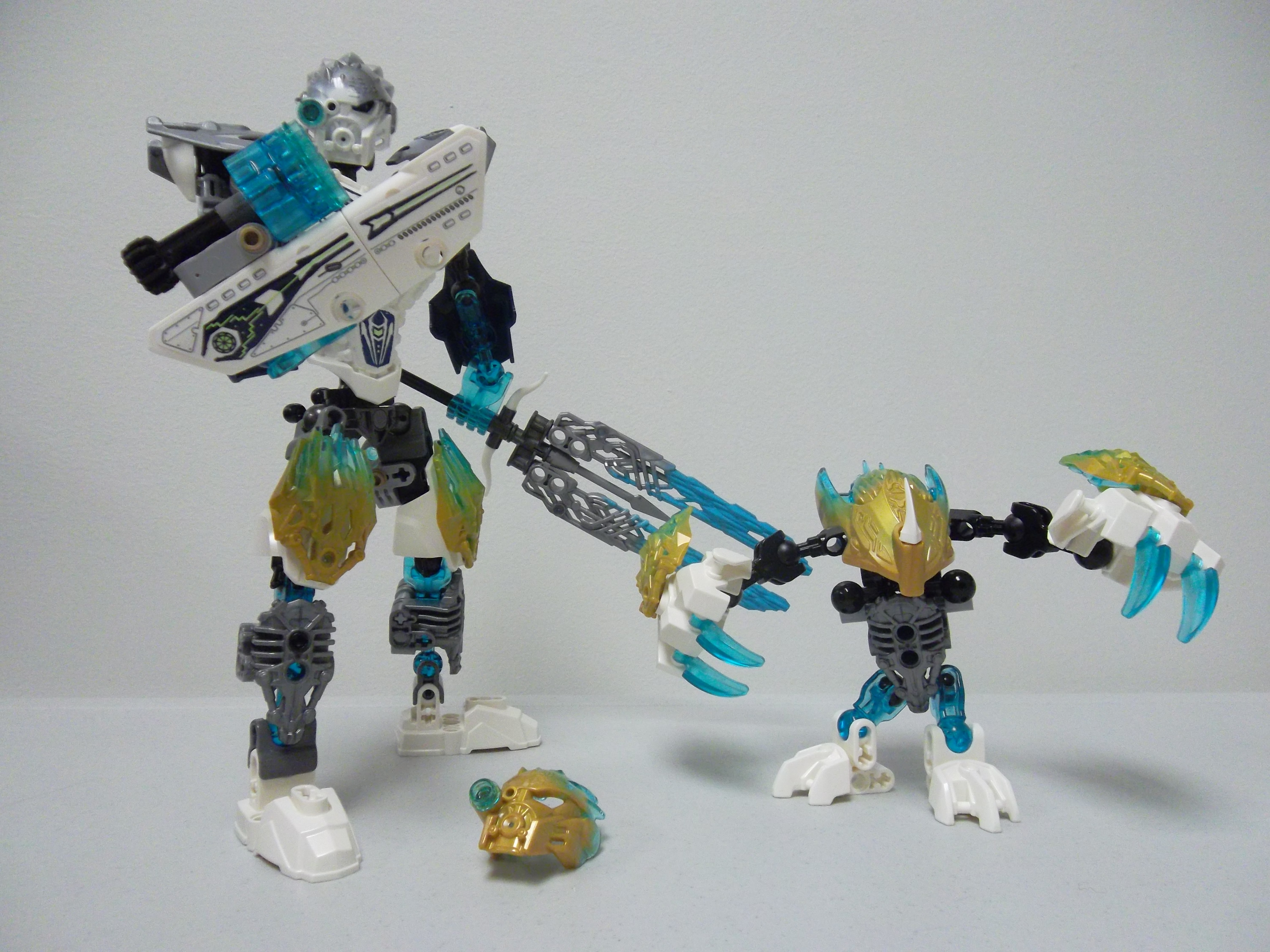
Kopaka and Melum are pleased to meet you.
I’ll preface this by saying that, as far as I’m concerned, the creatures are definitely the best part of this wave, and that I plan on getting all of them. I don’t plan on picking up any of the Uniters, but this being a unity set, I couldn’t have Melum in my lineup without having Kopaka as well… And with that, this one set actually has become the perfect illustration of all my thoughts about the Bionicle 2016 sets so far; what I like, what I don’t, and why the Uniters failed to excite me anywhere near as much as the creatures or the Toa and Protectors from last year did. As such, while I’m posting this as a review of this set in particular, I’m not going to go through all the nitty-gritty details like listing the new and recolored parts and explaining the entire build of the set. There’s plenty of other people writing reviews out there who do that already, and since we’ve all fundamentally got the same set, those lists are always going to be the same. No, I’m going to critique Kopaka and Melum based on what matters most to me, which is the final aesthetic, the set design and what it communicates, which as far as I’m concerned is where many of the Uniters really missed the mark.
##Kopaka

Heroic Pose.jpg
Let’s start with Kopaka, then. Before I delve into the bad parts, let’s mention what he gets right: his sword. It’s an awesome looking weapon that actually features some construction, which I applaud, especially since old Bionicle had an enormous list of large, specialized weapon pieces that had nowhere near the appeal of this contraption. I’ll also admit the torso armor piece looks much better in person than it does in the official pictures and renderings; it’s much more contoured than I expected. Nevertheless, it does have problems, but I’ll get to those. Kopaka’s torso construction is also clean and compact, and it doesn’t need to use lots of Bohrok eyes to fill in gaps like some of the other Uniters do. I consider that a plus because Bohrok eyes tend to do a very poor job of filling gaps or ‘bulking up’ a construction from most angles, a fact that became all the more apparent to me when I watched Eljay’s review of Tahu 2016; the eyes work as accents on his boots, but not to bulk up the torso. Kopaka manages to steer clear of that, though his torso construction presents its own problems.

Torso construction detail. Everything is constructed in a clean, compact manner, and only two Bohrok eyes required to fill out the back slightly. Also, someone tell Kopaka to put his ■■■■■ back on.
Since much of the buzz around the uniter sets has been about their unique torsos, let’s start with those problems: Kopaka, like Lewa and Pohatu, reverses the age-old wisdom that, in shoulder construction, the ball should be fixed to the torso and the socket to the arm. Instead, he uses a set of socket joints mounted in his torso, and builds his upper arms around two Glatorian neck pieces. There’s a fair bit of technic work involved in making a solid arm out of this configuration, and it’s all cemented by the use of Vorox armor pieces as pauldrons. The advantage of this configuration is that those pauldrons actually move with the arms, which makes certain poses look a lot more realistic. It’s tricky to get this kind of construction right, though, and Kopaka does indeed run into a few problems; the Vorox armor interferes with both his mask and/or the shoulder sockets, depending on what pose I try to put him in, and that’s a very annoying thing to have to deal with. Secondly, he has no armor whatsoever on his upper arms. They’re pure technic, which makes them stand out from the rest of the set’s CCBS construction, and not in a good way.

The Vorox armor somewhat restricts posing the arms. It also interferes with the mask quite frequently, and the sockets to which the arms attach tend to flex during posing, which makes them feel weak.
Comparing this to 2015 Kopaka, the difference becomes even more obvious. The old set uses large, bulky beast hand pieces for his shoulder armor, but they are attached separately from the arms, which greatly helps his articulation and doesn’t in any way compromise the appearance of the upper arms. Uniter Kopaka also encounters problems on the torso side; while they are positioned nice and flush, the ball sockets are only attached to the torso with two red axles and a lever arm; an assembly that tends to flex quite a bit whenever I move Kopaka’s arms. This feels flimsy, unfinished, and I find it quite perplexing that the designers saw fit to leave it like this, especially since it seems that they went through the effort to make sure that every other technic piece on this set is secured very well.

The full range of motion of the gear function is about 70 to 75 degrees to the left and right. Mine is also squeaky.
The other noteworthy feature of the torso is, of course, the gear function. On this, I fully agree with the TTV cast’s assertions that, while a mediocre function at best, it is very valuable as an additional point of articulation. However, even in that role it has significant limitations; it can only swivel, and therefore won’t allow Kopaka’s new form to hunch over, arch his back, or otherwise bend his super-advanced torso any more than his old form could with a simple CCBS+gearbox arrangement. Worse, the addition of the function has thrown his proportions in disarray, and that problem’s not just confined to Kopaka; the more I look at the Uniters, the more I feel like their torso armor wasn’t at all designed to work well with this function.

Comparison of torso height. Across the board, the Uniters have grown significantly, much to the detriment of their proportions.
Compare the hips of the Masters to those of the Uniters, then compare the height of their torso armor pieces. Notice the difference? The new, single-piece torso armor is the same height as the combination of HF armor and chest plates that was featured on last year’s sets. However, the hips of the new sets are located one ‘stud’ lower so the legs and armor won’t interfere with each other during operation of the gear function. The end result is that all the Uniters have taller torsos than their old counterparts, while their arms and legs haven’t gotten any longer to maintain proper proportions. Ever wonder why everyone complains that Uniter Lewa’s arms are too short and stubby? It isn’t just because of the shorter arms; it’s the fact that his torso is longer, which means his arms effectively don’t reach as far down as they used to.

New, single-piece armor layout has the same height as last years two-piece arrangement, but again, the torso beneath is longer so the gear function clears the armor piece. New piece isn’t as flat as initial picture and renders let me to believe, thankfully.
Kopaka’s arms and legs effectively haven’t changed in length at all, but the stretched torso in combination with the technic construction of his arms and his comparative lack of armor introduce another problem. Here, I’m moving more into the aesthetic side, asking the question: “Does the Uniter of Ice look like the upgrade over the Master of Ice that he is meant to be?” Sadly, I’m not convinced that he is; in fact, putting them side by side, beyond one or two highly specific similarities I’m having a hard time believing that I’m looking at the same character. There is no visual consistency between the two: 2015 Kopaka’s design worked beautifully to evoke a winter warrior, with his bulky armor layout that suggested he was wearing thick and insulated boots, and perhaps a coat of some kind. I actually enhanced that look further by removing some of the friction socket add-ons in his legs, bringing his stature more in line with the shorter Toa and highlighting the ‘bundled up’ look even more. Of course, it caused some articulation issues, but the fact remains that all the elements of Master Kopaka’s design work together wonderfully to create a strong, tribal warrior that looks the part of his element.

Old and new. Can you tell they’re supposed to be the same character?
By contrast, Uniter Kopaka looks much more like a robot. Gone are the smooth armor shells and add-ons, the bulky shoulders and thick boots, replaced by a bewildering array of hyper-detailed pieces on a strangely lanky frame. Granted, detailed pieces were always G1 Bionicle’s thing, but even the theme that brought us molding nightmares like Axon’s axe blades and Krika’s spikes and mask at least managed to always maintain a somewhat consistent set of textures on its sets. Uniter Kopaka doesn’t do that; moving from the bottom up, he’s got smoothly armored HF feet, pistoned and deeply louvred ‘pieces of unification’ on his shins, and crystalline armor add-ons on his thighs, which by the way are the only gold on him unless Melum intervenes. That’s just his legs, and already we’re up to three wildly contrasting styles. His torso is dominated by the singular chest plate, which makes a decent attempt at combining the greebled pistons with some smoother HF style armor plates, but it features nothing that in any way fits with the crystalline pieces on his thighs, so those still stand out as sore thumbs. Continuing, we find more HF armor on his forearms, raw, exposed technic on his upper arms, and then the thin, jagged armor style of the Vorox slapped onto his shoulders. For anyone keeping track, we’re now up to five different, conflicting textures, all on one figure. Oh, before I forget, his sword does actually feature crystalline blades, but then the cross-guard uses pieces that resemble small horns or bone pieces or something similar. In his other hand, the fairly neutral blaster is fitted to a smooth set of curved technic pieces that, once again, do not have a textural equivalent anywhere else on the set. So we’re up to seven, and we haven’t even started talking color yet.

Seven pieces that are clearly visible on the final set, seven competing textures, seven different colors… any wonder this guy looks so messy?
The colors are a disorganized mess of their own; the two gold add-ons are the most obvious offenders, but the metru blue armor on his forearms also makes no sense. Yes, we’ve seen white+metru blue done successfully on the Glatorian, but they weren’t tasked with adding silver, gold, and transparent light blue to their color schemes as well, never mind textures. Here’s a fun experiment if you have both sets: replace the metru blue armor on Uniter Kopaka’s forearms with the same piece, in white with stickers, from Master Kopaka’s thighs. Remove the gold crystal add-ons from the Uniter’s legs. Now, how much better does that look? Okay, I can’t speak for you, but as far as I’m concerned it works much better already, doing its part to solve both the color and texture issues. Exchanging just two pieces and removing two others already did a great deal to improve Uniter Kopaka’s appearance; that’s how much of a jumbled mess the appearance of the original set is, a shame compared to the wonderfully consistent design of last year’s iteration.

Two pieces changed, two pieces removed, and already he looks a lot better.
Putting aside the fact that it’s messy, Uniter Kopaka’s plethora of textures also include far more greebling and detailing than his previous form, which leads him to look much more robotic and less like the tribal warrior from before. His comparatively lanky appearance also contributes to that; a mostly robotic being likely wouldn’t be as affected by the cold as a more organic one, so thick boots and insulation wouldn’t be as necessary. This might be more in line with how the designers and writers of G2 imagine the biology of the characters, but there’s no denying that it is a big change from last year’s sets, and it applies to all the Uniters; they look more like characters from a sci-fi as opposed to a fantasy story. Which of those is more fitting is probably a matter of personal preference, but I feel like Bionicle G2 is meant to evoke the feeling of a fantasy epic first and sci-fi second, so even if Uniter Kopaka managed to pull off his more techno-focused appearance in a more consistent manner, I wouldn’t be surprised if I’d still prefer the old version. Then again, at this point I can’t say what direction the 2016 story will take; if it’s going to be akin to moving to Metru Nui from Mata Nui, than the change in appearance would be perfectly reasonable, even welcome.

Old mask, new mask, new golden mask.Why exactly the mask’s default from is molded part-grey on all the Uniters is a mystery to me. Interchangeable colors of lenses on the new mask are nice, but I’d prefer it if the scope was mounted higher, like it was on every previous iteration of the mask.
Lastly, there’s his mask. Master Kopaka’s mask was never my favorite of that wave (that honor goes unequivocally to Gali), but it certainly hearkened back to the Akaku from 2001; it is a design influenced by the character wearing it, and doesn’t look out of place in any way on the set it came with. The latter thing can also be said for Uniter Kopaka’s mask, but regrettably this one was shaped more by necessity than by personality or design. The necessity in question was to incorporate the Unity function, which required a forehead structure devoid of protruding features beyond a few low ridges. Gali’s mask suffered from this the most, in my opinion, but Kopaka is unique in that he’s had to move his scope down from it’s high vantage point so Melum can fit his head over it. However, if the point of the scope was to allow Kopaka to easily distinguish objects or creatures far away, or in low visibility conditions, wouldn’t it make more sense to leave the scope high up, so it could see over obstacles? What I’m saying is: it just looks odd compared to every previous iteration of Kopaka’s mask (and Nuju’s Great Matatu), which all featured the scope high up on the forehead. The ability to stick a stud on it and with that influence its color is a plus, but in all, I still can’t say I’m a fan of the design. Also why did it have to be molded partially in silver? It adds nothing, and only makes it harder to MOC with for those who are so inclined.
##Melum
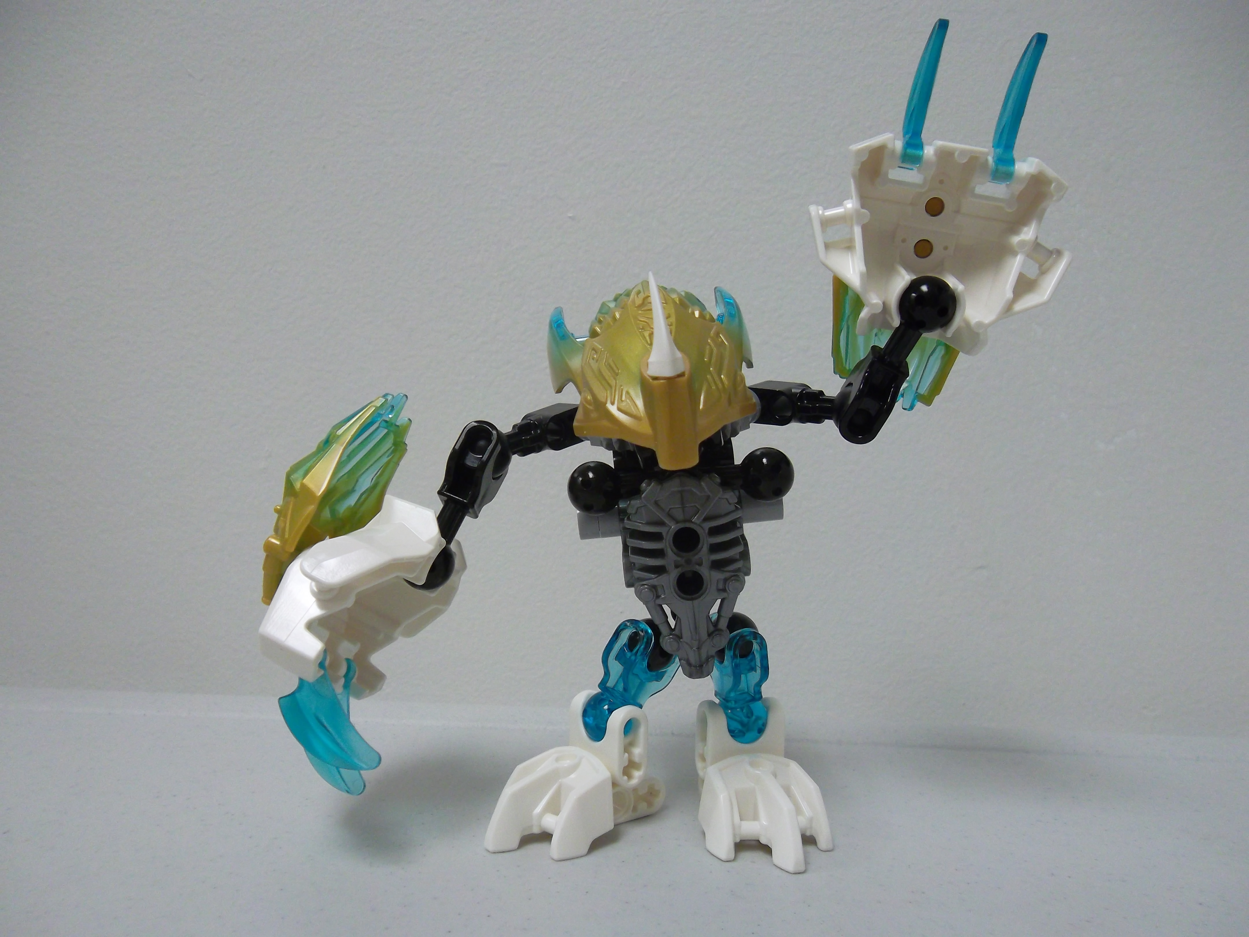
Melum says hi.
With that, I think it’s high time I moved on to Melum. Kopaka’s companion bears a great resemblance to Terak at first glance, but looking closer it becomes obvious that he’s not been given quite as much love in the piece count department, lacking several claws, some armor pieces, and featuring a slightly simpler gearbox build. Obviously, the designers had far stricter part count constraints to work with when it came to designing the creature than they did with the Uniter, but it’s amazing how much fun Melum squeezes out of what he has to work with, especially compared to Kopaka.

Melum’s build is simple, but the function is great. His gearbox is operated by moving his tail up and down.
In general, the creatures’ designs follow a textbook ‘less is more’ approach, focusing on getting a consistent appearance and lots of expressiveness out of relatively few pieces. This approach is what allowed the Protectors to easily outshine the Toa last year as far as value for money is concerned, and I feel the same about the creatures this year; Ketar might have been thoroughly underwhelming, but one only needs to look at Ikir to see what’s really possible when the designers don’t overreach. Melum, however, is arguably the best example of all, since he’s being bundled with Kopaka, whose design usually eats up a parts count like the Zivon does Visorak, and therefore has even fewer parts to work with than his companions. Yet, sitting next to Uxar and my own Ketar revamp, I’d have to say that Melum is the most fun out of all of them. With his short legs and his neck retracted, he looks like a penguin with bear arms, which is a lot cuter than it sounds, and his paw clapping function is so cute and funny that I’m seriously considering making a gif out of it.
-8-8-8-8-8-8-8-8-8-8-8-8-8-8-8-8-88-8-8-8-8-8-8-8-8-8-8-8-8-8-8-8-8-8-8-8-8-

-8-8-8-8-8-8-8-8-8-8-8-8-8-8-8-8-88-8-8-8-8-8-8-8-8-8-8-8-8-8-8-8-8-8-8-8-8-
Seriously, someone go tell Ketar’s designer that this is how it’s done. Melum also manages to be wonderfully posable in spite of only having 10 points of articulation (not counting those in the function), and I’ve had hours of fun in making him into an example of all sorts of comically exaggerated body language.

The Expressions of Melum. Someone make a T-■■■■■ out of this.
Melum isn’t entirely without flaws, however. First off, the torso leaves some ball joints open, which is a bit irksome. The super-short bones used in his legs, combined with his top-heavy design and small feet, can make it difficult to get him to balance many poses. The fact that a lot of his weight is in his claws, which are moved around a lot by his function, doesn’t help in that regard. The piece of unification still doesn’t really fit the aesthetic of any of his other pieces, but thankfully Melum is nowhere near the textural nightmare that Kopaka is. His hollow head and hands also undermine the appearance a bit in certain poses, but the former can be solved quite easily by retracting his neck to where his head looks to be sitting almost right on top of his body. He only really needs the long neck for the unity mode, speaking of which…
##Unity

Some unities work well. This isn’t really one of them, which is odd since this is supposed to be the ‘Unity’ set.
Yeah, I’m not a fan. The unity mode looks okay-ish on some Uniters, in particular Tahu, Lewa, and Gali, whose creatures actually have beneficial features to add to their appearance (wings, more wings, and a fish tail, respectively), but here it really just looks like Kopaka is giving Melum a piggy-back ride. Cute? Maybe, but I can’t see it being very useful in battle. Besides, is Kopaka really the type to give piggy-back rides to anyone? Their combined form does go some way to solving the issue of Kopaka’s golden pieces by adding more of them, but Melum’s function is completely negated since his paws have to stay in position to form Kopaka’s new and improved pawdrons. They don’t even fit smoothly over the Vorox armor anyway, and the entire assembly is top- and back-heavy, making it as awkward to pose as it is to look at. I suspect Onua and Terak suffer from the same issue, and it contributes to my opinion that the unity mode was wasted on half the 2016 sets, and in fact made those sets worse.

Unity side view. Like the other Unity combos, this one ends up rather back-heavy and is therefore annoying to pose. Also, what exactly is Melum supposed to be doing? Getting a piggy-back ride?
Made them worse? How, you ask? Well, look at Kopaka, and how much of his design was either influenced or necessitated by the need to fix a bear-penguin to his back. In fact, look at all the Uniters. You see, the only thing the creatures have to do for the function’s sake is to 1) have the ‘piece of unity’ on their chest, which isn’t much of a problem, and 2) have a long neck so their heads can be hats for the Uniters. Now look at the uniters: first off, their masks had to be designed to accommodate the heads of the creatures, which meant we got a set of masks that all featured various smooth, sloped foreheads with some ridges slapped on for texture. They had to attach the ‘piece of unity’ to their backs, but that wasn’t so much an issue as the other places where it tends to pop up, like Kopaka’s legs. Speaking of legs, the Toa have all had to add additional friction joints there in order to reliably support the added weight, which has made some of them considerably taller, adding to the aesthetic rift between them and their previous versions.

Back view. Like all the other creatures, in Unity form, Melum has nothing to do with his feet.
Worst of all, last year’s great function, the swinging arms, had to be removed since the gears involved couldn’t be fitted with the creatures attached. The sets had to include some kind of function, though, so now we have the swinging waists, which in turn have brought us awkwardly proportioned torsos since the armor was never designed to work with that kind of function. If it had, it would have been made in two pieces, fitted to a shorter torso. The new function also demanded that the Toa be given weapons to work with it, which meant that Gali, Pohatu, and Onua all ended up with two-handed staff weapons, which as anyone who ever bought Vastus knows are terribly annoying to pose. Really, only Onua benefited from the weapons change; he always could have used a bigger hammer, whereas Gali lost the axe that contributed so much to her striking appearance, Pohatu lost the stormerangs that were at least interesting, if questionable in effectiveness, and Kopaka got a nice sword but lost the giant shield that set him apart before. In all, is it any wonder that the Uniters don’t have the same appeal to me that the Masters did a year ago?
I do have to give the designers credit for trying, though, since they did succeed in meeting a very demanding set of requirements. I mean, last year’s combinations only involved the protectors gladly handing over their weapons to the new Toa, whereas this year entire sets had to be able to combine in a relatively smooth manner, and they do, even if the result only looks good on half of them. The problem is that so many compromises had to be made to meet those requirements, compromises that on a number of sets really aren’t worth their tradeoff. This is why I’m actually kind of sad that Kopaka and Melum were made into the unity set; why couldn’t it have been a combination in which the unity actually looked really great? Tahu and Ikir would have made a great $30 ‘phoenix rising’ unity set, whereas Gali and Akida or Lewa and Uxar would both have been possible for $25, and they could have included a shadow trap in the deal. They actually would have felt like a cohesive set together, whereas Kopaka and Melum just… don’t.

“Look to the stars, young one.” Note that Melum’s head doesn’t lock on to Kopaka’s mask in any way (none of the Unity forms do that), and therefore looking around becomes quite difficult for Kopaka without taking off his hat.
That, unfortunately, is the bottom line for me: Kopaka and Melum represent a missed opportunity. They both would likely have been better off as separate sets, while several other Uniters and their respective creatures would all have made much, much better unity sets. Priced at $10, Melum could have had a few more pieces to play with and his own ice-themed shadow trap. Kopaka being a $20 set again might have given the designers the opportunity to refine his design and keep it slightly more in line with his prior version, including perhaps a better shield to go with that awesome sword, and some bulkier, more consistently designed armor to bring the aesthetics in line. I’ll probably end up revamping Kopaka quite a bit to see just what such a set would look like, but in the end it’ll all be theory-crafting and ‘what-ifs,’ which don’t help much as far as the original set is concerned. So, much as it pains me to say, I have to recommend people skip this set unless they can find it at a reduced price.

Kopaka is not pleased at the verdict.
##Final Verdict:
Unless you’re absolutely gung-ho for Melum (I wouldn’t blame you) or Kopaka (again, wouldn’t blame you), or you absolutely want to complete the wave now, I don’t recommend buying this set early. Wait for a while and see if you can get it at sale price.

My verdict made the Melum sad. I’m sorry…


