I started to draw this as a small break from doing the animatic, when I thought what TTV wanted was more like the Netflix Elves series, with a little more anime influence than before.
Then yesterday as I was starting to finish it, they upload the brainstorm podcast and say they want something a little more western in style…
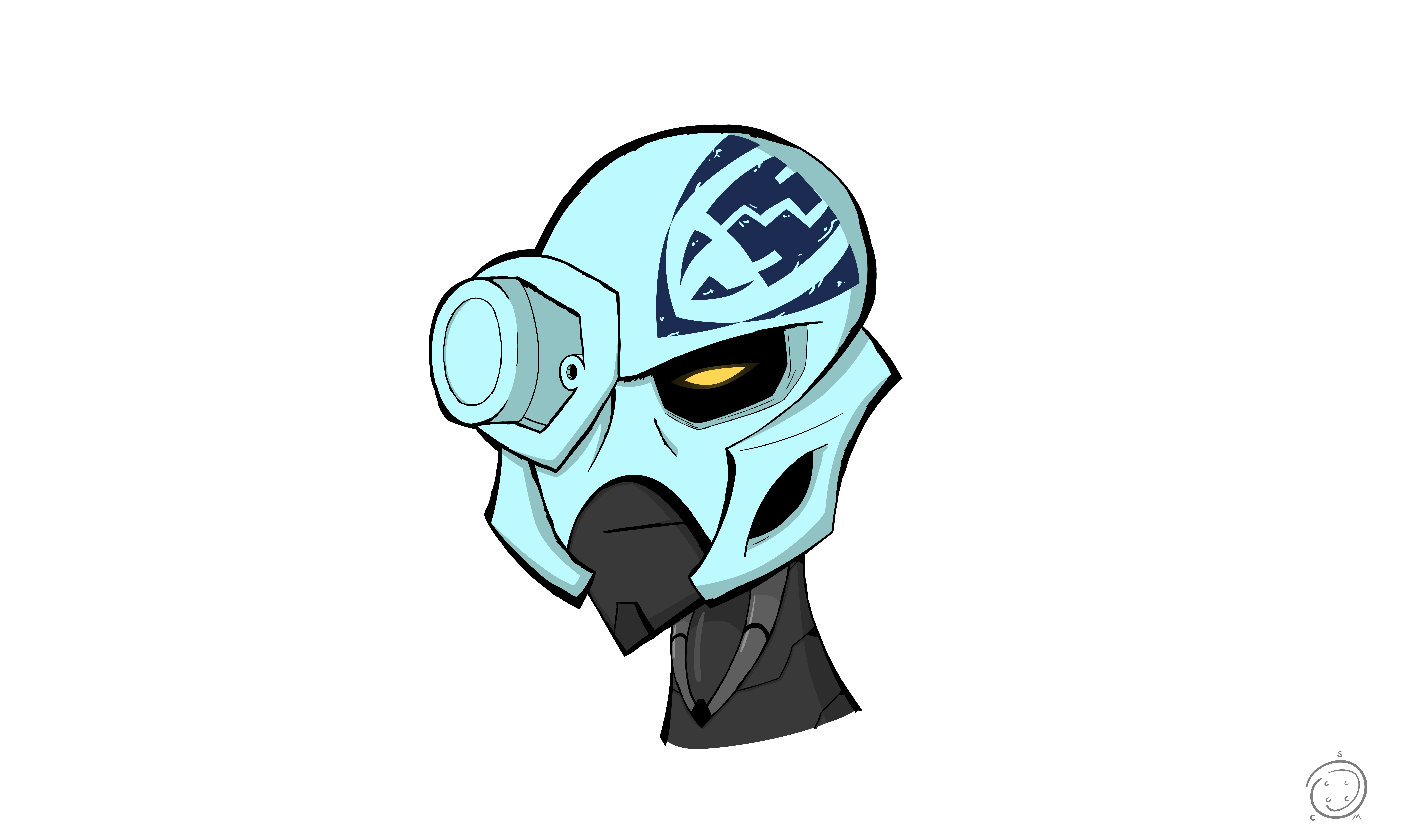
Anyway, I kept CCBS in mind when drawing this. Even if I didn’t make a moc-up, you can probably tell how he’d be built. Cloth pieces galore. I took some inspiration from Elves in how some elements are celarly made from Lego, but look very stylized. It still might be too complex to animate, but the silouhette is easy-ish to draw. Yes, he would make a pretty boring CCBS figure if he looked like this.
I also started this before someone else uploaded their animated version of Kopaka, which you should probably check out as well, if you haven’t seen it yet. Now that TTV is going to discuss the style they’ll be using definitively, I’m pretty excited to see what they have to show.
Really like the design on this. Thou i think the spear’s body is a bit to thin and the hear too small. It looks like if in a fight with one of the Rahkshi, the spear would break very easly.
I see what you mean. I wasn’t too concered with his spear since I was focused more on his design and the style itself. I’d also have added his shield somewhere if I tried to design the weapons.
I just uploaded a scrapped version of Onua I made months ago on Tumblr. I tried out a minimalist MNOG style and would redesign about 90% of it. I’d definitely redo it.
This is really great. I think the slim build of him kinda suits him more than my bulky style. I also like the waist skirt thing, and the cape too. I need that example of the TV show style so I know what they are really going for.
@Ragdoll, Wow, this looks amazing. I wasn’t sold on TTV’s “ab” armor but you have executed the look to perfection. I also love how you created this with CCBS in mind and could see it working magnificently as a set. I think the color swap between white and aqua blue really brings out the yellow as well.
The chin is a little too pointy for my liking though but I do understand it is part of the style.
I also don’t really like the idea of any of the Toa/Matoran having white teeth and would rather see something similar to how G1 Transformers handled it but I am probably in the minority there.
Thanks! I think we went for diffrent takes on Kopaka. Your bulky version would be more intimidating up front, where I tried to give him somewhat finer features and make it seem believable that this guy is a prince well trained for fighting, and doesn’t see much value in brute strength.
The pointy chin was for the “finer look” I was trying to go for, in comparison to someone like Tahu, whom I picuture having a very boxy, superhero-y chin. The chin could be rounded out slightly if it’s too pointy.
As for the teeth, I get you mean, but I think the 2D style makes it a little easier to stomach than… shudders


