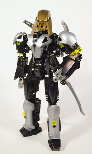
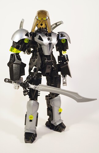
“A hundred years, a thousand, ten thousand… yet the duty remains,”
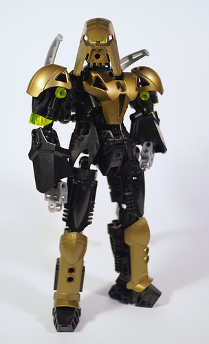
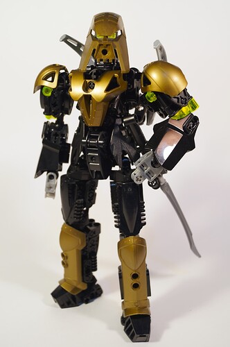
Kromastus began life a long, long time ago as my self-MOC, back when those were more widely used. Back then he was a bulky, over-designed, chunky titan with limited poseability and a lot of big Technic parts, with incoherent colours and textures. I made a lot of progress as a builder in the 12 years since then, and until recently, Kromastus stood as one of the last examples of my transitionary building style - the colours were sorted, the build sturdy, the form good, but textures were still imperfect, proportions a little off, and poseability less than I wanted.
“Warrior, arbiter, judge… I’ve been called many things,”
Now, he’s a reflection of my current building style - the most recent figure I’ve built, encapsulating most of the new techniques I’ve learnt. I don’t make things as organically shaped as some modern builders, because the design language I favour is still that of Lego’s 90s and early 2000s constraction, with a greater emphasis on heroic proportions, big armour, and robotic structure. You can also see the design influences here that echoes in that era - military sci-fi, Transformers, U.S football gear, and the like.
“Armour protects, but it’s a symbol as well,”
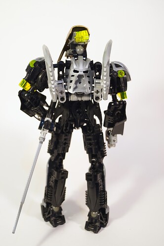
Kromastus was always meant to be something of an ‘eternal hero’ style figure, and to that end there’s hints in his armour of Western knights, Eastern Samurai, and future space marines. There’s a little bit of cyborg, and a little bit of battleroid - 12 years of design influence from within and without the world of Lego, all to end up with the biggest influence being the Toa Nuva. A few design elements have stuck around just for posterity, such as the over-shoulder claws, and a few for pragmatism - I can think of some slight tweaks to the upper arms, but nothing that’s substantially more suitable than what is a 10 year old design, only slightly edited.
“I swear it changes every time, and yet it’s always the same…”
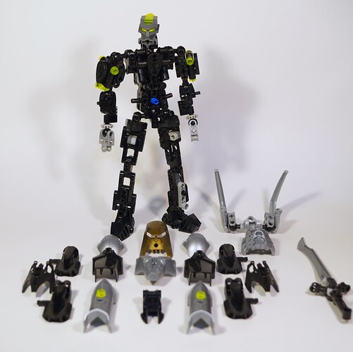
I’ve been immensely pleased, in this re-design, to retain and in fact improve the armour-on-frame style that I started out with 12 years ago. The un-armoured figure can be parred down to an even more skeletal frame, but retains structural integrity even with 95% of the armour removed, such as here. I’ve also finally managed to give him a weapon I don’t think is daft.
“I’m seldom one for an ostentatious display, but even I must admit, there’s something classic about gold,”
The added benefit of the re-designed armour over previous versions is that all the armour pieces (except the shoulder spikes) are available in the same shade of gold, allowing for a set of gold armour to be used. Were it not for posterity (and the fact that I’m borrowing the shoulders off my 03 Takanuva), I’d almost be tempted to leave him in this configuration, perhaps with black hands. The contrasting mask was always a point of interest and difference, but seeing him in the cohesive colours here, maybe this was a move I should have made years ago…
It is a little harder to get good swords in old gold, though…
Thanks for reading this, if anyone does. Most of the actual history of my old warrior here was lost when MOCPages fell, and I suspect that this rather contextless ramble won’t mean much to many, but there’s fewer and fewer places online to share long-form posts about Lego builds. Flickr has limited photo slots, Instagram is really designed for one-image posts with tags, and MOCPages is not only gone, but virtually forgotten, too.
So thanks for indulging a sentimental builder and his old warrior MOC - I hope the pictures are interesting, if nothing else.
