you might’ve needed to wait for the pics to upload before you post?
Sorry thought it uploaded.
Fixed it up.
Edited for double-post. Please take a look at the site rules if you haven’t. Thanks. --John Smith
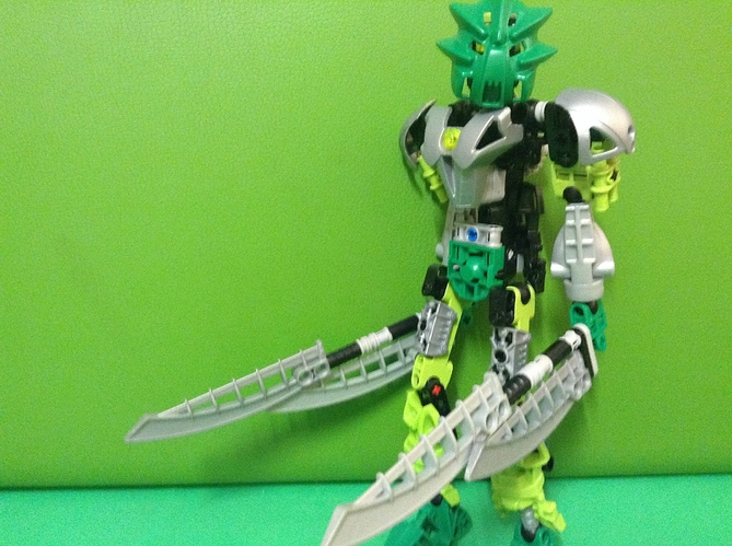
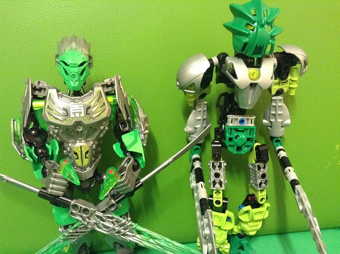
looks really nice, if a little bit on the skinny side. good work 
This is a nice upgrade except those legs might be a bit skinny
Pretty good.
Except for the mask, but you can’t really change that.
I just don’t like the Miru nuva.
not bad a bit gappy but not bad
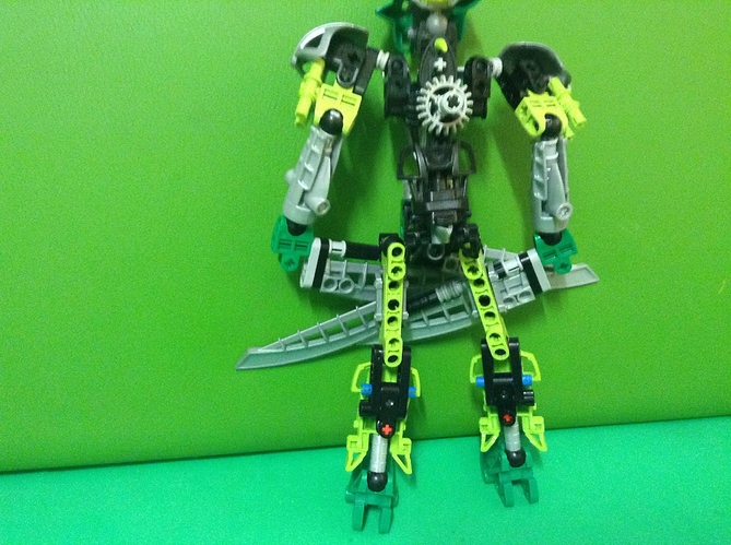
The back of the thighs could do with more coverage.
The midsection is too thin. It makes it look like the lower ha;f of his body atrophied. Overall though, I think this has potential.
A very interesting take, good job 
The upper legs look a bit odd, but everything else works out fairly nice.
Looks interesting
The MOC has a lot of gaps, the thighs look a bit too thin and the back could use some work.


