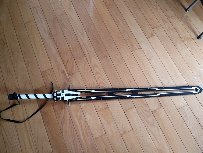
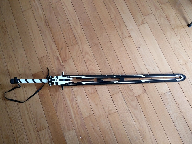
Beauty in symmetry
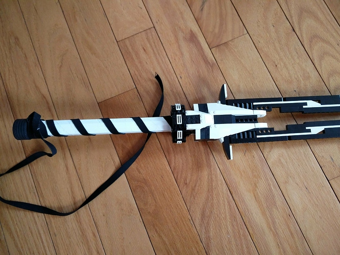
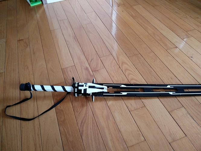
This sword preceded Singularity but I had to make adjustments to the handle before posting it. I could’ve repeated the same technique used for the handle to avoid using non-lego materials, but I don’t like to repeat techniques because that would be boring and takes away from the uniqueness of each sword. After much consideration I felt like I had no better option than to cover the handle because while other options meant having less structural integrity and/or being uglier because you can see the individual parts.
I love the colors and how they are distributed and the overall build looks good. I suggest you use Duplo bricks for aesthetics.
For which parts do I use duplo bricks?
Everywhere.
Everything…
I don’t see how they can incorporated or why they need to be.
it’s an April Fools Joke. Go check the Brickionicle topics. It’s named something like "important changes to brickionicle.
Love the sword. Looks very awesome.
Pretty cool, reminds me of Genji slightly.
Where’s the Duplo, though?
My other blade that I have not yet posted looks more like Genji’s sword than this does. I don’t see the resemblance. Perhaps the black ribbon is kind of like Genji’s strips of cloth attached to his helmet.
I want it in my hand.
That’s why I always make swords that you can hold and swing around (slowly). Half of the pleasure is holding it your hand.
Thought this was a real sword until I saw this was made of Lego. Honestly so cool, the black and white colour scheme is great and the sword design looks firm and smooth. One of the coolest and most unique things I’ve seen made out of Lego in a while.
Is it me or does that hollow slit in the blade make it look like a rwby bow / sword combo weapon?
I like the choice of colors here and how well they’re distributed. They also fit well for the duality theme you look to have been going for.
Maybe one day I will make a transformable weapon
I just love this
Gorgeous.


