Looch
January 7, 2016, 3:50am
1
“That thing was too big to be called a sword. Too big, too thick, too heavy and too rough. It was more like a large hunk of Iron.”
“Swords are tools of justice. Not used in anger. Not used in vengeance. Unfortunately for you, this isn’t a sword.”
“I’m gonna make them give back my past.”
“Snake, try to remember the basics of CQC”
So yeah.
I actually made Looch V2. For reals this time.
Da da da daaaaa.
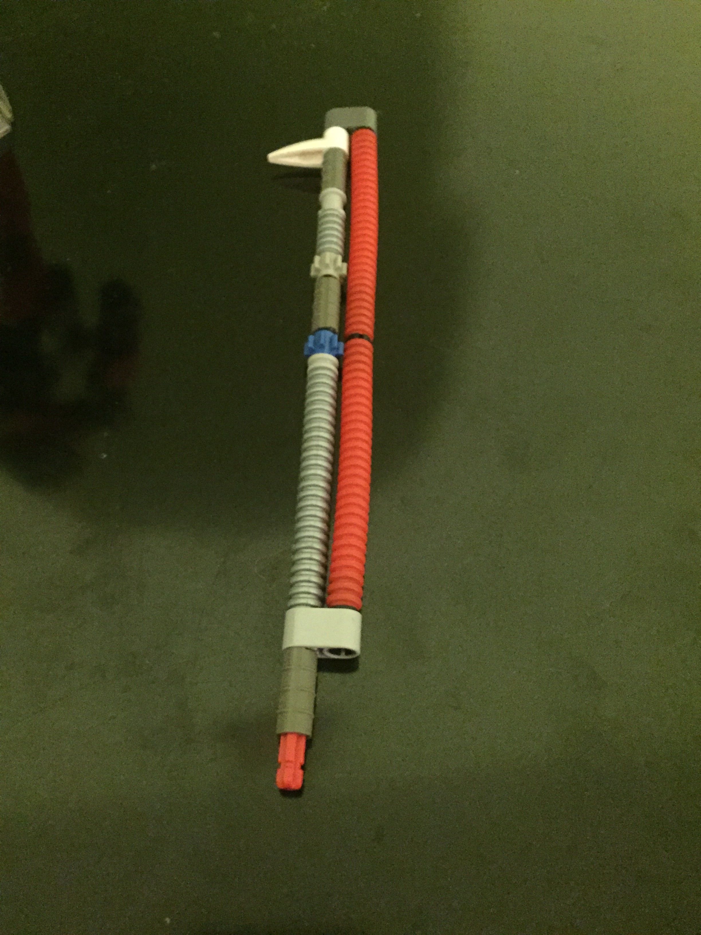
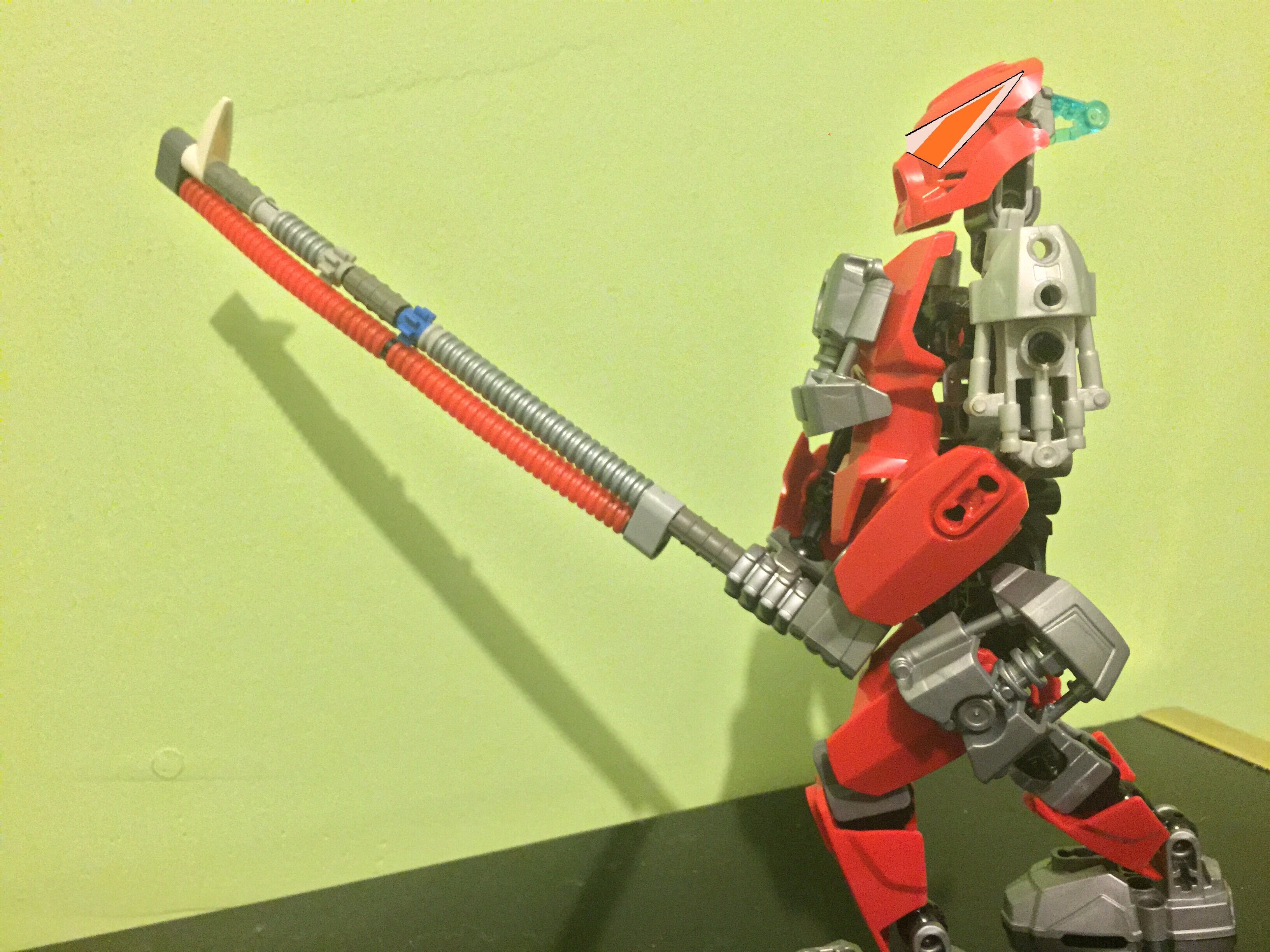
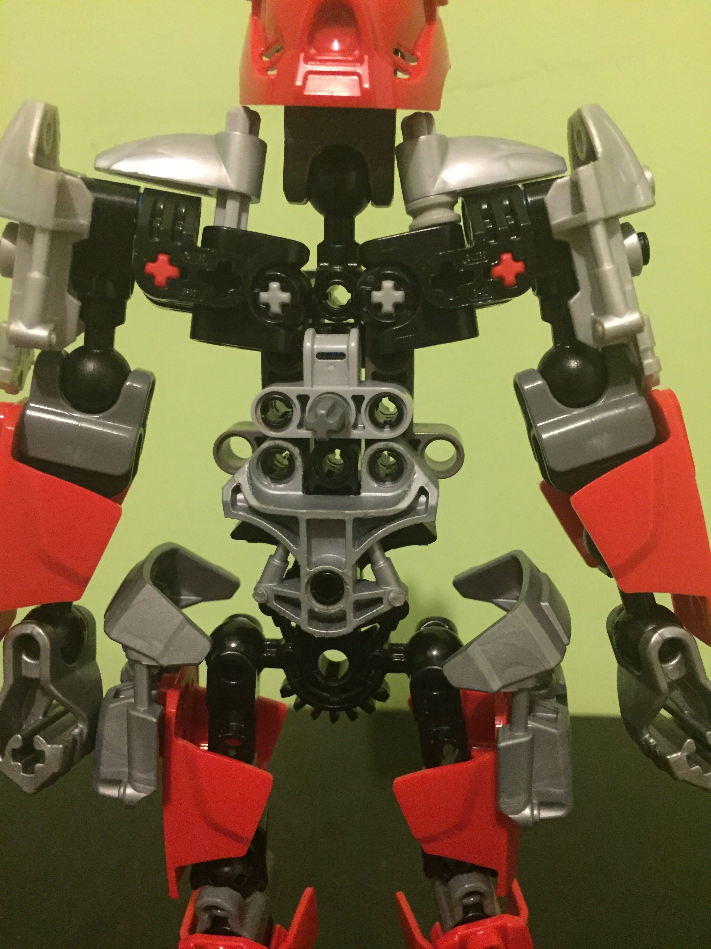
Full shot of the “hunk of iron”, which I call the Doom Blade of Doomy Doom. The single blue gear is a nod to the original Looch V2. (As featured for 5 seconds on the Omega Looch episode of “MOC Spotlight”)
Mid swing
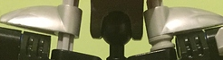
Rear shot
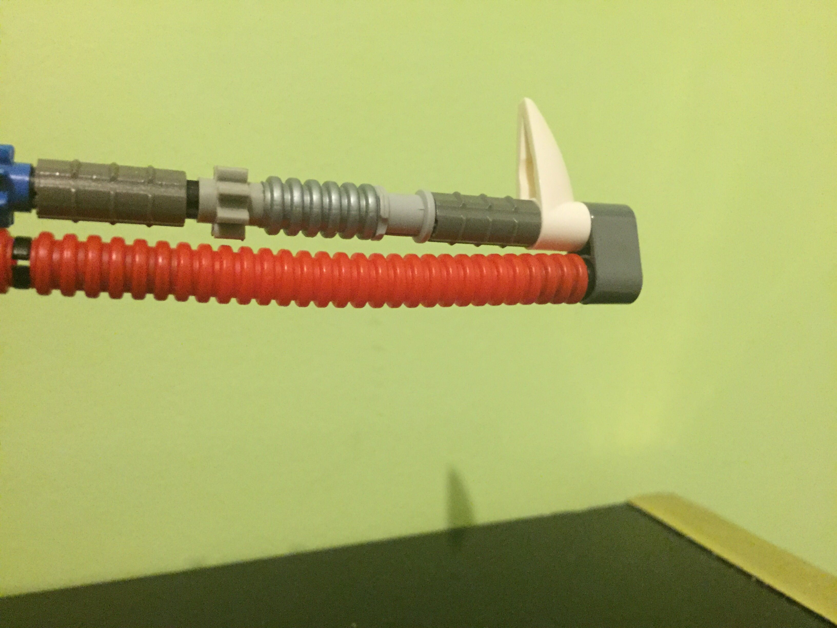
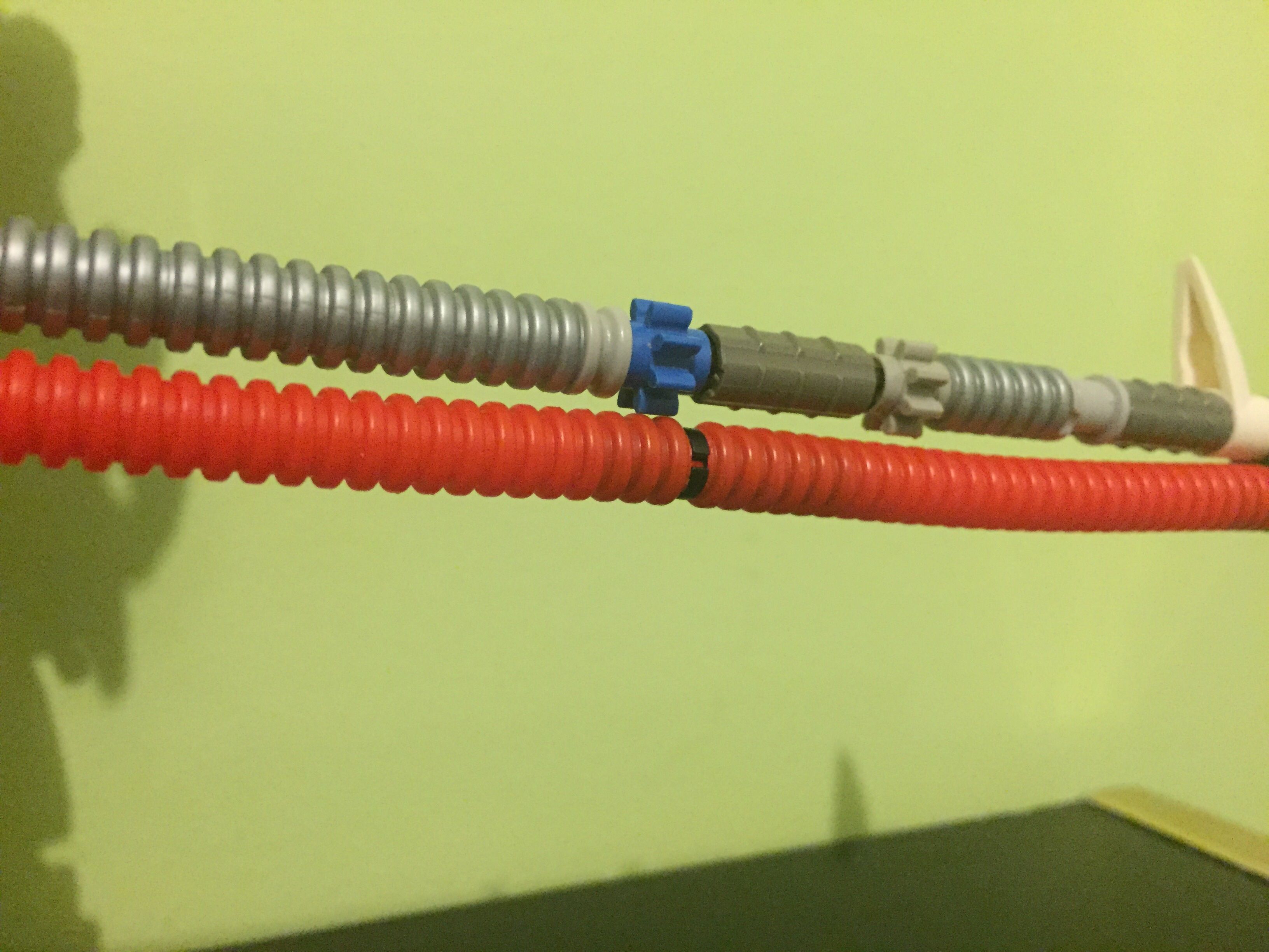
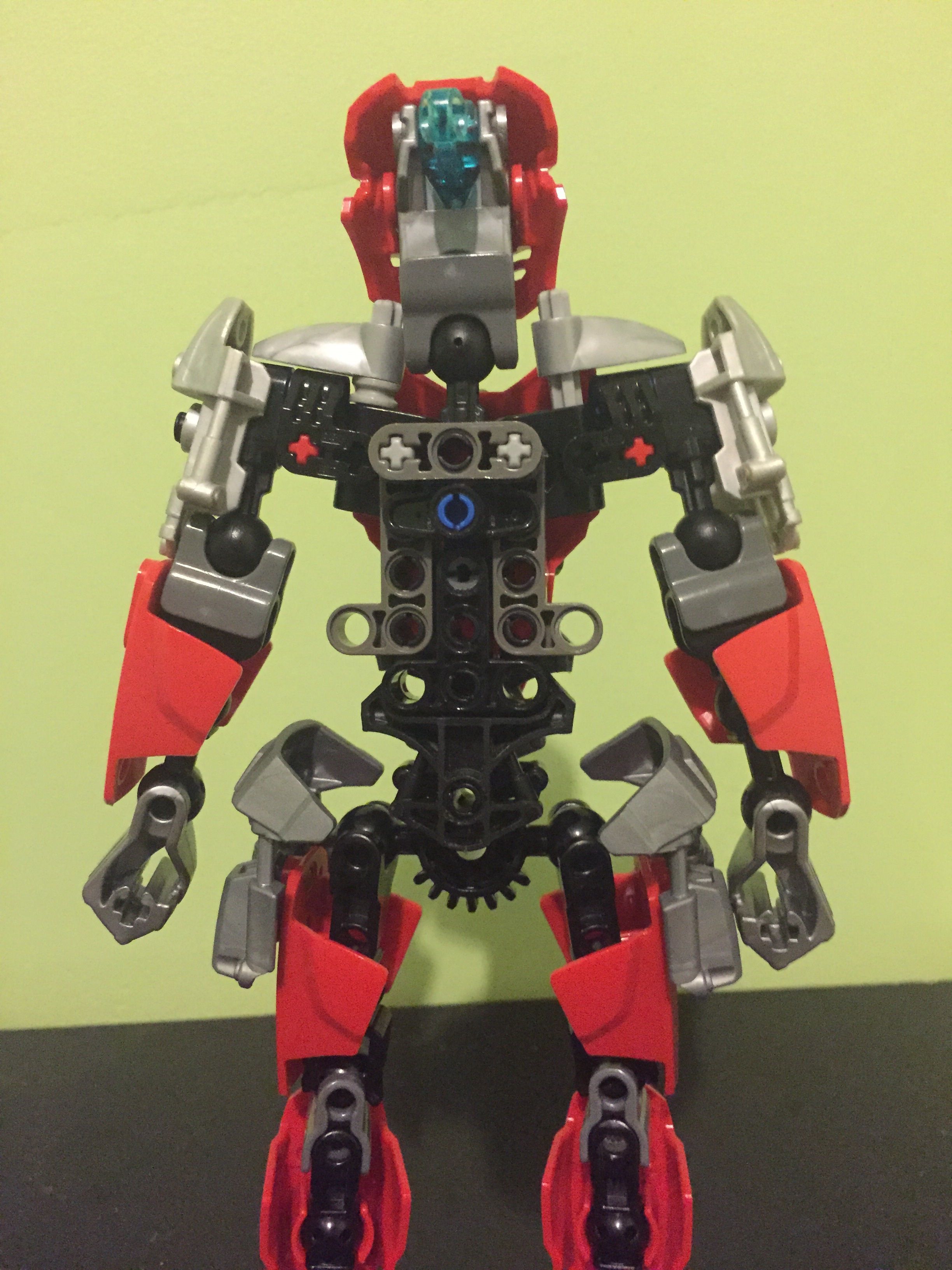
Under the hood
##ゴゴゴゴゴ
26 Likes
Still should have added the blue axle from the original as the shield.
1 Like
Plunko
January 7, 2016, 3:54am
4
1/10 Original Looch V2 was better
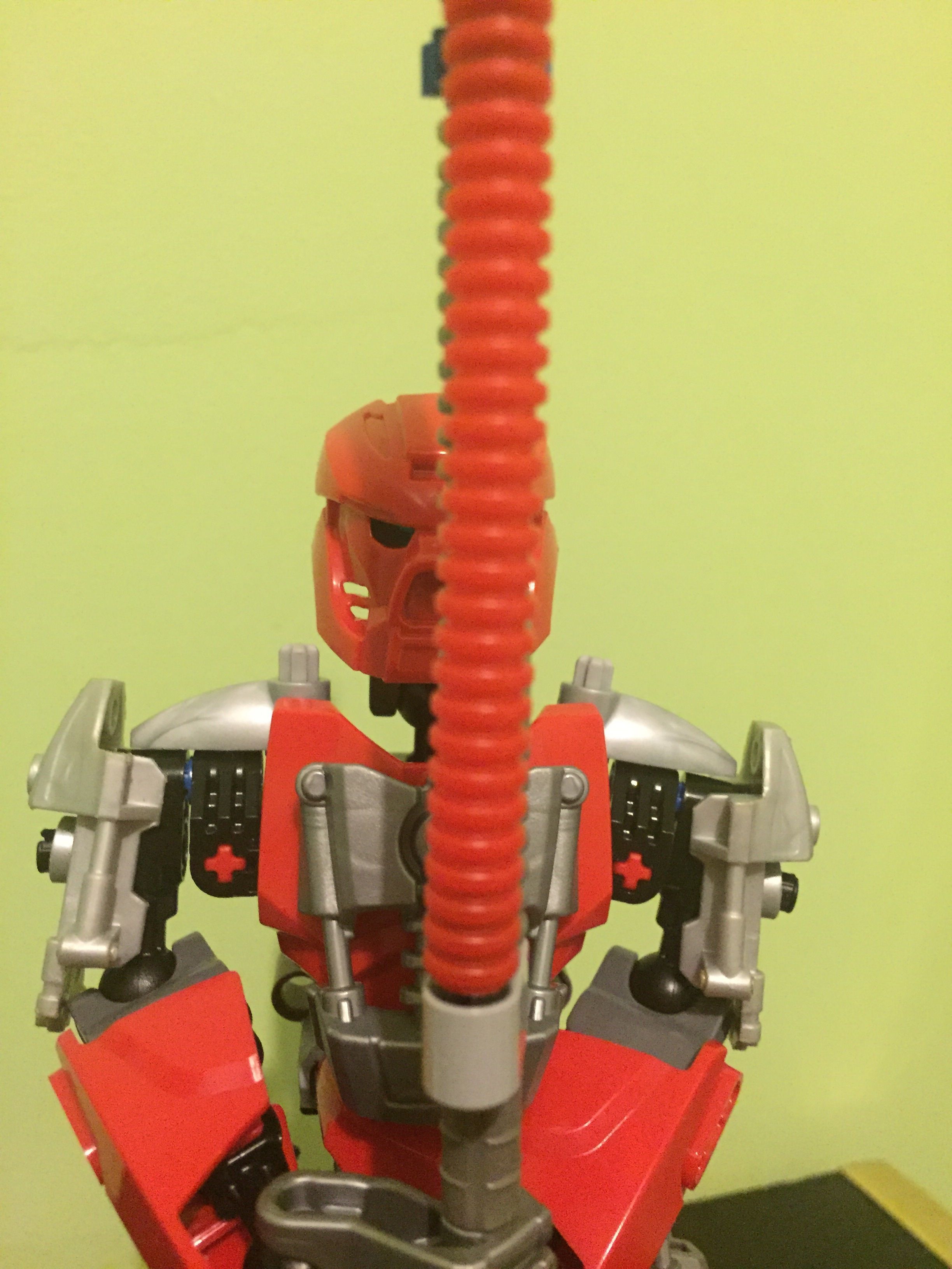
/s Very nicely done by the way, although the chest sticks out a bit
6 Likes
Looch
January 7, 2016, 3:55am
5
If Elder Scrolls taught me anything, it’s that you can’t wield a 2 handed sword and a shield at the same time
4 Likes
Soooo…
He can’t move his arms forward, huh?
1 Like
Looch:
only slightly though
I see.
Still looks great. I think he is a pretty cool upgrade from V2. He seems more articulated.
Stoax
January 7, 2016, 4:19am
9
It’s beautiful. I give it a V for victory. Chest sticks out a little though.
Looch
January 7, 2016, 4:23am
10
I just noticed that.
I guess it’s a side effect from posing.
The piece that I used is loose and tends to pop out occasionally.
1 Like
Nicely done!
I like it.
1 Like
Plural
January 7, 2016, 12:52pm
14
Looch, this looks fantastic. The Silver and Red really work together and its build is great, but similar to what @Stoax said, the Chest sticks out a bit too far.
1 Like
Triple
January 7, 2016, 1:02pm
15
Looch in the flesh!
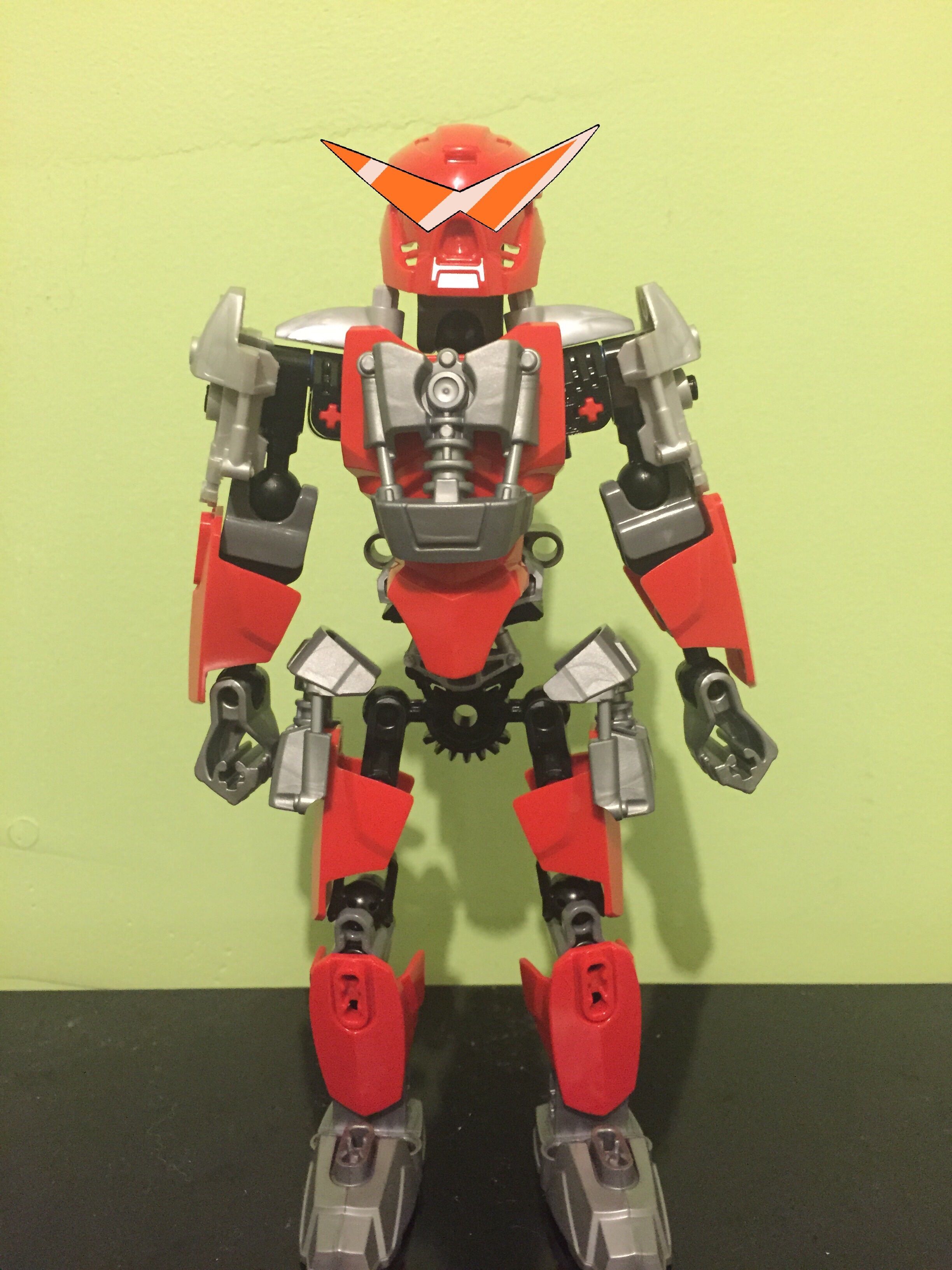
Nice MOC. I like his custom arms and torso. The only thing that bugs me is that a half-spacer is missing below one of his Bohrok eyes.
4 Likes
Welp. The MOC is simplistic, that’s most of what I have to say. Generic build, generic color scheme. The sword is really the only unique thing going for it. I would suggest trying to remake the concept of the MOC to fit what I believe is his best aspect, the sword.
Basically find a way to make him look visually weeaboo
1 Like
Looch
January 7, 2016, 8:33pm
19
tbh the one that I had there flew off in an incident I dub “Slippery Spaghetti”
Donate to the Looch Fund and I’ll buy a bunch of magical girl figures and tape their accesories to this.
https://i.imgur.com/f7FdEdG.jpg
My blue gear manifested a stand and this is it
Rockho:
Why
The extension or the missing half spacer?
1 Like
Wow. Very Go. Much Katakana.
1 Like

 a bit gappy though, and the shoulder design could be better,