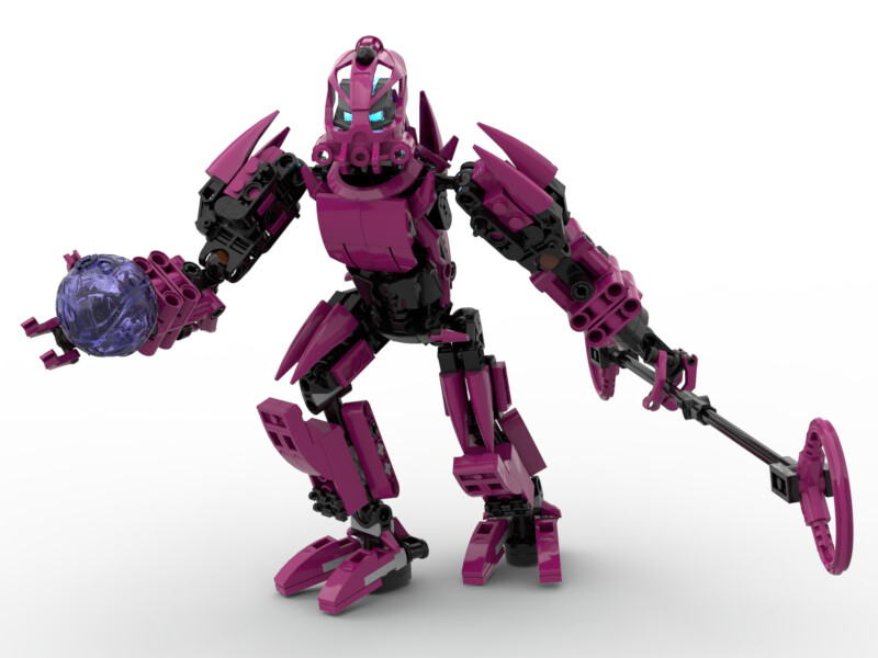
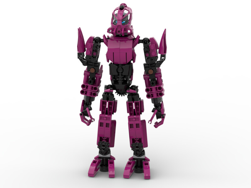
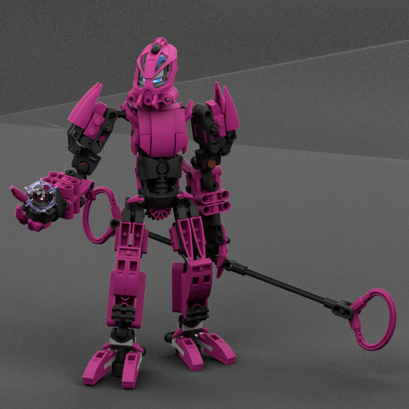
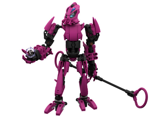
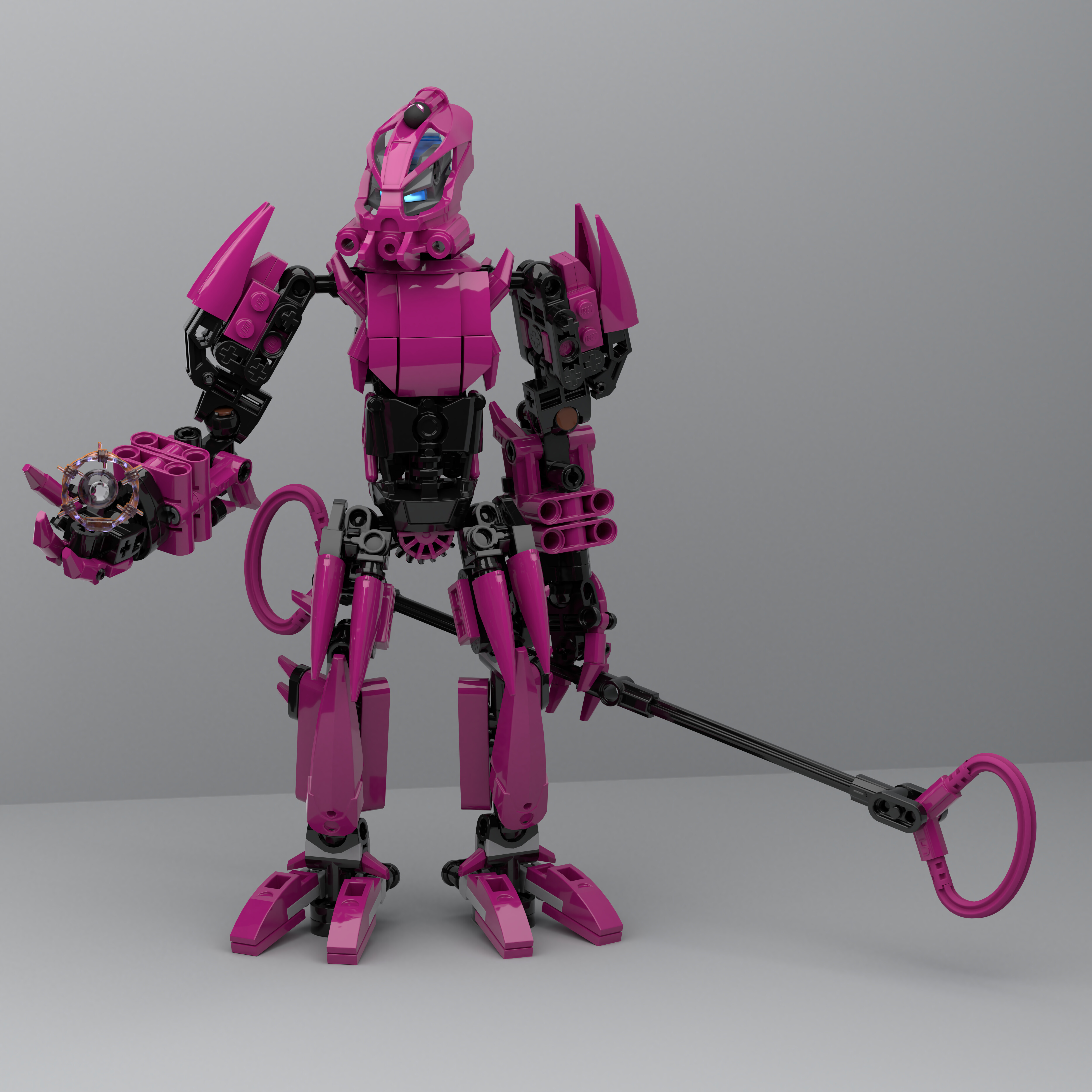
This is a fairly new MOC of mine. My single goal behind this build was to create a Toa of Gravity without using either of the two common shades of purple in Constraction. As a result, Maka uses Magenta as his primary colour, and, with the obvious exception of the mask, this MOC is completely purist.
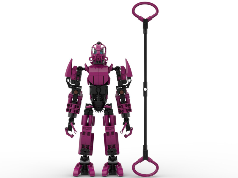
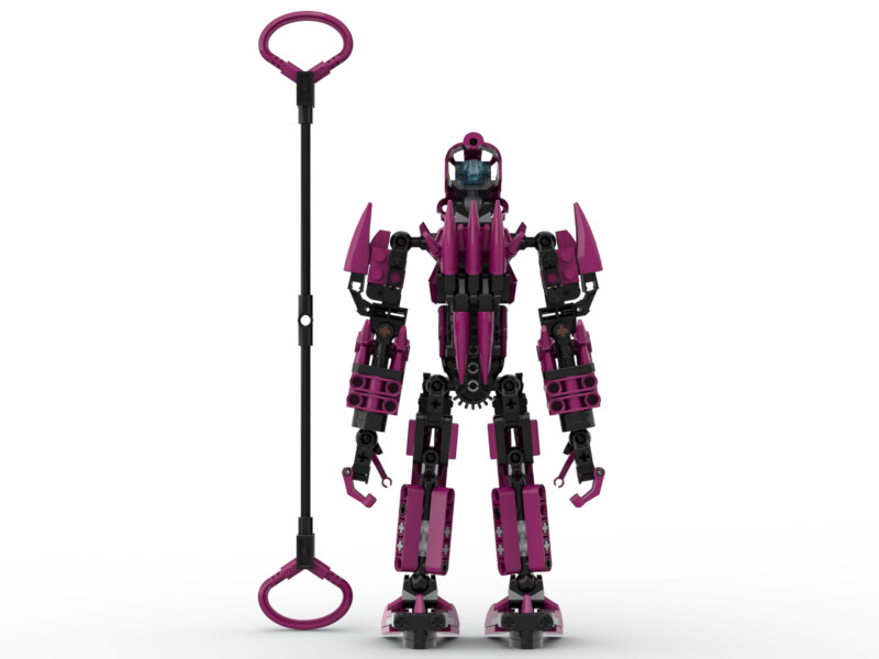
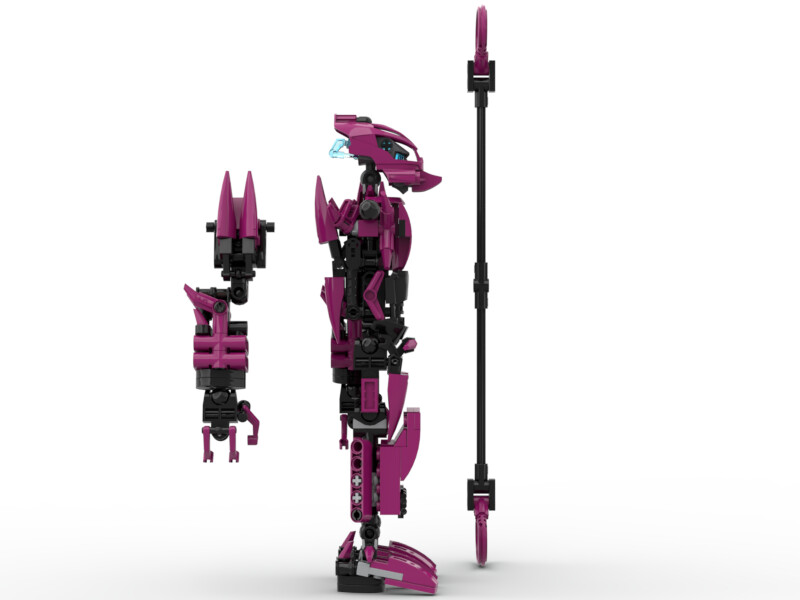
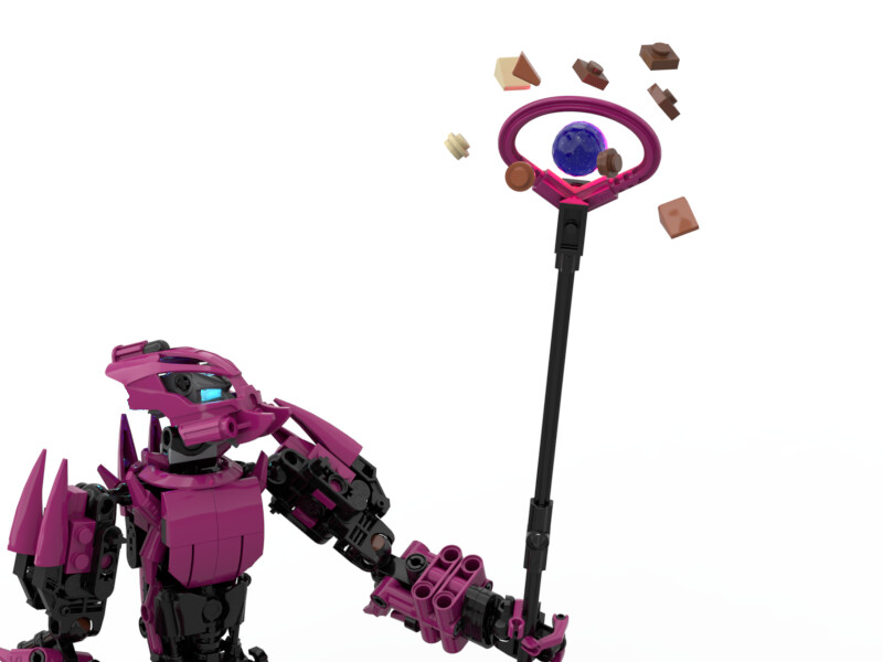
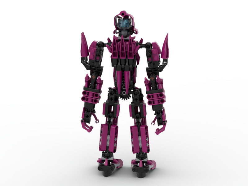
Here's a few other angles of Maka and his Loop Staff:
The style of this build was driven by the limited number of useable magenta parts, rather than any intentional creative decision. However, I think this worked out well enough, with a fairly consistent theme of both spikes and blocky armour.
I’m open to any suggestions for improving the build, within the constraints of magenta-based purism.
He’s looking great, top-notch use of system and he doesn’t look too blocky. The feet and legs in general are expecially nice. The stuff is simple, but kinda piculiar, I wonder if it can be used to launch the ball with the flex of soft axles.
You might be able to if you built it in real life, but that wasn’t really my intention. The staff is meant to be solid metal, and the “ball” is just the best “gravity effects” I could come up with in stud.io.
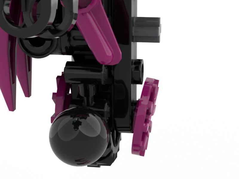
I did think it might be cool, though, if he could create “gravity wells” in the loops:
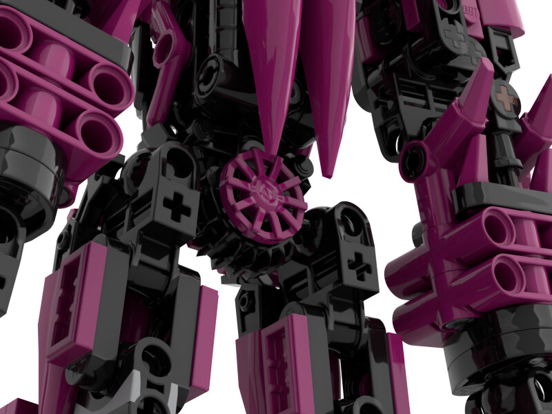
Pro-tip: take the magenta spikes and flip them around so their hollow undersides are exposed. Old bionicle pieces are “anti-bricks”. They have lots of exposed gaps as a way of saving plastic, making the pieces lighter to reduce shipping costs, and as a side effect, giving them a more technical look. If you just took a generic magenta 2x2 brick and flipped it so the underside is exposed, it would make for a more bionicle-like chest than smooth curved slopes.
(The ones on his lower back clipped too badly to just be readjusted if I flipped them)
It works on his thighs, but I’m not sure if I like it on his torso; his torso armour is somewhat-intentionally spiky, and I feel like the hollow spikes take away from that. Plus the shaping of the shoulders looks a little off.
I like it on the thighs, though, because the “spikes” weren’t meant to be spikes there, just panels, so the greebliness of the backs of the spikes helps.
I really tried to, but that’s just such a tricky piece to use. I don’t like the look of them as actual hands, and there’s not much else to work with in terms of connection. It would be nice if I could have worked the spiky fingers into the armour, though.
It might just be because I just put away a bunch of early G1 parts, but the two fingers/thumb is more nostalgic of the classic Mata hand. That’s my little vote
I also think leaving the shoulder spikes smooth was good, now the smooth-to-greeble ratio is pretty well balanced between the arms and legs
It’s not that I had any particular issue with the initial shin design, but once I saw that Part 15362 was recoloured in Magenta, I knew the piece would fit great with his more “spiky” aesthetic: