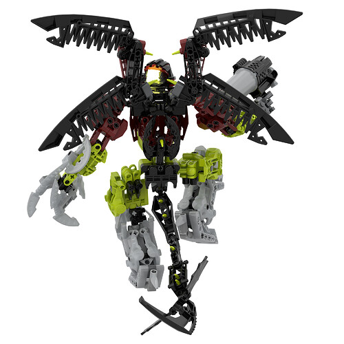
Makuta Spiriah Revamp

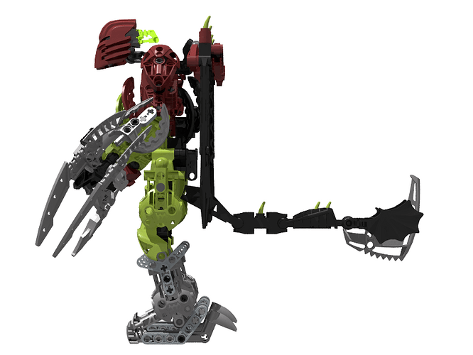
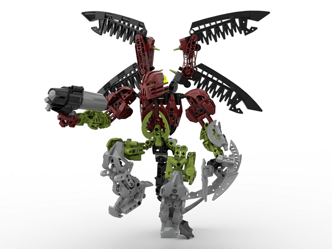
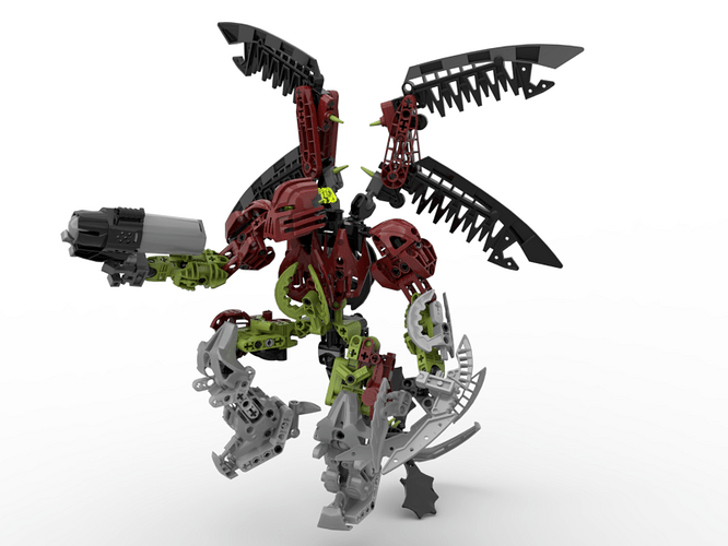
As with a lot of Bionicle combiners, the official Spiriah model leaves a lot to be desired. I decided to take a crack at giving him a new build while still keeping the important features of the original.

Spinny .gif

Spiriah Spin.gif - Google Drive


The most obvious change is the removal of the Tridax Pod. This is because he never would have used one in-story, and Greg has said that it was only included in the original model to promote the play features of 2008.

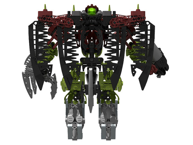
As for the things I kept the same, the most important thing for me was his body shape; the original model has extremely wide hips, and I wanted to keep that. I’ve slimmed them up a bit relative to his shoulders, but they’re still pretty wide.

Next was his colour scheme; dark red and lime are the main colours of the original model, though the gray shins stand out as well. I translated the latter into a kind of boot-like appearance, being partially inspired by the large Mantax feet. I also made the colour more metallic, to stand out more.

The large feet, combined with the wide hips, lead to the entire leg design being really bulky, which I think works pretty well. He now has a second knee joint, but this was more for poseability reasons to offset the thicker limbs; I would still consider the model to just have standard knee articulation in-story.

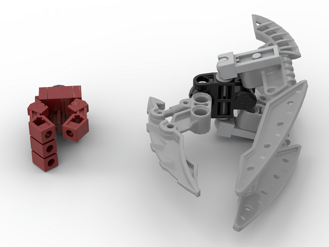
There’s nothing too special about the arms; I cleaned up the colour scheme a little bit, and added some more red. The hands, though, both now have finger articulation. His right hand has fairly standard Exo-Force fingers and a connection point for his Skyblaster, while each of his claw-fingers is on a ball joint.

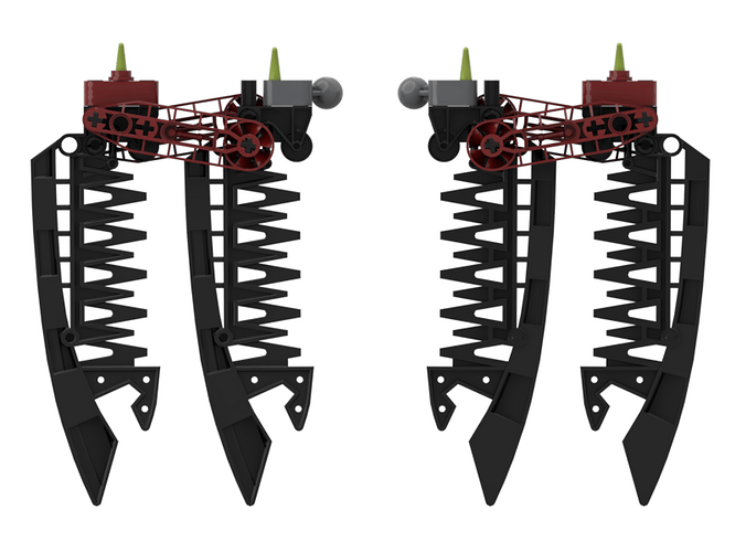
Next, his wings got a massive overhaul. I kept the original colour distribution, but that’s about it. I moved them closer to the middle of his back, and added more poseability. Each wing has two points of articulation, plus a rudimentary open/close mechanism. While I wouldn’t exactly call it a “function”, per se, each wing has a four-bar mechanism that stops the blades from rotating independently, and maintaining a nice “sweep”.

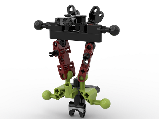
Finally, his torso. The skeleton is made up of a number of ball joints, so it should have some amount of flexibility. Pretty much all of the armour pieces can pivot as well, to adapt to whatever pose it’s put in.

It’s worth mentioning, though, that this torso flexibility is theoretical; stud.io doesn’t play well with multi-joint constructions, and the armour alignment would have to be pretty precise. Besides, I never really intended to introduce torso flexibility; it was more of a side effect of the choice to use Bohrok limbs for the hip joints.

And finally, the tail; there’s nothing to really say here; I liked the original choice of blade for the tip, and I integrated the bat wings a little smoother. I’d imagine he could use them as a kind of stabilizer during flight.


Credit to Khingk for the non-shapeshifted Jutlin.


Thoughts? Is there anything you would do differently, either in terms of creative design decisions or build details?
EDIT:

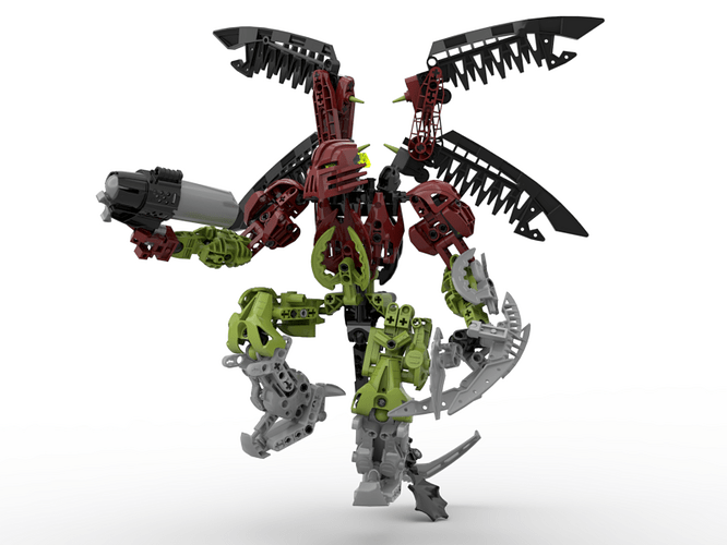
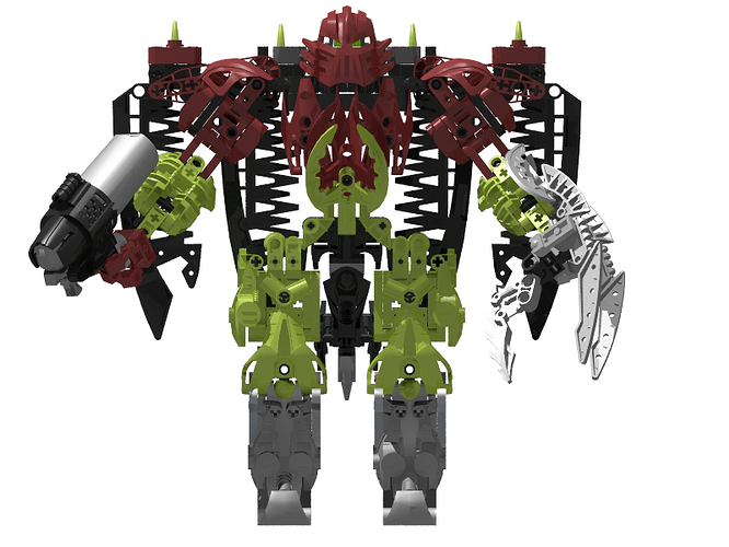
More or less immediately after posting the topic, it struck me that he might look better (and be more accurate to the original colour blocking) if his knees were silver:

Any preferences?

33 Likes

i like the wings!
the torso is also nice.

He looks a lot better than the original combiner, nice job!

The actual MOC’s construction is slick!

However, the color blocking needs to be improved upon.

In what sense? Do you mean in terms of accuracy to the original, or overall design?

I think he means that it looks like Spiriah’s wearing green pants. And while I’m here, it’s also worth nothing that his proportions are wack–his torso and legs are super short and wide, but his arms are relatively normal-looking, and he doesn’t look like he has a neck.

Sorry I meant color distribution, but still the colors need to be spread out more evenly.

imagine not knowing the difference between the two can’t be me :wink: :wink:

1 Like

I do think that he looks better with the silver knees. Very interesting colour seperation in general though, keeping each section in a single colour actually works really well.

now I can’t unsee that

When you are that much of a fashion icon that your lime green pants merge into your legs.

2 Likes

wouldn’t you mean lime green pants?

1 Like

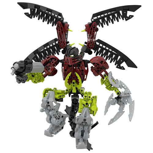
I took a shot at recolouring the thighs:

I added red to the sides, and black to the back (to match the black back of the torso). I kind of like the recolour because it’s more similar to the thigh colouration of the original model, but I also feel like the colour scheme looks a little too chaotic now, with the red on the thighs being disconnected from the rest of the red.

I also tried out making his right hand gray to match the Hordika neck that was used for the original hand.

2 Likes

I actually do think that it looks better segmented. Like you said it looks a little chaotic now, the colour separation actually looked really good in my opinion.

1 Like

This is well done! A great improvement!

Hips are fun. Have you built something like that in real life? Does the empty socket rest on the axle from the bohrok limb to help supoort weight?

Yeah, I think I’m with you one that. I’d still like to get a bit of red on the thighs somewhere, but I’m not sure where. I do want to keep the black on the back, though.

I haven’t tried building it with real parts yet, though I hope to at least test out the individual components of the build eventually.

And no, the empty socket doesn’t really support any weight. I just put it there to fill what would otherwise be a really narrow point in his hips. It does slightly restrict the axial twist of the hips, but this is more than made up for by the two end-mounted ball joints in each knee.

Mostly pretty good, just the shoulders (arm attachment) are a tad bit weird, but I dont know what to change. Maybe they should be thicker.

Here’s some new renders I did:

There’s no real changes to the build; just some minor recolours and a pseudo-“marbled” Kanohi

4 Likes