Well, you did an excellent job making him look like his portrayal in LoMN, great job! I like the MOC, but won’t go too into detail on a review since most of the cons are already stated. I’ll just reiterate that some more red would help round it out, and that the wings are great! Admittedly, I’ve never been a fan of his mask in the movies, I always liked the set’s version of the Kraahkan better, but it looks pretty good here. Nice job, and keep up the good work!
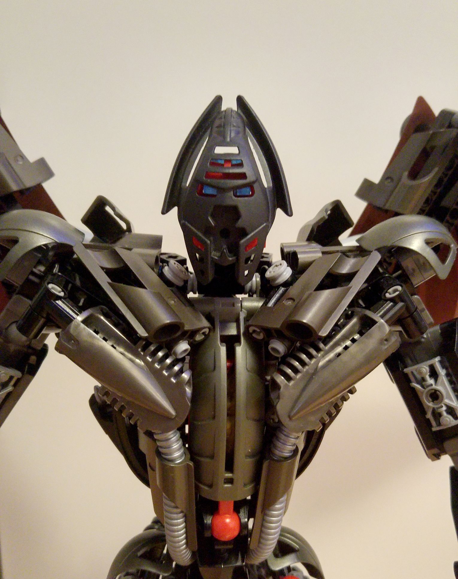
The head looks a bit small, but the rest is fantastic! Also, I would love to see how he looks in an official Kraahkaan.
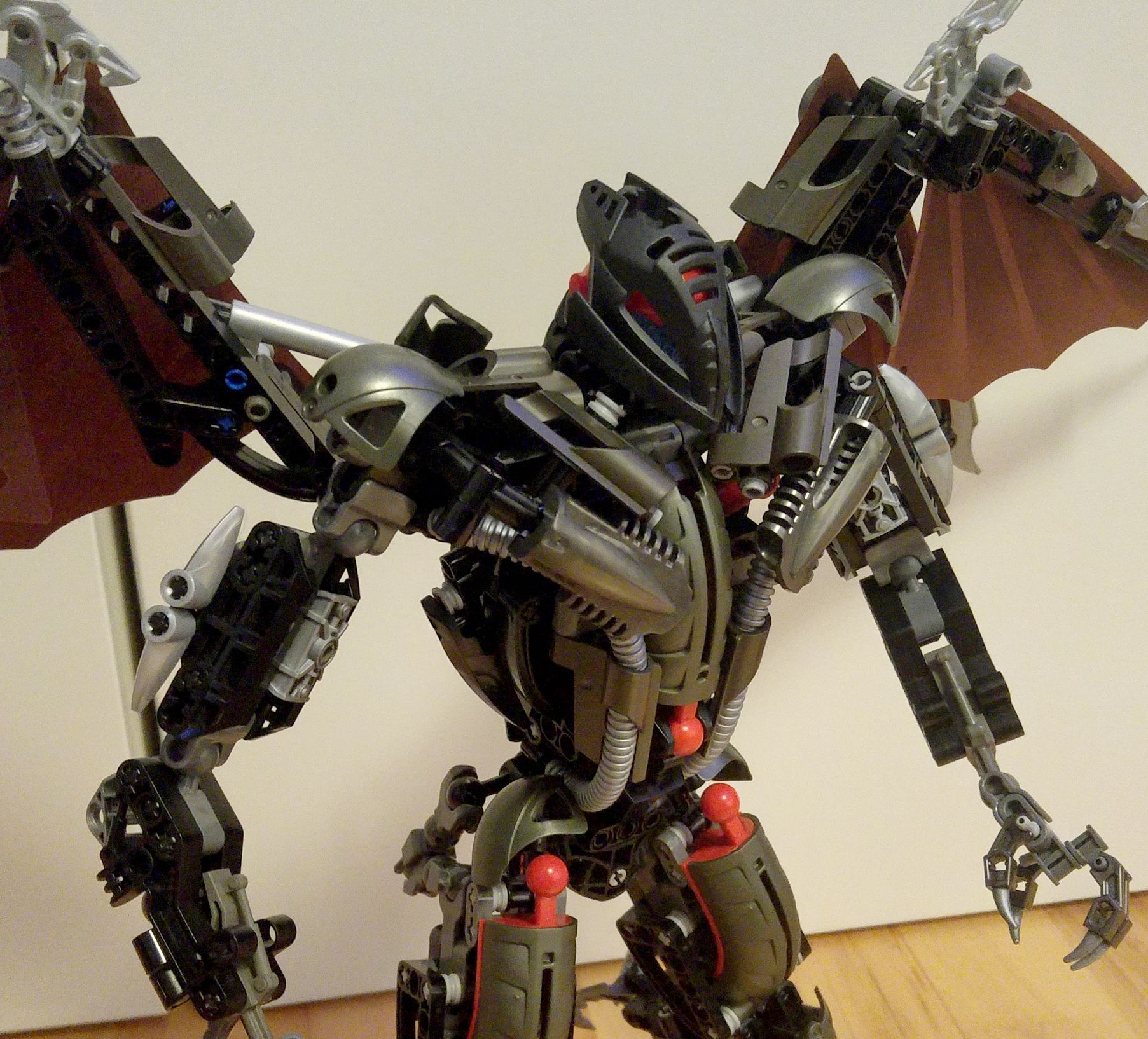
Oh man, that looks sick. He looked cool before, but that… that is amazing. He could only look better with the special edition “movie” version they released, which is basically a darker, shinier, and more blocky version of the original set version.
I got to say this looks great.
Really captures the movie version of Makuta perfectly.
Though the Mata Red pieces stick out of place.
Bro! Bro! Go to the TTV vessel page (at https://www.vessel.com/channels/thettvchannel ) right now!!!
In other words

Will Venom give out his first 15/15 score? 
3 Likes
I cannot sign up haha
What exactly is this?
If the mata red wasn’t there maybe.
One easy way I think you could cover up the red balljoints would be to put the smallest ccbs she’ll on top of them. Really amazing though.

Those three clashing red protrusions bother me so much.
Well coming from someone else with a makuta revamp I kept those uncovered too. It adds to the main look a bit.
If the red is to be left uncovered there should be more so it doesn’t look out of place. Here the only red are those three ball joints, so it looks it of place.
2 Likes
Or, adding more Mata red would work too, probably. That would make the MOC even better, IMO
2 Likes
Nice Revamp. I would however suggest rearranging the wings to look a little more symmetrical (the Ewok flier printing is very noticeable).
First off, let me say that this is one of the best Makuta mocs I have ever seen. It looks remarkably similar to the source material and I’m thoroughly impressed by the shapes that make this up this beast. It really bothered me that Ven gave this a 12.5, deducting most of the points because of colors. The shades of gunmetal, black, and silver here match up fine imo and I give this a 14.0.
3 Likes
He actually gave it a 12.5 but he did the math wrong
3 Likes
Thank you all very much for your feedback, I am trying to add a bit more dark red to the build and I have already removed the mata red kraata container pieces. I haven’t decided yet whether I should keep the 3D printed mask, because the original one fits quite well, what do you guys think?
I’m not quite shure what to do with the arms, but as soon as I’m happy with them I will probably post it here ^^
1 Like
I think adding more Mata red would’ve been better, since Makuta traditionally have dark grays and red as their colors. As for the head, if you want to stick with the movie aesthetic, keep the printed mask, it looks great. However, as a standalone MOC based on Makuta from every media, I prefer the original mask.
1 Like