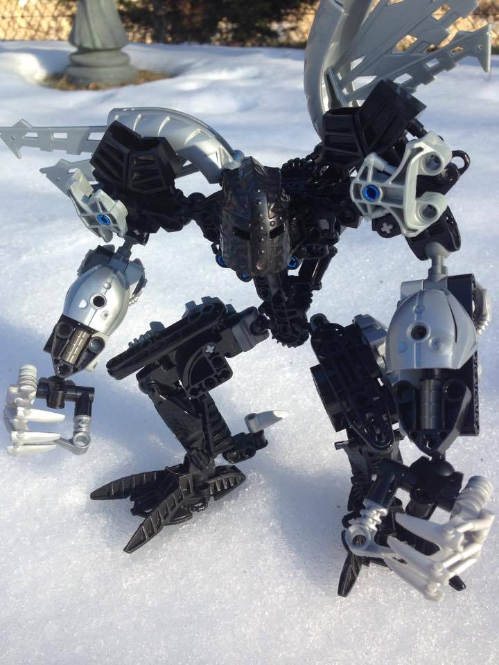
major changes include the removal of the Va head, and an alteration to the shoulders. I have also upgraded his arms so they now are straight as opposed to permanently bent. minor changes include tbe adition of extra leg armor.
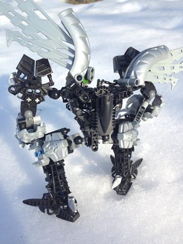
here’s the back view. nothing special really.
Holy Mata Nui this is awesome. I saw it and my eyes exploded from how awesome this is.
I love how consistent you kept the color scheme. For me, it adds a lot to this MOC. I also like the build. To me, it definitely looks like a Makuta. The only thing I can really say for cons is that there is no elbows and the arms appear to have limited mobility. But either way this is a great MOC in my opinion.
Well there’s another point to critique. The elbows look more like shoulders. But either way the MOC still looks pretty good.
“Black and silver is overdone and as a result any MOC that uses it automatically sux regardless of how well it is built.”
ahem
Anyway, I wanted to bring up…
this.
Those shoulders make things super wide and just look awkward.
I think that’s how I’d describe the whole MOC. “Awkward.”
Like, the hands and their blue-pin connection free-rotating claws just seems weird to me.
Also, while I appreciate his more hunched over look, and I think it’s very interesting, I feel it only clashes with the humanoid knightly Karzon helm.
The lower arms being so long while the upper longs are not only short but also sticking up like towers just seems off putting.
However, it does have its pros. As @Ekorak said, the wings do work somewhat well, if it weren’t for the fact that he doesn’t seem like a character that could even properly use them.
Also, I’m curious, and would like to get an idea of what pieces you exactly used for the neck connection.
While I will give you that Black and Silver may be overdone, I would argue that milking a quick “criticism” by mentioning it is just as tired and overdone.
Just a standard hand piece. And as for the color scheme, I was trying to create the appearance of a shadow (the blue pins are meant to act as highlights to the shadow). locked in by metallic armor. You’ll notice that the silver’s only really on the outside of the MOC. That’s also the reason I switched to the Karzon helmet. It looks like it’s keeping something in. As for the shoulders, they’ll be changed as soon as I can figure out how I did them the first time.
my only real complaint is just how ugly the hands are, the rest is at least alright, I like the lower arms(add some tires to the elbows to fill in that gap if you can though) the helmet was a good choice.
overall I like it.