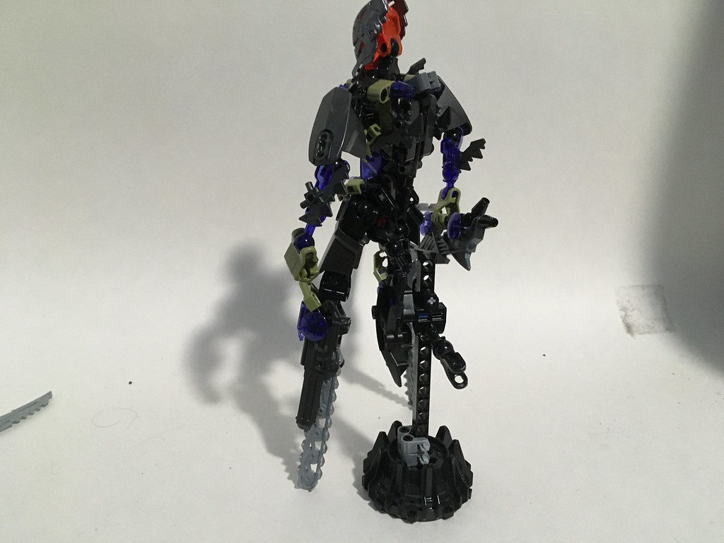
I was hoping to get Pouks done but it’s giving me troubles. However, thanks to being overly nervous about posting, I have a ridiculous backlog of MoCs. To keep it on theme, I thought I’d get some opinions on my model for the eventual Marendar contest. I wanted to do a sort of meta-textual design. Marendar was an adaptive killing machine, designed specifically to be opposition to Toa… So why not HF armor and post bionicle colors? I am a proponent of HF, so this isn’t meant as a slight, merely an interesting design concept.


So no, I haven’t gotten it to stand upright, but some things are worth the sacrifice. Before anyone asks, I actually don’t think I’d heard about the Chainsaw Man manga before I built this. I took inspiration from MrBoltron’s Voluraan, The Mach Runner 03 | MrBoltTron | Flickr MoC, and originally this was meant to be in a no-feet HF team that I’m 2/3 done with. However, I really liked the idea of the MoC representing the Marendar more, so I shifted the build.
Not really what I imagine Marendar to look like, but the concept is very interesting. I look foward to seeing more MOCs from you!
I don’t find the design to be threatening or durable enough to look like it takes out Toa to be honest but I think the concept of your idea for those colors is awesome and you should continue to play off of that. Definitely adds to a more alien and new threat feel. I like the chainsaws on the legs, although I’m not sure you should keep them in that exact way. Play around with it some more, you seem to have a good imagination, I’m sure you can find ways to improve it to your own taste!
I think the biggest issue is that it’s not quite big enough to feel like the “bane of Toa,” which inhibits the ability of this design to really feel imposing. Don’t get me wrong, it kicks ■■■ and makes perfect sense, but not on the scale that really feels appropriate for Marendar.
I agree, it looks more like a Toa who lost his legs.
And just to be honest with you, its not a bad design but I wouldn’t vote for it, solely because to me it does not look like a G1 creation. If it had more G1 parts and vibes to it I’d be more inclined
These are all fair enough assessments. I don’t think I could make it much larger without sacrificing the Olive Color scheme, which was the impetus for the original version of the MoC, so I may keep it as is and accept that it wouldn’t receive winning votes. I’ve mentioned it before but in other posts, I’m totally ok with not winning in these contests. I think I hadn’t considered the scale of Marendar when originally converting the moc. As much as Marendar is a seperate entity, I tend to conflate it with the Baterra a lot. I appreciated all the kind comments on the MoC, especially if you thought it was cool but not necessarily fulfilling your vision of Marendar, that’s a very wholesome attitude to take in these competitions.
Very interesting design! On top of that, the gunmetal, olive green and trans purple form a very unique looking color scheme.
nice idea for the look, but I never imagined that the end of toa would come with a stormer helmet.
I mean hero factory kinda (Not really) killed bionicle soooo…