Hello everyone. I wanted to take the time here to look at and examine the G2 Toa masks out thus far, and how they compare against the original set from G1.
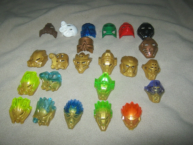
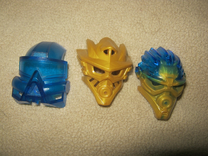
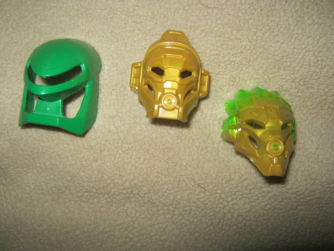
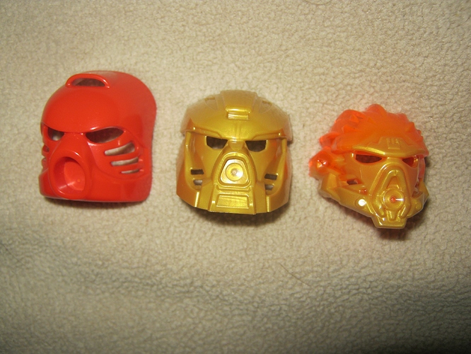
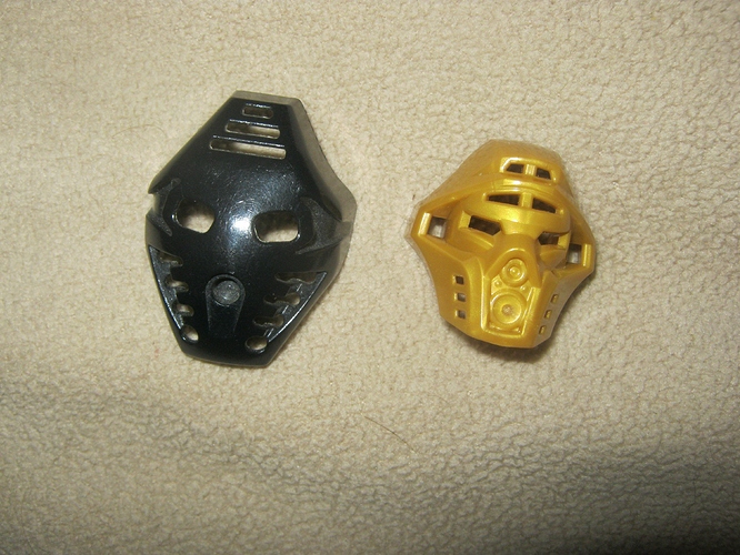
Here’s my collection thus far. As you can see, I’m missing four G1 gold masks, and of course they never relased trans-melded versions of the 2015 Kaukau and Hau, and I have yet to purchase Onua Uniter. Still, despite these gaps, I think I have what I need to talk about the differences between these masks.
(The normal-colored G2 masks weren’t present because of being used elsewhere at the time of taking this picture.)
Let’s start, shall we?
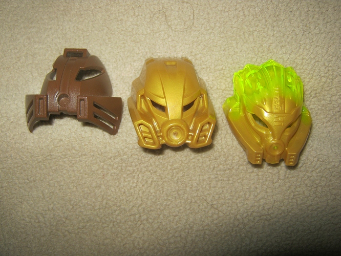
Let’s start with Pohatu, my first set in every wave he’s in, with the exception of 2008. Anyway, the original Kakama is a pretty popular mask in MOCcing, and it’s not hard to see why. The overall triangular shape is very pleasing to the eye, and fit well with its user’s mountain-like, bottom heavy design. The elongated eye slits and vents along the sides and on top give the impression of speed even when in rest, and it all just comes together very nicely.
The 2015 Kakama opts for a boxier, more trapezoidal or hexagon-esque look. The eye slits are made much smaller and shorter, but retain their overall shape, and the vents along the side, while bulkier and more forward-facing, still feel fast. The top vent, meanwhile, is subtly hinted at without actually being present. However, if I had to pick a gripe with this mask, it’d be the mouthpiece, which is emphasized a little too much and gives him something of a derpy look. While my least favorite of the three, though, the 2015 Kakama is still not a bad mask by any means.
The 2016 Kakama looks at once very similar to and very different from the original, bringing back the inward-pointing vents but removing the bottom corners of the mask’s ‘triangle’ in favor of a slimmer and more curvy look. It also departs from both of its predecessors by making the eye slits more of a downward slant in front, and the cheeks are sunken in right above the vents. The top vent is gone completely, but in its place is a lot of very nice-looking Okotian detailing (I wonder if any of that is translatable?) and the good 'ol Nuva symbol. Overall, this one has a much rounder look than the other two, and the greater level of detail in the face area serves to give it a weathered, wiser look - as well as curiously feminine.
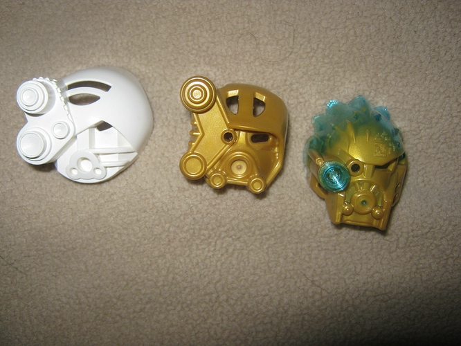
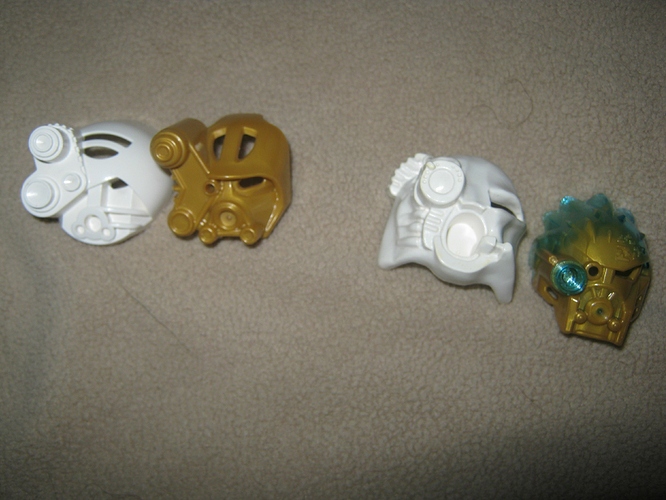
The only asymmetrical mask of the original bunch, the Akaku wears it well. The most obvious feature, of course, is the scopes on the left; they are quite well-spaced and sized, and together give the impression of an analytical type - more than appropriate for the wearer. Then on top we have a semicircular opening interrupted in the middle by another arc. This actually ties in rather well with the original Kopaka’s gridlike shield in terms of shaping - a very nice touch on the designers’ part. Below, we have a sort of ‘nose’ leading down to the mouth area, from which a pair of raised sections lead off to the right in a way that suggests cables of some sort. Finally, the right side of the mask is overall featureless in comparison to the left, but with a very small eye slit. The angled ‘brow’ is subtle but effective, giving the wearer a look of intense concentration, and the asymmetricality of how it crosses the ‘nose’ suggests the scopes as a sort of eyepatch or something similar.
The 2015 Akaku has a much boxier feel than the original’s circle, but is also probably one of the most faithful revamps. The scopes on the left are a bit more spaced out, unfortunately leaving a lot of featureless space in between, but I feel they made up for that nicely with the added shelf features on the far left wall. The original’s rectangular nose is only slightly hinted at now, while the other features are more heavily exaggerated - from the side, the brow sticks out like a golfer hat, and the mouth area is more remniscient of Darth Vader than anything else - whether that’s a good or bad thing I’ll leave up to your own discretion. The semicircular hole on top is rather similar to the original, but with a vertical beam in the middle rather than a (mostly) horizontal one. However, this also actually ties rather well into Kopaka’s 2015 shield, so kudos. Finally, on the right we have the eye slit, which is wider and less angular here, and seperate from the now-horizontal brow. This is also where I’d have to take issue with this version of the mask, with the cable sections gone entirely, and the sunkenness of the eye area only serving to make the rest of the cheek look oddly puffy. Again, though, it’s a really quite nice mask overall, combining the original’s analytical suggestion with 2015 Kopaka’s heavy, well-armored feel.
The 2016 Akaku…
Wait, hold on.
The 2016 Akaku is actually rather remniscient of the Akaku Nuva, mainly in its sharper bottom corners and having a central large scope compared to the 2001/2015’s fairly balanced trio. The eye slit on the 2002/2016 versions of the mask are much bigger as well. Thankfully, though, the 2016 Akaku eschews the ‘organic’ look that made the Nuva masks (and the Inika masks as well, while we’re at it) look like poorly-designed crap, keeping hard edges and straight shapes. Unlike the Nuva mask, it also does still retain the other two scopes; they are simply much smaller now, with one over the eye and the third a tiny cylinder running alongside the main scope. Speaking of the main scope, the ability to insert a stud to look like an actual lens was a stroke of genius, and an evolution of the mask that I hope sticks around for any future iterations. Though it’s hard to see with the stud in place, the main scope is ringed with tiny bumps at even intervals, another clever callback to the Nuva Akaku’s small indentations.
The rest of the mask is fairly nice as well, with the slits along the cheeks being an indirect callback to the cables of the original, and the return of the rectangular ‘nose.’ Like the Nuva mask, this Akaku lacks any vents or slits on the top section, but at least makes up for it with the presence of the nuva symbol and associated pixely patterning. The brow is much more subtle here, something I appreciate. And finally, the mouth area… and the part of this mask I’m not completely happy with. Like the Nuva Akaku, it is a much larger feature, though they manage to fill it in with detail more along the lines of the Mata and Master mouthpieces. It’s a nice effect, but leaves the front of the mask feeling rather rectangular, which took me a bit to get used to. Still, overall I do rather like this mask, though I can’t really say whether it’s better or worse than the 2015 Akaku, as they both have a rather different feel just due to the scopes.
The original Kaukau was a rule breaker, being completely translucent where the others were opaque. This was of course because of the visor, which as you could see on the golden version, would be rather hard to see through without that. The visor itself was quite nicely shaped, with the downward angle being interrupted in the middle by the triangular nose/mouthpiece; the two sections in tandem giving a strong scuba-like feel. Along the side we had a pair of rounded tube things, and some vents below them. Finally, to complete the mask, we had a back-swept quarter-dome thing with another suggested vent juuust above the visor. It was a rather blocky mask compared to the others, and not exactly feminine, but it worked well in the set and for Gali.
The 2015 Kaukau is a rule breaker. Where the other Master masks are much blockier than their original versions, this one is much slimmer and more angular, with a rather sharp chin and a wide top. To be honest, this one took me some time to get used to, but now it’s my favorite of the bunch. The top is rather similar to the original, but with a pair of spokes framing it. The vent is no longer just a suggestion (though it unfortunately looks like a pair of nostrils) and is raised up from the visor a bit. The visor itself was also a point of contention for me originally, but I’ve come around now - it is still a visor, and the nice shaping from the original is further improved upon here. Despite the disappointing lack of transparency, the indented section in the middle gives the same feeling, and the eye holes are so close to the face’s shape that it’s not hard to pretend they aren’t there at all. The added bit of detailing on the sides is quite nice as well. Which brings us to the bottom third of the mask, where the tube things have been removed entirely and the vents made larger and more… vent-y. If anything, the vertical slats call to mind her Nuva mask, but in a good way. The triangular mouthpiece, while partially overtaken by the new rounded injection section, is still present in a subtle capacity. Overall, this mask gives off a very… Atlantean vibe, and the angular shape gives off a nicely feminine feeling.
The 2016 Kaukau… is a piece of crap.
Well, okay, not quite that bad, but it’s still not the greatest. Let me put my thoughts on this in a somewhat different format…
-Pro: Long chin is a half-stud lower, lending itself better to certain chestplates.
-Con: Chin has weird detailing on it that makes Gali look like she has a Soul Patch.
-Pro: Nuva symbol and patterning.
-Con: No vent.
-Pro: Arrowhead shapes on sides tie in well with Tahu’s Uniter mask, and look nice besides.
-Con: Ridges on top are much tighter than other Uniter masks, giving a rounder look and making Gali look like she has dreadlocks.
-Pro: Okay, Gali with dreadlocks actually sounds kinda cool… just not here.
-Con: Round part of Mouthpiece is exaggerated to looking derpy while the triangular part is all but gone.
-Con: No vents on cheeks.
-And the biggest Con: The eye holes are very very sunken, removing any trace of the visor and giving Gali a downright thuggish look.
So yeah. I’m not a fan of this one, but it’s only my second least favorite mask of any of the ones I’ll be reviewing today. On that note…
This Miru has clearly seen better days, but that’s mainly a sign that I handled it a lot as a kid. This is one of my favorite masks of the original set, with some very simple shapes coming together to create nothing less than the very perfect image of a trickster. The nose, the smile, the eyes… I really don’t need to say anything about this one; it speaks laughs for itself.
The 2015 Miru is not even a Miru at all. It is an abomination and I hate it. No nose, no smile, weird ridges that just make the whole thing look wrinkly, and the vents on the sides and top make him look like a cyberman. Whoever designed this one should be ashamed of themselves.
The 2016 Miru is actually pretty nice, capturing the same feeling of the original if not the look, and taking the elements of the 2015 disaster and somehow making them work really well. This one still lacks the nose, unfortunately, but it has the suggestion of one. The mouth slats, while still rather small, are much more visible from the front rather than being tucked away to the side. The ridged texturing is still there, but it’s integrated with the eyes and much more subtle overall, and so works out much better. The Nuva symbol is always a plus, and the Uniter Masks’ way of removing the features of the mask’s top actually works in its favor this time, getting rid of the absurd-looking top vent. The side vents are less obtrusive and much deeper, turning them from weaknesses into strengths. So yeah, I’m very happy with this one.
The original Hau is downright iconic, let’s all admit this right now. It is simple but effective, its semicircular shape adorned very sparingly. The eyes with the furrowed brow, the wide mouthpiece open in a perpetual scowl, the slits along each side, and the vent on the top. That is it; that is the Hau. Tahu’s mask, but also the symbol of Mata-Nui for so many years, until the Mask Of Life came to steal its thunder. (I do like the MoL too, though)
The 2015 Hau is, much like the other Master masks, a lot bulkier and blockier, and a bit more finely detailed. The sides and bottom are emphasized a bit more, giving the wearer a bit of a beard. The scowl is still present, but refined into more of a trapezoidal shape. I will say that the smaller eyeholes do give it a bit of a crosseyed look, but it’s not too bad most of the time. The slits, while deemphasized, are still present. And the indented eyebrows? A subtle and effective touch. While this one doesn’t quite match the original’s iconic look, it still holds its own as a worthy successor.
The 2016 Hau is nothing short of miraculous. Not because it’s my favorite of the Uniter set, because it’s not, (That would be Lewa or Pohatu’s) but because of how it grew on me. When I saw Tahu Uniter’s boxart, I really did not like it. It looked generic, with too sharp a chin for Tahu and only the eyes to really give the feeling of a Hau of any sort. I mean, it’s still miles better than the Nuva Hau, but for what it was, I wasn’t a fan.
Then I bought the set, just yesterday, and opened the box.
The slits are still present. The mouth is, while more of a diamond now, still angry. The eyes are great, and much less derpy than the 2015 Hau. The beard isn’t as noticable but is still present, and the chin, while certainly sharper, was still flat enough to feel like Tahu. Oh, and those arrow shapes on the side are a really cool looking detail. Really, my only complaint about this mask is the lack of patterning to go with the Nuva symbol, like the others all have.
I bought Tahu Uniter yesterday, and in that time my opinion on the mask has done a complete 180. Now that is miraculous.
The original Pakari is an interesting one, design-wise, with lots of detail around the edges but mostly a wide flat space in the middle interrupted only be the eyes and mouth. It has a very simple diamond shape that works pretty well. The eyes and mouth look perhaps a bit cartoonish or… startled, but still somehow give off a sense of one who doesn’t give much away and has a lot more going on underneath than one might suspect. Or maybe that’s just because of Onua. Either way.
The 2015 Pakari favors a lot more detail. While the four slots on the bottom corners are downgraded to three, the rest of the mask is given a hefty makeover, with the mouthpiece being turned into a snout with lots of cogs and wheels and round shapes going on. The original Pakari’s lines along the side are turned into full-on vents, and the eyes are made much smaller. The thee slats on top are turned into only two, and then split both vertically and horizontally. The result of all of these changes is a much more gorilla-esque visage that fits well with G2’s more brutish interpretation of the character.
Now, as you can see, I still have yet to get Onua Uniter, so the Pakari section will be a bit incomplete. Still, from what I’ve seen it seems to be a blockier version of the 2015 Pakari, so most of what I have to say about that probably applies to it as well.
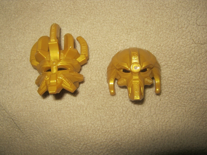
Bonus round! While the MoCr and MoCo are different masks from each other and have no real G1 parallels, I still wanted to examine them. The MoCr is upward pointing where the MoCo is downswept, but both feel like the masks of dwarven kings, with their heavy detailing and mouths and such. The MoCr’s crown is pretty obvious, but the MoCo’s smooth top is also remniscient of some great war helm. They feel ancient and powerful and detailed.
Both also have a pretty solid eyebrow game going on.
So yeah, those are my thoughts on the masks thus far. What do y’all think? Agree, disagree? Anything I missed?
