Hello all! Lately I’ve been working on a lot of Bionicley projects, and been making extensive use of the official Matoran language given to us by Lego. But one thing that bothers me, in large blocks of text the various English punctuation marks stand out like a sore thumb. Stylistically, they don’t fit whatsoever. So I’ve been experimenting around with something that fits the round-letter aesthetic.
These are really good. They definitely fit the design language, and they’re pretty intuitive.
One interesting thing you could add is a special decimal punctuation. I know that we typically just use a period (or comma, depending on region), but I think there’s some room to make a unique decimal punctuation and/or syntax for the Matoran language.
The other thing I would add is brackets. Maybe three of these small circles stacked on top of each other, with different line patterns inside for left and right brackets, or for curly and square braces (if you want to get that detailed).
Ooo I like these ideas! Matoran being a computer-brained species, I can definitely see use for additional mathematical or even programming related special punctuation. Though they already do math in base 6 so adding decimals into the mix makes it even more complicated hehehe
I’ll work on a part 2 with some additional symbols!
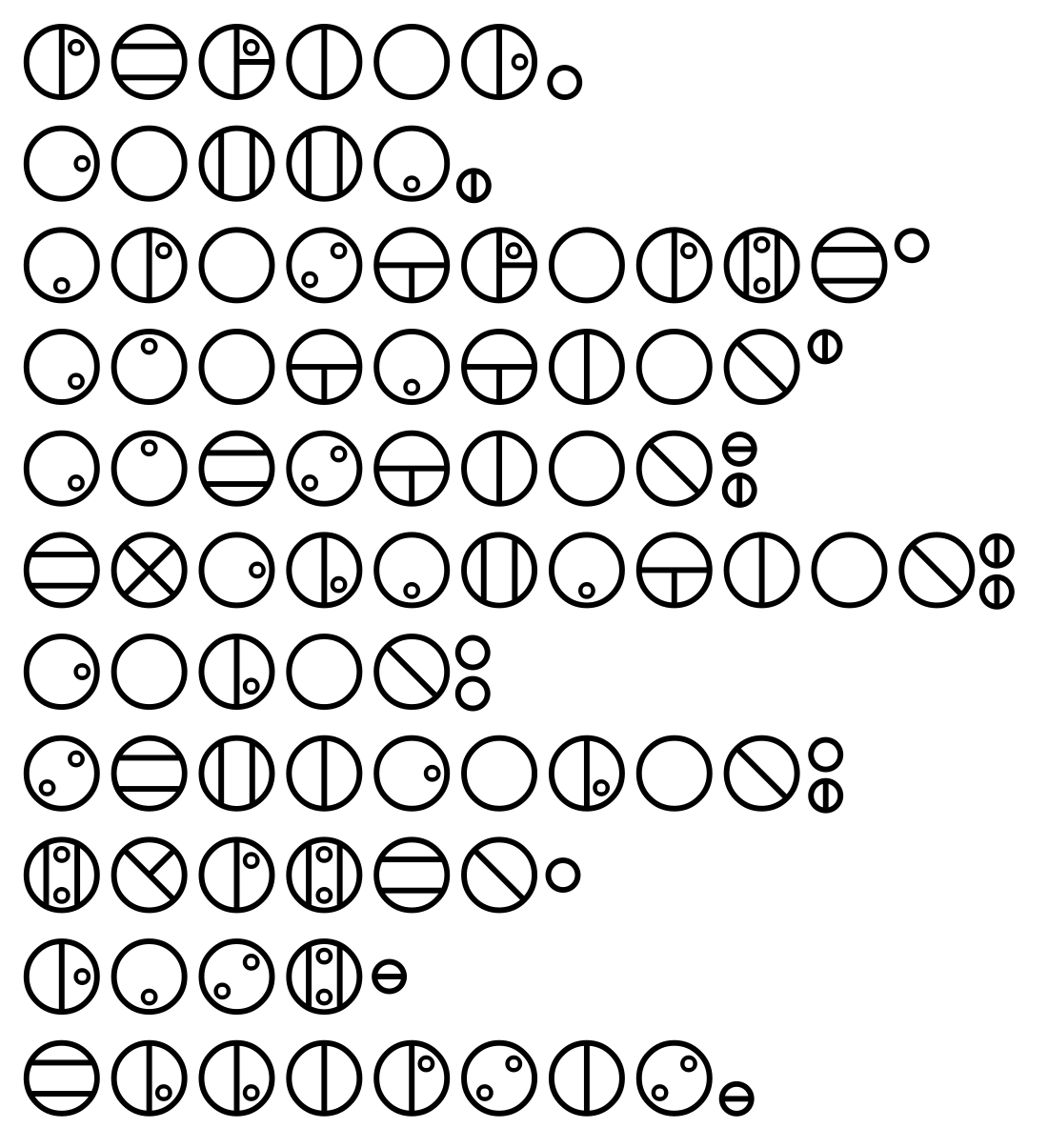
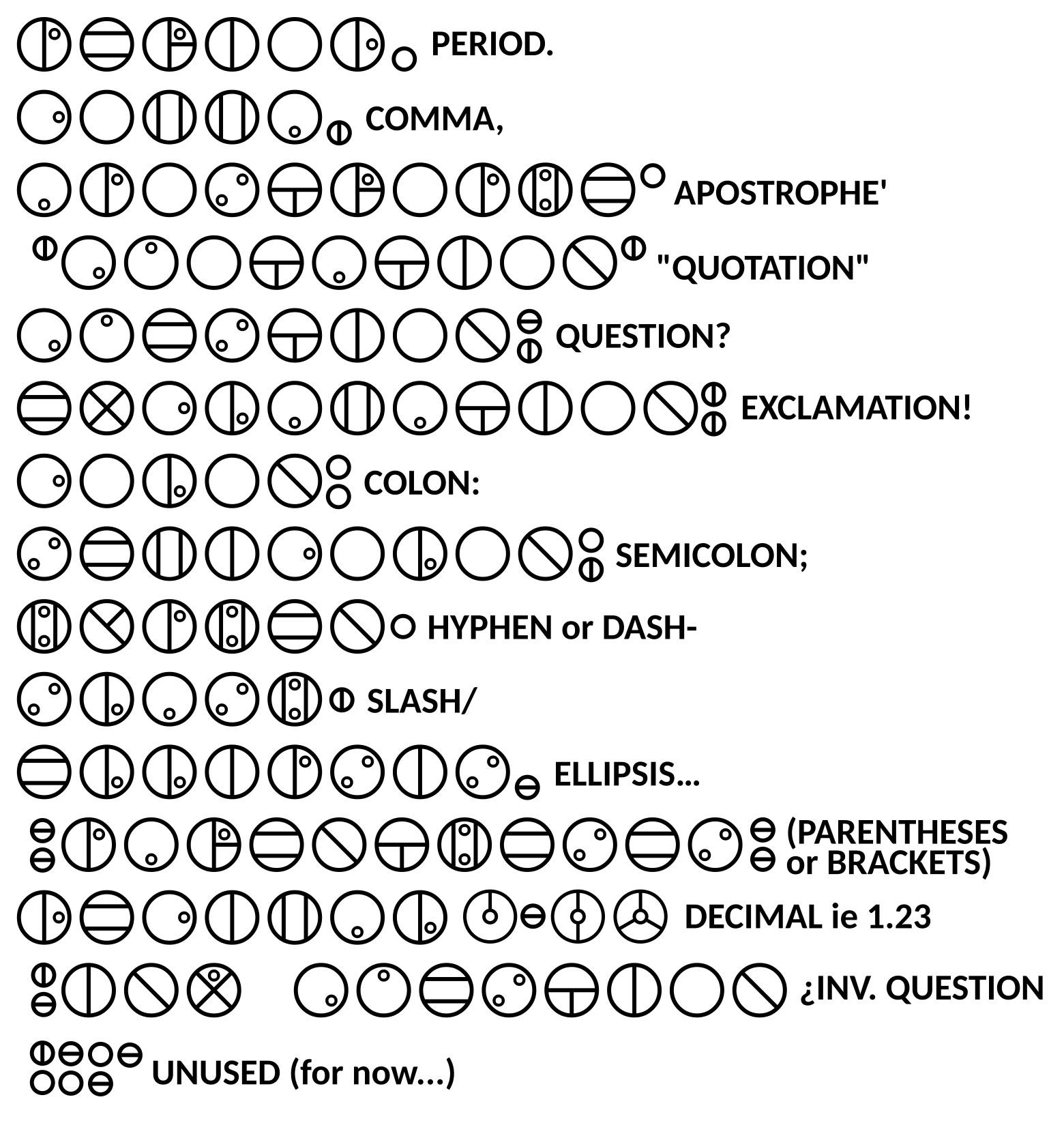
I wrote it next to each symbol, but I should translate lol. From top to bottom, they are:
Period, comma, apostrophe, quotation, question, exclamation, colon, semicolon, hyphen, dash, and ellipsis
I’ll include it in English too next time
Very cool, and definitely feels diegetic, though I wonder if it’s necessary to separate dash and hyphen? The difference is realistically quite minimal, to the point where they aren’t different when written, and we only have one key on a standard keyboard. Perhaps we could consolidate the two and find a better use for the one with the dash mark? (also be careful about double posting, it is against the rules)
I do like this idea. I suppose I could just use the same symbol for both in the font file, huh? Thanks!
(And apologies, I struggle with navigating the site on mobile. I’ll be careful.)
–UPDATE YAY!–
Here’s a revised version with lots of additions. But it’s still a WIP, so I’d love more feedback!