hey there,
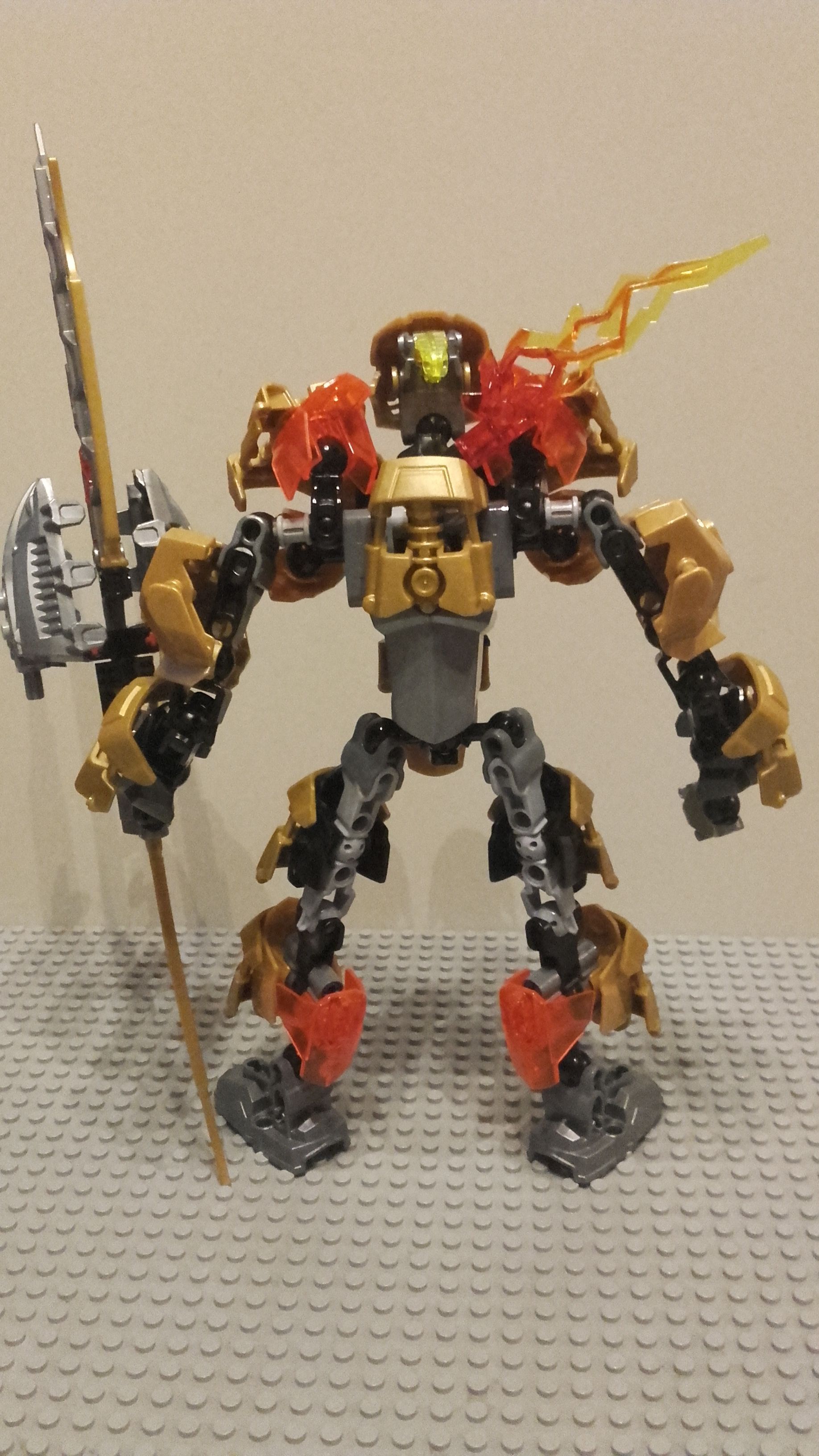
this time i have made TAHU, master of the golden fire.
i made him a little bit bigger then the normal tahu, a little bit, trust me!
the main color is of course Gold with some transp. red/orange and a bit black as well.
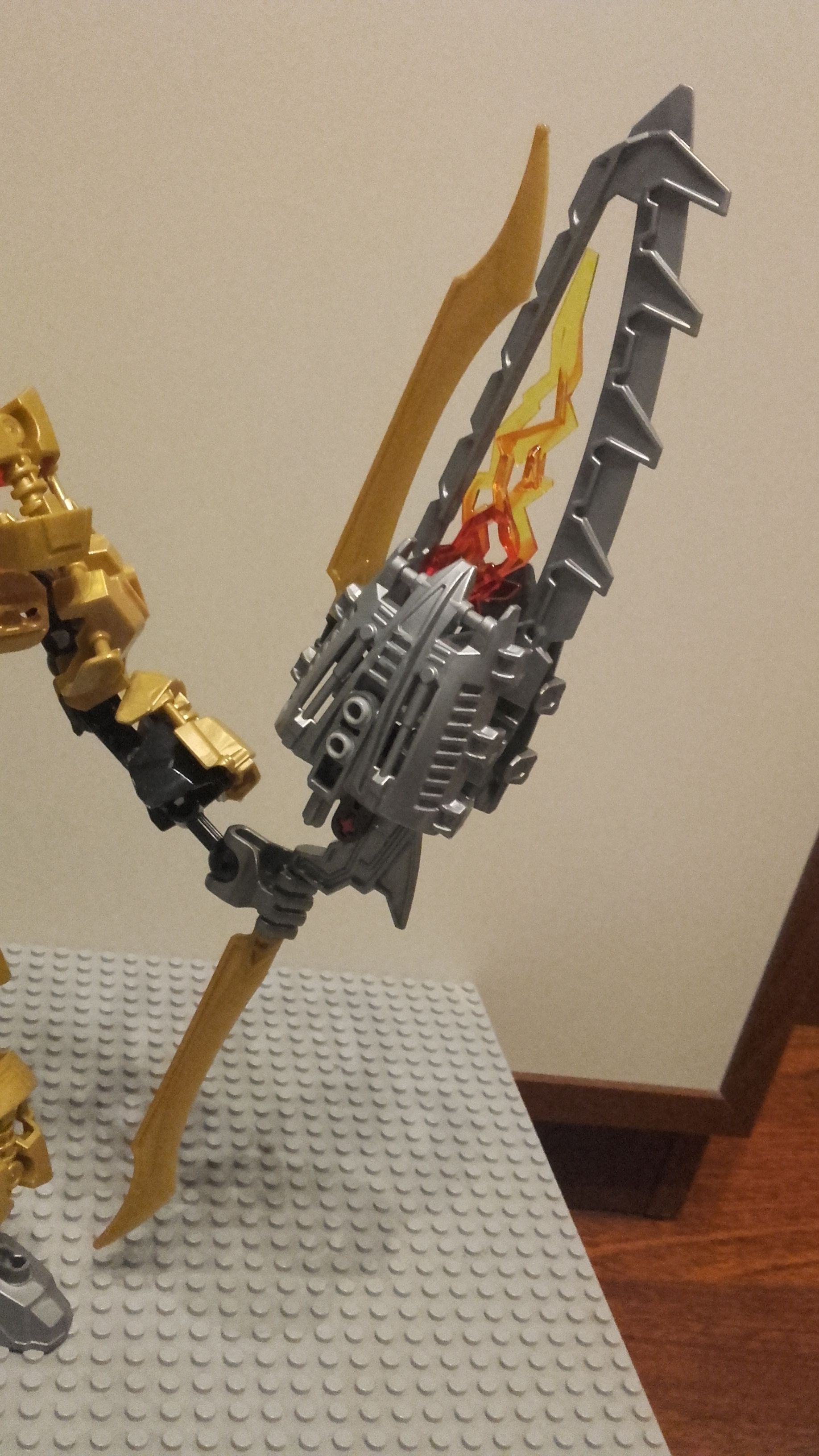
i wanted something unique, but not to different from the normal sets from 2015, but his torso is different and his weapon is unique for me, if there is something like that weapon, plz dont hate me! its also not very special, i just used the basic ccbs and combined som of it.
i really liked to build it and i am really curious about the support and critizism you have for me.
it is also my FIRST moc that i build with CCBS, so yeah!
alright, i talked to much now, take a look and leave support.
for now, peace out, RF
thanks for looking at TAHU! i hope you liked it, if you did, leave a like.
feel free to say whatever you want about it, i can learn from it!
thanks, thanks, thanks
-> The gold looks alright, but it could stand to be toned down.
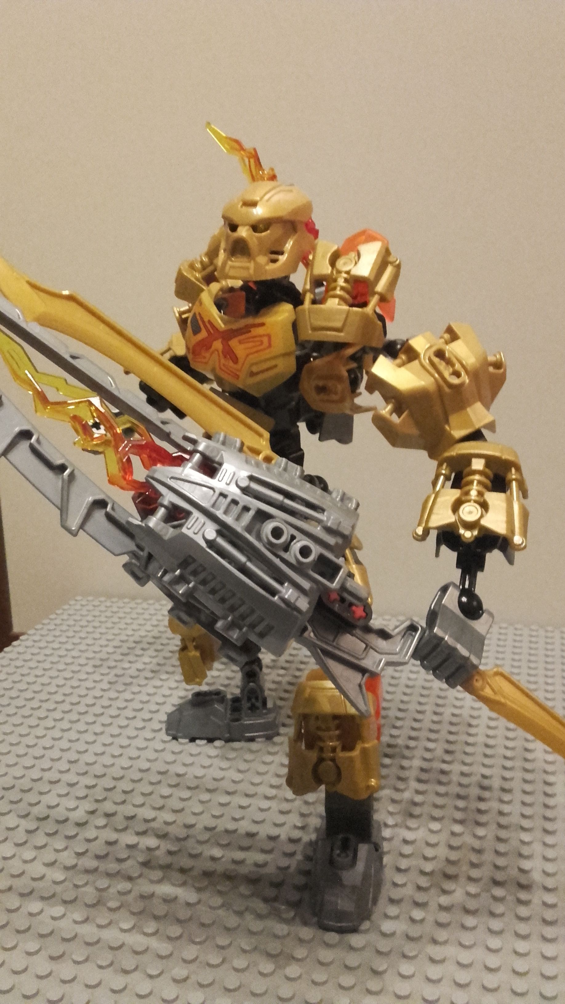
*The gold could also stand to be more on the back, as the back is plain
-> Funky, impractical weapon choice. Maybe just go for a sword
-> A revamp of Tahu. Not really a fan. making OCs is better IMHO
-> Shoulder pads look kind of awkward, it’d be better to make them more flush and less saggy.
-> Not a fan of the silver.
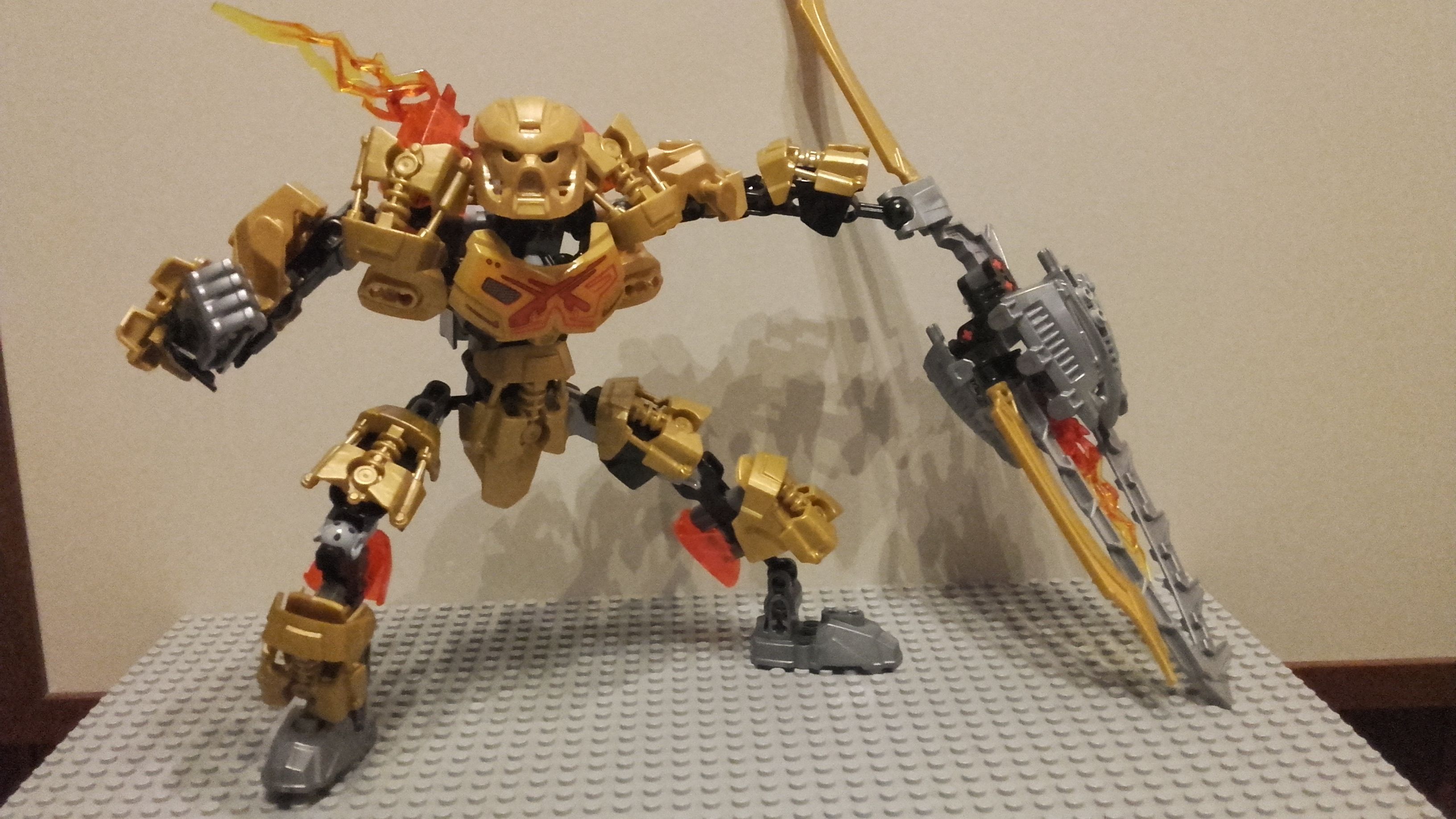
-> Proportions are inhuman and incorrect for a humanoid build (hands at knees, legs too far up, ect.)
I give it a 6.5/10. Not a bad MOC, but could definitely use some fixes here or there. Otherwise it looks rather swell, and I like the idea of an all-gold Tahu
I like the moc, Color scheme is ok just plain could of added a little bit of red components, and the back lets have no armor. (It’s CCBS I know you can’t cover anything) 7/10 it’s a fair rating:)