Hello
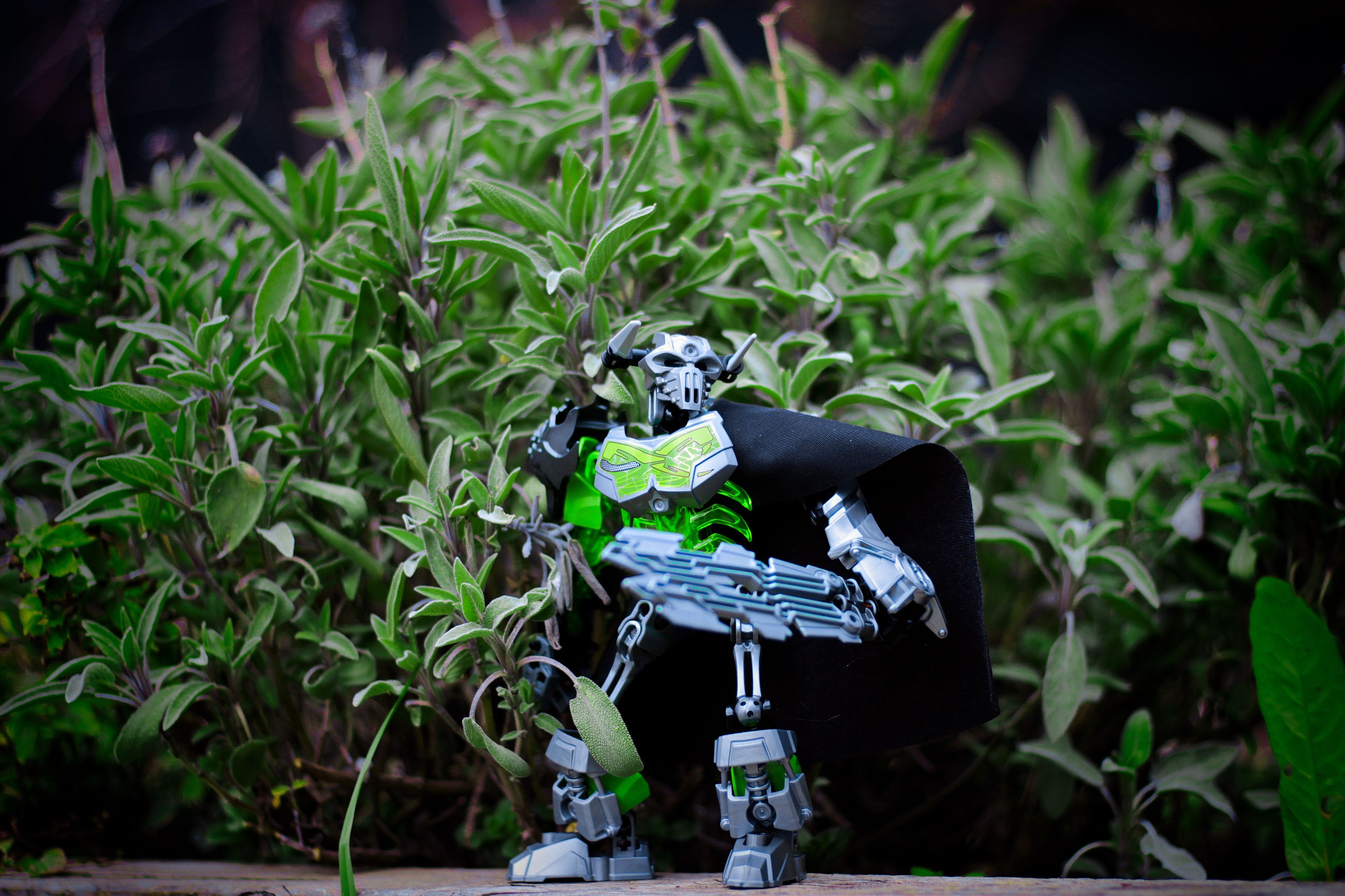
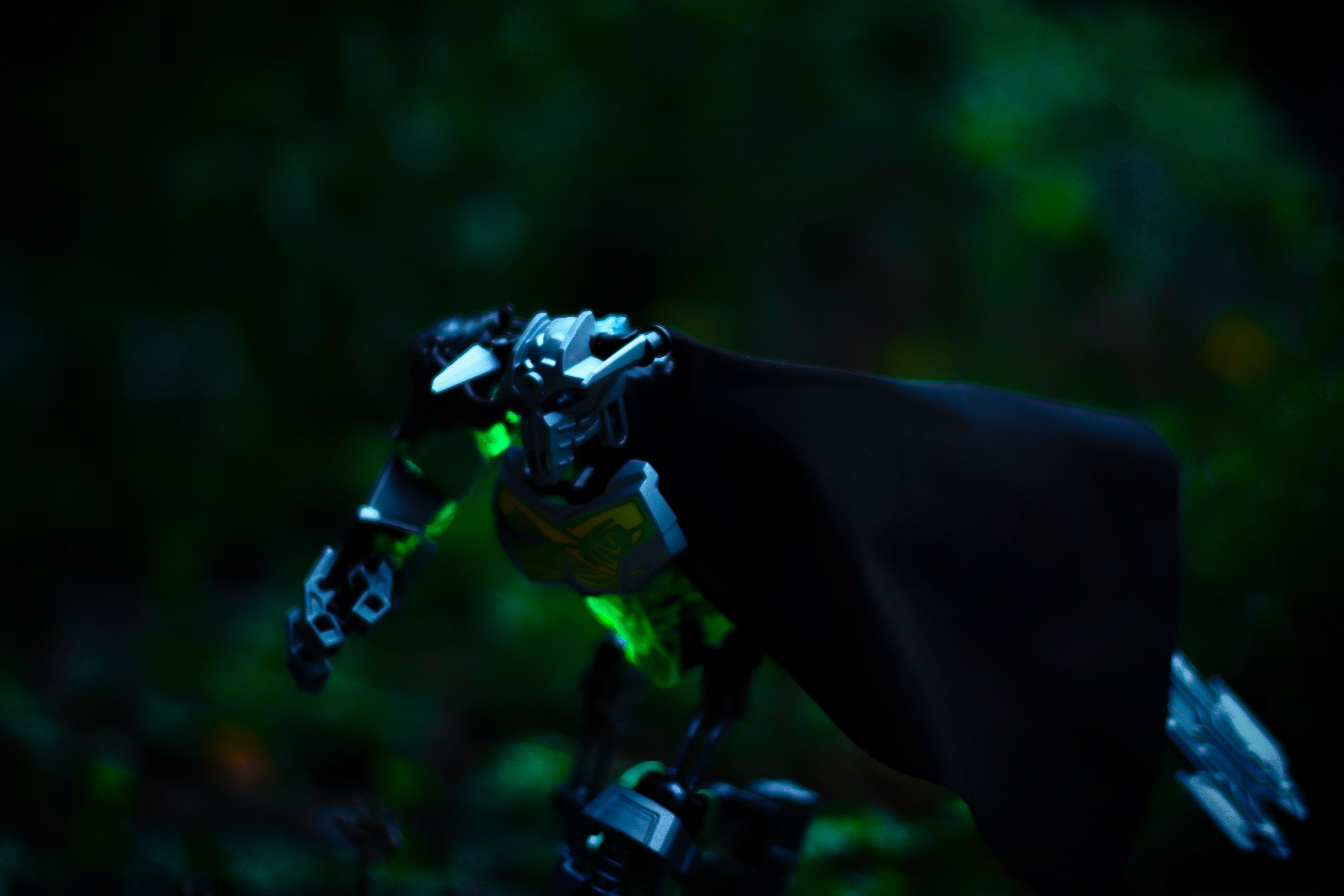
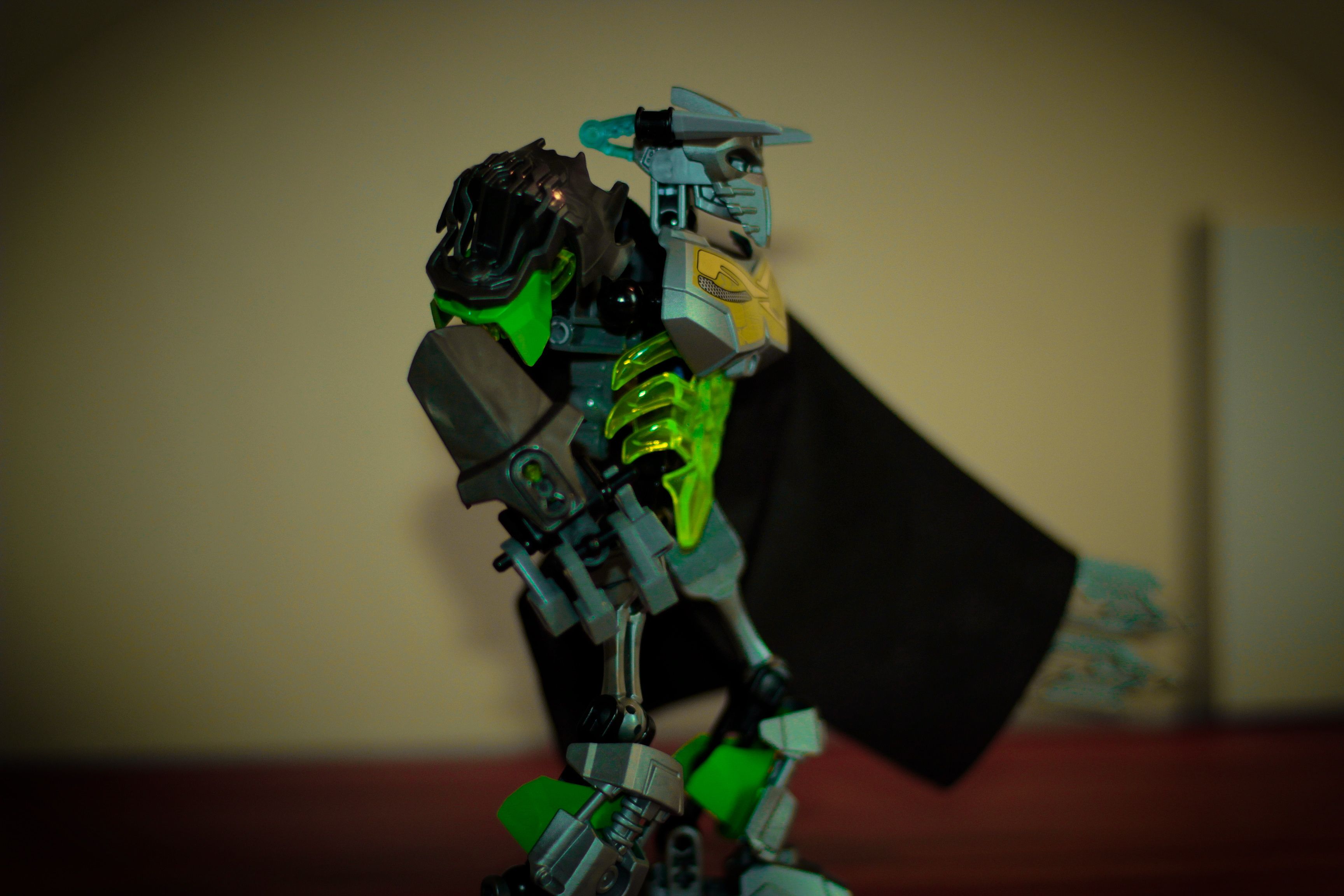
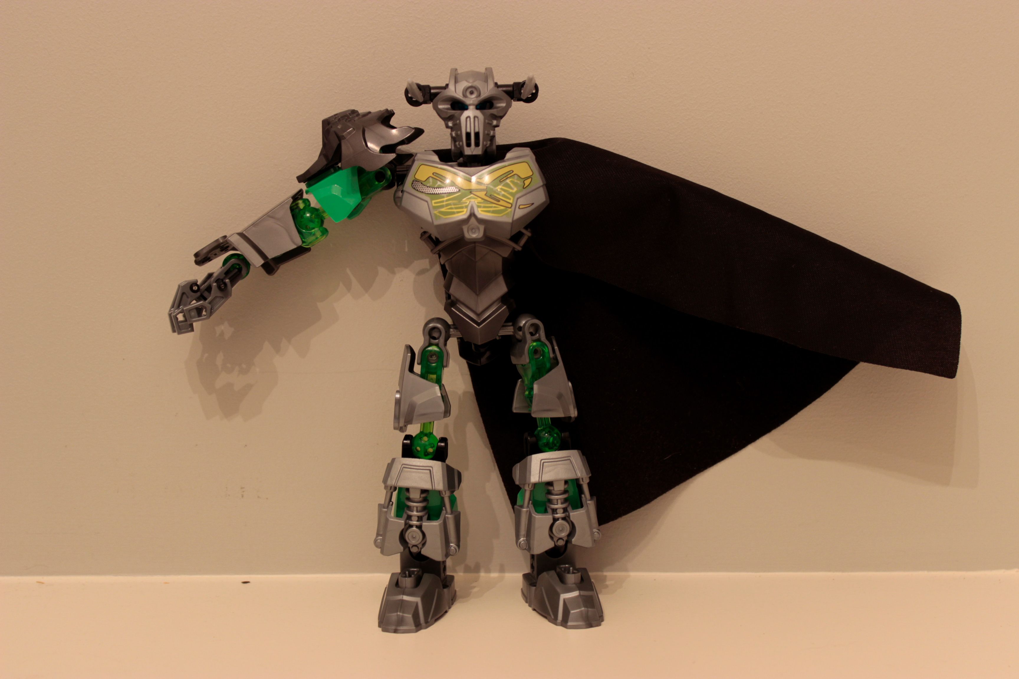
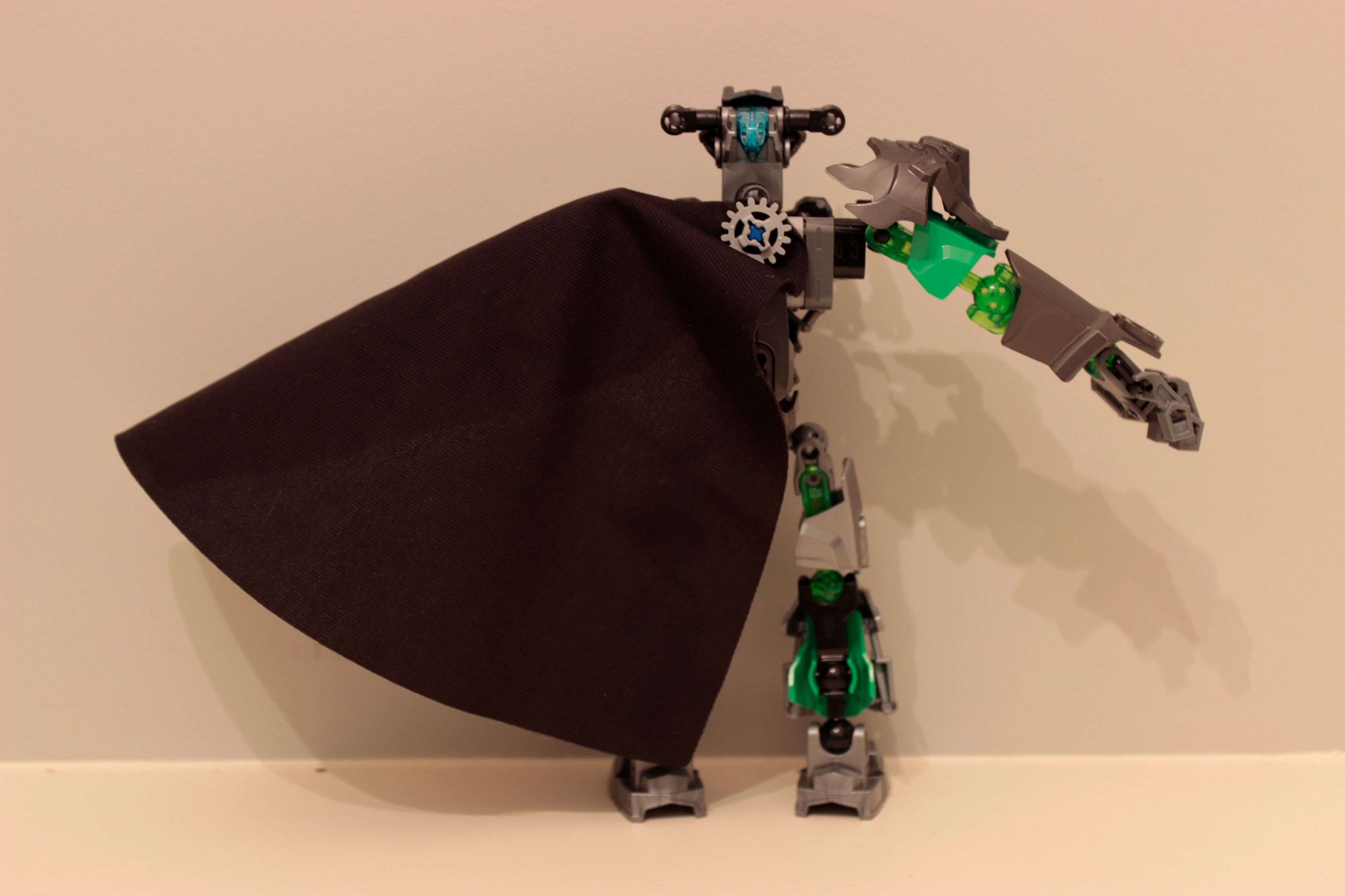
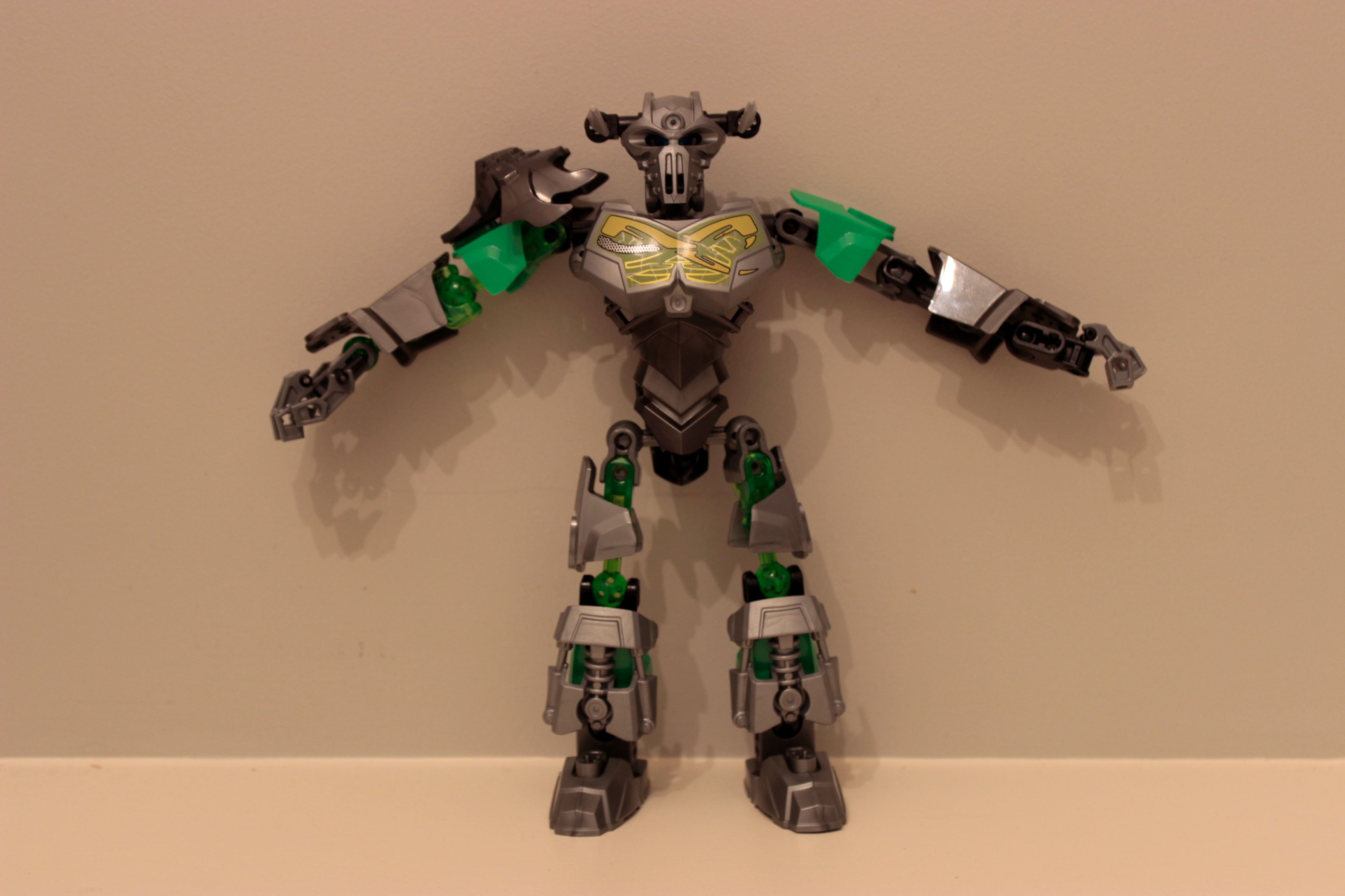
Meet Cazapar.

VERSION 2 UPDATE!:
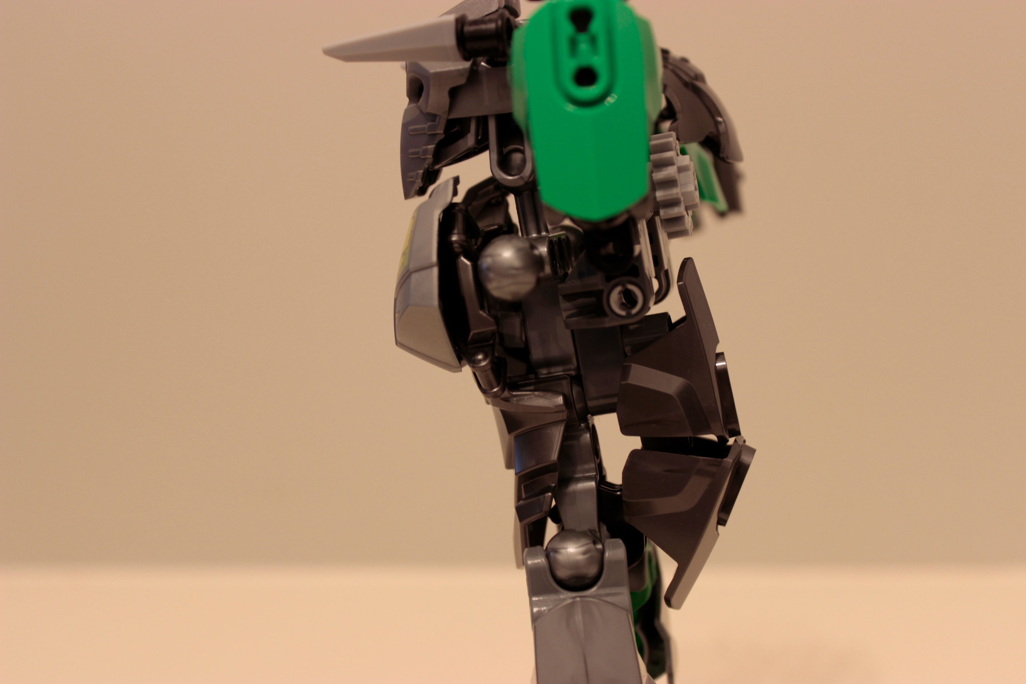
Just testing out some different horn designs.

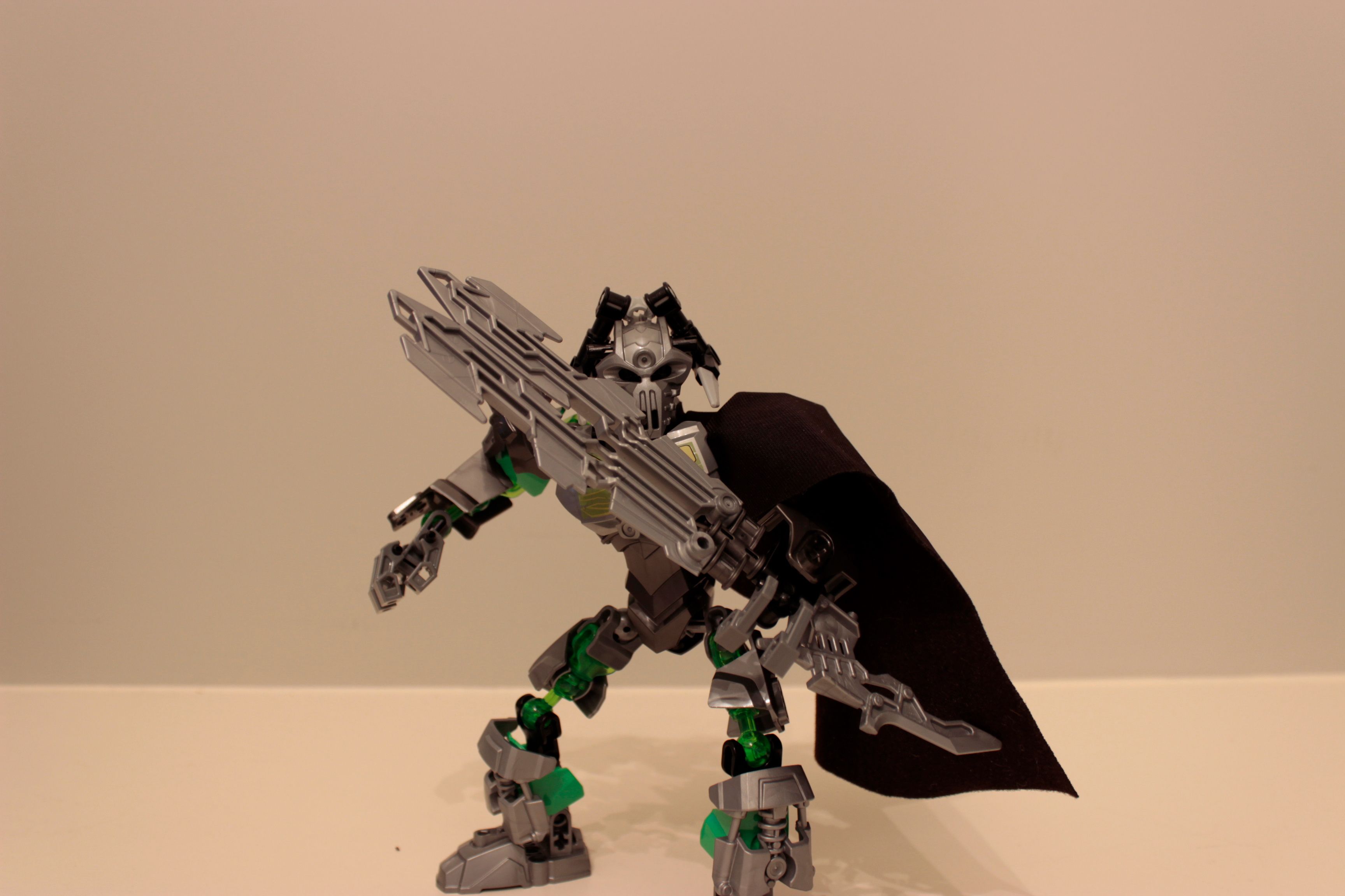
Final pose.
Let me know what you think!
Hello
Meet Cazapar.
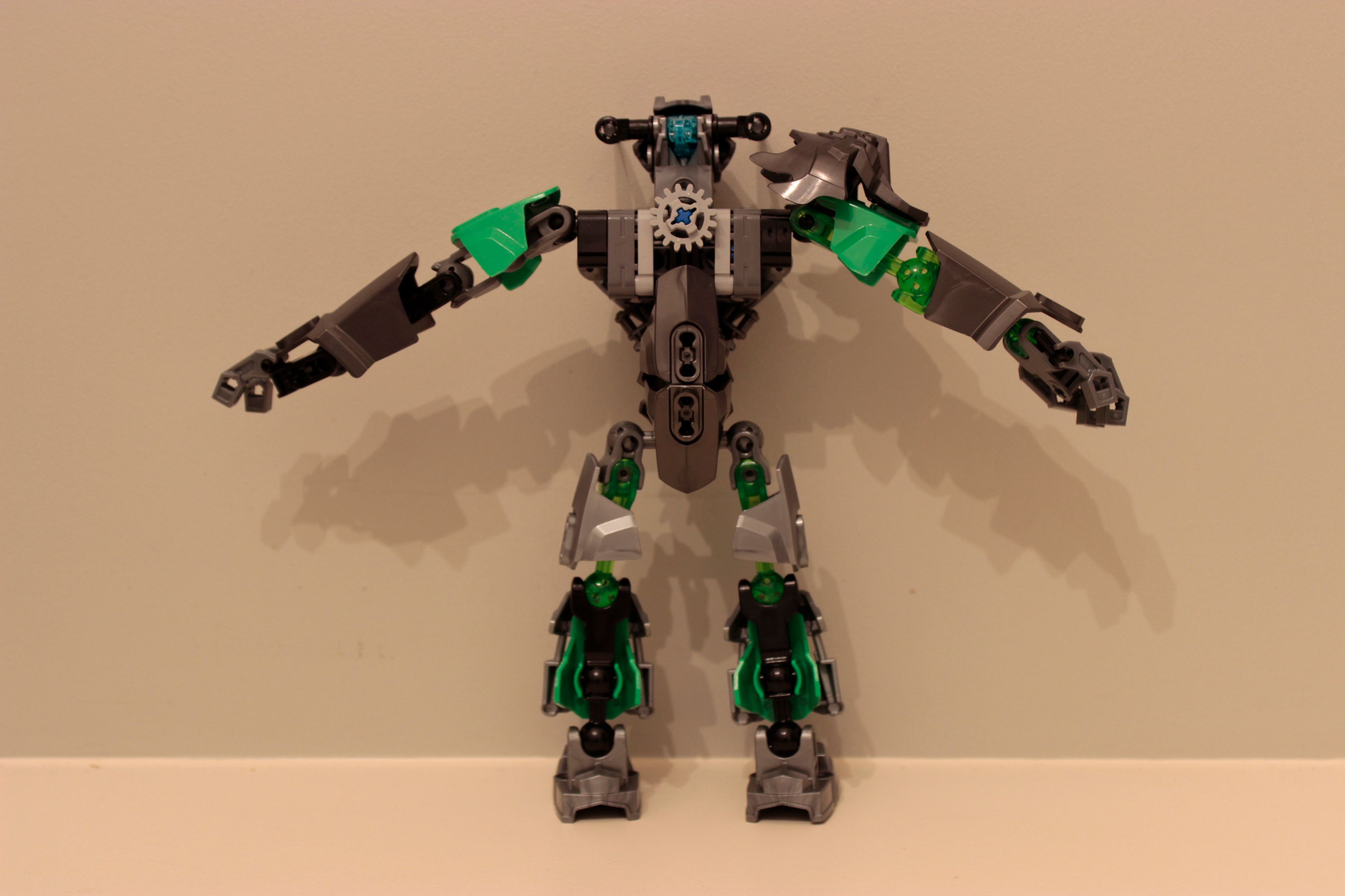
VERSION 2 UPDATE!:
Let me know what you think!
Not_Plural’s Quick Review:
Overall, I give this a score of 9.5/10
Fantastic job! 
Also, that photography is amazingly well done.
Thanks! <3 ^-^
this looks amazing!
This looks really good.
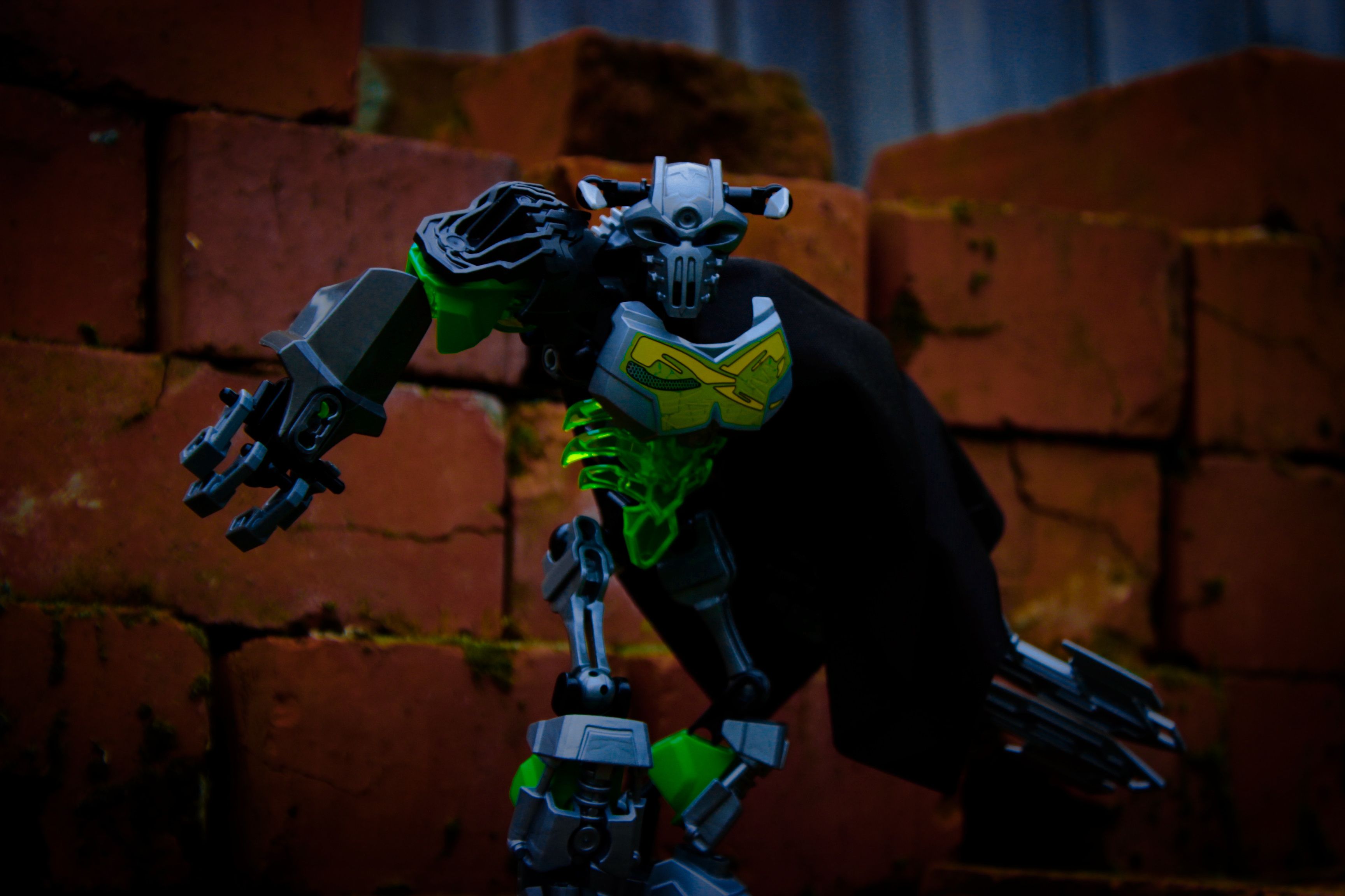
I love the photography but I really need a clear front and back view of the moc.
Plural’s Real, Non- @PekekoaOfJungle’d Quick Review:
I would give this MOC a 7.5/10.
Grood Job!
![]()
great moc
great pics
4 outa 2
Will do good sir! And I won’t filter it ;D
Hey can you get a pic without the cape, too? Thanks! 
Yup! ;D
I will post the pictures in around 5 hours. (5.30-ishPM NZT)
Thought the title was Carapar.
#The Best 2007 Set.
One word:
MAXILOS
Eh, he’s really gappy.
Boo
Heresy
Carapar best set
Dang it! I forgot how to quote posts.
@SwagMeister Fair enough.
@Takua Carapar was my first 2007 set, so. Fair enough.
lol
First off, I really like your camera work.
Colors and Design are good.
The cape is used very well.
I’m really liking all these double swords I’m seeing.
I approve of the idea of selfMOCs that are immersed in the 2015 theme.
Made a good choice to start simple, lets you get the feel of the character right. Not a big fan of of the use of bone-thighs but they don’t detract too much. Would suggest using a “cean” chest plate and spread out the silver and gunmetal some. Also, dat cape.
Actually really cool. 1/1
c: