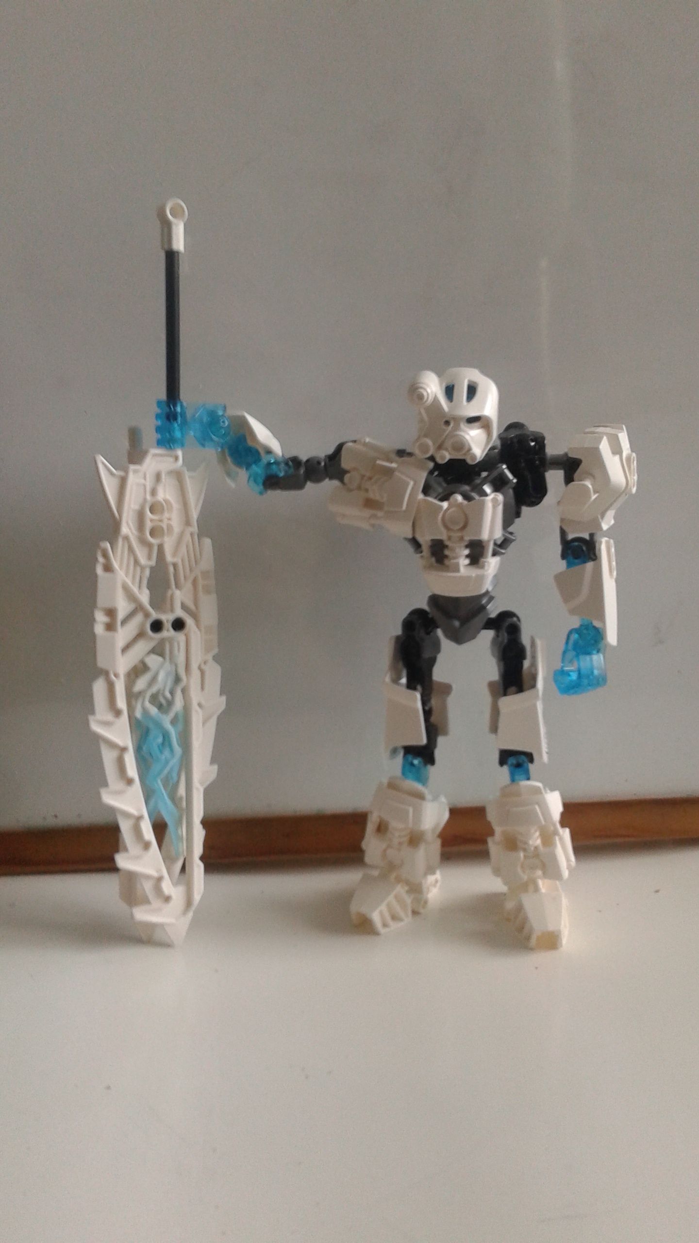
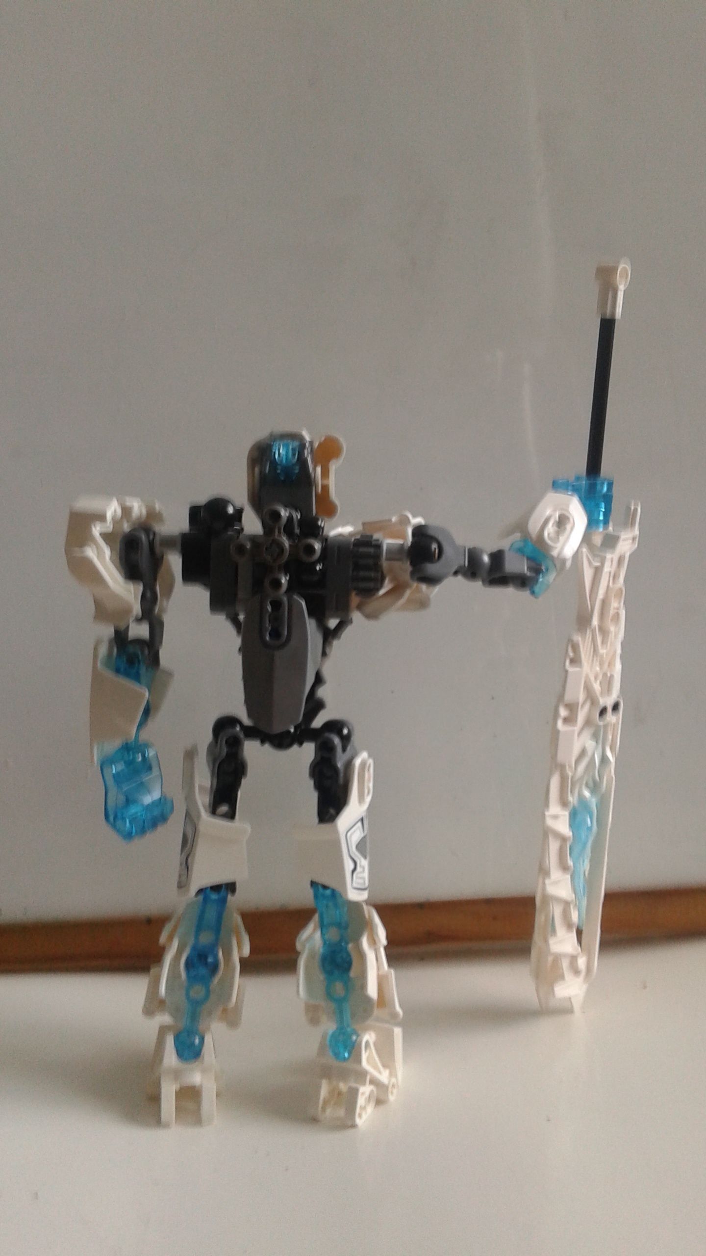
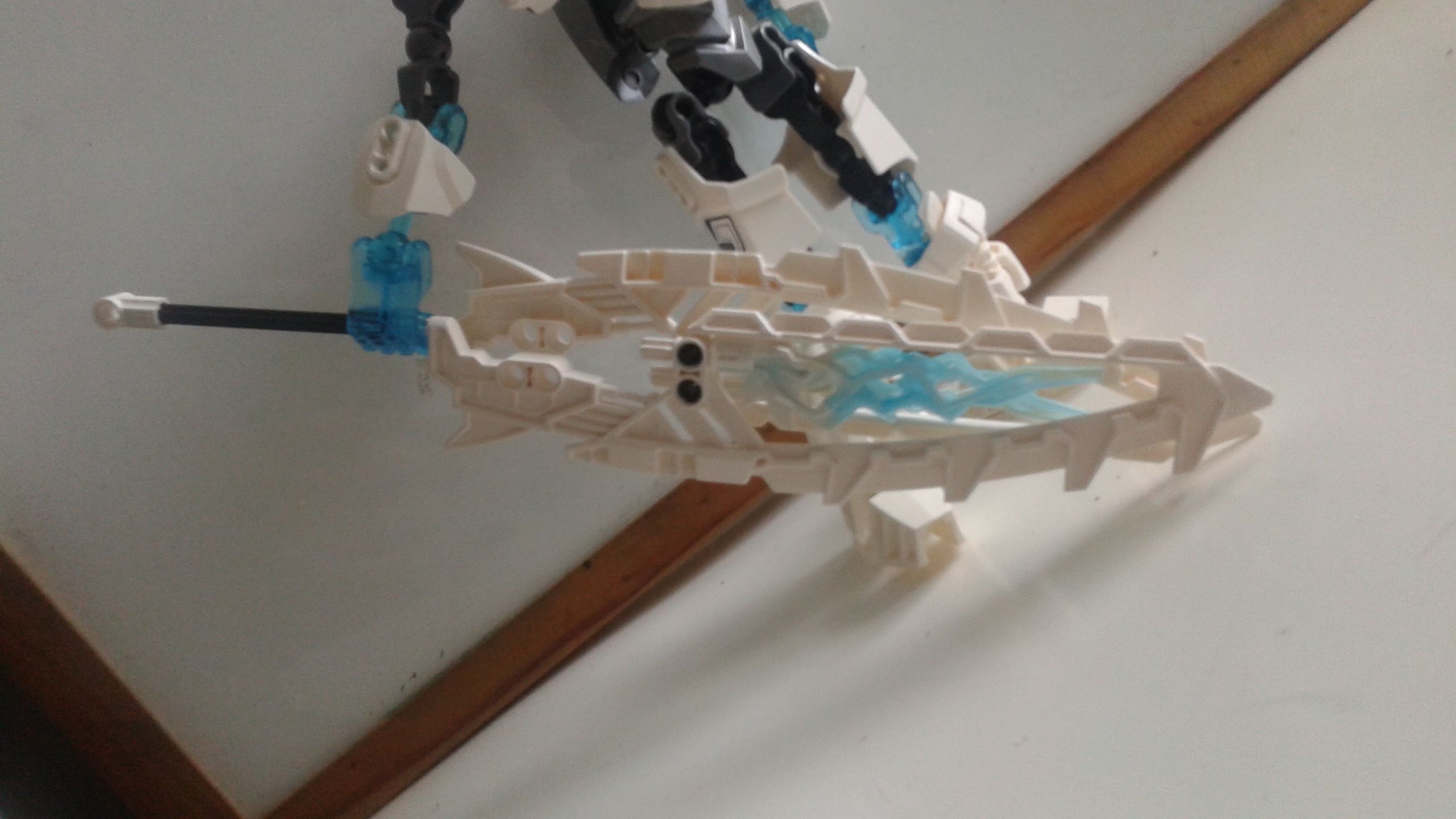
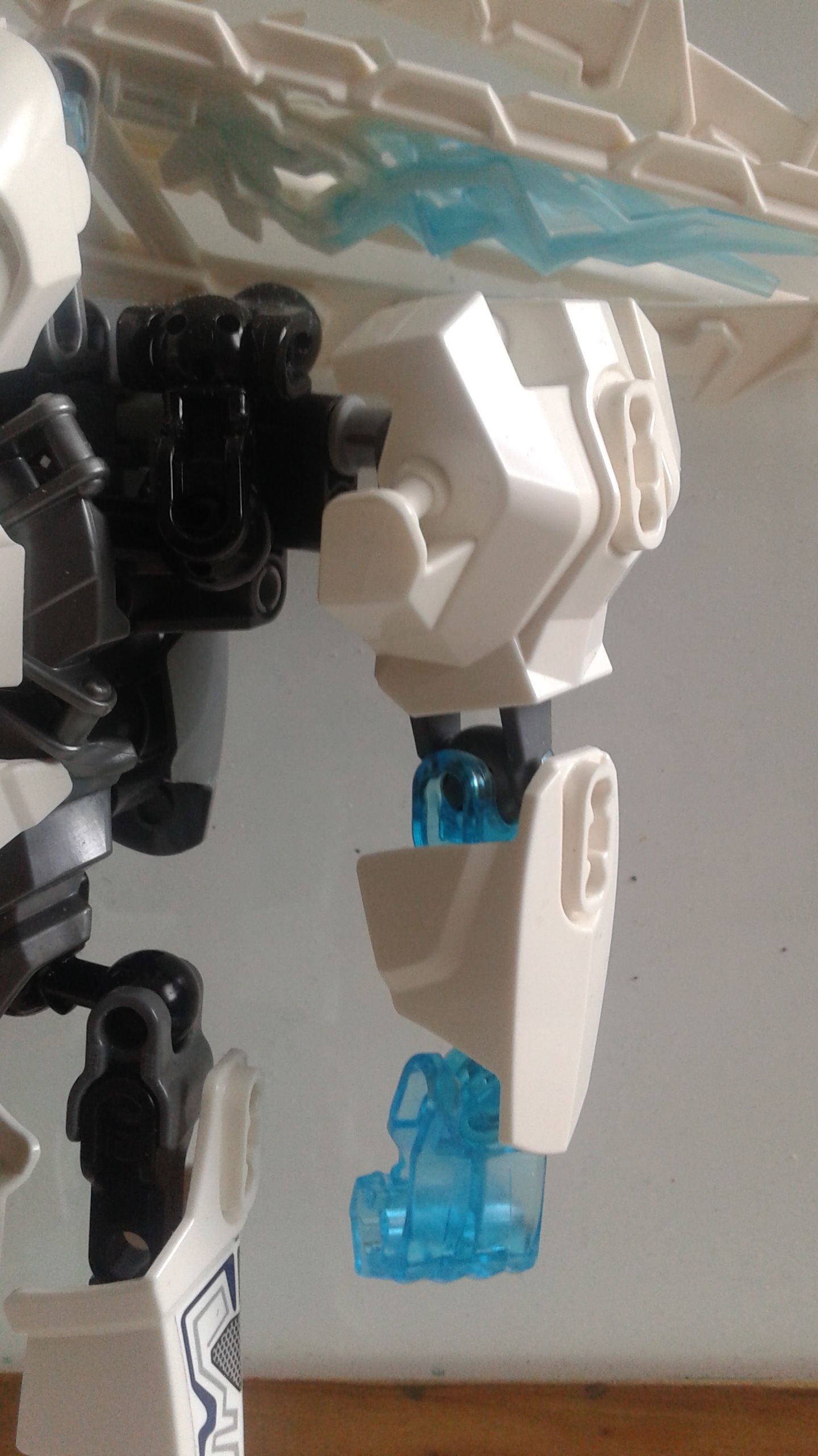
I got another 2015 kopaka as a gift, so i took extra white parts from a bin and removed all the gold and yellow from the set and changed the armor placement. Not much to it, just something i made for fun.
11 Likes
I like it, only minor critique i have is that the arms seem a little too far out. I mean the right arm has a shoulder armour piece to cover it so that one is alright, but the left arm has nothing to cover it so it looks a bit odd.
3 Likes
This seems pretty well executed, but as a matter of tastes, I personally liked the set better.
1 Like
i think the gold was unnecessary
I think the gold made the set not look bland.
this is bland.
and it also doesn’t feel like kopaka to me at all.
I think I like it better than the original build. To me, a defining trait of Kopaka is sort of a trim look, and this does that way better than the real set. Also interesting take on the weapon, I’ve been looking for a better way to deal with his weapons, and I might try your idea.
i think the original set looked too bulky for kopaka. i always thought of him as a more slim set
1 Like
Weah, I did as well.
Yeah.
A defining trait of 2001 Kopaka, the 2015 one is a completely different character.
Again, too bulky for 2001 Kopaka.
I like this build, but I don’t see Kopaka in it. There is a lot I think it lacks to be even a 2001-styled CCBS Kopaka.
Overall Rating:
##6.5/10
1 Like
Nice MOC! Only critique I have is the torso is a bit too all over the place and low. Other than that, pretty good!
The arm armor shouldn’t be asymmetrical and the legs are too bare near the hips.
I have 1 question for this MOC:
Did he slip?
Besides that, looks good.
@Sammythekat what do you mean by “did he slip?”
“I didn’t slip”
one of Kopaka’s lines.
Looks alright but the armor placement is a bit too messy and scattered.
no, he did not slip.