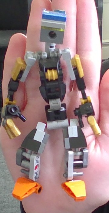
When I got into bonkle around 3 years ago, when I wasn’t even a teen (btw, I am old enough for the boards. The moment I hit the right age, I made an account), I built Electro, a toa of electricity. Quickly after, I built this little guy. A matoran. Funnily enough, I never named him. I just called him “Ali’s brother” or “Bro” for short. I don’t have any photos of his old design, but I have his old torso build still intact, which I will be showing last.
This is the first moc I’ve ever seen with such perfect humanoid proportions to have asymmetrically-assembled thumbs. That cro-magnon browline he’s got is mighty impressive; one could easily store a mantelpiece clock up there.
It’s really weird seeing the younger Bionicle builders using pieces in their models as if they’re commonplace despite being such new molds relatively speaking, as with the orange half-grabbers for the feet. Nothing the matter with you, of course, I’m just inexcusably old.
Thank you! I always try to keep proportions in my builds, with the hands below the hips and the legs longer than the torso. The asymmetrical thumbs are actually due to the pose I had “Bro” previously. The thumbs can be put on at two configurations due to my choice of using SNOT bracket parts to attach them. The head design is relatively unchanged from when I built him 3 years ago, so that’s why is looks more like a cartoony metru head than the supposed Hau I designed it after (I don’t think it looks like a Hau.) As for the parts I use, I don’t have many Bonkle parts, so I make brick-built kanohi and use system instead of the expected Bonkle part. A good example of this is the claw-grabber parts on the feet, which are supposed to look like downscaled Mata feet. This gives my MOCs a cool style, but I think that they don’t feel very Bionicle because of it sometimes.
If you’re a Bonkle fan, you can’t be that old. 30’s to early 40’s aren’t ancient lol.
From inexcusably old to as smooth as a baby? I saw you say that the silly little people we see in the computer are not real. This is a great example of you, AI Ghid, poorly imitating the real human who is in stasis within a canister.
You’ve reached the current usage cap for ChatGHD with a free account. For more responses, please upgrade to the $131.99 premium service, ChatGHD+ Gold Edition™, by entering your mom’s credit card information provided through the link below:
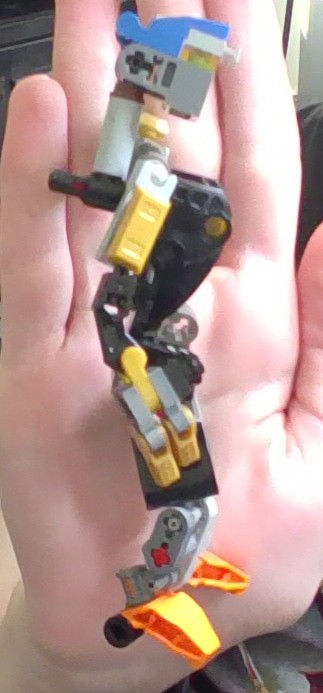
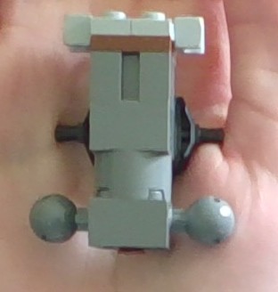
Thank you! I was trying to use more Bionicle parts when I built it, so I used a Rahkshi back part for the structure, with a LEGO Hockey foot part for the chest armor.
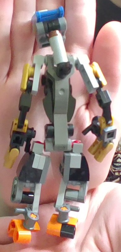
I like a lot of the colors you used–the gold, grey, and black work really well together. However, I think that the orange on the feet and the blue on the head would work much better if they as colors were spread out more throughout the build. Also, I know not everyone is bothered by asymmetrical things, but I feel as though symmetry would make the Matoran feel much more intentionally-designed.
I echo @bunnigloss’s praise of the torso, though–it’s very clean, especially from the back. I also like the use of the Prime Empire sticker (from the Empire Dragon?) on the original, although I understand why you didn’t carry it through to the final version.
The blue and orange are carried over from the old version. Call me lame, but I have sentiment for that original color scheme, so I wouldn’t change it. The asymmetry in the thumbs can be fixed with ease, but I didn’t notice that they were in different configurations when I took the pictures. I don’t mind it symmetrical or not, but it can be fixed if it bothers you. Thank you for the praise of the torso, though. I never thought the torso would get so much attention. I personally think the torso is 1 liftarm too long, but I guess that’s not the case here! Thanks.
I like the orange and the blue; my only problem with them is how they are only used in one spot each. The orange isn’t too much of an issue, since it’s similar enough to the gold, but the blue stands out a lot. I think just including blue pieces in one or two more spots on the build would help it feel far more cohesive.
In terms of symmetry, my issues are mostly minor color differences between the two sides that I would put down to parts limitations, like the spacers on the legs and the clips on the hands, as well as the spacer that is used on one foot but not the other. None of those are a big deal, though, and I wouldn’t change them unless you feel strongly about them. The hands are negligible as an issue, since, as you mentioned before, that was down to posing.
It does look really good overall, though, and these are nitpicks more than anything.
I think the Blue should be better distributed, too. It is too concentrated in one spot. As for the missing bushing in the foot, “Bro” has the bushing there, but I was fidgeting with him before I took the photos, and forgot to put the bushing back on when I took the photos. But the MOC does have the bushing there. As for the slight differences in colors here and there, they are due to my parts pallet, just as you guessed. I have 5 bins of LEGO, and I still have trouble finding two parts that are the same color lol. In future versions, I will fix these nitpicks because of my perfectionist nature .
Thank you for your praise. You could say the limitations of my parts pallet inspire creative solutions.
Yes, absolutely. I have several Matoran MOCs—some that hadn’t been updated in 3 years and some that were revamped recently— that have never seen the light of the Boards or even the internet. I also have a Toa of Cosmos I built a year and a half ago that I plan on revamping soon. When I built it, I wanted to make her feel more feminine, but I think I crossed the line. In the revamp I will be posting soon, I’m gonna make her a balance of cool armored Toa and female shaping.