kaikue
January 4, 2022, 9:23pm
1
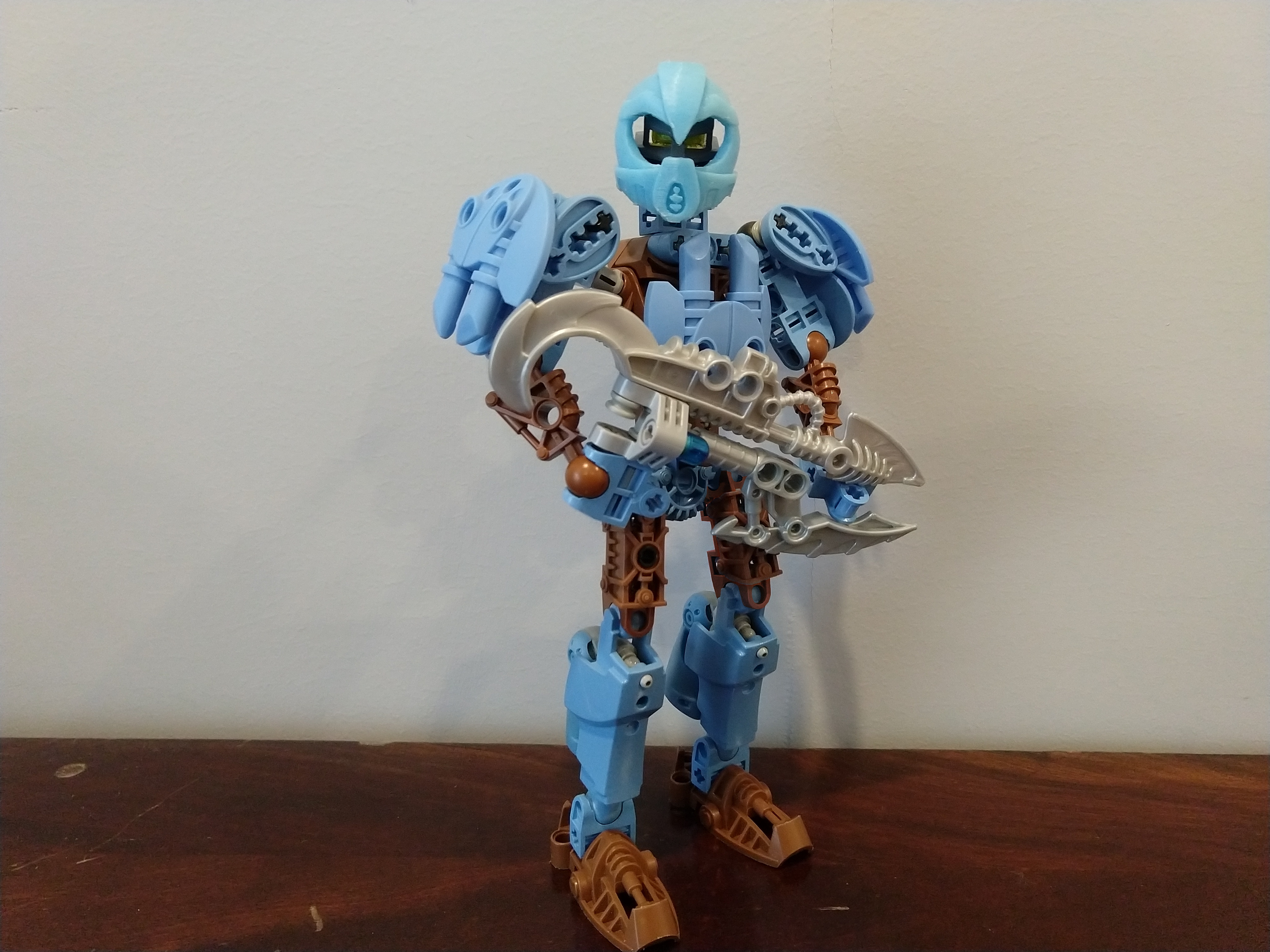
It’s Toa Naho, everyone’s favorite extremely-appearing-in-the-actual-story Toa of Water!
Close up of leg jets (Galidor FTW):
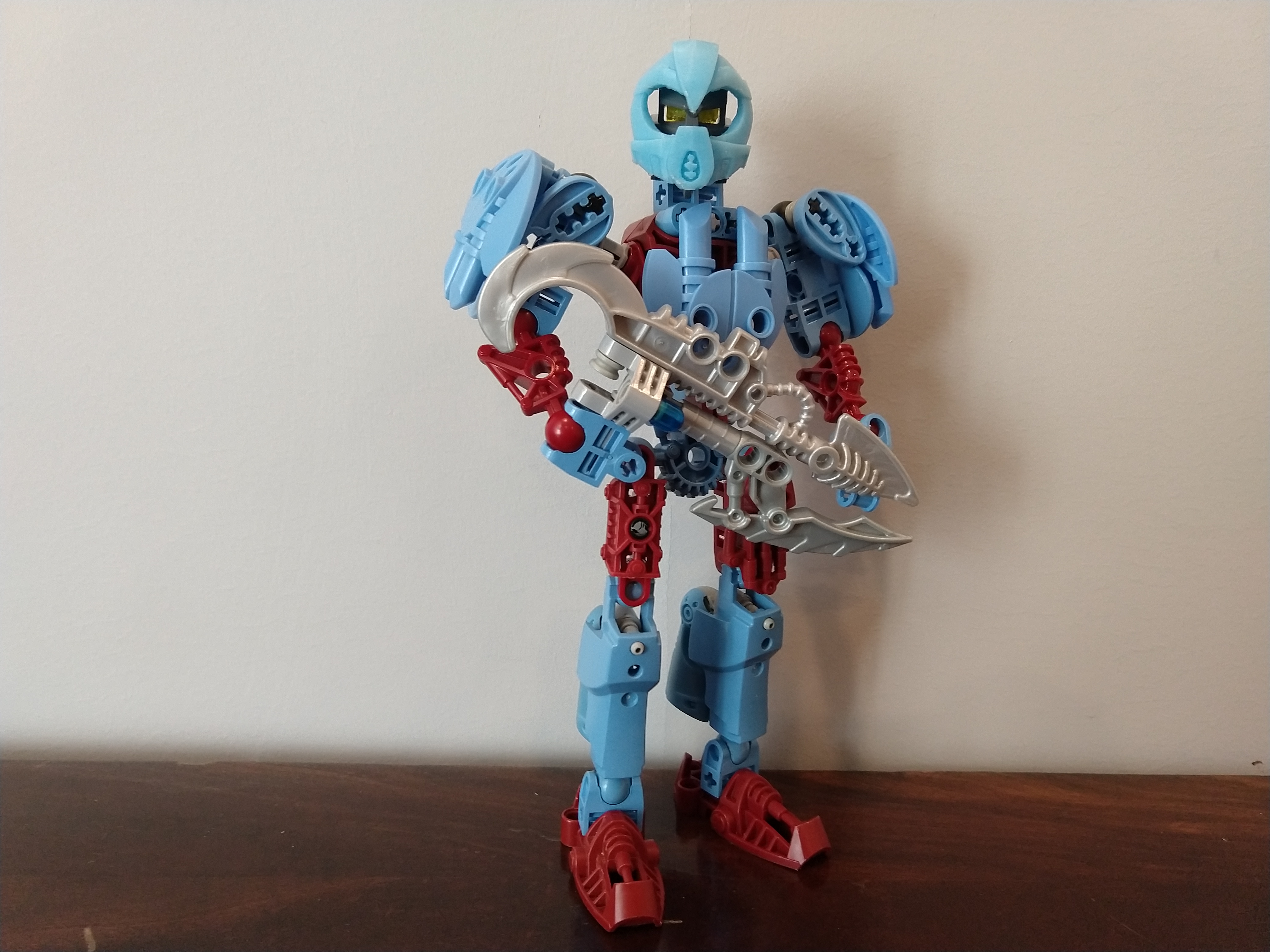
Alternate “Coral” coloration: please ignore her left thigh thanks
Which color scheme do you like better?
Mask model by Galva: Mask of Direction -VootCaboot Commission- by Galva - Thingiverse Reddit - Dive into anything
24 Likes
I kind of want to say I prefer the brown, but that would really just boil down to brown and blue being a highly underused color combination. With that in mind I’d be lying if I said the metru red wasn’t the more visually striking of the two.
7 Likes
Rukah
January 4, 2022, 9:57pm
3
I like the metru red a little better than the brown, because I think the brown just looks like mud. The rest of the moc looks good though
3 Likes
that colour scheme is pretty funky, i must say i prefer the brown.
2 Likes
I like the tropical feel of the red and blue coral combination better.
4 Likes
Winger
January 4, 2022, 11:12pm
6
I like the idea of coral coloration, but I don’t think it was executed very well here, so I’d say go with the brown.
For coral, I’d suggest dabbling with pink and sand green, rather than flat out red.
3 Likes
kaikue
January 4, 2022, 11:37pm
7
Thanks for the feedback, everyone!
Winger:
I like the idea of coral coloration, but I don’t think it was executed very well here, so I’d say go with the brown.
For coral, I’d suggest dabbling with pink and sand green, rather than flat out red.
Yeah, I kinda agree. Dark red doesn’t really fit the mellow, friendly vibe I was going for. I’m pretty limited in color choices with this build, but maybe it’s time for me to go more custom…
I saw a great coral-themed build here: DriftingFarandWide on Instagram: "Rough post for today, just a few of the masks that I have finished on the matoran in their color. First image is a standard Ta-Matoran wearing a Great Rau, model by Galva. Second is a Matoran of Magnetism wearing a Mangai Styled Kakama, model by Galva. Third is a Matoran of Psionics wearing a Noble Kakama, model by Galva. 4th is a Coastal Coral Reef Ga-Matoran, wearing a mask shaped like Bomonga’s Great Awai, model by Rothanak. These just need a photoshoot before I can upload them to my store. Which one do you like best? 🙂 #bionicle #bioniclemask #bioniclemasks #bioniclekanohi #bioniclekanohimask #bioniclekanohimasks #bioniclemoc #bioniclematoran #matoran #kanohi #customlego #paintedlego #driftscustomkanohi" Maybe Mata red would work better.
3 Likes
kaikue:
Yeah, I kinda agree. Dark red doesn’t really fit the mellow, friendly vibe I was going for. I’m pretty limited in color choices with this build, but maybe it’s time for me to go more custom…
If you’re willing to work with some System-heavy custom greeblies (and have access to the parts), Lego straight-up has a colour called Coral:
It’s mostly small System pieces, though there are a handful of Technic and other mechanical-ish parts available in the colour.
1 Like
In my opinion, the coral color would work better with metru blue. If it were used on this moc, she’d look like cotton candy. The dark red looks nice with the medium blue.
4 Likes
I always wanted a light colored Naho! The brown ersion si better.
2 Likes
I’d say the ‘coral’ colour scheme would be my pick as the red and blue is a very striking colour scheme and because to me the red and blue has more of a connection to the element of water compared to brown and blue
1 Like
I’ll go with neither, because the brown one gives me a toa of the Green vibes for some reason and the red one is just, no to me.
That’s not Nymue…
Pretty neat. The shoulders are well done, and the light blue and brown is a decent color combination. I’m not a fan of the blue and dark red, though.
1 Like
kaikue
January 5, 2022, 8:53pm
14
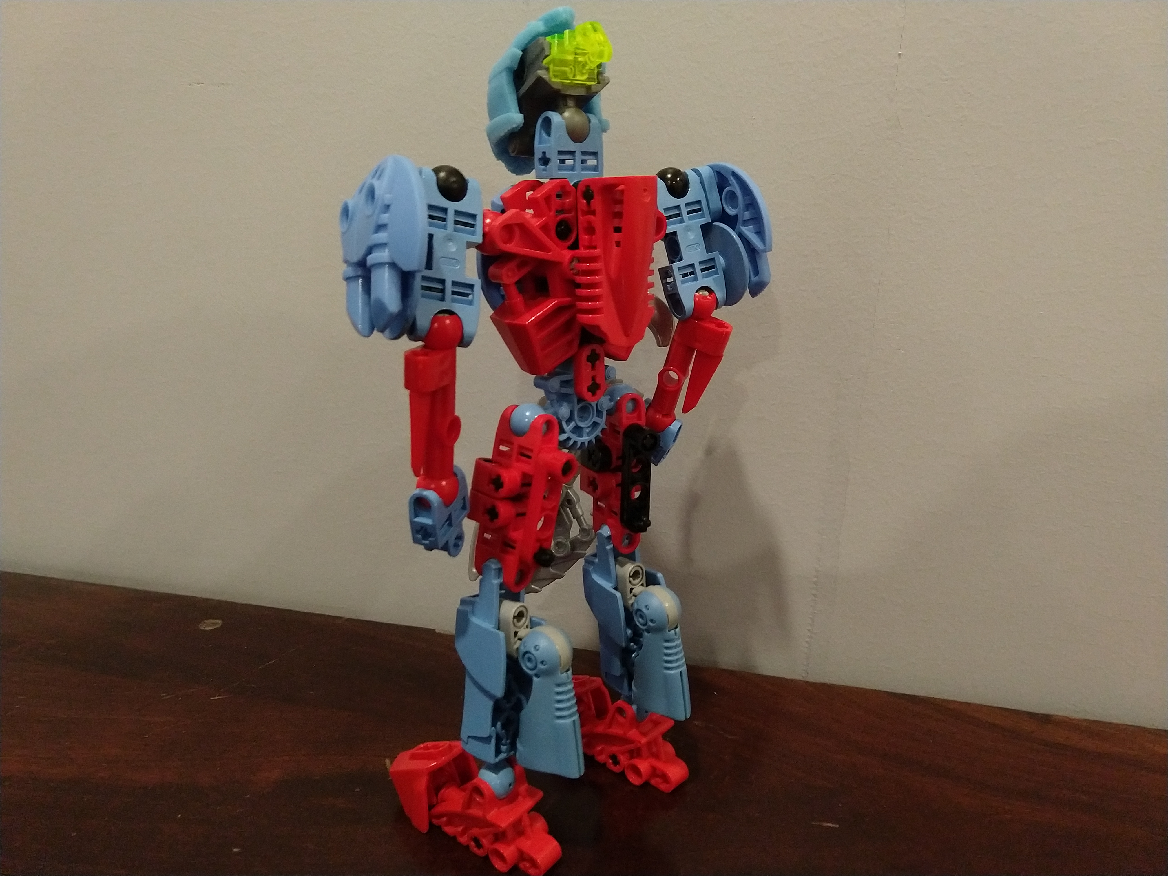
Alright, here’s a new version for all you coral lovers:
Still not sure which one I like the best, but making “fake Metru parts” was really fun.
5 Likes
Rukah
January 5, 2022, 9:41pm
15
woah actually I think that looks pretty good
I like this one a lot better.
Brown gets my vote. That weapon is rad as well.
1 Like