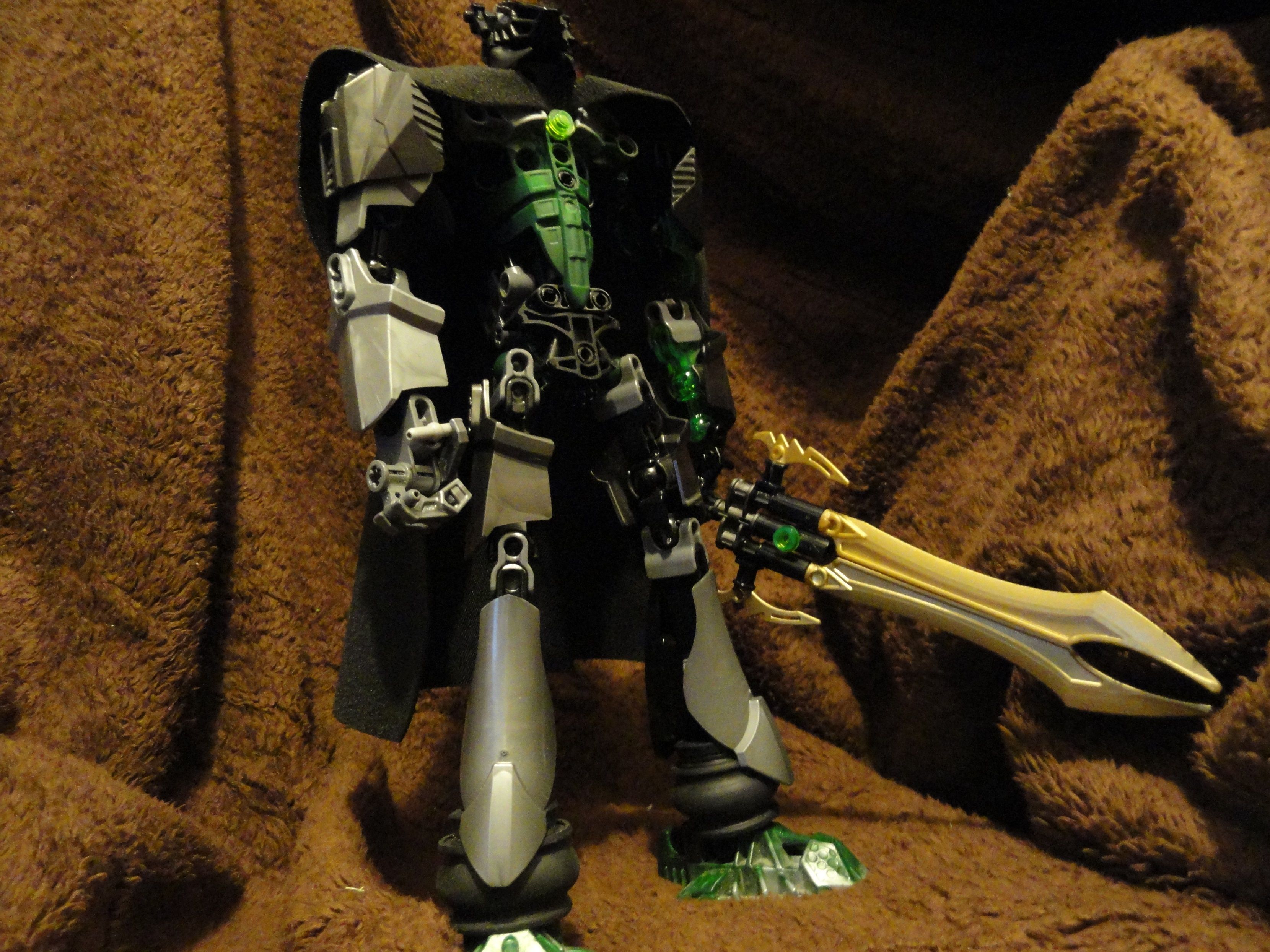
This is my biggest change to my self moc yet!, Thank you Lego for the new parts!!!
I killed them all BTW
This is my biggest change to my self moc yet!, Thank you Lego for the new parts!!!
I killed them all BTW
More pictures please?
Thats all I got right now.
Force Friday Update? Why would you call it a Force Frid- [looks at MOC a bit more] Oooooh. Anyways, He looks pretty shweet. 
Thanks!
I’m getting a Megaman X vibe from this.
gotta say, rather like the legs with the new shell,
I think those friction adders in the knees aren’t necessary, and it would look better without them.
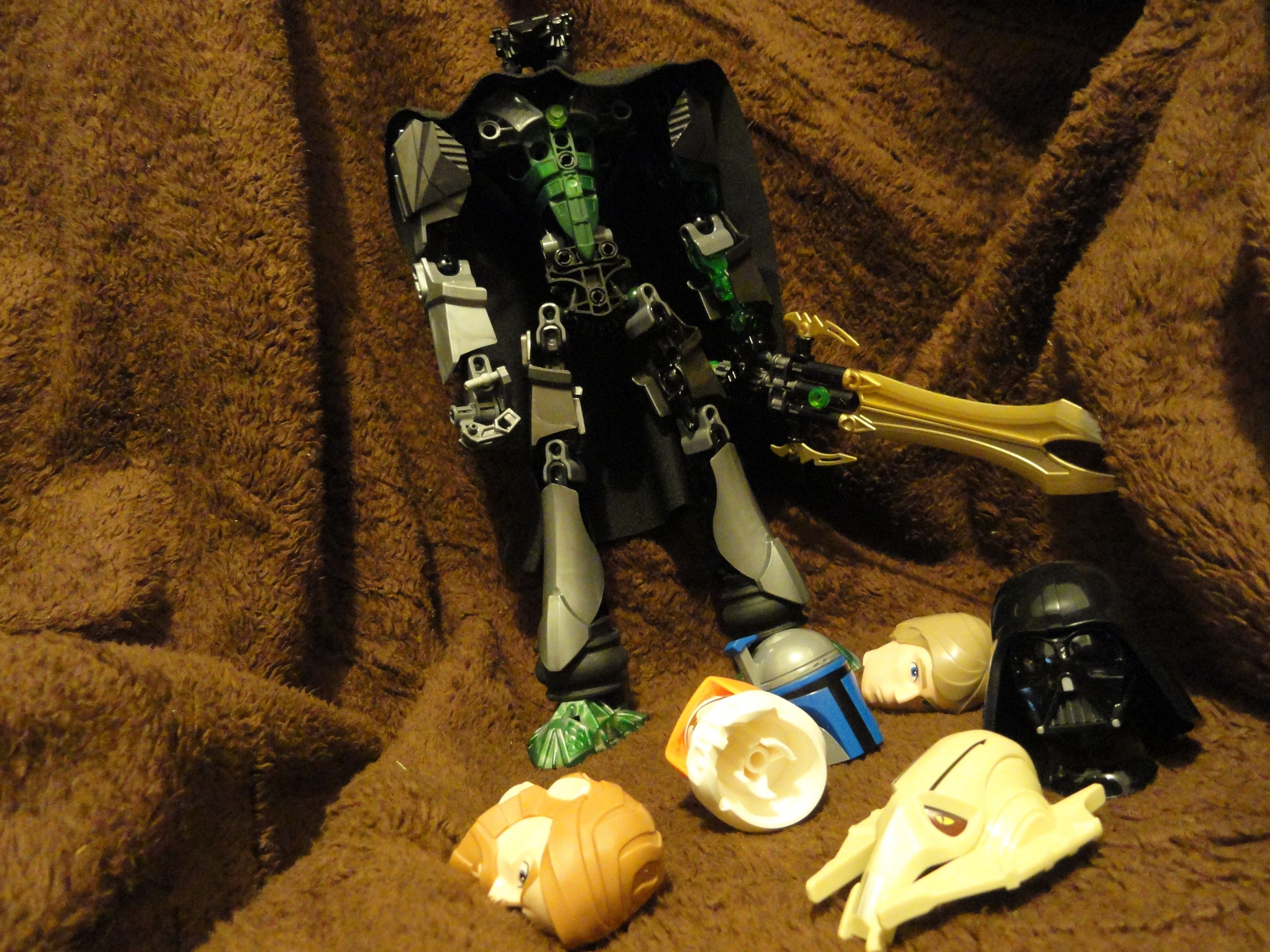
“Sees the heads”
Can I rob you?
Nice use of the new shell, it looks cool.
Noice!
7/10. +1 000 000 for being able to kill a mando legit (Not like Windu. Biggest inconsistency within the canon. Bleh.)
@DoremarNuva Thank you, I would add more green if his story allowed it, and had more green parts…
@The_Exurian I got the head design from Labg, so sure!
@Payinku To me the friction adders in the knees keep him proportional, your hands only go down to your upper thigh, not your knee
the friction adders on the knees make his lower legs longer, not his upper legs.
It would also make his lower legs shorter than his upper legs.
Any other SW ultrabuilds-based MOCs in the works?
Anyway. I like the large use of CCBS he has, gives him a very clean look. The torso distracts a bit from that aesthetic, but that could be fixed by taking out the Metru waist and replacing it with a smoother piece on the waist. I want to like the color scheme, as I’m currently working with muted and “realistic” color schemes, but the use of both gunmetal and new silver is kinda distracting. Using one or the other would be better. I do like the scattered green placement, gives a bit of life to the metallic-heavy character. Also sword is great. Wish you had included a better shot of his head, can’t see it that well. Overall, looks nice and definitely the kind of MOC that I’m taking inspiration from right now. Looking forward to next (hopefully better color schemed) update and/or next MOCs.
Not really, unless they come out with new parts in the SW buildable figures line, as for the colors, its mainly green and gunmetal, the silver is suposed to be his more robotic cyborg features…The glatoriab waist will stay since it looks more like a belt with yesterdays updates to him.