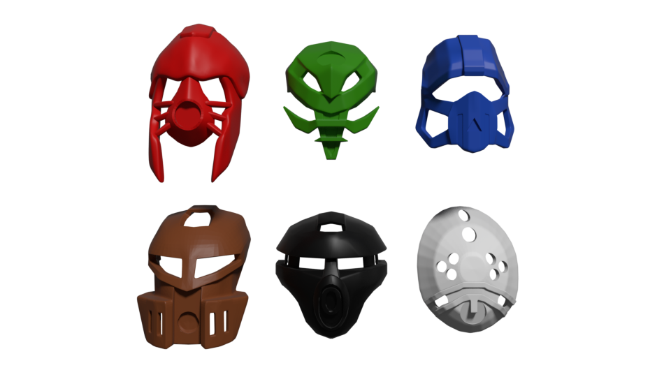
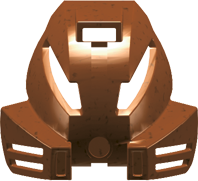
As a follow-up to the non-organic Inika Masks, I present to you, the first public look at the next stage of our project: The Noble Mata masks. As with the last set, they are 3d printable and fit the Metru style head. Our previous set has been released, and is available for purchase at the shop: Red Star Forge by Red_Star_Forge - Shapeways Shops
The Miru, Akaku, and Kaukau were designed by me. The Pakari, Kakama and Hau were created by Brian Khong.
Most of these are pretty good. The hau and the kaukau are meh, the miru isn’t really good, the akaku, the pakari is pretty good, and the kakama is great. Its good to see that someone is at least coming up with noble designs of the three kanohi mata we didn’t get officially.
I feel like the cheek vents on the Kakama ought to be moved up, otherwise it looks too long.
The Hau is OK but I think the area with the small cylinders connecting the mouthplate with the sideburns ought to be solid with vents added afterward; it looks very gappy and incomplete.
The Akaku seems kinda strange, but I’m glad you didn’t go with a telescoping lense for an eye again; not sure what I would change with it.
The Miru… is just plain blech. It’s far too gappy; specifically I think the eyes could be slanted down a bit more, the blades coming off the sides could be thickened and attached to the upper portion of the mask, and the chin bit shouldn’t be there at all.
Anyway, I think it’s pretty cool to see people modeling these masks and I hope you can work out the kinks over time.
As always, constructive criticism is welcomed! Our internal groups have said the Miru looks too much like a Noble Huna, and so we will be reviewing it for a revision
I like the designs though I believe it was said that Solek, Tanma, and Photok’s masks were the Noble versions of the Akaku, Miru, and Kakama respectively, although it’s possible they could’ve been modified for better aerodynamics.
While our team is aware of the masks’ canonical appearance as the noble masks, we feel that they do not do the Kanohi justice, and were only seen worn by the Av-Matoran of Karda-Nui. We wanted to introduce newer versions that would also be seen elsewhere.
These are… really meh. The only one that looks passable is the Pakari. The rest look just too far off from the Great Versions. They also seem really heavy and blocky, the kakama, Hau, and Kaukau in particular. The Miru and Akaku are just too abstract imo.
So, after looking at them again after a while, I have some new opinions. Primarily, in the akaku. While I really like the ideas and concept behind it, the execution leaves a lot to be desired. But the thing is, technically, these don’t have to look anything like the original mata masks, as the few official noble masks we have seen, look little to nothing like their great versions. Having looked all of them over, the only noble masks that look like their great versions, are the rau, and maaaaybe the kakama.
Also the shadow matoran masks, but those are basically carbon copies of the larger versions, and unlike all the other ones, where designed in the same year as their great counterparts.
Overall, I think that all of the masks have really good ideas, but problem in the execution. I feel that if you could make a few small tweaks to each mask, they could be a lot better. Except for the miru. You should start over there. I really hope I’m not coming across as rude or hateful, but in my opinion, I absolutely do not like the miru, at all.
Hau:
Having a more open design is a good idea, though the proportions seem too exaggerated. Maybe scale things back a bit. Especially those spike things.
Kaukau:
This one is the opposite problem. The mask feels too open and hallow. Try filling in the holes on the cheeks, and put some more detailing there. Though don’t get rid of the cheek holes entirely.
Kakama:
The overall shaping is good, but it feels a bit too big and blocky. Maybe slim it down a bit? I have the least to say here, since personally I think this one works the best.
Pakari:
Again, its the opposite problem of the last mask. Its too small here. Try filling out the cheeks a bit, and add a hole on each, to represent the great version’s cheek vents, kinda like what you did on the forehead.
Akaku:
I love the idea you had for the eyes. Though the rest of the mask is problematic. Its too abstract. The best advice I can give is to design the forehead mouth and cheeks a bit more like the great version, but not too much. Also, try and see what an asymmetric version might look like.