I’m not saying that if it is not custom it isn’t good, what I’m trying to say is that we’ve already seen Inika builds before, therefore taking out the ‘originality’ or ‘creative spark’ most MOCers like to see. I hope you understand that I’m not saying it like that.
1 Like
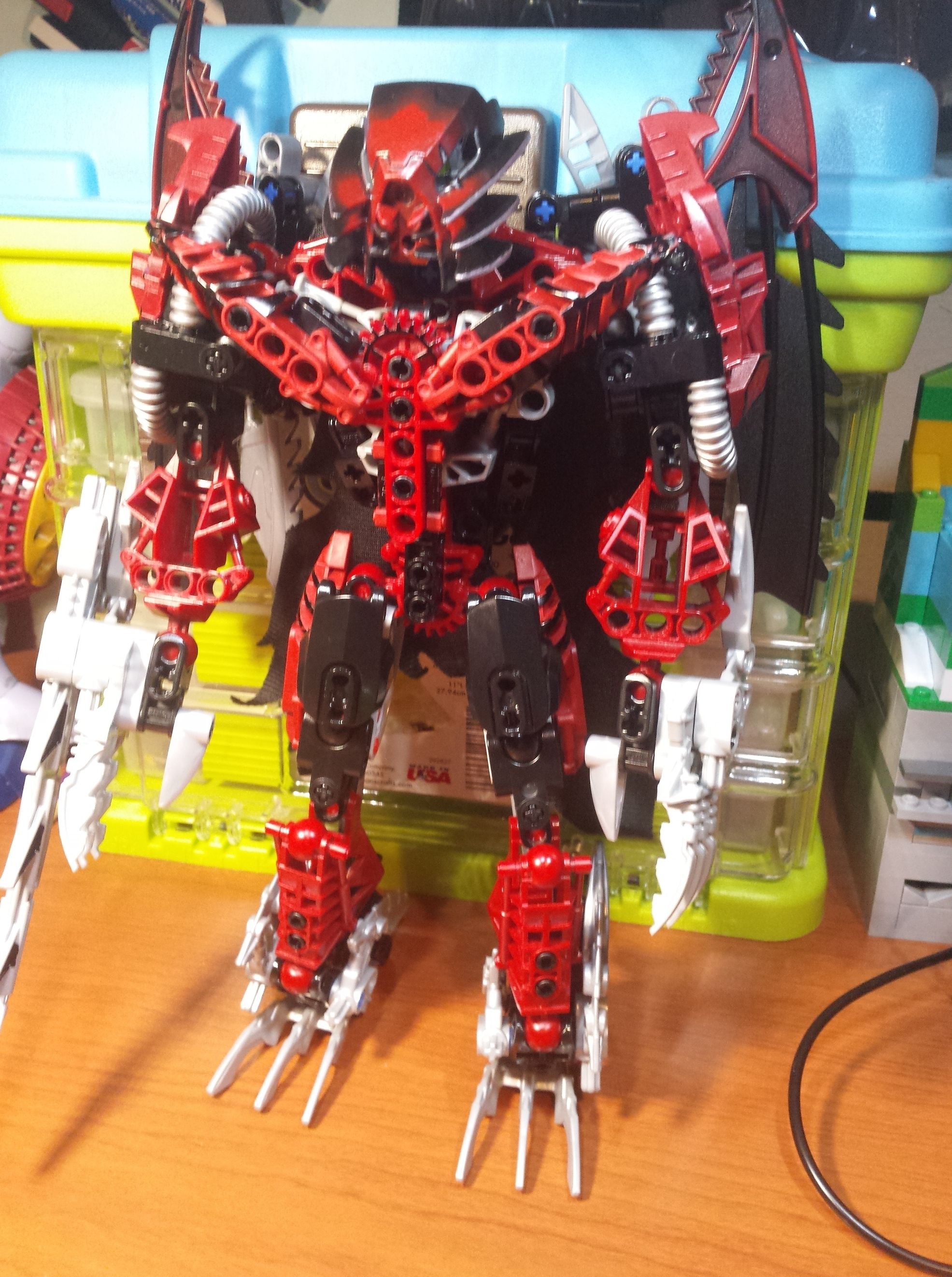
Alright, the MOC here is alright, but ATM he kinda looks a bit generic and messy, I think for your ideas a thinner, sleeker, more coherent build would help. the grey seems really out of place, as does the silver. I think you should clean the build up, make the black and red the main colors, and use silver for weapons and tools. I do not think he needs to be super complex, but some work could help.
All in all, keep on improving and I look forward to seeing where this goes!
RT~
1 Like
I understand where you are coming from, and I respect that.
But the only “standard” Inika design is in the forearms. Every other part has a bit of an interesting design aspect. The lower legs admittedly are extremely flawed.
I’ll try to change the grey for black ![]()
Though I’d rather not replace the silver in the main body, as that would make the hoses on the shoulders and the clawed parts look out of place. Same with the clawed feet.
1 Like
Maybe if you replaced those parts and made some better designs you could fix that issue?
just food for thought.
1 Like
3 Likes
Tons better. Much more coherent.
1 Like
Better colors. now work on the build.
1 Like
The removal of dark grey does wonders for it, actually. Looks a lot better, although;
Doesn’t justify them as they are, maybe the ones on the wrist, but the ones on the ankles just make it look blockier. They might just need a different attachment point that doesn’t look as awkward - angled on the hips or back are good options.
2 Likes
Man. This actually looks like a titan that should’ve been released.
2 Likes
Is that Gundam Marker I see?
1 Like
Yep!
That’s the paint I use.
1 Like