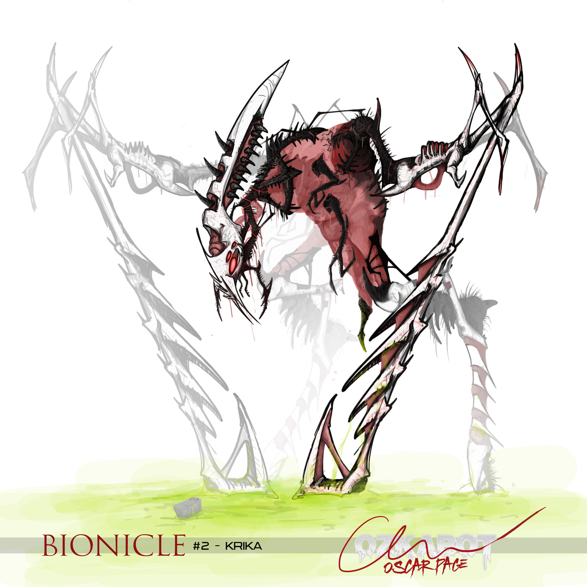
I didn’t intend to go as detailed with this as I ended up going; originally the plan was just a black brush on white background sketch, but as the design started getting more complex I felt I needed to go a bit more refined and bring in some colour in order to clarify some of the ideas I was implementing.
The goal of this piece was to really push the grotesque nature of insects; and I think we can all agree that maggots are up there with yucky things associated with insects. While being adjusted throughout the process, the maggot torso was pretty much the first thing I thought of; “a maggot on legs” is how I described the idea during a discord chat. I liked the idea of that maggot aesthetic being revealed in piece throughout the rest of the body, so that was used to represent the red injections that the Krika leg pieces have.
I do intend to continue this ‘nightmare fuel’ series, but the following pieces definitely won’t all be up to this level of finish - I rarely have the motivation to spend as long as long drawing as something like this takes.
I think you were really successful with the torso here, the maggot aesthetic definitely comes out!
I do have to say though, I think it might be a little too heavy on the intangible portions of him. I see what you were going for, but to me it just looks like those parts of him are unfinished. Perhaps adding some kind of tint to those areas would make it look more like they’re ghostly and less like they’ve just been dropped in opacity.
That’s really the only thing though, it only bothers me because the design is so well executed that I want to see as much of it as I can. Amazing work as always!
I do see what you mean. I was thinking for those parts, some highlights / reflections could help give them some more presence, and maybe give an almost slimy look. I’ll definitely work on that.