Plural V4: Back in Black (and Silver)

#“Something about Scrubs” -Me, 2016


I got sick of the old plorb, so here’s a new one to take his place.

Front View:

Side View:

Back View:


Here’s Caped McPlorbster with Lawrence, calling him out for being a dastardly tree thing:

I don’t think this picture needs an explanation:

The aftermath:

And now here’s Plurb riding off into the sunset with the palace pet he bought for less than a dollar at Toys R’ Us (It was cheap, okay?):


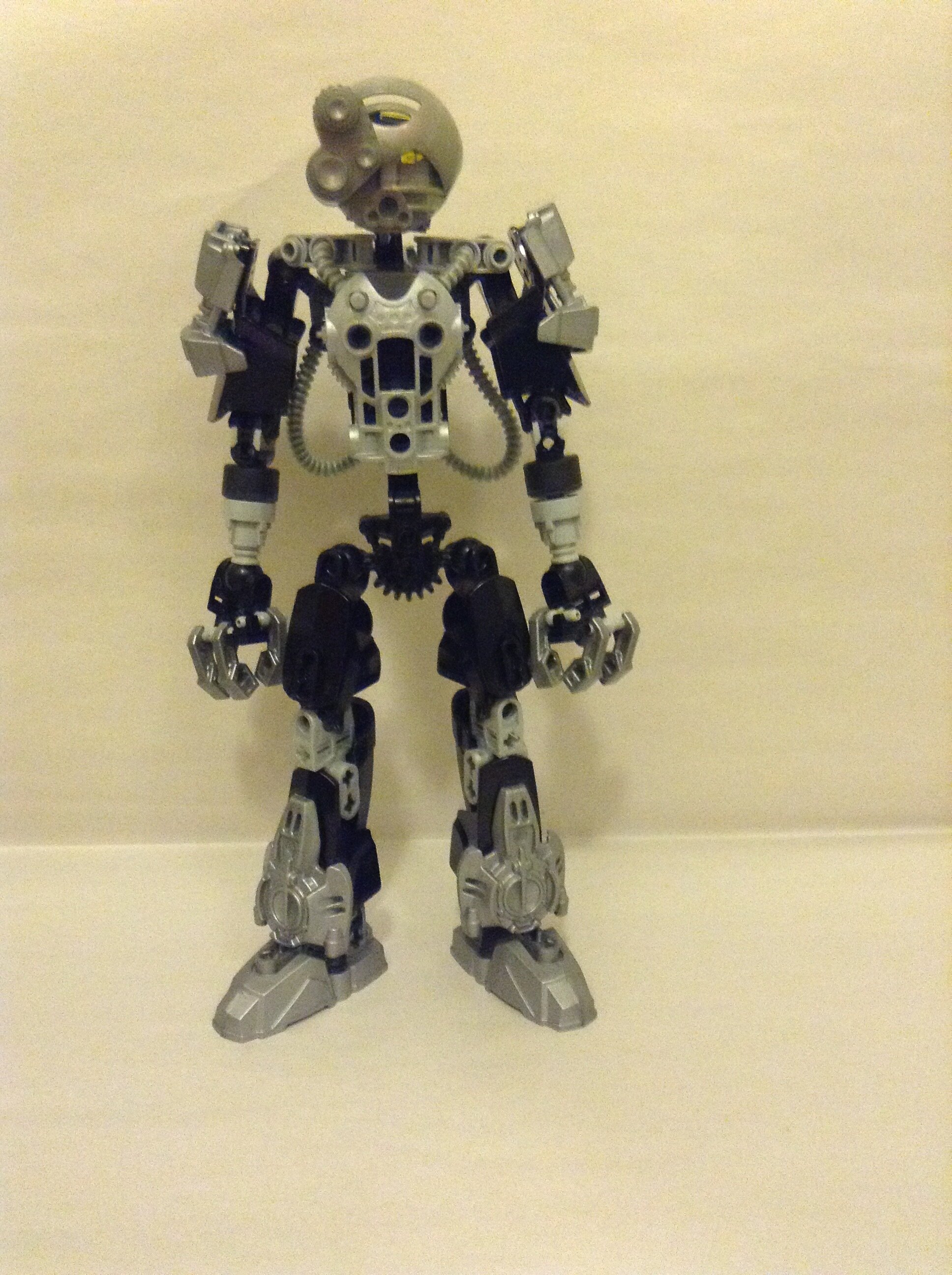
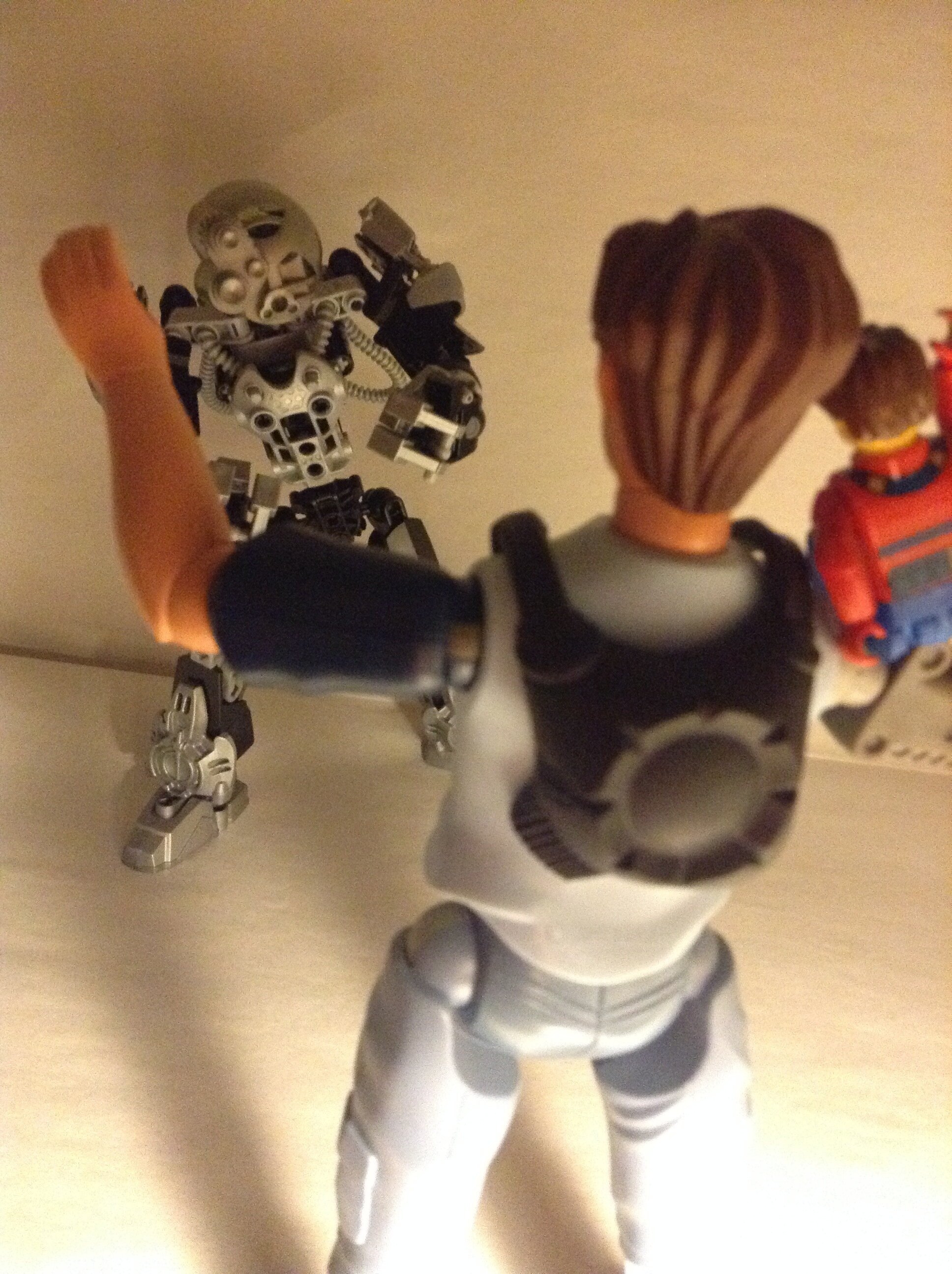
I’m not too satisfied with this version. I’m kind of getting bored with the black and silver and he just looks kinda goofy in my opinion, so some criticism or advice would be extremely helpful.

43 Likes

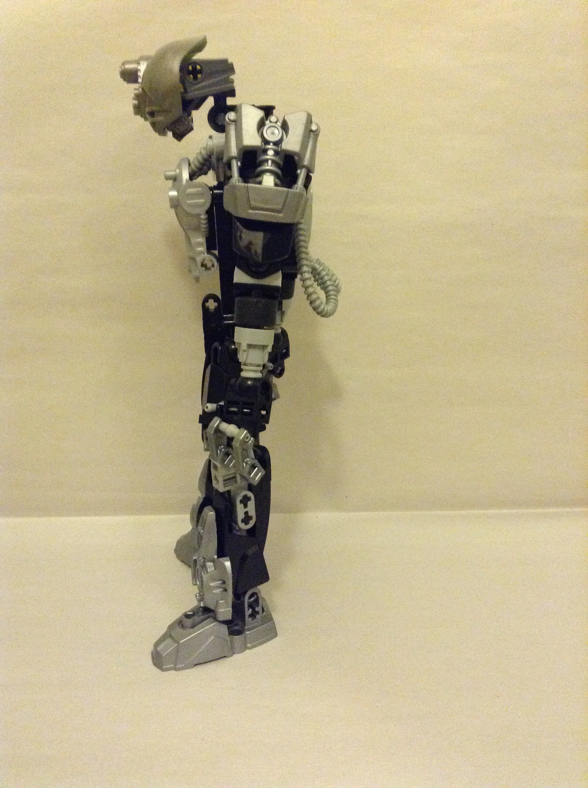
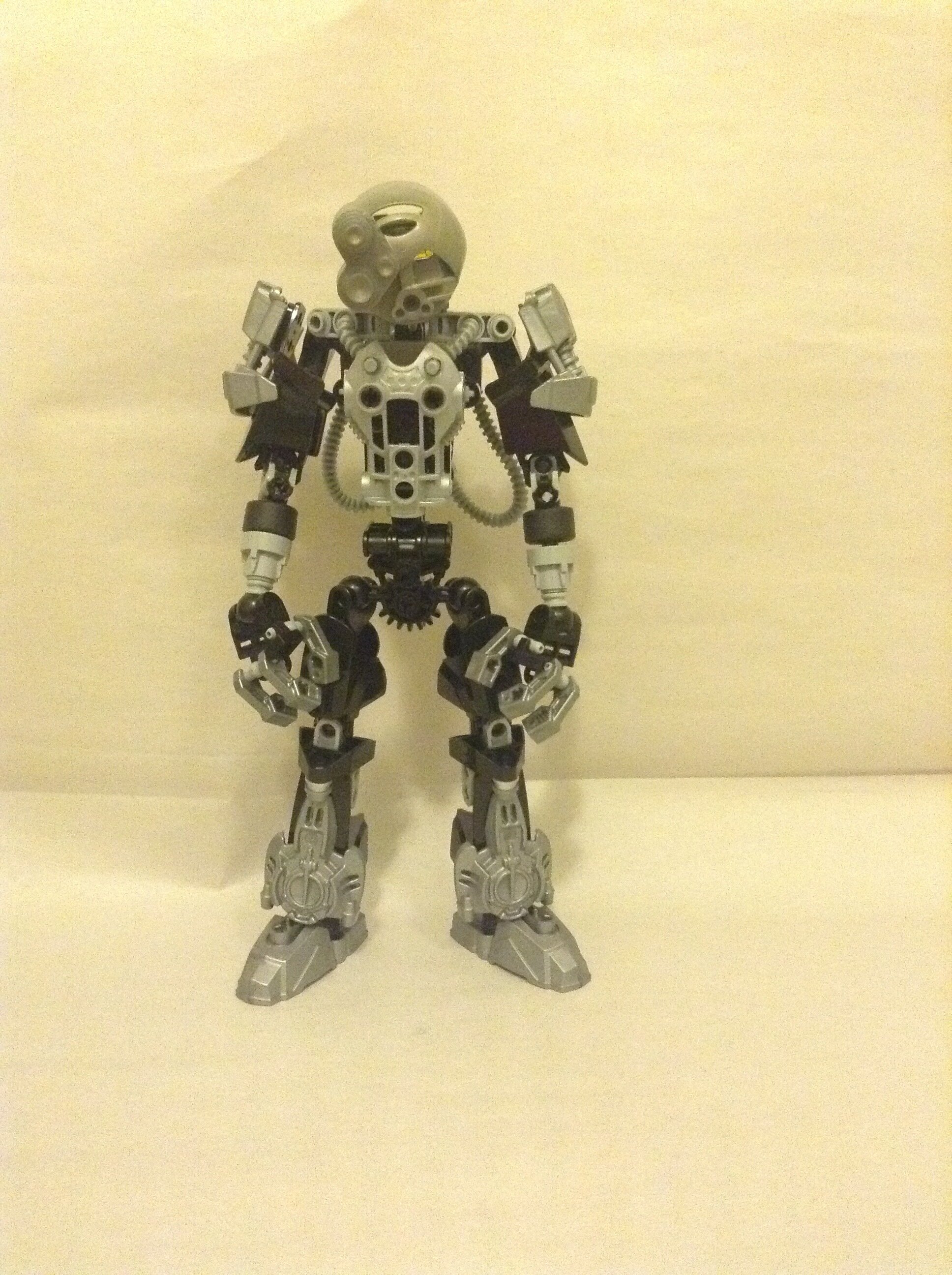
I think it’d help a bit if you found a way to move his head/neck back a stud or two. He’s pretty cool overall though, and your photography is top-tier. :stuck_out_tongue:

6 Likes

Thanks jogn! I had a slight issue with connecting the head to the body (that’s what happens when you start from the bottom and go from there), so I just went with the easiest, ugliest connection.

1 Like

But you’re a kinda goofy guy

8 Likes

Gee, thanks. :smirk:

Well, I think you should probably eat something, but otherwise I really like it.

2 Likes

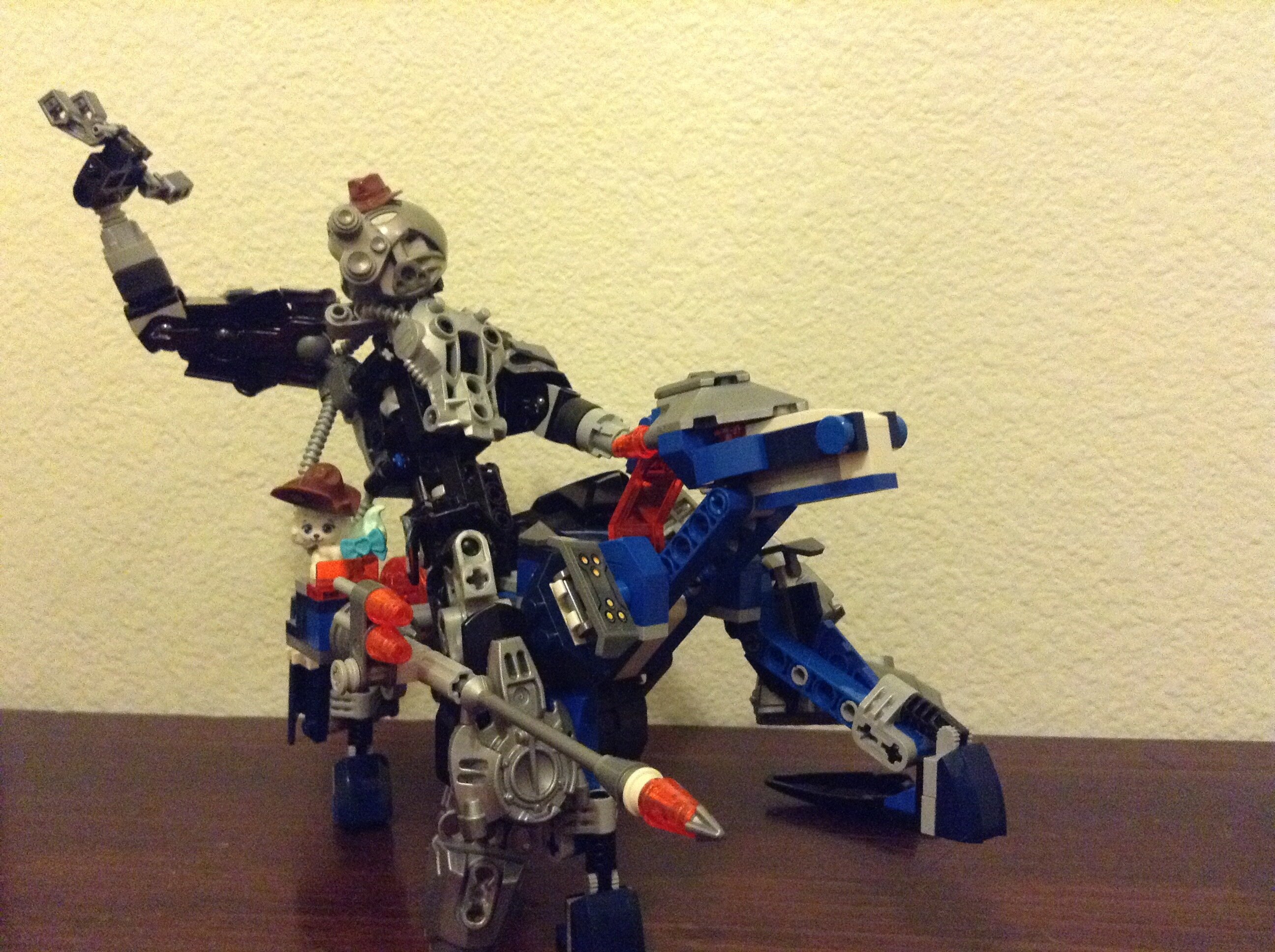
It looks great, minus a few nitpicks. For example, the colors (which you mentioned yourself), the waist is pretty skinny, and the top of the knees are a bit exposed.

However, only one of those really matters, and that’s the waist. Lots of cool mocs suffer from thin waists, and it’s an easy enough fix.

Still, gr8 moc m8!

1 Like

I find your lack of Mixel eyes disturbing.


Looks amaze man.

2 Likes

Yeah, I just noticed that tbh.

I’ll fix it.

I actually kinda like the little bit of silver at the top. I guess I could add something to bulk it up, though.

Rood.

This a nice lookin’ dudemanbro, but I miss the Mixel eyes :stuck_out_tongue:

1 Like

I fixed porb up a wee bit:

1 Like

Looks great, nice colors, it’s kina bland

1 Like

Not a big fan of the chestplate and super exposed waist. and I agree with the silver and black being a bit bland. All in all, its neat, but not too great.

1 Like

You were right, you could’ve gotten rid of the goofiness by using the mask you suggested

5 Likes

I don’t know about that personally; I kinda like it.

Dang you’re right.

Time to go to Shapeways.

2 Likes

Alright then, it IS your MOC. I just personally think something larger and maybe more complex could help the overall look.

TO THE CYBER-HAND!

2 Likes

A larger chestplate would just add some unneeded bulk to the top half. As for its complexity? I don’t see exactly see what you mean when you said “more complex”. A custom chestplate? Something with more gears and buttons?

Probably something custom, but if you like how this is, then keep it.

Those tubelies are a Pacha meme…

1 Like

A plurbtastic job with his arms and legs. His torso looks a little awkward near the middle, though.

1 Like