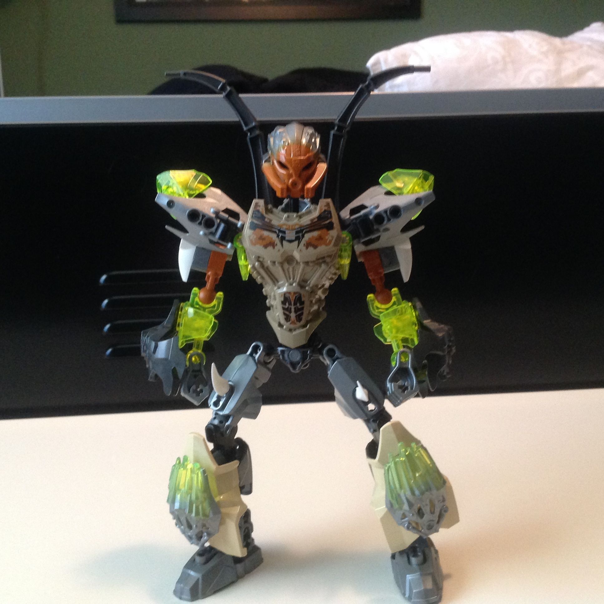
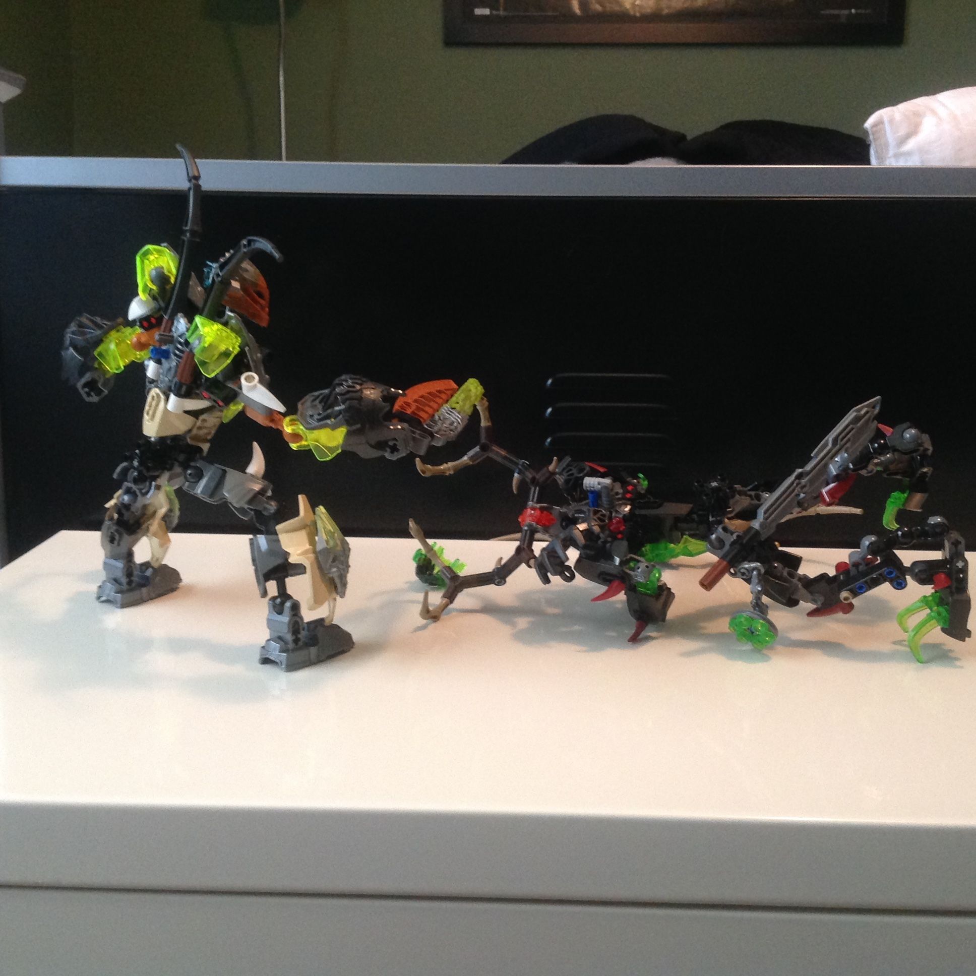
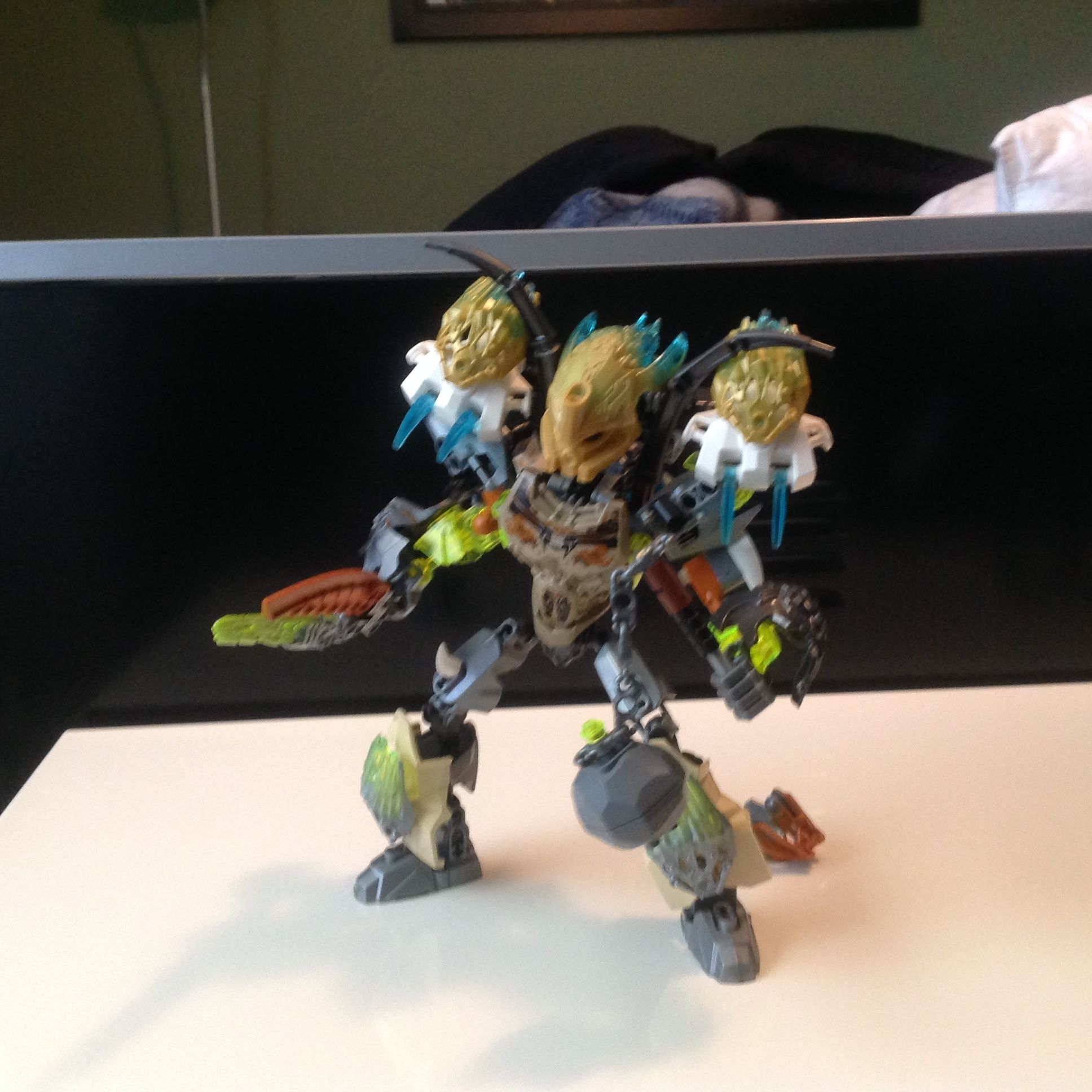
I decided to revamp the Uniter of stone more or less into my version including details like the “bones” on the original. I also didn’t like the staff as it was difficult to pose the arms so I made one end a chain mace and the other a sword. His waist function still works and he has the Uniter port also. Mostly I just built him to look cooler than the rather basic look of the set.
Idk, the lower legs look really awkward, the white spikes are just another color added to a rainbow Pohatu. The skull adons on the lower arms look out of place too. The spider legs look ok, and the sword isn’t too bad, but overall he looks really messy.
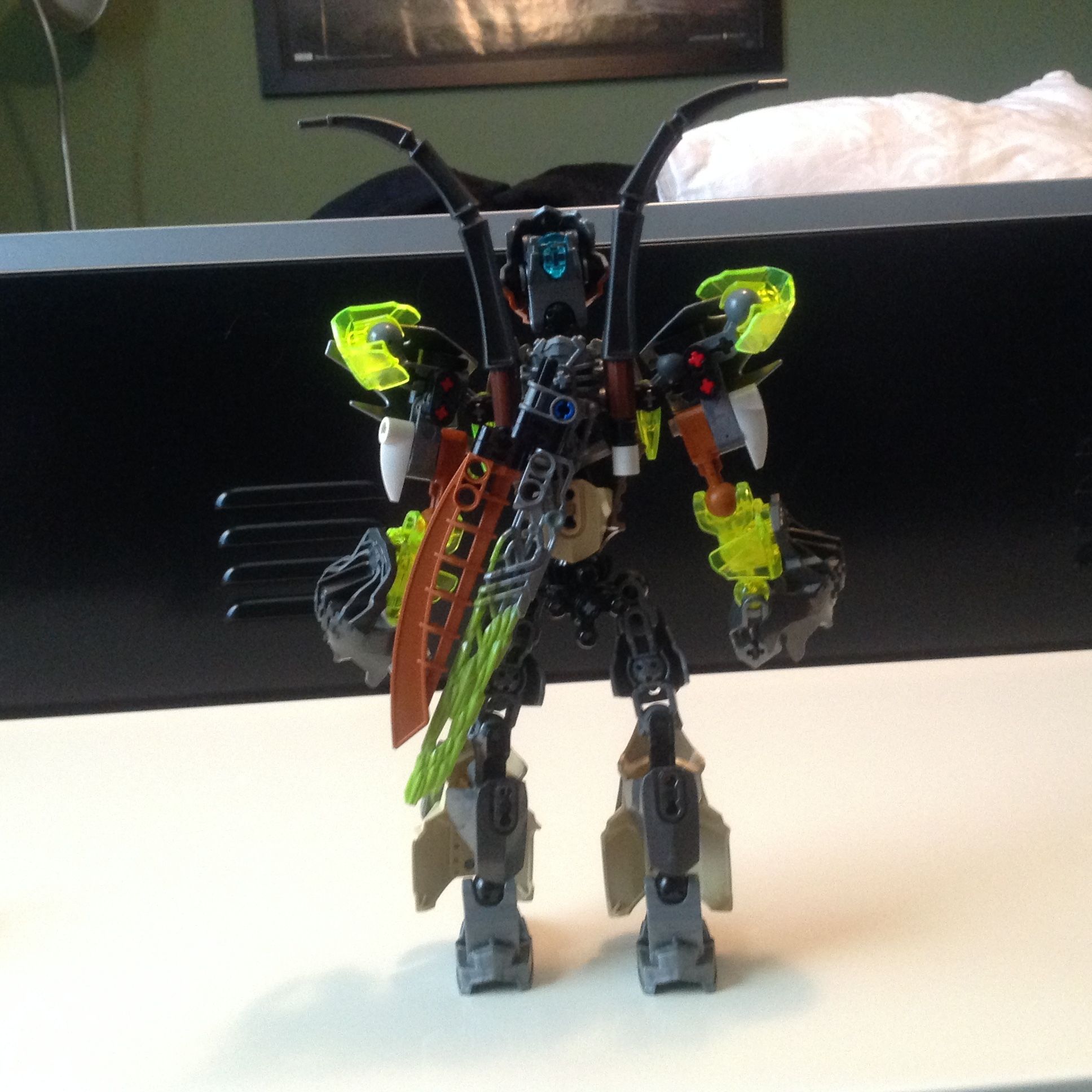
Them flared pants though.
I think that the lower legs are a bit to bulky and the shoulders and skull armor on the lower arms look awkward to me, but apart from that it not to bad
I don’t like it. Looks like you bulked up certain areas just for the sake of bulking them up with little sense of consistency (CCBS shell behind Vorox armor). I prefer him to be sleek rather than bulging with armor. But that’s just my opinion
This looks better IMO then the original set but the forearms sr a little to big and I don’t really like the look of the bone spike the hints on the back. But other then that good moc.
You failed to make him colorwise better than the set. In fact, it’s probably even worse, there’s still the same amount of orange and on top of that you incorporated normal tan along with gunmetal, silver, trans yellow, burnt orange, and sand brown.
I’m not a fan of how you bulked him up. His lower legs come off as too wide, and there’s no real consistency with any textures on this. The white actually comes off as an eyesore on this, and those black bone spikes are unnecessary.
Forget the haters, @Khalsa721 . Though this does need a bit of work color-wise, it’s no worse than what I would have done myself. For that, I give thee a like and say, “Good job mate!”
Yeah. I appreciate and can see the problems mentioned but we all have at least one moc that we just like too much to change. I think this is that moc for me. Also I’ll have to search that but gundam lewa had nothing to do with this. Just wanted him to look cool.
But I’ve never liked the upside down chest armor on the lower legs. It gives a bell bottom pants look that just doesn’t work for me (I hated it on 2015 Tahu as well).
Overall though it is an improvement from the original set.
Yeah I don’t like that either.
Okay I am back for my groovy thing I have been doing lately. This one is going to be a hard one.
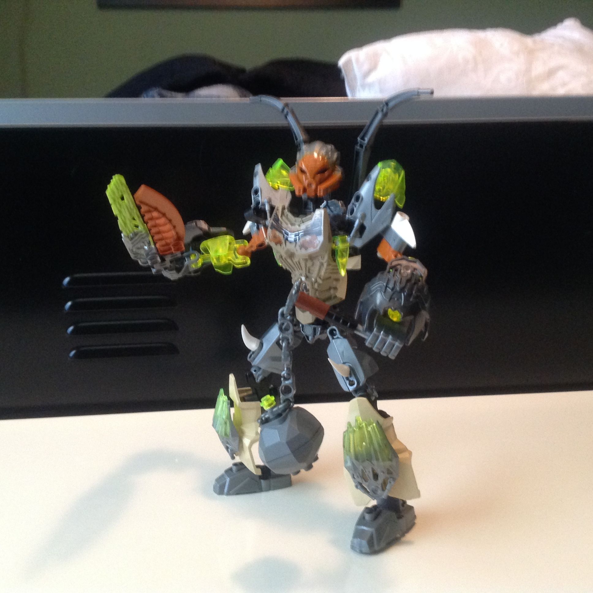
Eh the upper arms look like they have way to much going, to me at least.
The lower arms are okay to me.
The torso looks good to, but those spikes on the back don’t work for a “timeless Hero”, to me at least.
I like the sword, but I don’t think it goes well with Pohatu.
The legs, I Already stated how I feel about those torso pieces being used like that.
Also the two shades of tan are a little too much.
Anyway, some of these problems I have with the original Pohatu as well. But overall I do like the set better then this revamp.
Well that’s just an opinion, my opinion.
Yeah, not a fan, the shell changes look worse and the colors are a mess.
I prefer the set.
[quote=“FatCat23476, post:10, topic:19309”]
Forget the haters,
[/quote]for the sake of improvement ignore this advice, people have problems with it for a reason.
There is a difference between haters and reviewers. We are merely stating our opinions on the MOC and hos it could be improved, otherwise you end up with comments like “THIS IS AMAZING” on a mediocre MOC.