So I have really done my best to make this drawing, so I hope you like the drawing.
I am really proud of it, and I hope you like it too.
(Then again I am not the best artist…)
So I have really done my best to make this drawing, so I hope you like the drawing.
I am really proud of it, and I hope you like it too.
(Then again I am not the best artist…)
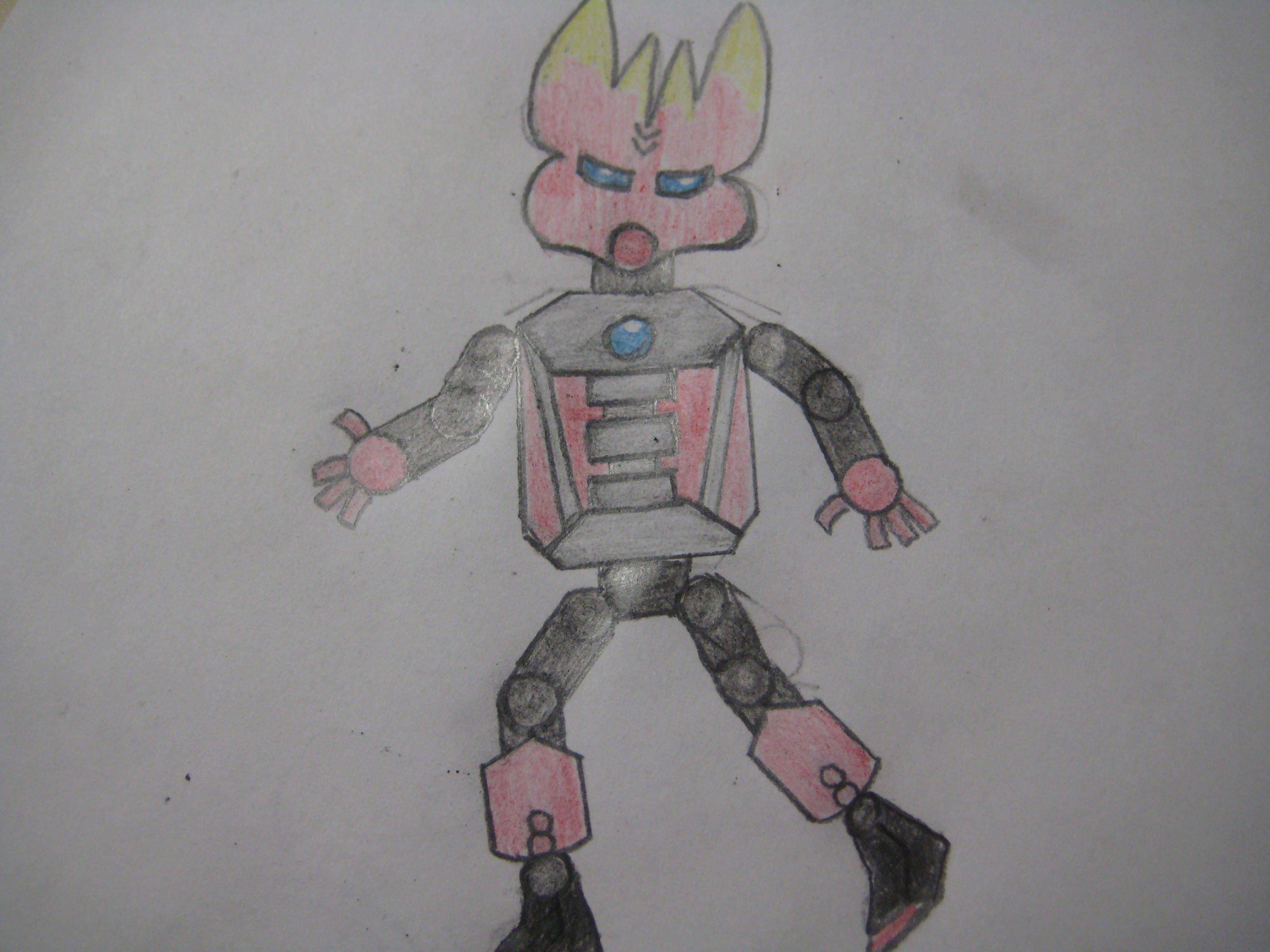
It’s simple, but it works. I do think the torso is a bit boxy though.
Still better than MY feeble attempts at art.
I’m going to echo Eko: better than my normal art.
I disagree about the torso, though. I think it looks just fine.
then I guess I have to play makutas advocate and actually critique it…
the mask looks different to the rest of him(honestly it reminds me of creeps art style) while the rest of him is boxy, the proportions are really off, the arms are too short, and the legs are too skinny, the torso is a companion cube, his shoulders seem a bit low, also the feet seem less arched than the protector feet should be, and I personally think the round hands with rectangle fingers look odd.
that said, the positives are there as well, the lines are clean and the limbs are the same size on both sides, the coloring is good, the bleed in the mask is exceptionally nice, and the heartlight is really nicely done, also the actual design of the chest is nice as well.
basically just work on your proportions and have a slightly more consistent style(maybe add a little shading) and this would be great, also I would put him in a more static standing pose personally.
keep drawing and you can, no, will, improve.
thanks for the tips @Payinku! I shall definetely work on it!