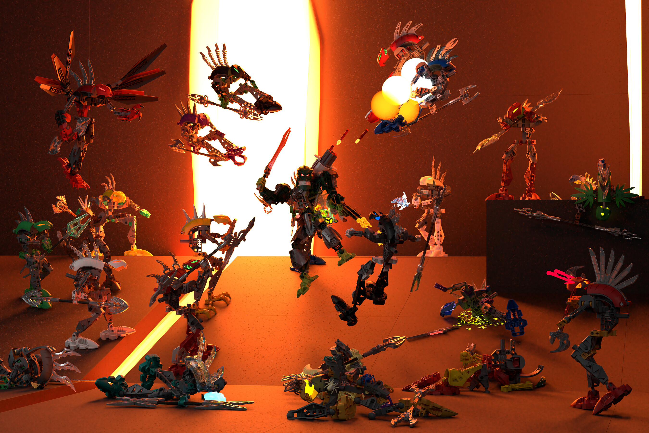
I’ve been working on this render for quite a long time, and I’m very proud to say that it’s finally completed! Zefir, bane of the Makuta, has been ambushed by a troop of Rahkshi, but he isn’t concerned - much like Reidak, he picks his teeth with Rahkshi. Armed with his powerful sword, the Crusader, and a mini arsenal of guns, he’ll make short work of the Sons of Makuta.
I rendered this at 3000x5000, so it’s a great resolution if you want to use it for a wallpaper (jk… unless?). I actually got it printed out as an 18x24" poster.
Rahkshi spines were courtesy of Kardas’s Rahkshi pack!
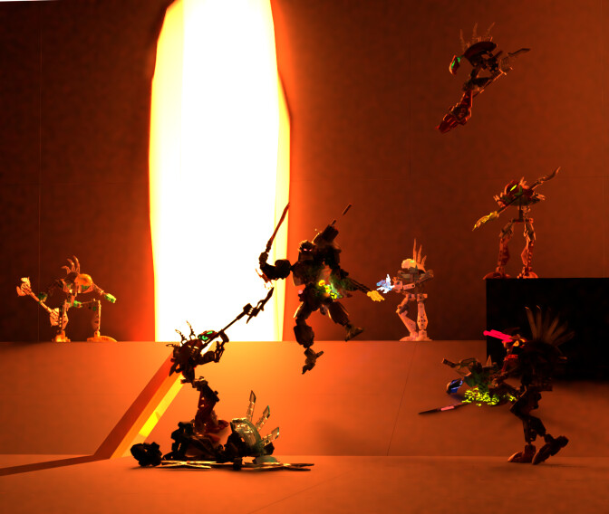
Nice composition, great MOCing, but the lighting just pisses away all that hard work.
Try not to silhouette your characters. I suppose for a shot like this, a double fill light should help to add definition to the builds without removing the mood.
Basically, try to light your scene like how they do it with action movie posters, 2 light sources on the either side of the character to highlight the silhouette while keeping the mood dark and edgy.
This does make me wonder how in the world the Skakdi had any kind of a chance against the Rahkshi during their conflicts seeing as the Rahkshi have Makuta powers.
Still though, this is a fantastic rip-and-tear moment. Little confused by the winged Rahkshi, but it’s definitely a vibe.
I definitely appreciate the feedback, though I respectfully disagree. I did add a few extra lighting sources in front of the scene out of view, and I wouldn’t say any of the characters are silhouetted by any means. Though the lighting is definitely a little dark, all the details are clearly visible. It’s definitely a far cry from my first test render, where Zefir actually was silhouetted.
I mean, Skakdi have some pretty broken powers too, to be fair.
Thank you! The model for the winged Rahkshi was offered to me by a friend, so I obliged him by using it. As a lore explanation, it’s a modified suit for a Rahkshi of Darkness, built stronger and tougher (and with wings) to hopefully be able to deal with Zefir.
Honestly, the full silhouette looks more deliberate than the half silhouette.
I understand you tried to illuminate it from the side, but it’s still not bright enough.
You have to remember your eyes are drawn to the brightest part of the image, and the brightest part is still the orange crack. This style of lightning emphasize the architecture more than the characters, and the architecture is too simplistic here (which I’m not blaming you, cause you don’t have time to construct a proper background, and you shouldn’t).
You should tone down the intensity of the back light, increase the side light, so that the brightest part of the image are the highlights defining the character’s outline.