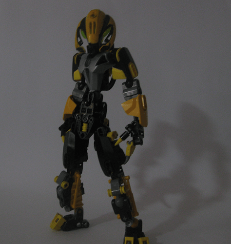
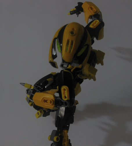
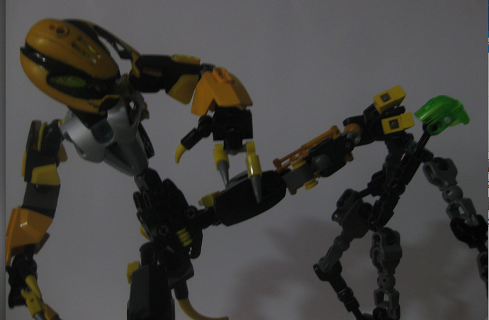
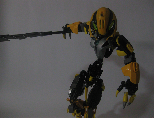
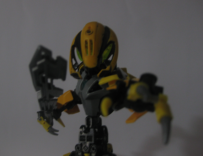
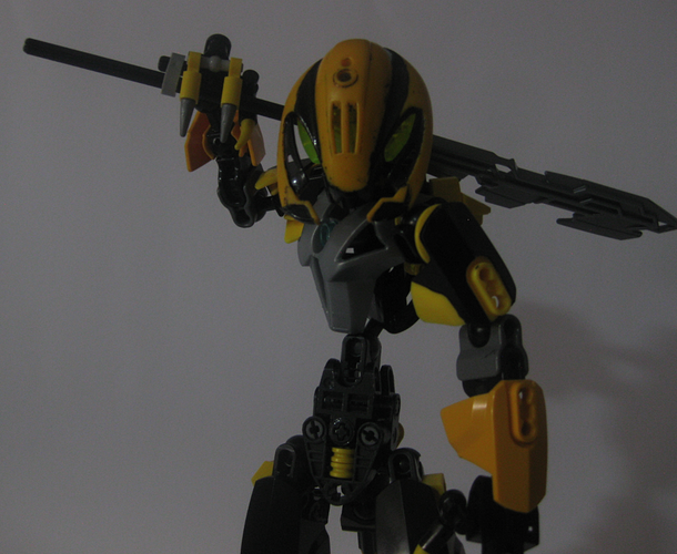
An assassin sent after Omni,Razzo will stop at nearly nothing to eliminate his target.He has the ability to teleport,and uses this ability to its full extent when fighting,almost surrounding the enemy with a wall of hits.
He is highly trained in hand-to-hand combat,though preferring a long-handled blade when he has to.
(What do you guys think of the new background?)
ok…but where is the edgy anime pelvic thrust pose.
As my joke might suggest - this is a simple and generic Bounty Hunter Moc (albeit well-built)…I also think the picture quality is a bit poor.
My suggestions? Put a bit more personality into the moc.
Had to use my crappy camera for this one 
But yeah,I’m already planning a revamp.
I really like it, and the painted mask is  .
.
This looks great.
I really love the painted headpiece.
Not bad.
I like the bumblebee head.
That head tho… awesome. I’ve been waiting for someone to use the Telluris helmet like that. 
The design is nice imo.
The photos are a bit dark, as people have already been pointing out.
I like the headpiece, although his waist is a little too thin.
I’m not a fan of how thin the MOC’s torso gets, but other than that, this looks really good.
The midsection is way too thin, but everything else looks pretty rad.
always like that mask backwards
Really sweat MoC, love the use of the helmet.
The chest is a bit boring. That’s my only complaint.
Thanks! One of my personal favourite “masks” too!
Looks great
Nice! That painted head is sick! And the tail is sweet too! Those two features really work well together. A few nitpicks:
- Torso is a bit too thin, though that may just be a personal style choice
- Heart light doesn’t match the eyes (I like to match them up, but it’s up to you)
- Silver talons on the hands feel a bit out of place. Black would flow better with the color scheme
- Hordika necks on the shins don’t work with the shaping of the rest of the MOC
- Grey clips stick out on the toes
- Not sure how well the silver chest plate works with the dark grey friction adders on the arms. Normally you should avoid using too many colours that are similar, they conflict. Speaking of which…
- The keetorange and regular yellow doesn’t quite work. As I said, they clash too much.
But honestly, your biggest problem with this MOC is the picture presentation. The quality is fine, they’re just really dark, which makes it really difficult to see the colors. It’s extremely easy to brighten photos like this with any modern image viewing app. Wanna give it a go?
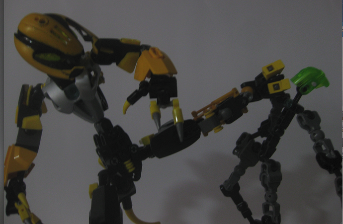
A featureless plain white background! Yay! Though you’re gonna wanna be careful to crop images when you get parts of whatever is next to your background, like here on the left:
Edited title -legomaster
You’ve executed the bounty hunter look well. Nice job.
Hey thanks! For the app,mind if you recommend one to me?
Rather buglike. I love it.
