Very good improvements Reokai. The armor looks pretty natural and you did your best to keep the color scheme very consistent. The only thing I have a gripe with is the tail, don’t quite think it looks as natural as it could be. But that is just personal preference, overall nice job with the moc sir.
Thx mate 
I tried several times to make a better looking tail but since none of the models that i created satisfied me i decided to keep it that way.
Again,thx!
You have indeed. The MOC looks much, much better.
Thanks man.
And I thought I was scrawny. Glad to see he got some extra beef added on. 7/10 for the most recent form.
Thx for the feedback.
The update is much better. The first version was missing A LOT of armor. Now, it looks pretty good.
Thx man.
1 Like
Always happy to give my feedback. I’ll always give a compliment, and usually constructive criticism, and hopefully I can help MOCists improve!
Thx man 
Pretty basic but pretty good. I do think it could still use some upgrades to make him look more like a knight. But he is pretty cool.
Oh sweet. Nice use of that chestplate.
2 Likes
oh mang its so much better now!
Woah thx man 
@JohnWells i dunno, i thought about modifying the legs a little bit because they look kinda simple and boring.Maybe put some silver on the tail as well.Thx for the feedback
@Political_Capps hehe thx dude
Alright.Time for another update.So i wasn’t very happy with the new color scheme that the guy had,and the legs were way to simple,so i worked on them a bit more.I also added some armor on the hands,and now the guy looks much bulkier.
I also improved a few other things.
So…voila!!!
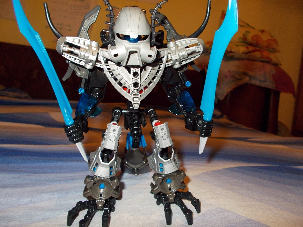
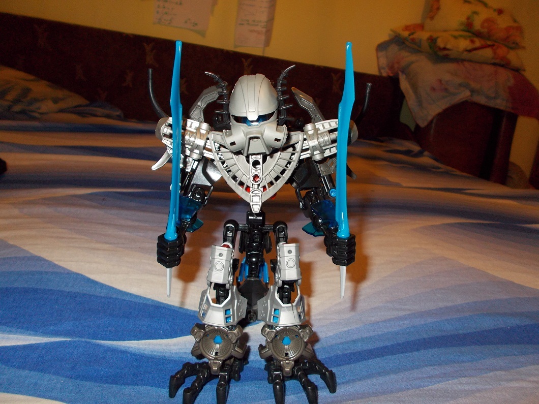
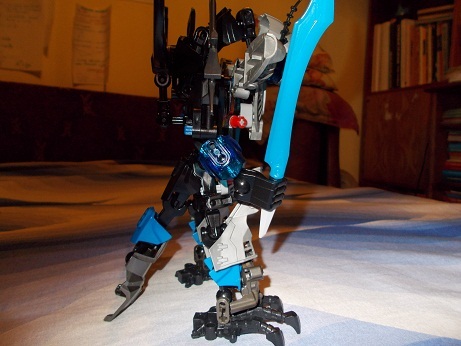
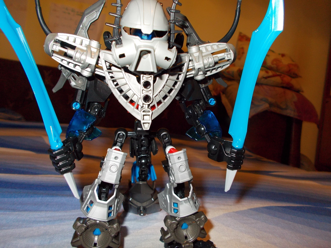
So as you can see, this guy now has a more silver-black color scheme,even though he also uses gun-metal grey and blue.
Any opinions?
This won’t be his final form,as i still want to work a bit on the legs and maybe give him a better weapon.
4 Likes
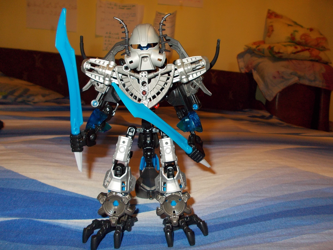
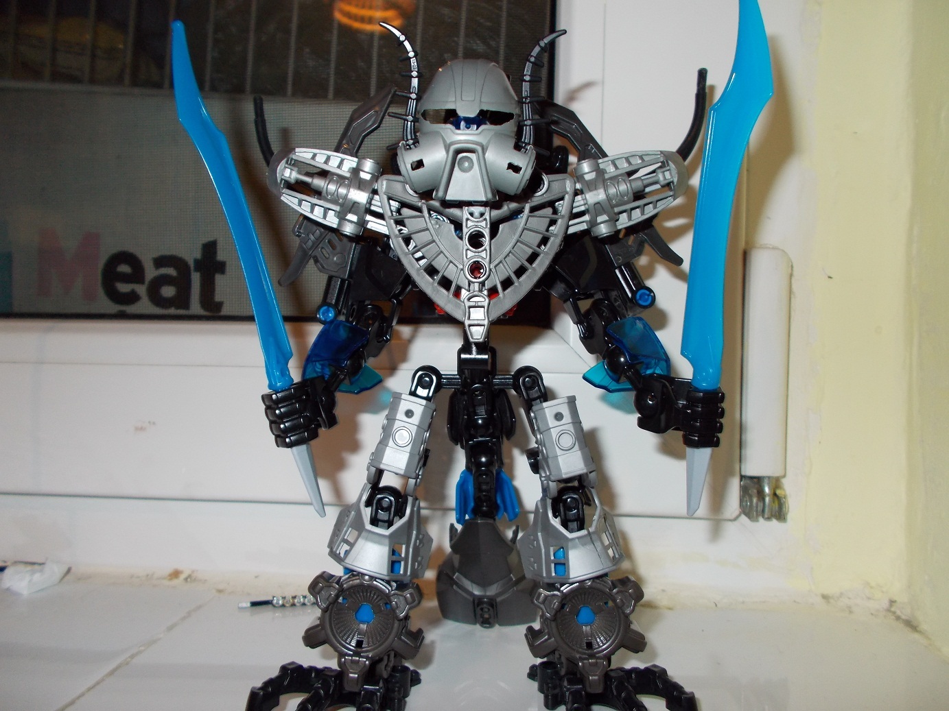
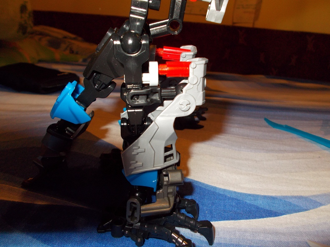
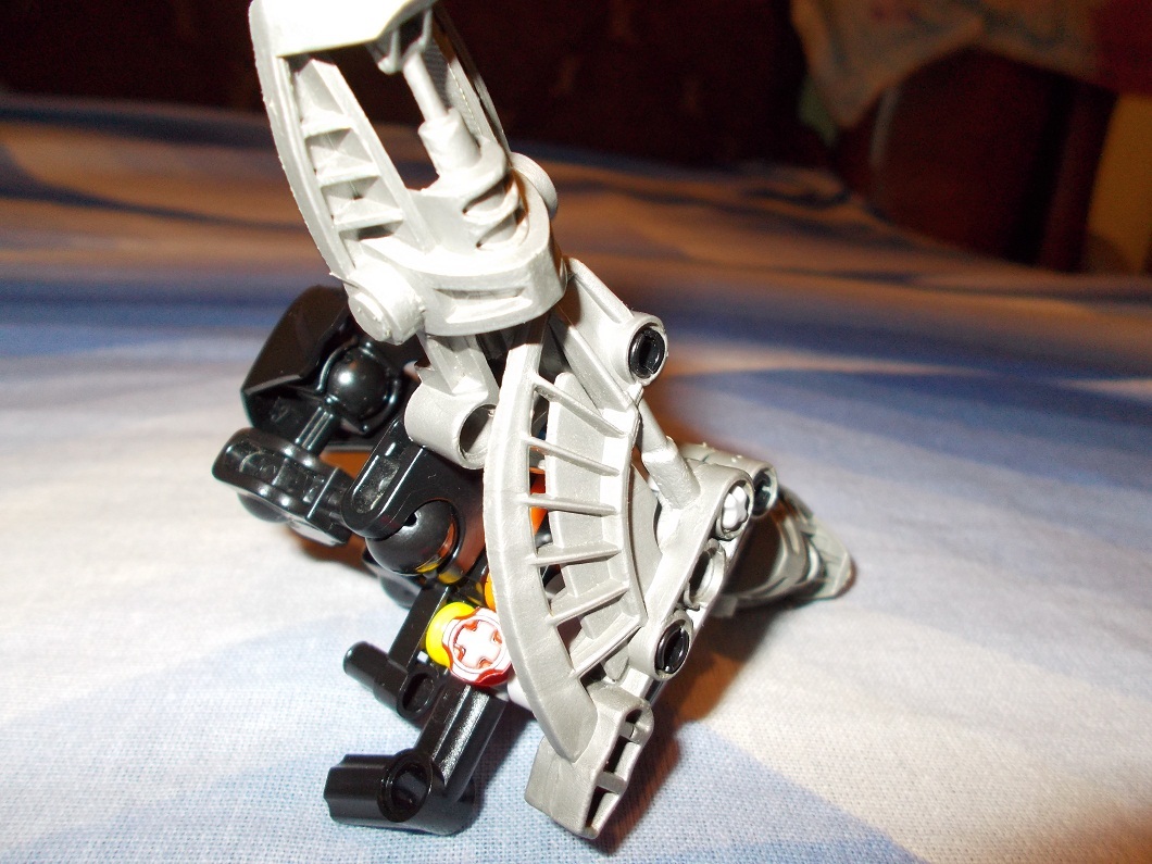
Alright, got a bit of an issue here. The upper legs might have been better without much armor, because the current armor is very awkward and leaves those red technic connectors bare. The rest is still pretty good, though.
His eyes…where are his eyes?! Those empty, soulless holes…following me…
(Yes, I’m only just noticing this now)
I also concur with Ekorak that the thigh armor could use a bit of work. It also looks like that shoulder armor may restrict his arm articulation too much, but that’s just me.
1 Like
thx for the feedback.
I don’t think i will remove it because i really like the look of it,it definetely helps the color scheme a lot and i find it much better than the average CCBS ones.
But yeah,i agree that the red pins are a problem.
As i mentioned before,i will fix it
@Cordak_the_Last_Makuta Ah yeah,the eyes.For the head i used a brain attack head,that is the cause.Sadly i don’t have any blue Metru brain-stock.
Neat improvements
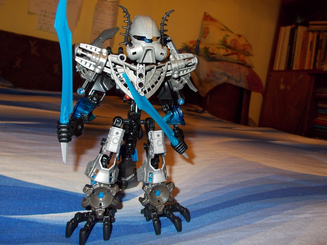
Nah, man. Don’t get me wrong. I love the look of it, but only head-on.