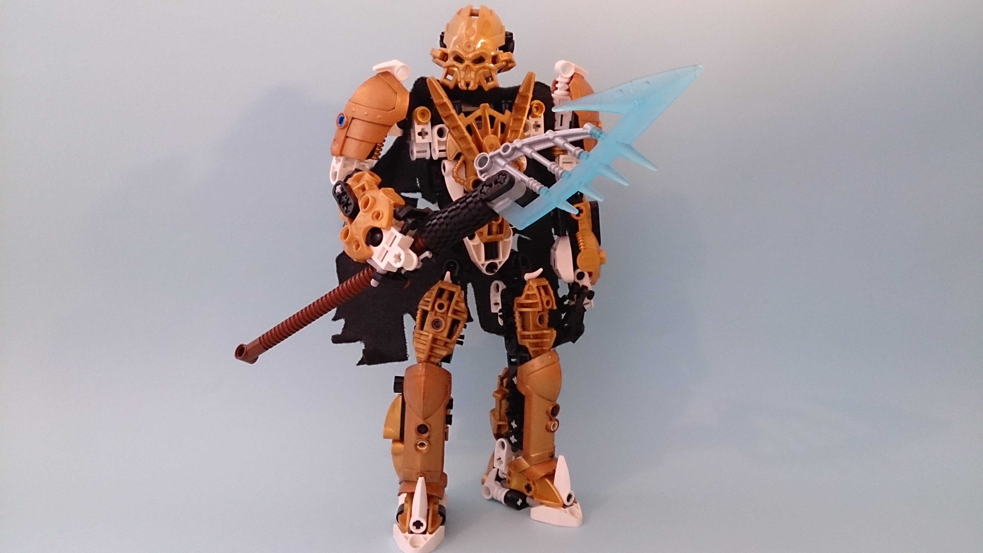
Well, here I am with my first post! This is my most recent MOC, Reller. He is a qhutonnian (a species in my storyline) and is somewhat of a villain. I’m still working on the details of his story so I can’t say much more.
EDIT: Topic has been updated with images rather than links.
Personally, I’m not too pleased with the lack of consistency between the Piraka foot on his chest and the rest of his armour, though I suppose that’s a minor gripe.
I’m also not fond of the exposed connectors by his shoulder, so I just shoved a couple of golden studs there and called it a day. Any suggestions as to what I could do to cover those up?
I would have uploaded more images but there was an error preventing me from doing so. Anyway, all constructive criticism is welcome. Please let me know what you think!
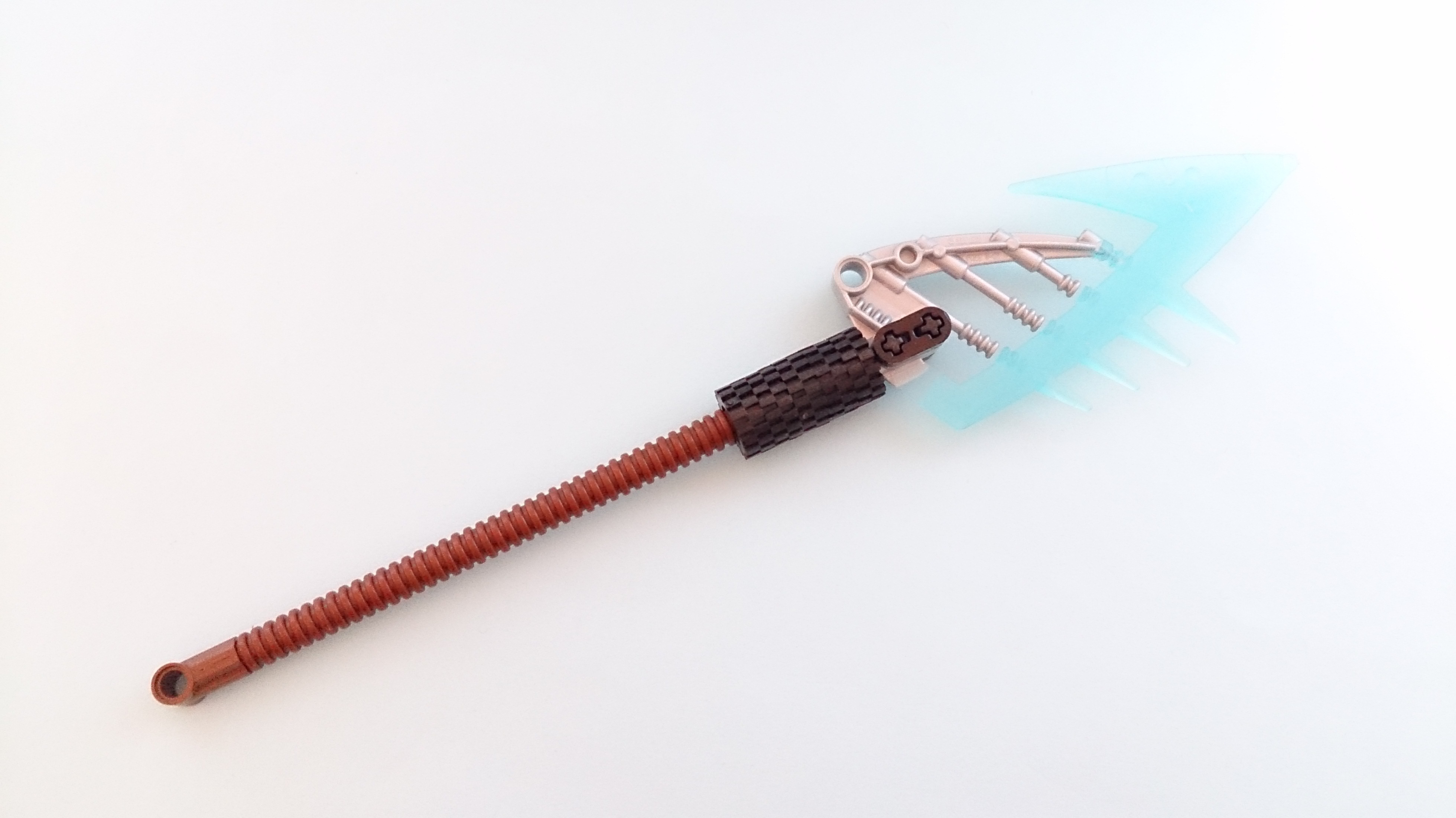
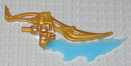
Thanks! The weapon was actually pretty annoying to build because the tires were difficult to slide onto the axle piece. Though I’m pleased with the result.
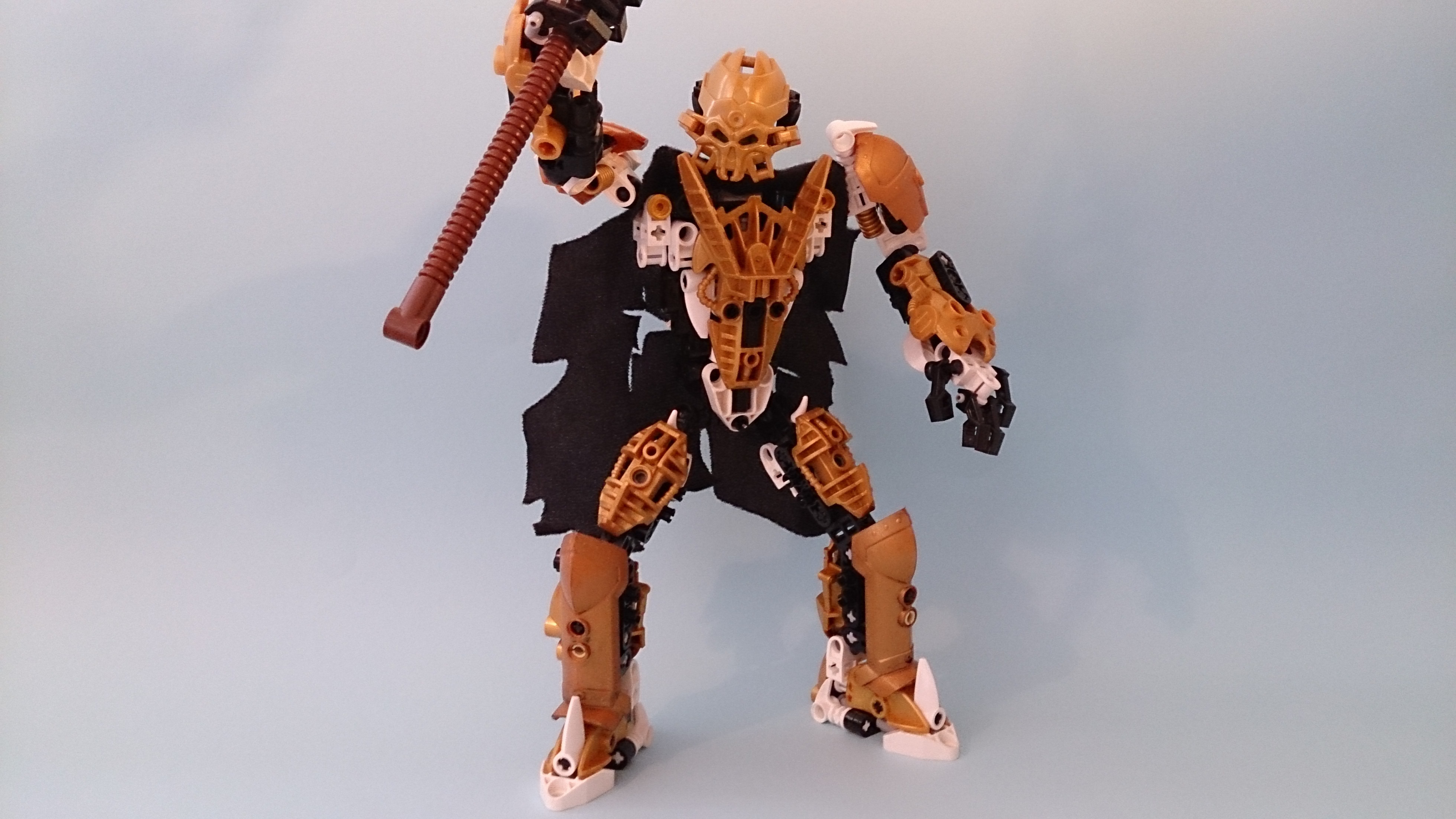
If I could critique anything it would be the open pins on the inner lower legs. A couple of small technic bits can fix that though. Over all this is a great moc and a prime example of what you can make with constraction. Also, his lance might look just a little better if you use one of these instead.
Thanks for the suggestions. I just tried out replacing Gelu’s blade with the one you suggested and personally prefer the original because it gives the weapon more of a lance-like look. But I have covered up those exposed pins, so thanks for suggesting to cover them up because I never really noticed them before.
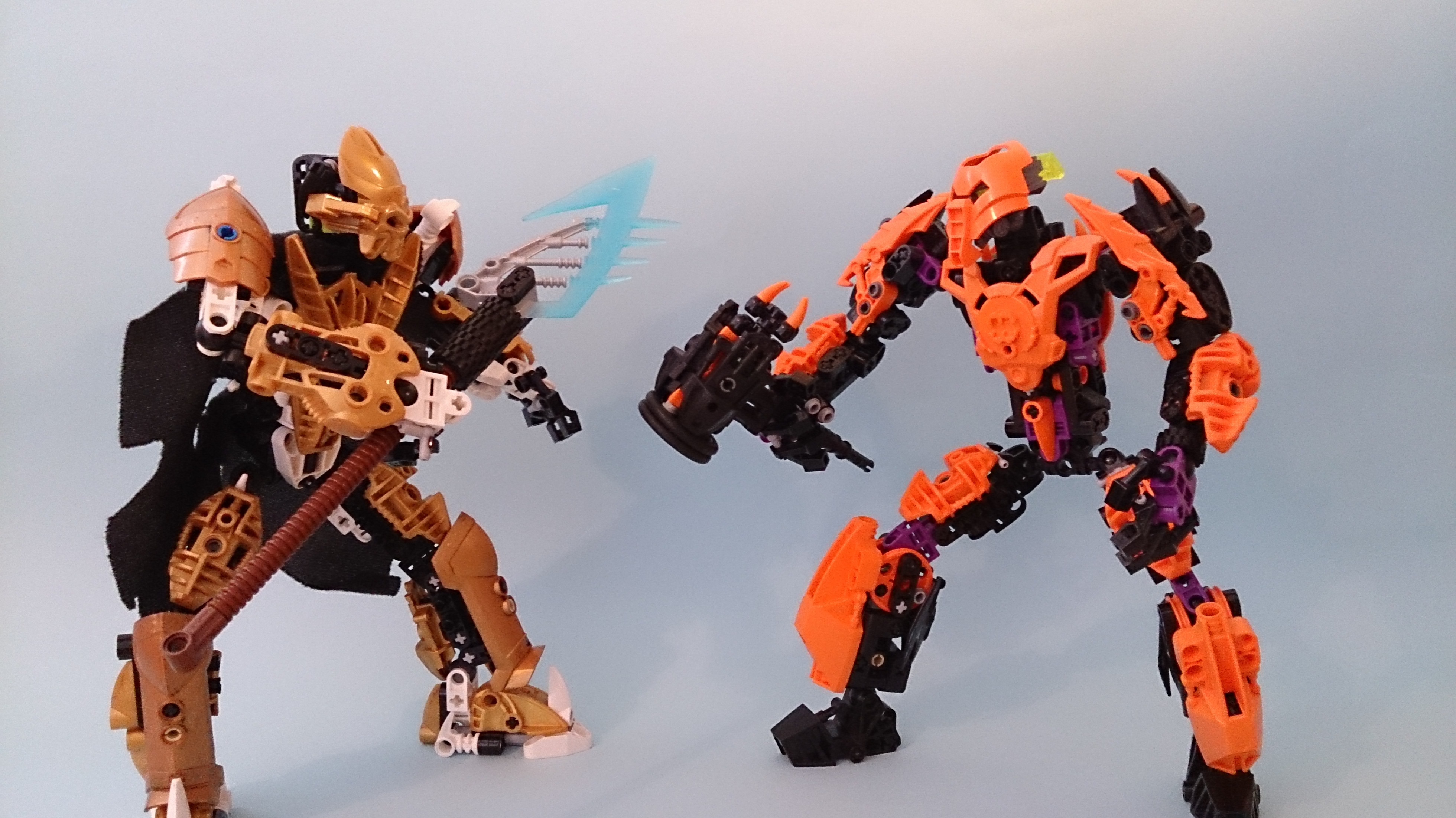
OMG, @Rando may I marry those feet? I am completely in love with them! I also really like the lower legs too. I personally don’t mind the silver on the lance, I I imagine as say a gold knight holding a normal sword, but I would like to see more light trans blue on this guy. Overall I’ll give it two thumbs up
I have to say that better lighting and some ankle-room would be good. His lower legs look a bit stiff. Same thing with his wrists, but slightly larger hands could also fix that. Overall though, it a pretty solid build.
Your observations are pretty spot on, both the wrists and legs are difficult to move, the legs in particular. I’ll try using larger hands and opening up some more space around his legs, thanks!