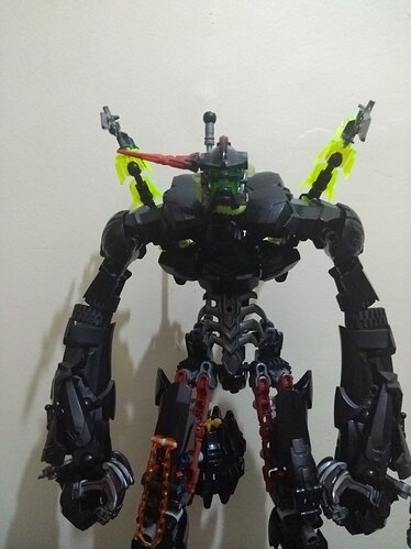
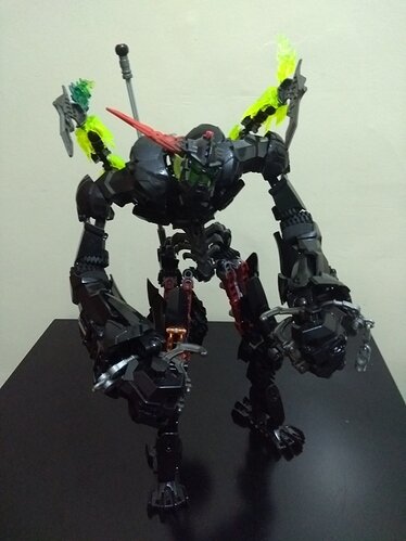
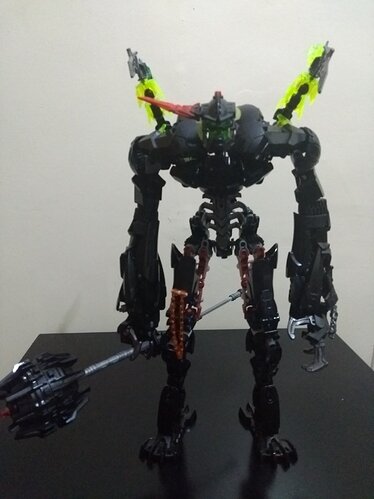
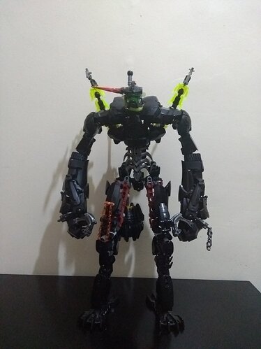
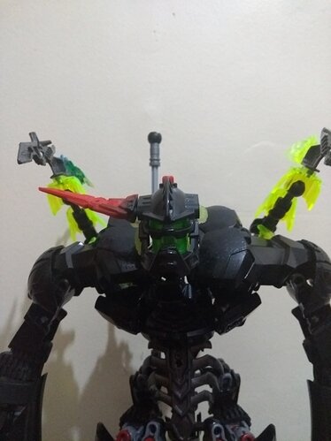
This is a remake of Black Phantom (the main villain of the breakout series) and my first post so sorry for the bad quality T-T
Well this is a thing.
So, try to make the upper arms more bulky. And why he have only one red horn/spike/thing? 8/10
Ok now I really, really love this, but… why is he missing a horn and why do his arms look so long?! I mean, heck, the design itself more than makes up for it more than makes up for it… maybes its just their lack of bulk on the shoulders? I dunno, just something seems off with 'em.
Also, you gonna make his spider? Cause I wanna see that!
Awesome job! Loved this guy already and love him even more now!
the proportions are wonky cuse he is hunched over (i forgot to put that o the post), the horn thing…idk and yes i will make the whole breakout line so eventually i will make his spider
The abdomen could use some work but the rest is ok
Ah, that makes sense… would put some kind of other/more armour on his shoulders (where the original covers are) but other that that, hey! He’s awesome! Can’t wait to see dat spider and the other villains! GO YOU!
Now that’s what I call a sumo phantom.
Great moc! Like the consistent color scheme and texturing
Unfortunately, it really only looks good from the front.
I get what you’re saying but that is the bulkiest piece I have that wraps around the entire shoulder
Ah, have had that problem many a time myself, so, don’t worry about it! If you ever get a piece like that just slap it on there but until/if that happens it doesn’t really matter to me either way! I still love this redesign!
At least the image isn’t vertical compared to the other users post. ![]()
How can you tell if it’s bad if there is no image for the back view? There is an exception, but im not going to dive into that. (your old enough to understand)
No one going to mention that this is a reskin of Grevious? ![]()
Not sure how I feel about this re-imagine of this moc.
The back stingers doesn’t work with the swole build, I like the arm build, but the upper arm looks bare from certain views.
The mace looks ok, but has less “personality” and the lmissing Arachnix Drone make him feel abit unfinished.
I do like the moc quite a bit.
Also didn’t he have to two of the horn spike things?
This has some wonky proportions that don’t really fit the character of black phantom.
The forearms are the best looking part of the moc. But the moc doesn’t look like black phantom that much, more like a fantasy warrior or something.
If you want it to look more like Black Phantom, these are the things I would change:
I would shorten the arms.
Fix the colour scheme, it’s a bit all over the place right now.
Fix the gappy lower torso and upper thighs.
This moc is very impressive, and with a few tweaks, it can be great.
The proportions are wonky cuse he is hunched over (i forgot to put that o the post), the color scheme is the same only with a bit less dark red, you’re right about the torso and the thighs I tried mimicking the normal set
I have to say, the exaggerated proportions grew on me, and now I kinda like them. That being said, I don’t like the skeletal piece for the torso; a different torso plate would fill out the abdomen more.
