(SERIOUS) Why Solek isnt so bad as everyone says (NO JOKE)

His rules aren’t that off-base - it is the noble version of the Miru… The 2008 Miru. It looks like the mask of the year.

Sudden headcanon that everyone will hate: the adaptive armor changed to mimic the Matoran they were driven by destiny to unite with in their effort, and the Av-Matoran wear versions of the noble masks designed for the environment of Karda Nui. The actual Nobles would look a lot more G1-esqe and possibly contain more identifiable elements of the Mata masks.

Go ahead, hate me

Contrastly, 6 out of 10 times I’ve heard the build get dunked on, the mask is in conjunction with it, almost always in connection to it being a bad Noble for the Mata.

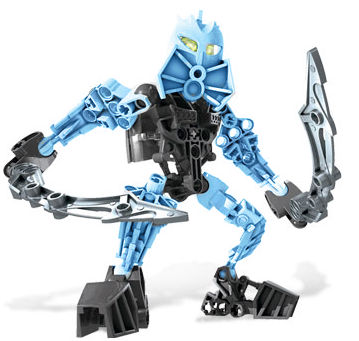
Solek is a set with nothing unique going on. He has two swords - every AvToran outside of Radiak has two swords, with Radiak having four as limb extensions. Tanma is the poster boy for the Av-Matoran and Kirop is the poster boy for the Shadow Matoran. Tanma is on the forefront of the promotional material alongside Lewa. Photok breaks the color blocking of every AvToran build and has stupidly lanky arms. Solek is filler.

Solek is also the only AvToran build that year to not share an obvious design element with his pairing set. Tanma uses Lewa Nuva’s swords to illustrate the connection to the Toa of Air, Photok has stupidly lanky arms to tie in better with Pohatu’s hands being the blades for a blender and his arms being blocks of grey. Contrasting colors and all that.

Radiak is quadriped, to illustrate - or perhaps contrast - the bat-like yet completely upright and otherwise humanoid body of Antroz. Kirop is hunched and wields hooked blades to tie in with Chirox being a gangly nightmare. And Gavla has long jagged hooks to represent the atypical bat-like design of Vamprah.

Solek has two Mahri blades and that is it. There’s nothing unique to copy from Kopaka because the only unique thing on Kopaka is the wings. Ultimately, people are more forgiving to Kopaka, because there are bigger fish in that department to fry, like not looking like Kopaka and also being a lame set. But Solek has nothing unique or interesting about him - he’s not worse than all the other sets of his build, as I said before, but he is boring.

Could there be a more perfect target for the community to vent its despising the sets into? “Well, at least Solek has ____” wasn’t an option because Solek has nothing; ergo, no reason not to demonize him as everything wrong with the wave. Was that Meso’s original reasoning? Maybe. Probably not. But I’d like to think the community which sided solidly against Solek used reasoning akin to that.

Therefore Solek is the best character do not look at my profile picture.

4 Likes

As a Solek owner myself, I must say…

Yeah he’s a pretty lame set. I enjoy the meme he has become, though I really don’t love any of the av-matoran and agori builds and pieces. The era of tight joints and constant breaking was not a pleasant one…

1 Like

i think av matoran system can be made better by the hero factory wave 1 limbs and some of the shorter ccbs parts as far as MOCs go tho

3 Likes

@Seuss Definitly. The av matoran build is like a proto version of the CCBS build. kinda.

The best thing about his character. Imagine how happy he was he got not only to talk to his idol, he even got to fight alongside him! Too bad we didnt get to know Solek or the other Av matoran either.

EDITED FOR DOUBLE POST - Spiderus Prime

2 Likes

I’d disagree that the Phantoka are “well contrasted” because of how much grey there is in comparison to what’s ostensibly their primary colors. It’s the most prominent color in all three, and nearly as much for the Av-Matoran as well. The lack of a true secondary color doesn’t help.

White is a part of the grey scale. It has no hue of its own, unlike the rainbow colors. It’s not an additive computer system where white is the sum of all colors - arguably it’s a subtractive system, where white is the absence of color.

I was actually thinking this while discussing the subject earlier.

1 Like

At this point the topic has distanced itself rather sufficiently, I’d say. We aren’t here to talk about Solek’s personality and how great of a character he is… I think.

Yeah, it’s not necessarily a bad look per se, but it s a bad look for these sets trying to be the Toa Nuva - a team defined by their vibrant colors. It just doesn’t work, or at least not the way they handled it.

Also Photok is gold my foot. Greg really had to stretch with that one.

Ah, Finally the real answer! Now I know who is accountable.

But seriously Solek did not deserve this. The color argument still does not work.

I was expencting this suggestion - but disagree with it. Light blue is not brighter white.

Solek is not an ice character, though.

The amount of dark grey does not have any weight on the contrast. The fact that it is dark grey does, and it is a very good contrast for all three colors.

Anyway, I got what I came for - the origin of this bizzare hate.
I don’t find any of the actual arguments convincing, maybe aside from the part -searching MOCist.
But it’s not like community can be cleansed of the Solek hate at this point. What a shame :slightly_frowning_face:.

2 Likes

No, but it is a bright color that contrasts better with grey or white than they do with each other.

And Tanma isn’t Air, Radiak isn’t Fire, Gavla isn’t Water…
They’re light. Light can be any color, and they chose the most boring ones for Solek.

technically speaking, black is the absence of color

Just to be perfectly clear, Meso only said “I think Solek is the worst G1 set.” He isn’t responsible for turning it into a meme.

I think on this matter, we may just have to agree to disagree. I stand by my opinion that Solek’s colors are the worst of the Av-Matoran (aside from maybe Kirop), but it’s clear you have a different opinion. And that’s fine; not everyone has to agree on what the worst set is.

3 Likes

True, but that’s only because Greg said they could be any color to compensate for the set designers not intending them to be light. “This is the white one and this is the green one.”

So really, all of them are horrible colors for light characters who are typically white and gold. But even with that in mind, Solek is still boring.

And yet he still manages to be boring. All right all you MNOG fans, come and get me

My condolences. But, inversely, you’ve added nothing to the argument and refuted everyone’s points without conceding anything, so I’m not sure what I was expecting.

Quitter talk. If you want there to be a change, start making one. Nothing will happen if we wring our hands and mope.

I’ve already presented the solution to the Solek hate problem, but it got mostly ignored, so I’ll restate it: start a Solekvival. Start generating ironic interest in the character and people will begin making MOCs and artwork - eventually it’ll lead to unironic appreciation, and soon you’ll have a subculture in the Bionicle community based around the set design of Solek and the schemes of reimagining the design. You’ll see 3d modeled pieces to make articulated Solek limbs, an articulated torso, more mask variants, less power to the Solekians…

Of course, you could also not. But that’s your choice.

1 Like

I want to see art of Solek cosplaying as Kopaka.

3 Likes

This sounds as if you’re saying a white character with grey accents is the equal of a grey character with white accents, which I wouldn’t agree with. If you looked at a figure like Kopaka Phantoka in isolation, I don’t think you could tell he was an ice character because the amount of grey outnumbers the amount of white.

But you use white paper to draw with crayons or put into a printer, don’t you? Even if, from our perspective, white is the sum of colors?

I actually made a Toa Solek unironically in 2013, before I knew that there was a consensus dislike of the set.

2 Likes

stop with this Book of Logic babble

White light is the combination of all colors, not white as a color. Black is also both a combination of a good amount of existing colors and black is also representative of a lack of color altogether. There is no point to this particular argument for either side because you’re both right and wrong.

You probably could because there’s no other white Bionicle characters of heroic appearance outside of Takanuva who aren’t ice. Obviously Pridak isn’t ice, but he’s also extremely evil-looking.

Kopaka was on the far end of the Bionicle line, with two very contrasting colors in his scheme. He had the rest of every ice Toa set in the last decade to ride on(and throwbots/roboriders too).

1 Like

Pridak must love strawberry jam.

3 Likes

post can’t be empty

You can just write five characters in < > and it counts.

1 Like

Purely subjective opinion on Solek. Visually awful, but by the standard of Av matoran, lower end, but not the worst. I really don’t like his mask, and I think any set which uses the same design for every limb should be frowned upon to some extent. Boy do Av matoran suck.

1 Like

That’s because ink is black.
If ink were white… Well, we probably wouldn’t use it to print then, but if we did, we’d use black paper.

Because it shows up better.
As well it should. Black reflects no colors, red reflects only red, and white reflects all. Obviously, white is more different from red than black is.

And that’s why grey+white is so bland. To our eyes, he’s a blank pallete, no colour added, except for the eyes.

2 Likes

Just for fun
Screen Shot 2022-01-05 at 3.34.32 PM

3 Likes

why am i not having fun

also is this now Naho

2 Likes

what’s this topic?

1 Like