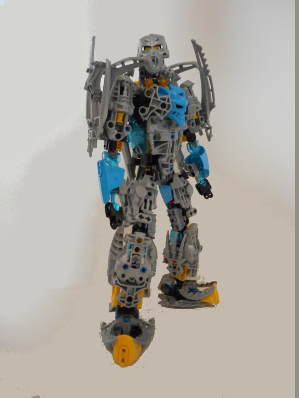
Actually the last of the Toa Vihagu, and possibly the last MOC from me in a while.
21 Likes
WHOA!
Okay, one thing: The blue (to me) does not work good with the gold and grey.
Those HF Shell + Pohatu Nuva weapon feet look amazing. The legs look really sturdy. The shoulders are… meh. Once again, the blue seems a little odd to me.
1 Like
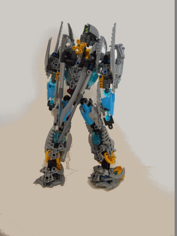
do those gears work?
4 Likes
Yup, on all my recent MOCs, they work… sorta. The fact that I’m using custom arms tends to put a lot more weight on these limbs than the arms in the official sets, so they don’t always stay in place. But yes, I can make them flail their arms around if I wanted to.
3 Likes
That’s cool, good looking moc though i feel the yellow and blue kinda clash, it’s for the most part ok
1 Like
Gali’s mask bugs me because it sticks out to me way to much. The neck seems a bit weird, it probably is that his head is to far back. The color scheme is good imo, but it needs to be spread a bit better. The build itself is great! I’m gonna give this a 8.5/10.
5 Likes
very cool! I like the color scheme, but is missing some azure and yellow. It is WAAAY too much silver. The weapons are also pretty cool. Good job! 
1 Like
You did it
you actually topped Therina for the position of your worst Vihagu
congrations
5 Likes
I like the design, but I feel the yellow should be replaced with blue. Also, I’m with Kaiba that the mask looks a bit…off…the way it’s placed. The eye holes are kinda distracting, I guess. Maybe turn it so it’s facing upward with the top of the mask as the chest?
1 Like
Alright, so, I see you’ve made a new MOC. Well, I think I’m gonna get to cracking the knuckles. Here are my opinions on the MOC:
The problems I have with the MOC
I have to be frank, I’m not a huge fan of this MOC. I feel as though the designs are clustered in the texture department, and nothing flows fluent. Also, I feel as though a grand majority of these designs are slapped together. Then there are some like the lower arms and hands where it’s literally tacked on due to either laziness or lack of parts. Lastly, and this bugs me the most, the Kaukau on the chest. It’s so out of place, and looks so weird, it kind of hurts. It doesn’t look like it fits at all IMHO, and that’s a real shame, because it’s a terrific mask. The whole MOC just looks, well, messy, and I feel as though you could have done SO much better. I would honestly rework the core designs, and clean them up, and also fix up any loose or fragile bits, as the MOC comes off as fragile to me in some areas.Especially with the gear box. I can see it in the back, and I’m unsure how to feel about it. Either way it limits what you can do, and it honestly feels tacked on. But eh, that’s my opinion.
Then there’s the colors, and the colors aren’t very good either. There’s literally no color organization, or blocking, or layering to be seen on this whole MOC. There’s random yellow tips on the “feet”, and then there’s literally none that is nearly as visible on the rest. Same for the lower arms, a good bit of blue, but it’s only really noted on the lower arms, and the chest. Granted, there’s other small bits on the back, but they’re equally as inconsistent in placement. This MOC would benefit highly from blocking and layering. Furthermore, it would benefit from possibly more CCBS use over Gen 1 pieces, as Gen 1 pieces have messy, complicated, and overall unfitting textures.
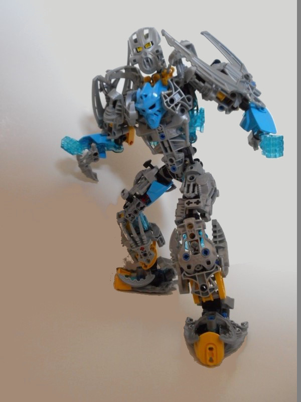
There is also something else I noticed that bothered me, and it’s small, but it still bugs me. I noticed in one photo, there were trans blue hands, then in the others, they were not there. That’s horribly inconsistent, and it really shows that you HAD ways to better the hands, and yet you still didn’t. Just wanted to mention that.
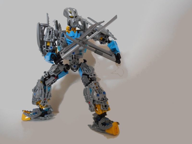
One last thing, and then I’ll finish this up… the weapons. Not a fan of them, they look awkward. Half finished, unpolished, and just unappealing overall in look. Furthermore, the way they are held in photos really turns me off as well. Hands don’t work like that, Steven  As stated above, if you used the trans blue hands, it would look a lot better. It’s a missed opportunity honestly, but oh well, that’s just my two cents.
Now for the stuff I like
While the things I listed above really bother me, I do like the attempt at a heavily armored look. I assume you wanted this to be bulky, and it works… okay. The proportions are a tad off, but it still works fine nonetheless. The weapons somewhat fit as well, but I think it would be more fitting to see something heavier. Then there’s the chest shaping. While I don’t care for the Kaukau, the attempt at shaping in that area is pretty well done. The Metru chests work fine, get the job done, and somewhat flow with the Kaukau. It’s honestly the best part of the MOC. Lastly, this MOC shows hope for future improvement. This is one of your best MOCs I’ve seen, and I hope to see you implement new tactics and improve in the future. Until then, thank you for reading my opinion.
~Ventum
9 Likes
Yay I get another Ventum rant. Haven’t read this in depth but I guess I’ll do that again when I redux the whole team.
EDIT: Hand difference is intentional. The trans hands indicate when he has charged up water energy for a massive attack. Sorry I didn’t clarify that.
2 Likes
Great MOC! I really like the upper legs and feet especially, though I think that some parts of the torso (Gali) and the space between the head and shoulders look really awkward. His lower arms don’t fit the rest of the MOC in my opinion, as do the lower legs (and those ankles, man). Overall, I think this is a great MOC, well done!
I’ve never been fond of that mask, and the neck looks rather spindly. Otherwise, this is decent, though the silver is overwhelming.
1 Like
more or less everyone’s thoughts on your feedback
2 Likes
Neck looks a bit awkward,otherwise i like it.
first fist-chest now face-chest whats next chest-chest?
Nope, ■■■■■■■■■■. See my Drainu update.
This looks good, but I’m not so sure about the dark azure and trans blue…