Ya happy that this isn’t a set mod, @PekekoaOfJungle?
C&C Welcome
Although the MOC itself is alright, you sir, have a fine taste in beverages.
LOL
You can never go wrong with Cherry flavors.
(unless it’s 7-Up)
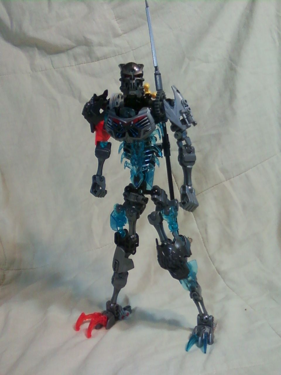
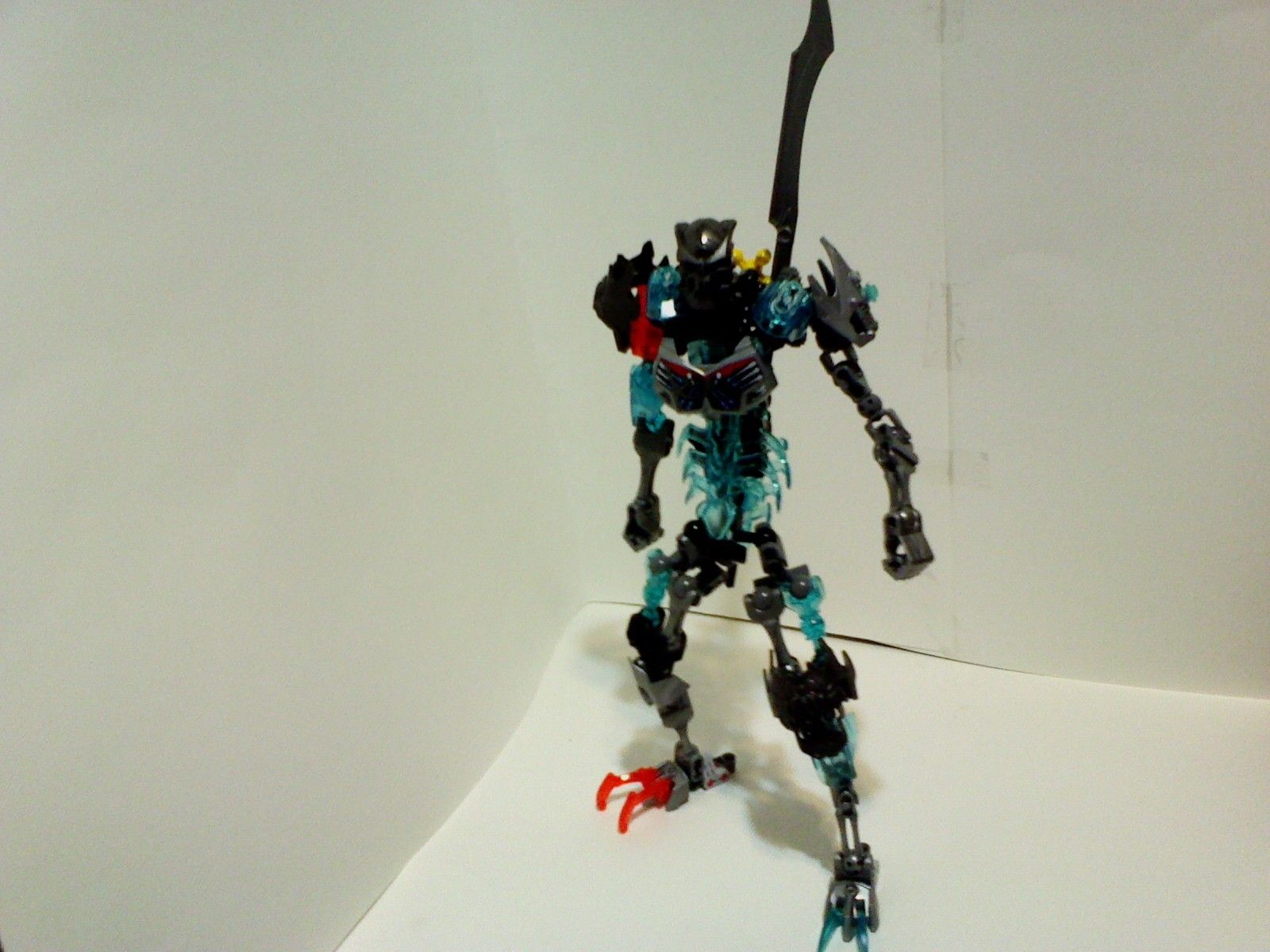
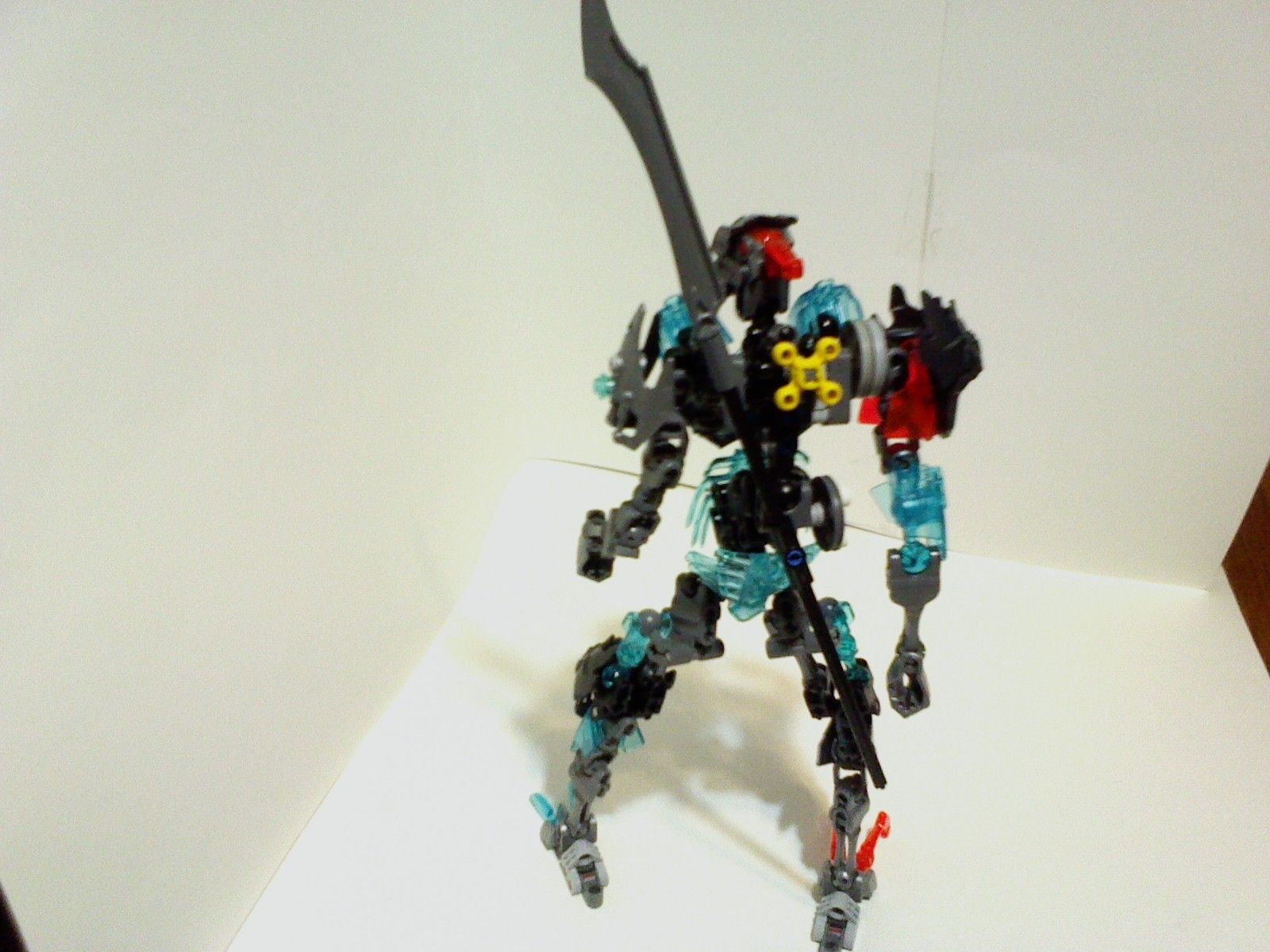
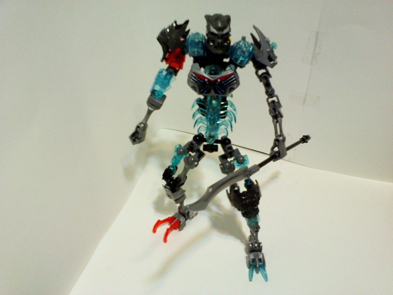
Eh I like the torso a bit, but the legs are looooong. Not really a fan of that but I guess it’s ok
Funny enough, the legs are kinda short, if we’re going with human proportions.
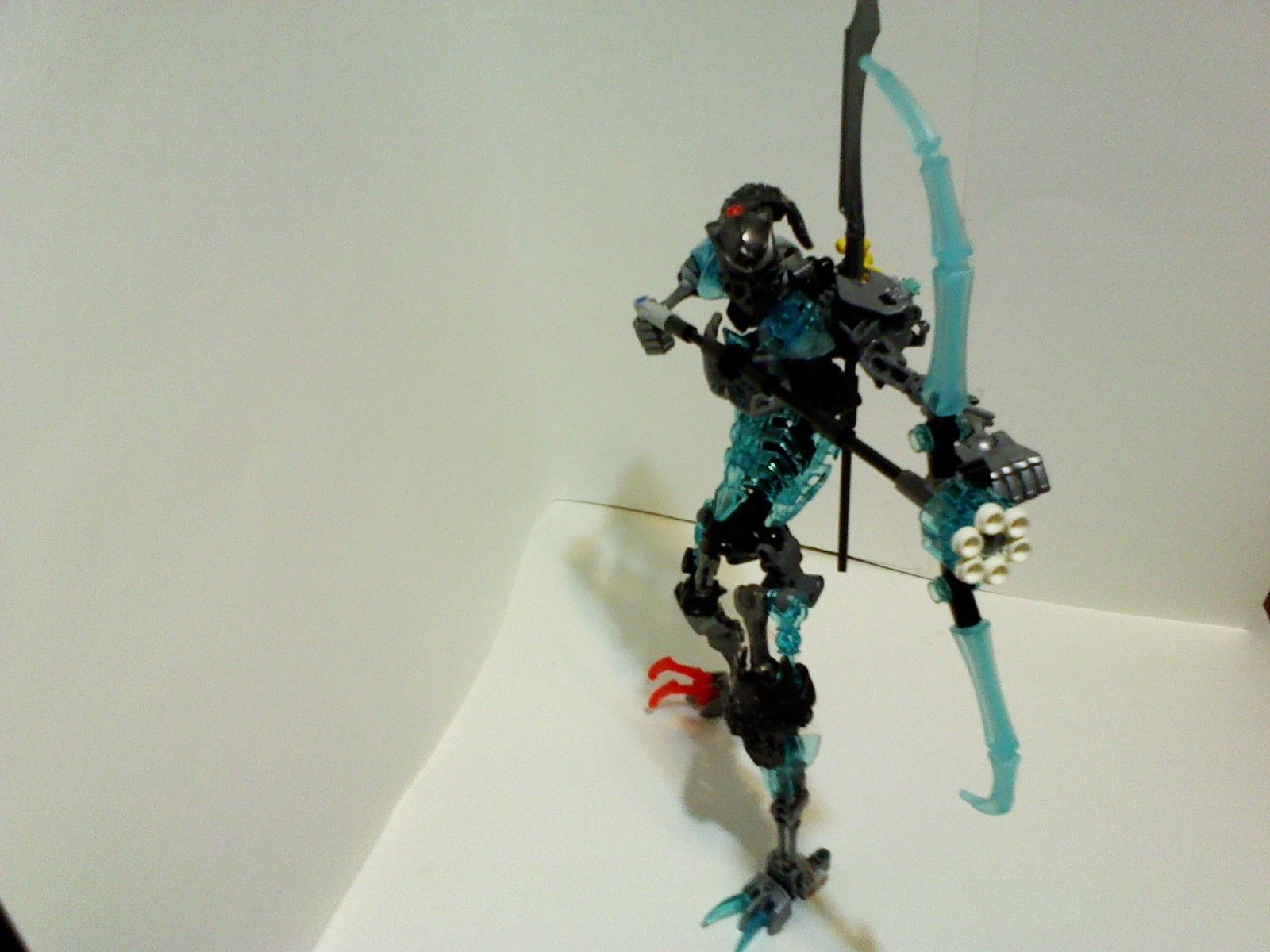
The creation really beefs up warrior while staying true to the spirit of the character. This makes me realize how bare bones (shut up) the set is.
Basically just a stretched out skull warrior, I don’t like it.
This is how not to revamp a set, bigger doesn’t mean better, as shown here, the extra joints in the limbs look ugly and make the limbs look broken, the torso has a rather lumpy shape, as well as a cluttered build.
Overall, this moc causes more problems than it fixes.
I’m not too sure about those triple jointed arms… It makes them look more like tentacles than anything else. All in all, I feel as though this guy suffers from being too big. Big MoCs are difficult, and there’s nothing wrong with making a MoC the size of a Toa as long as it has something interesting about it.
Oh, I just noticed though, the claws on his feet. I like what you did there. Although to really complete the effect I would put a trans orange shell on his right leg…
i can see what your going for but it looks all out of proportion
as a handy tip have pictures of the set so you can look at it for refrence (well thats what i do)
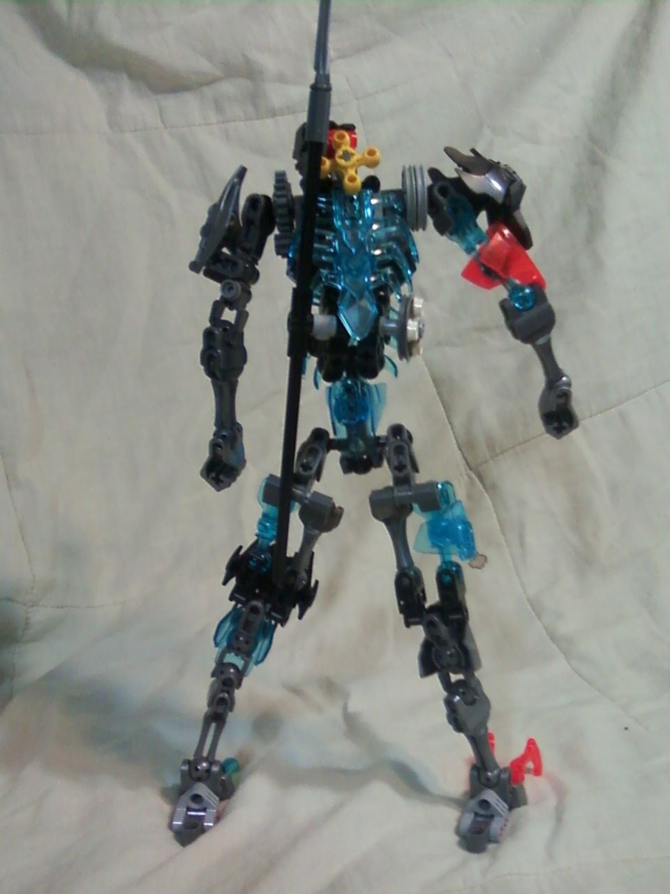
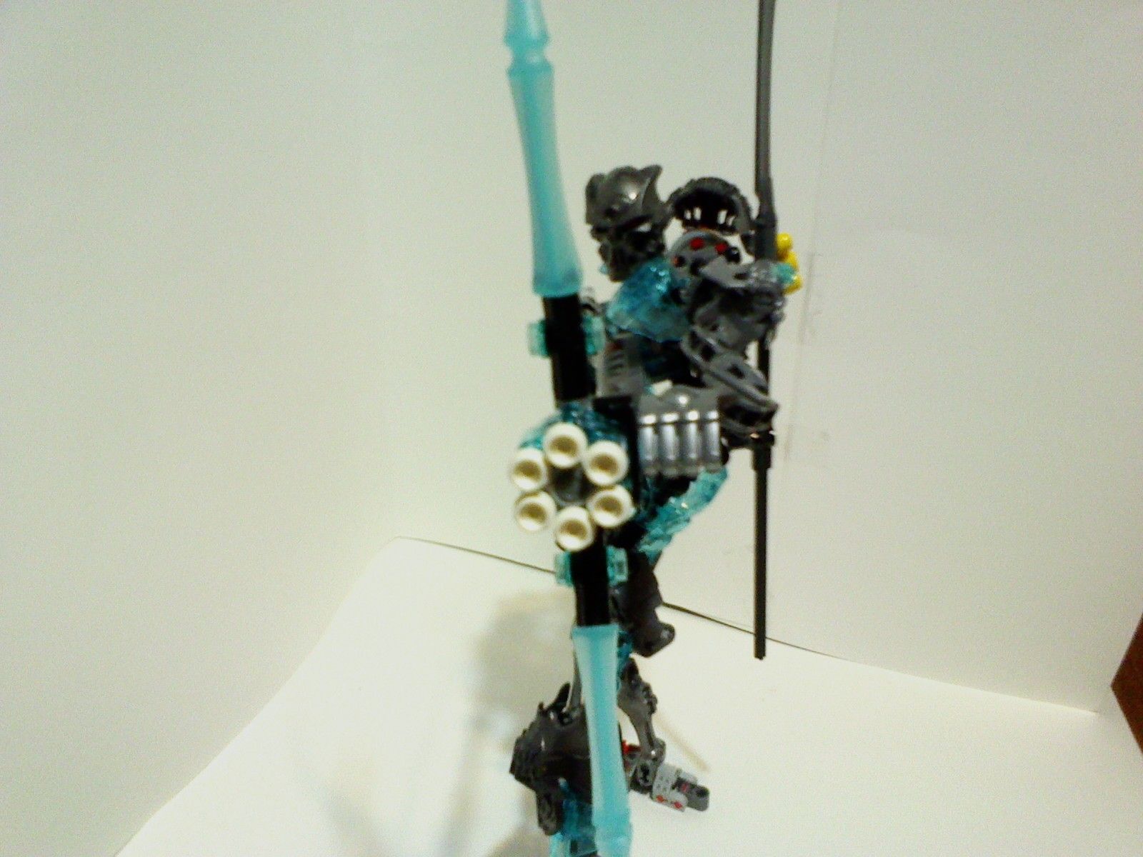
and its best to get some better lighting like just have the base and the bagrond with colour but leave the sides so light can hit the creation/ model it all pictures are dark and i and probable some other people can’t make out some of the details
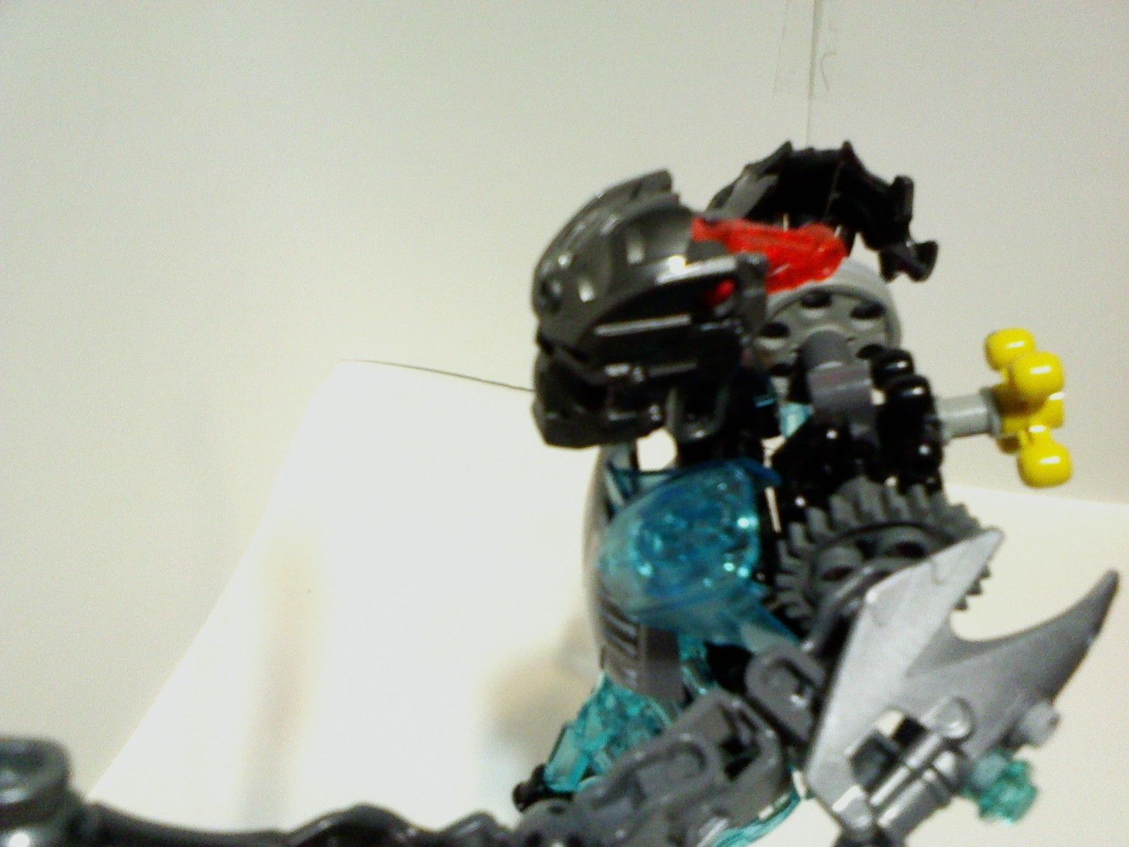
plus the rib cage looks way to far down looks like a crotch cage
but if your happy with it im not one to tell you how to build your creations.
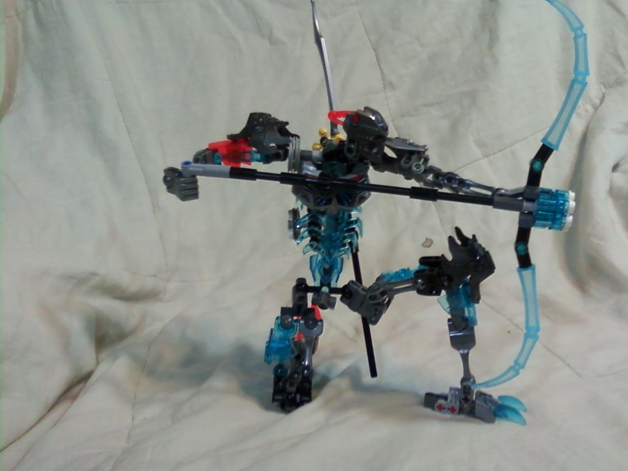
and why over head pics why isn’t there any looking up shots (where the camera is looking up at the MOC)?
@Payinku @SmeatyFlavor @TheLeg0Br0ny:
OK, so, on the moc,
The main issues are the arms and the torso design.
I’ll get to fixing that.
And as for the camera issues, I was using a new (crappier) camera, that didn’t like my lighting setup, which was the same one I’ve always been using.
I’ll be switching to my old camera for future pictures.
OK!
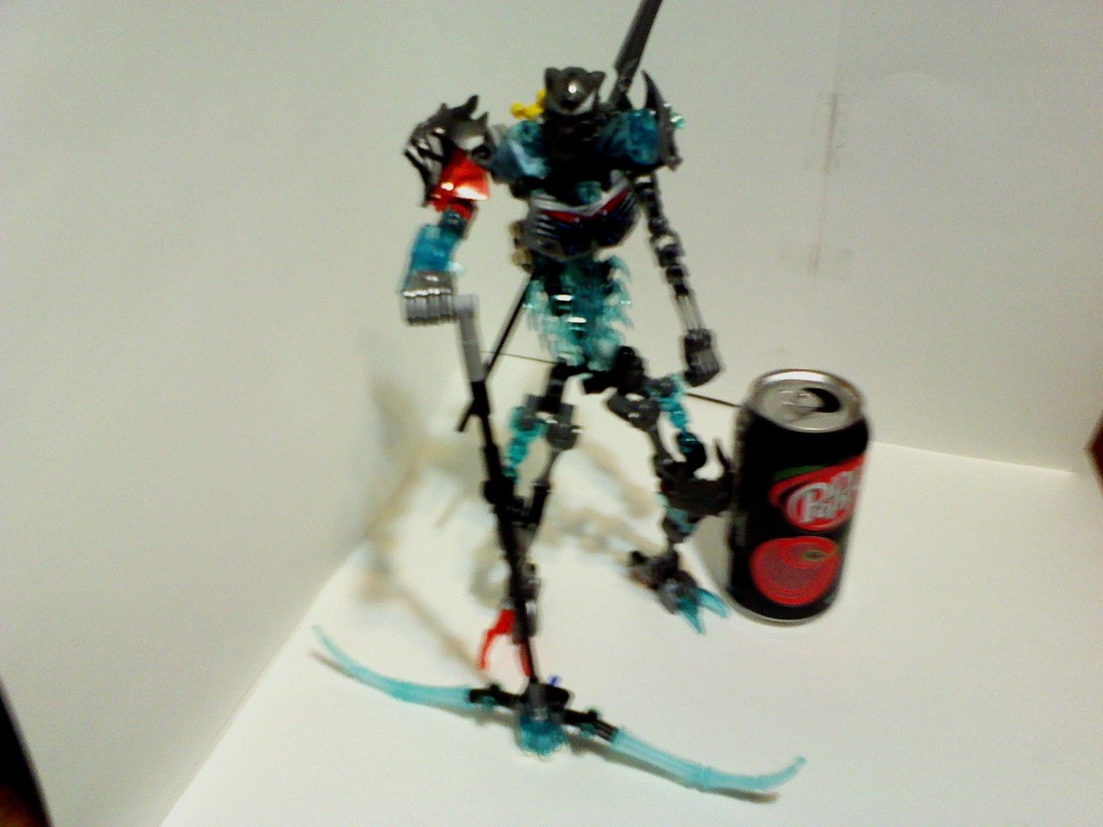
Did a bit of fixing here and there
List of new things:
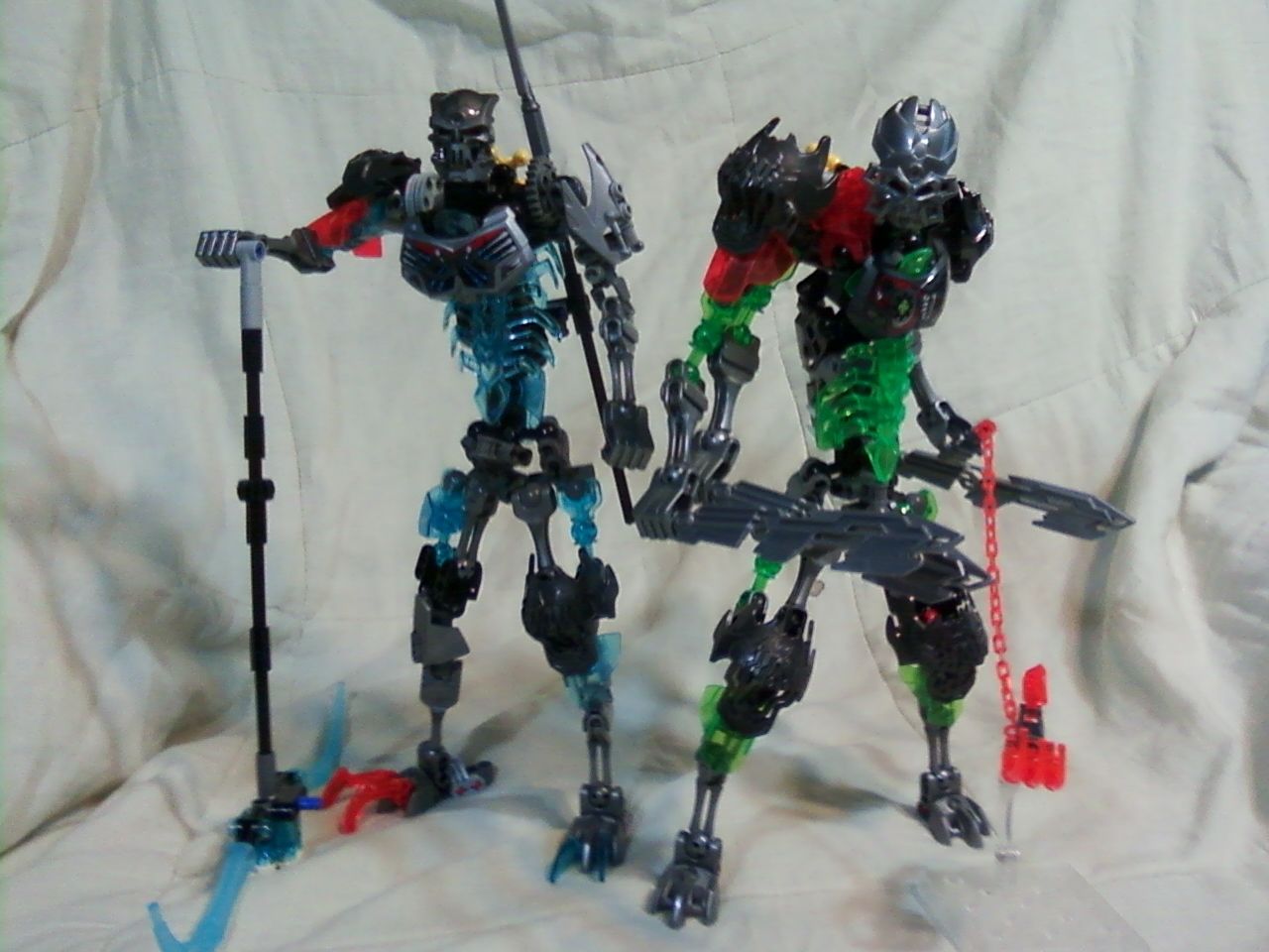
C&C for V 1.5 Welcome
Still has the limb problem and I’m not digging the skrall armor on the shoulder.
What specifically about the limbs to you have an issue with?
never been a fan of using over 2 joints in a limb to achieve more hight. I understand how hard it is to work with the bone species though.
Looks neat!
It’s very tall, obviously, but it has an imposing stature. I think the feet need to be bigger, though (for better stability)
Yea,
Main issue is, is that the larger creature feet don’t come in silver.
I’ve added heel spurs to counteract the stability concern, though (look on the back of his feet)
Much more opposing tha the original. I like it!
Thanks!
I think i’mma raise the shoulders back up and replace the neck armor.
Edited Title for Spelling ~ GuessWhoJustGotEtMM+UtD!