so last semester i took a few art classes for my graphic design minor
finally getting around to sharing it
yay for laziness
http://i.imgur.com/fg8Dtte.gif
http://i.imgur.com/ZBlCbU4.gif
http://i.imgur.com/e9lPJKG.gif
http://i.imgur.com/IxmKHrM.gif
http://i.imgur.com/BsRwJw9.gif
http://i.imgur.com/naVdH7h.gif
These gifs were all created for my Video Art class. Everything else that I made in that class (that I want shared) is up on my channel. I’m going to move onto the Typography stuff.
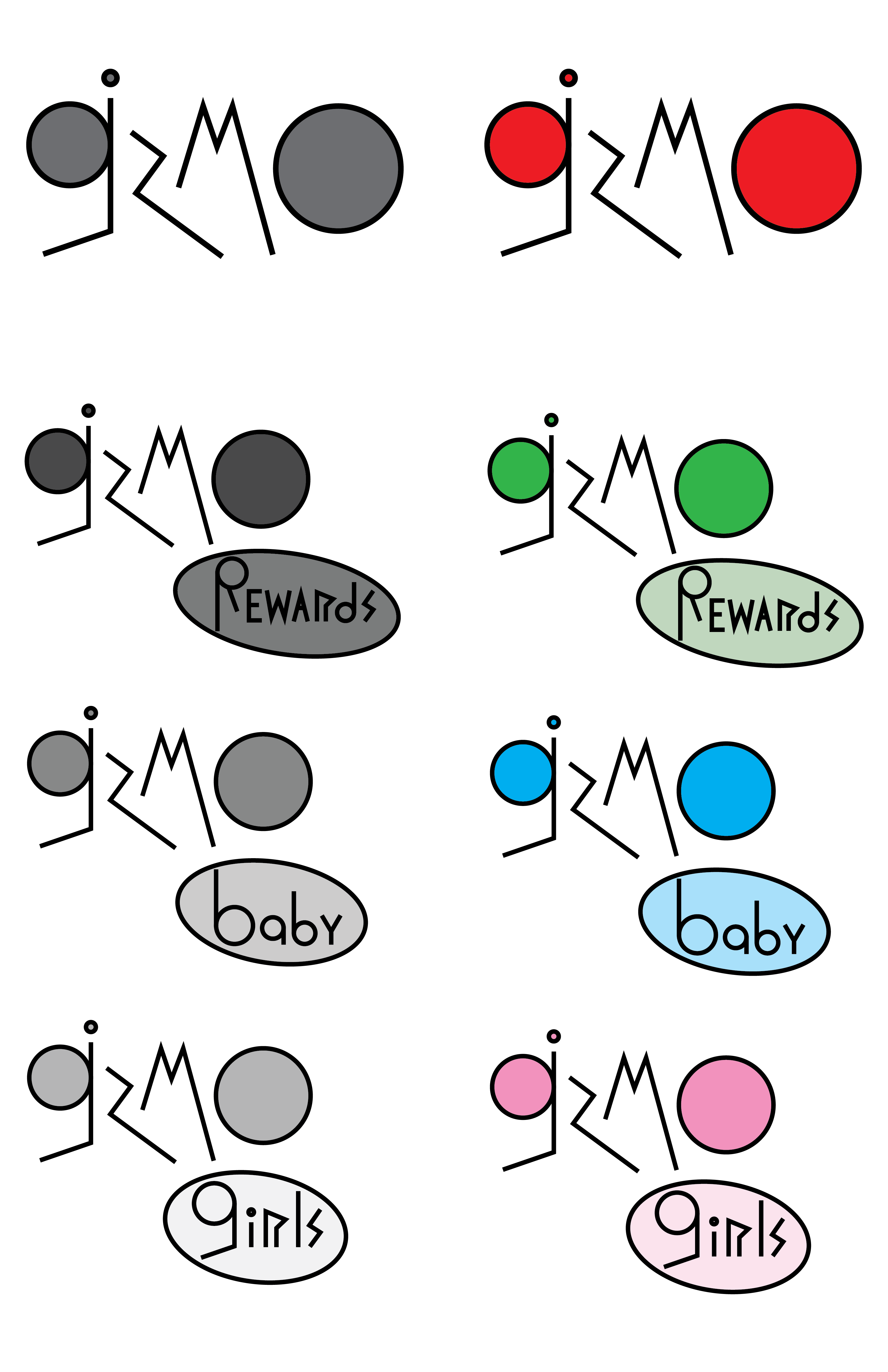
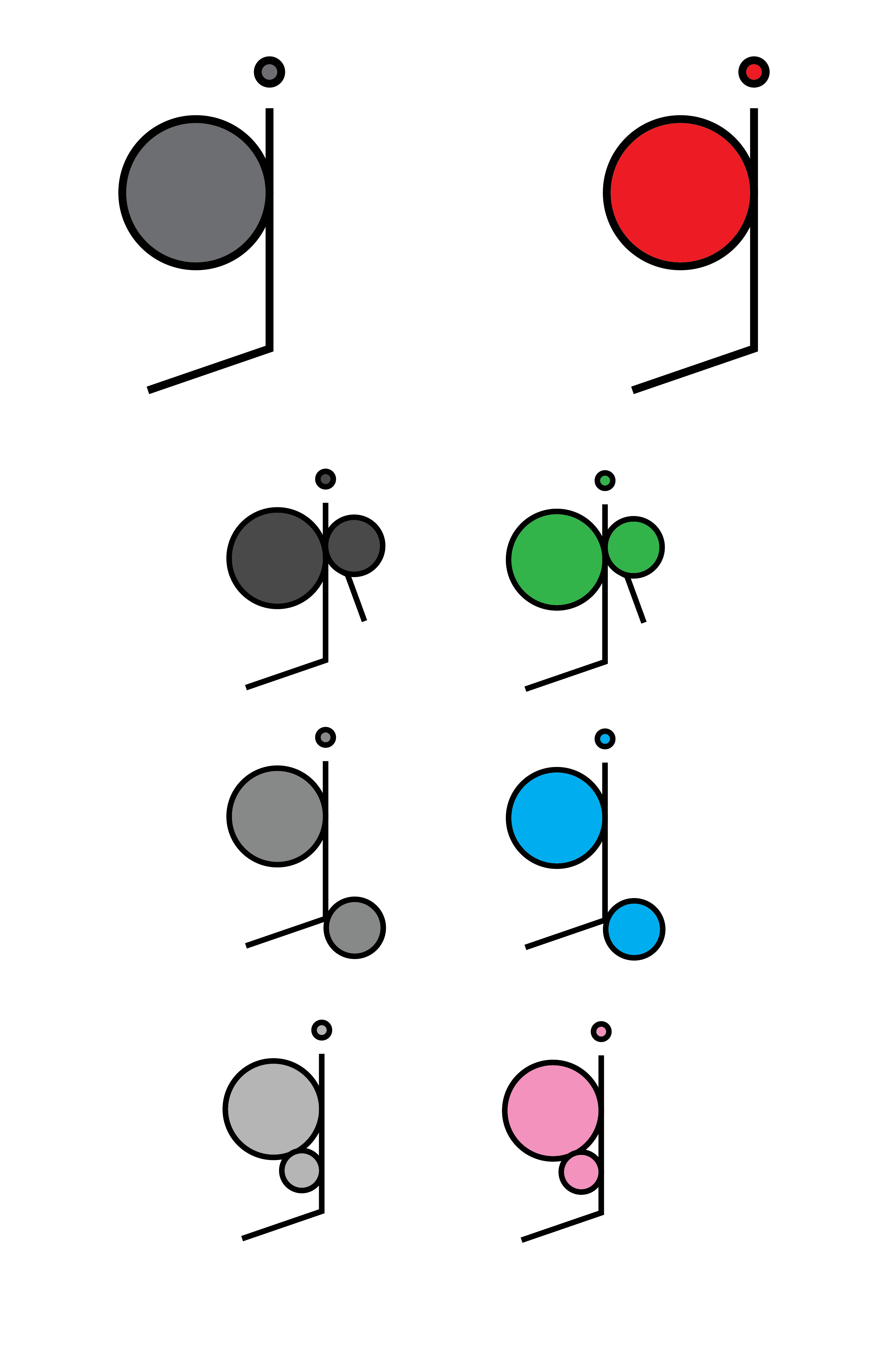
Typography, if you don’t know, involves the layout and design of text. The goal for this project was to create a logotype (top) and logomark (bottom) for a fictional company. I chose to go with Gizmo, a toy company.
http://i.imgur.com/yq8P52N.png
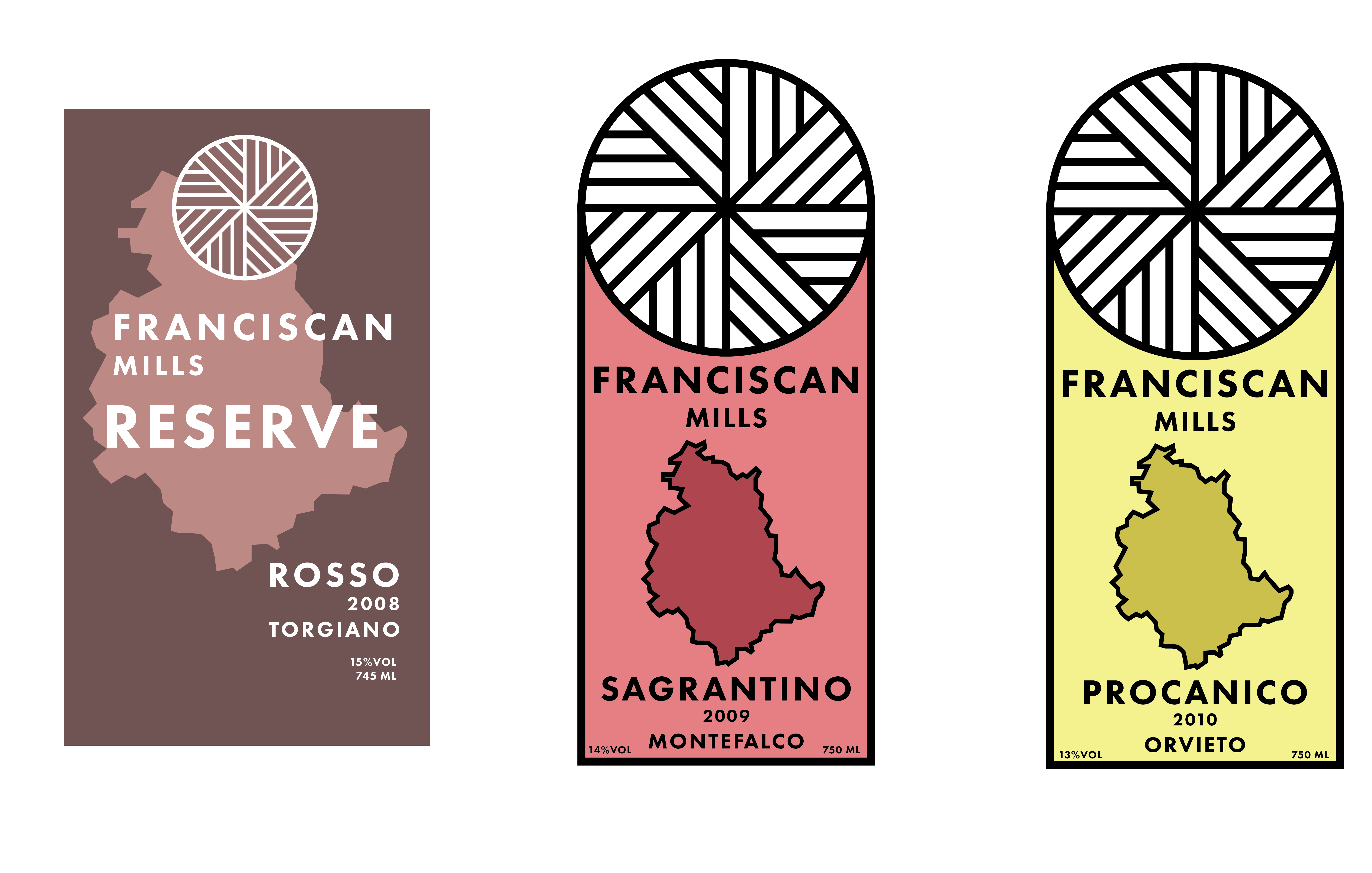
This assignment required us to design a series of wine labels for a fictional winery. I chose Franciscan Mills, because as a lot of people know, I’ve become obsessed with mills as of late. I started with the millstone design, but wasn’t sure where to go from there. I did a bit of research, and discovered that the Franciscans began in the Italian wine region of Umbria (that island-looking-splotch on the design). I added that in, traced a few bottles, and whabam. Decent looking wine label.
Honestly this was probably my favorite project out of the semester. Probably because it involved mills.
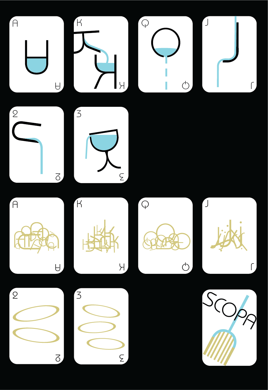
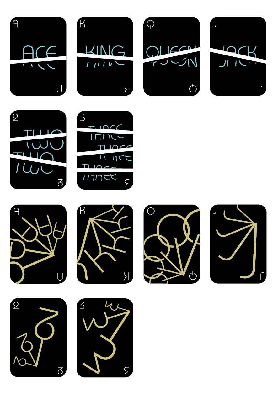
For this project, we were required to create a series of playing cards. The catch: we couldn’t use the common suits of Diamonds, Hearts, Spades, and Clubs. Also, we could only use type. I decided to base my design off of a card game close to my heart, Scopa. If you’re not aware, Scopa is a pretty popular game in Italy and apparently some parts of South America. The four suits in Scopa, as in any Italian card deck, are Cups, Coins, Sword, and Clubs (as in the weapon, not the clover).
In my design, the top two suits are Cups and Coins, and the bottom two are Swords and Clubs. I went for a more abstracted take on these objects 'cause why not. The word scopa in Italian means “to sweep”, hence the design on the back of the cards.
http://i.imgur.com/16BDzj1.png
For this project, we created the layout for a fictional magazine, Context. These are the two covers that I ended up with. Not really much to say about them, other than that the logo apparently resembles Zoom’s Logo:
https://ih0.redbubble.net/image.33360789.0350/raf,750x1000,075,t,101010:01c5ca27c6.u1.jpg
and if youre too young to know what zoom is then too bad
i also have like 7 more pages but they won’t translate well to the boards
anyway that’s enough text and images for one day
bye