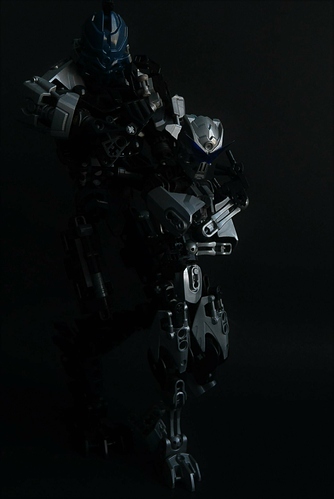
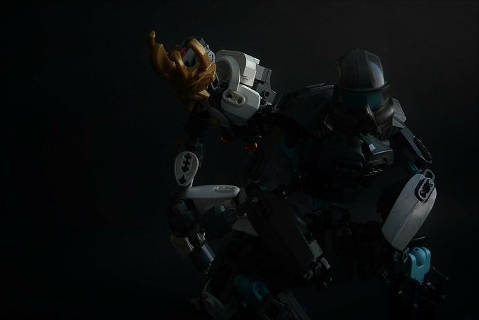
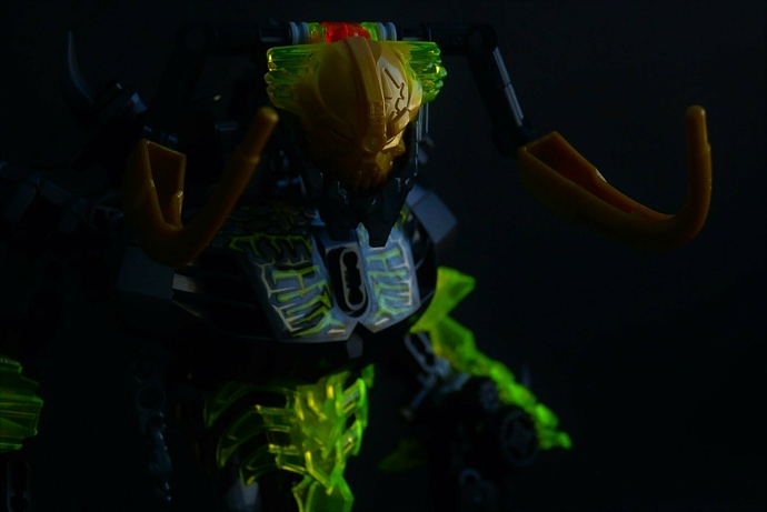
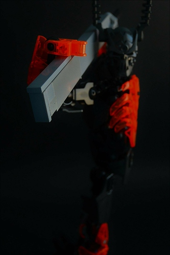
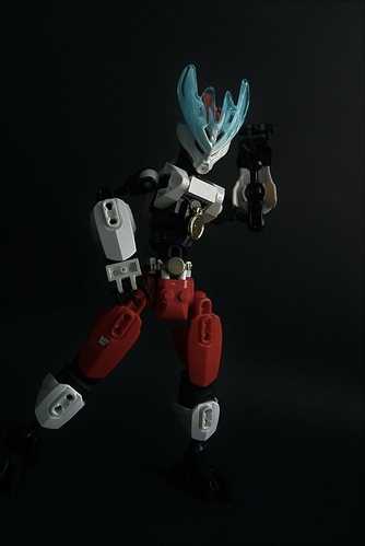
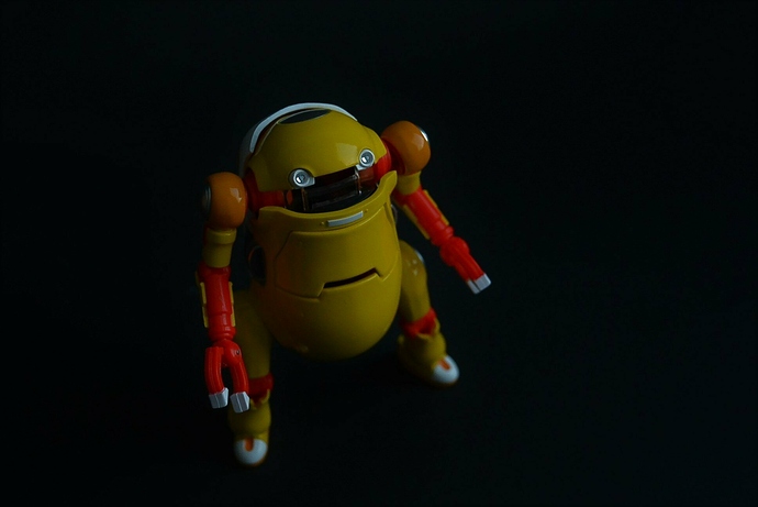
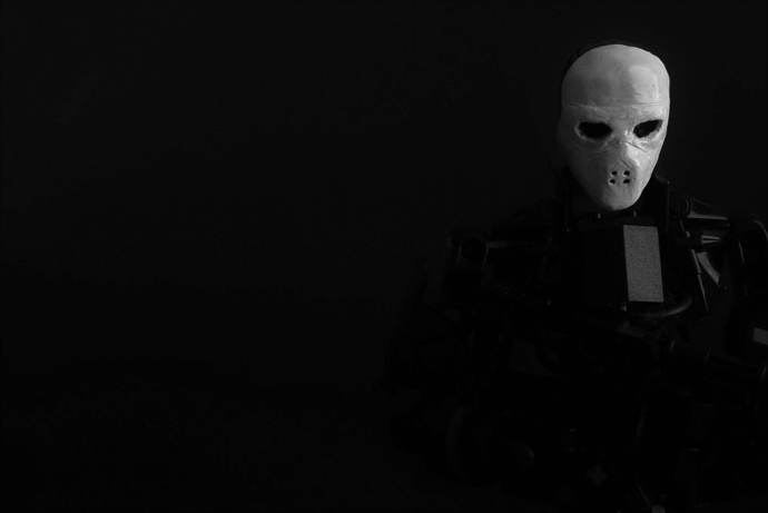
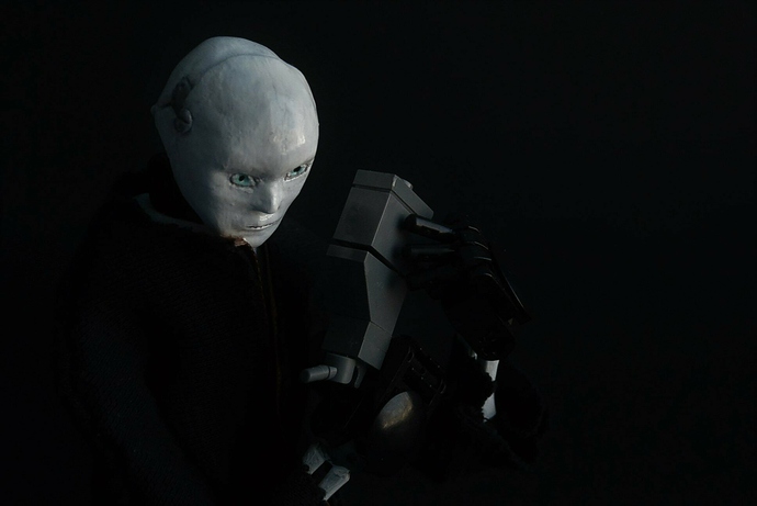
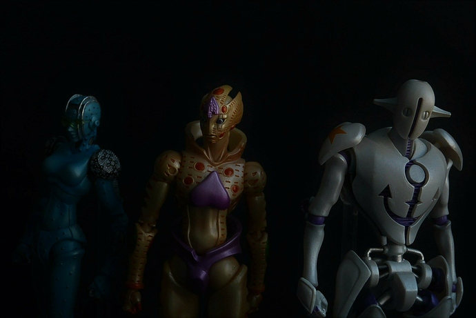
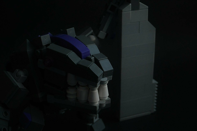
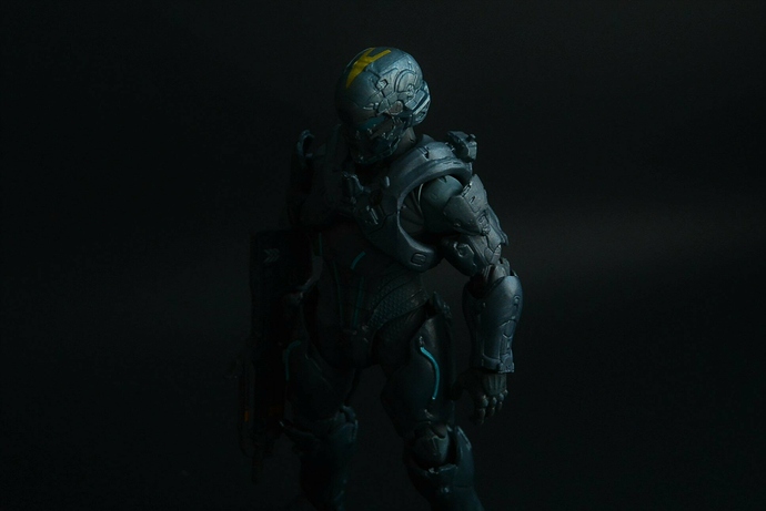
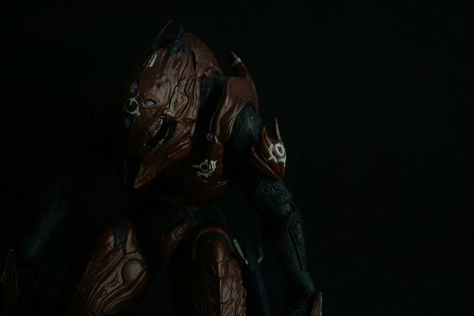
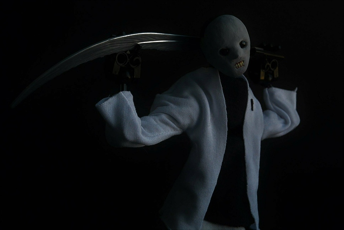
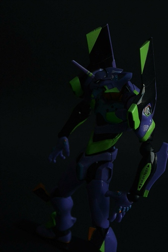
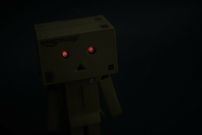
Nice photos, but i’m afraid I can’t rate 5 stars because the edge is killing me.
4/5.
Is?
oh.
oh god
ow.
please stop
the edge
it’s digging in.
/s
not bad, mate.
Ow the edge.
That’s really neat, dude. I love the lighting.
You’ve managed to make Danboard look creepy, Gost.
These are great. I really like the first one.
3edgy5me
I like the sinister aura the shadows give Umarak.
man these pictures are edgier than a rhombicosidodecahedron
Suprisingly i felt the box person was the only one that benefited from the dark lighting. The rest had too many darker pieces so most of them wasnt visible which didnt really work for me. The creepy masked guy in a white suit and with a sword may have worked if the mask was lighter, but it just doesnt seem impressive currently.
http://board.ttvchannel.com/uploads/db5640/original/3X/e/0/e0d6d2cd028b1c6dfe7a30d82053ea858bbfa855.JPG
Turn ghosty 180* and you’ve got a perfect shadow DIO.
Honestly I can’t believe you missed such an obvious reference.
