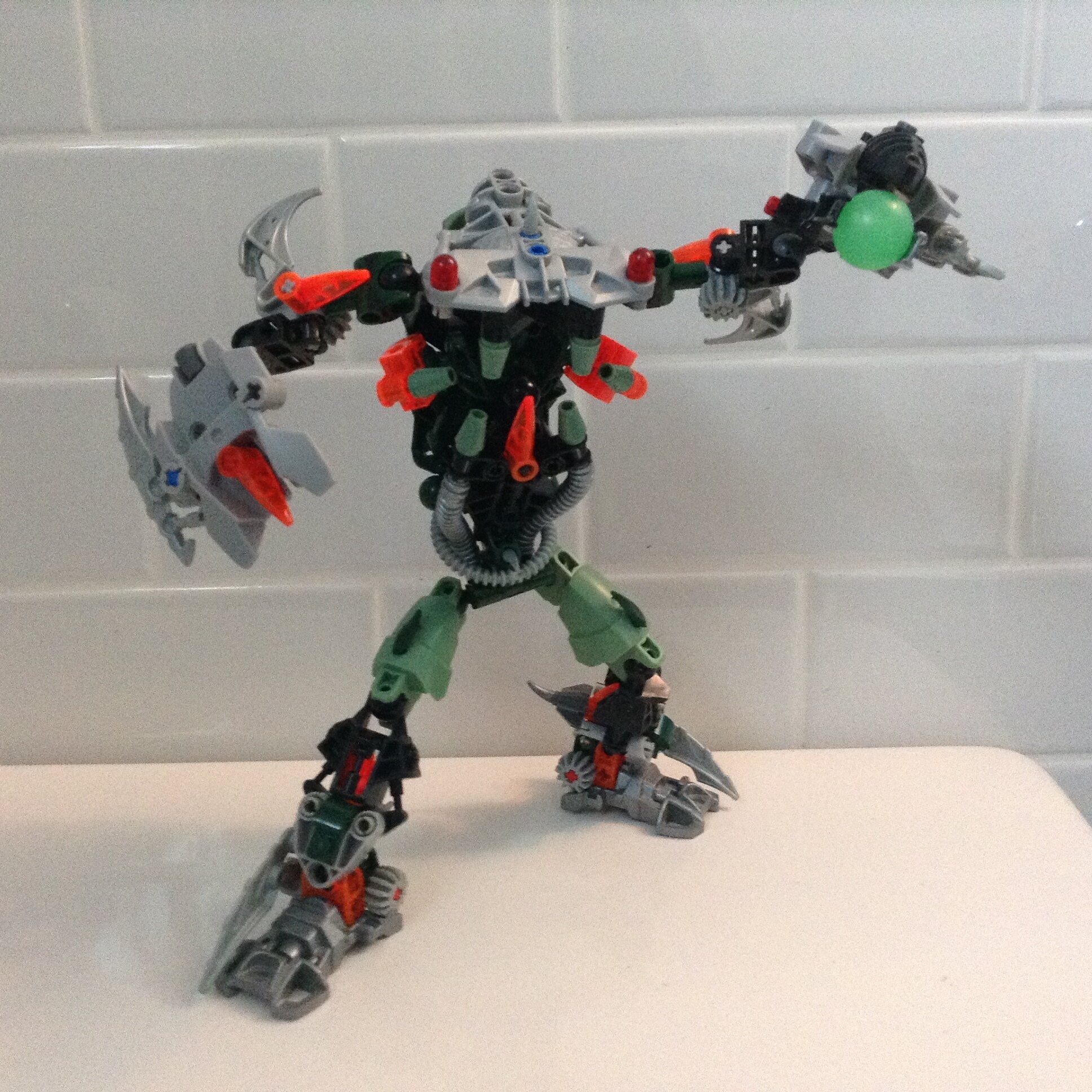
Here is version 1. Pretty boring 'aint it? Overused black and silver colour scheme with trans blue accents…how boring! And it barely even looks like a Bohrok!
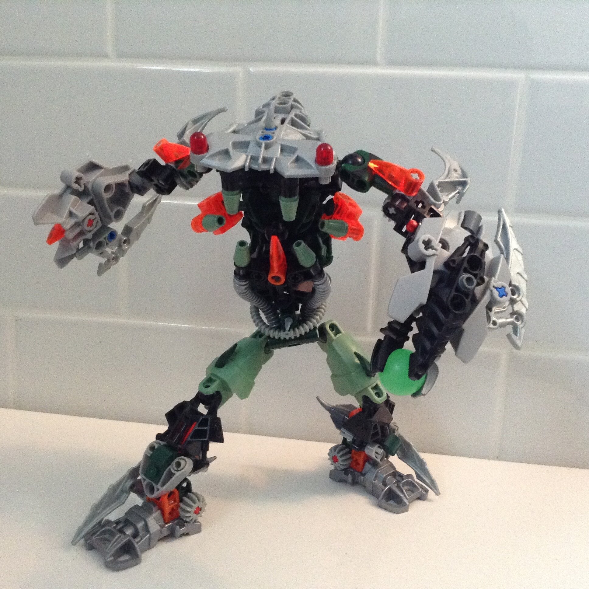
Well here is the revamped version. Despite the fact that the original Bohrok face-plate was what defined the Bohrok, not only is attaching it to the torso impossible, I always thought it lacked insectoid features, even though they were supposed to be biomechanical insects. So with gaping wide jaws, and alien-like beady red eyes, looks like it would fit in more with the Barraki then the Bohrok!
Well you could try to widen its hips maybe that will help give it that Borok-y outline a bit more. In any case giving it that unique ball transformation would help as well, good moc, though I think it could hold its own with a backstory and all as a moc and not a Borok revamp as of now.
Shorten the limbs, add some length to the torso, change the eye location to the side of the head and make them larger, remove the meteor blaster and make the shields bigger.
looks really cool, but as it stands, I’d say it’s more of a “Space Barahki”. keep up the good work.
I love v1, and I think this is a complete and awful departure from it. Sure, more colors is nice, but not when they clash like orange and green. Also, the face was very interesting in v1, it looked like a new take on the bohrak, not some weird alien mess.


 Heavens knows what he’s been through…